Jump to content

Where The Mad Dog (Vulture) Went Oh So Wrong. Offically Closed! Problem Fixed!


223 replies to this topic

#1 Bishop Steiner

    ForumWarrior

  • PipPipPipPipPipPipPipPipPipPipPipPipPipPipPip
  • The Hammer
  • The Hammer
  • 47,187 posts
  • Locationclimbing Mt Tryhard, one smoldering Meta-Mech corpse at a time

Posted 24 September 2014 - 05:08 AM

So. Mad Dog was pre-released for those who doubled up on the Clan Maxi-Packs. Totally unsolicited, and unnecessary little perk PGI put out there. So thanks for that. It will be available to the masses for MC in December, Cbills in January.

So considering the way in which we have gotten it, being heavily critical of the design may seem highly ungrateful. But, there is just so many things, that have gone so wrong, in the in game model, both from the original design, and Alex's gorgeous re-imagining.

Let us begin:
Posted Image

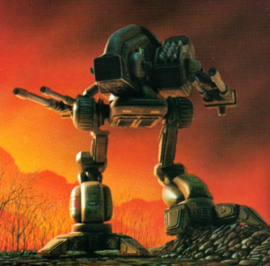
The Vulture- One of the most visually arresting designs in the classic Battletech game.
Posted Image
Posted Image

Several design elements of note:
Slender, but tall profile. Long/Deep torso
Long arm weapons barrels
Deeply flexed, ostrich legs.
Shoulders far behind hips.
Posted Image
The issues:
1) The deep but slender profile was changed to a much stubbier version. This is actually understandable, and much more survivable, fro side shots, than the original, much as the way the bullet snout of the Timber Wolf was reined in.

2) Long weapon arms? Nope. Stubby as heck. PGI modelers have done a lot of things right in this game, but the dynamic weapons are very hit and miss. In this instance, even using the generic "box" lasers, they are at the least, 2-3 times too short in barrel length. The PPC also could use a boost. This also largely points out the ludicrous nature of using the same little barrel for a .5 ton Small Laser and a 7 Ton Large Pulse Laser.

3) The Legs. IMO, the biggest deal breaker. 12-15 too large in general, and certainly 10% too thick in the thighs. I get that they followed the lore premise of re-using the legs from the Timberwolf (though even on the Timby they are borderline too thick). No, for me, the biggest issue is the posture. Far too erect and upright. Look at the original design, and it is deeply flexed, dynamic, looking ready to spring into motion. This one might actually be pretty easy to fix. Even if they simply re-rig the legs to a deeper bow, it would do wonders for the look, and perceived size, of the mech. Hardest part would probably be re-doing the walking animation.

4) The Shoulder placement. It is behind the hips. Perhaps, visually it would look nicer, further back, but with the changes made for viability, it would also probably expose the side torso to easier shots. So IMO; it's livable.

TR;DR:
Russ, not to sound ungrateful, but is there any way to have the weapon barrels looked into and given more of the flavor of the mech? And while a rescaling of the legs by 12.5% would be preferred, would it be too difficult to have the legs re-rigged (and walk re-done) to give the "proper" bowed look and gait to the Mad Dog?

edit:
25 minute sketch. Brehnman's pose, Alex's concept.
Posted Image

OK, this is what I am talking about...
Posted Image


Literally NO adjustments were made to the model. No hips moved, no limbes re-sized, nothing.


All I did was re angle the legs at the existing joints. Re-rig it akin to this, and look at how huge a difference you see in height, and the general demeanor of the profile. Doesn't have an upright Planters Peanut Man carriage anymore, but more akin to the Vulture the inner sphere named it after.

As of the June 2016 patch, this thread will be officialyl answered and it's purposed served.
Posted Image

Thank You PGI!

Edited by Bishop Steiner, 17 June 2016 - 07:49 PM.


#2 Jin Ma

    Member

  • PipPipPipPipPipPipPipPip
  • 1,323 posts

Posted 24 September 2014 - 05:11 AM

The lasers definately need to be longer. I cant' imagine it being much work. Since all they have to do is move it out a bit. modlers usually model longer than what is seen.. so all they ave ht do is slide it out

#3 CygnusX7

    Member

  • PipPipPipPipPipPipPipPip
  • 1,803 posts
  • LocationA desolate moon circling a desolate planet

Posted 24 September 2014 - 05:19 AM

It does look awesome... er Dragon. Well, amazing none the less.

Edited by CygnusX7, 24 September 2014 - 06:00 AM.


#4 Karl Streiger

    Member

  • PipPipPipPipPipPipPipPipPipPipPipPipPip
  • Wrath
  • Wrath
  • 20,369 posts
  • LocationBlack Dot in a Sea of Blue

Posted 24 September 2014 - 05:22 AM

Wish you luck OT - did have had the same problems with the Right Arm Laser of the Thunderbolt - looks castrated.

Of more concern is the 3 missile version of the MadDog - afaik the third rocket pack is part of the nose - so the Mad Dog is a pimple nose

#5 John80sk

    Member

  • PipPipPipPipPipPip
  • Ace Of Spades
  • 375 posts

Posted 24 September 2014 - 05:22 AM

The legs are too beefy I agree, same with the Timberwolf... from an aesthetic standpoint. From a balance perspective it makes sense to me though... could you imagine Timberwolves if they only took 1/2 the leg damage?

On the laser barrels I agree. Make them longer... and preferably round instead of square.

Other than that, I actually really like the look of the MWOified Mad Dog.

#6 Bacl

    Member

  • PipPipPipPipPipPip
  • Knight Errant
  • Knight Errant
  • 260 posts
  • LocationUsually between a rock and a Atlas

Posted 24 September 2014 - 05:35 AM

Lasers longer and just change the stance for a lower one, thats it.

It didnt " went oh so wrong", its not perfect but its far from catastrhophic ( almost hear the sad violins in the background).

Overall they nailed the design, it could have been much worse and yet we still have the essence of the Vulture. Seriously if i had to give them a grade i would grant a 85%, not perfect but very honorable.


#7 Sudden

    Member

  • PipPipPipPipPipPip
  • 275 posts
  • LocationK2 cockpit

Posted 24 September 2014 - 05:40 AM

View PostBacl, on 24 September 2014 - 05:35 AM, said:

Lasers longer and just change the stance for a lower one, thats it.

It didnt " went oh so wrong", its not perfect but its far from catastrhophic ( almost hear the sad violins in the background).

Overall they nailed the design, it could have been much worse and yet we still have the essence of the Vulture. Seriously if i had to give them a grade i would grant a 85%, not perfect but very honorable.

mmm I disagree 40% is more like it

#8 Bishop Steiner

    ForumWarrior

  • PipPipPipPipPipPipPipPipPipPipPipPipPipPipPip
  • The Hammer
  • The Hammer
  • 47,187 posts
  • Locationclimbing Mt Tryhard, one smoldering Meta-Mech corpse at a time

Posted 24 September 2014 - 05:41 AM

View PostKarl Streiger, on 24 September 2014 - 05:22 AM, said:

Wish you luck OT - did have had the same problems with the Right Arm Laser of the Thunderbolt - looks castrated.

Of more concern is the 3 missile version of the MadDog - afaik the third rocket pack is part of the nose - so the Mad Dog is a pimple nose

I like the nose launchers, lol.

#9 Senor Cataclysmo

    Member

  • PipPipPipPipPipPip
  • 373 posts

Posted 24 September 2014 - 05:42 AM

I've gotta be honest I really like it. I like it way more than the changes to the TW design. The stubby lasers don't bother me. I know the classic art gives it long barrels & they look great, but really lasers shouldn't even have a barrel if we're going for realism. Maybe it does sit slightly tall, I can definitely see what you mean about that, but again, personally I find that less aesthetically displeasing than the same legs on the TW chassis.

#10 Bishop Steiner

    ForumWarrior

  • PipPipPipPipPipPipPipPipPipPipPipPipPipPipPip
  • The Hammer
  • The Hammer
  • 47,187 posts
  • Locationclimbing Mt Tryhard, one smoldering Meta-Mech corpse at a time

Posted 24 September 2014 - 05:44 AM

View PostBacl, on 24 September 2014 - 05:35 AM, said:


It didnt " went oh so wrong", its not perfect but its far from catastrhophic ( almost hear the sad violins in the background).


allow me to re-acquaint you with the TL;DR portion:

View PostBishop Steiner, on 24 September 2014 - 05:08 AM, said:

TR;DR:
Russ, not to sound ungrateful, but is there any way to have the weapon barrels looked into and given more of the flavor of the mech? And while a rescaling of the legs by 12.5% would be preferred, would it be too difficult to have the legs re-rigged (and walk re-done) to give the "proper" bowed look and gait to the Mad Dog?


funny that-

#11 Penance

    Member

  • PipPipPipPipPipPipPipPip
  • Legendary Founder
  • Legendary Founder
  • 1,802 posts

Posted 24 September 2014 - 05:44 AM

You must be bored to nitpick about this aesthetic stuff, the hardcore fans usually need something to complain about :D. The mech is a freaking beast and looks great. I only got to use my prime once last night before the servers came down, but damn even the stock build was fun. I maxed the armor on all my chassis, can't wait to try tonight amid the cries of NEERRRFFF IT!!!

My one concession is the nose that looks like bot fly larvae if you put a missile rack there.

#12 0bsidion

    Member

  • PipPipPipPipPipPipPipPip
  • 1,653 posts

Posted 24 September 2014 - 05:44 AM

Well after the Timberwolf I really didn't expect this mech to look quite right. I was hoping at least the arm barrels would get represented a bit more faithfully but I'm not entirely surprised. On a side note, when you look at the models they do that Harmony Gold doesn't have a claim on it makes me think PGI's version of a Marauder would end up different enough to avoid litigation while somewhat resembling the old model some of us remember with nostalgia.

#13 Lily from animove

    Member

  • PipPipPipPipPipPipPipPipPipPipPip
  • The Devoted
  • The Devoted
  • 13,891 posts
  • LocationOn a dropship to Terra

Posted 24 September 2014 - 05:51 AM

legs are ugly still, but thats generally the TW problem. They should be more catapharact like legs.

Arms, yes they are too short, at least weapons attached to the arms should be long enouhg to reach the nose. then theywould be fine.

The rest is fine, all long nose mechs are shorther nosed in MWO, due to the shooter component and how this would ruin playbility of the mech.

the uglyness of the legs comes from the upper tight part, from the side seen it makes them look bulky. Imagine that upper tight would be truned around the axis 180degree. Then it would look better.
PGI could also probably put feet and hips to the romt makign a smaller angle.

What really looks wrong is exactly the angle of the tights.

originally they have a 90degree angle. but visually now we have probably 120degree. This feels off. catapharact has nearly the idential joint positions of hips, knee and ankle, but yet the angle there looks better.

Edited by Lily from animove, 24 September 2014 - 05:57 AM.


#14 Gernot von Kurzmann

    Member

  • PipPip
  • 49 posts

Posted 24 September 2014 - 05:53 AM

Yeah - the did many wrong at the mad dog design ;(

But i think the dont design them 1:1 like the original - could that the key? Copyright etc...

I dont know - but it looks like the designer made his own mad dog design. But the original look many times better.

The mistakes with the legs are much more than above the legs. The give him fat legs...


Posted Image

Edited by Gernot von Kurzmann, 24 September 2014 - 05:56 AM.


#15 Kiiyor

    Member

  • PipPipPipPipPipPipPipPipPipPip
  • Big Daddy
  • Big Daddy
  • 5,565 posts
  • LocationSCIENCE.

Posted 24 September 2014 - 05:55 AM

I still want it Bishop, cankles and all. Not as badly as the King, but I want it. It's payday. The money that should probably be put towards.... oh, i dunno, eating... is just lying fallow. It's so SAD there, being unspent and whatnot.

#16 RangerGee412

    Member

  • PipPipPipPipPipPip
  • The Defiant
  • The Defiant
  • 308 posts

Posted 24 September 2014 - 05:57 AM

I personally like the look. The original version looks cool but those pencil legs look like they could snap at any moment.

The new version looks like a proper mech that would be able to take damage.

#17 Bromineberry

    Member

  • PipPipPipPipPipPip
  • 436 posts

Posted 24 September 2014 - 05:58 AM

I don't get waht you're all complaining about. Imho, the Mad Dog is one of the nicest Mech designs so far in the game. I think it looks better, than most other clan mechs. And yes, the legs are different...butin my eyes, they're much better. Just take a look at the BT side-scematic that's postet in the opening post: The mech looks SO top heavy! It looks ridiculously stupid, like it would topple over with a lightest breath of wind around. I simply don't get it, how anyone could like this from an aesthetical point of view.

I love the Vulture, great work.

Edited by Bromineberry, 24 September 2014 - 05:59 AM.


#18 Budor

    Member

  • PipPipPipPipPipPipPipPipPip
  • 2,565 posts

Posted 24 September 2014 - 06:00 AM

I like the new look. The laser barrels could be longer but the rest looks way better than the old design.

#19 0bsidion

    Member

  • PipPipPipPipPipPipPipPip
  • 1,653 posts

Posted 24 September 2014 - 06:05 AM

View PostGernot von Kurzmann, on 24 September 2014 - 05:53 AM, said:

Yeah - the did many wrong at the mad dog design ;(

But i think the dont design them 1:1 like the original - could that the key? Copyright etc...

I dont know - but it looks like the designer made his own mad dog design. But the original look many times better.

The mistakes with the legs are much more than above the legs. The give him fat legs...


Posted Image


Copyright only applies to the mechs they don't have a license for, which were some of the mechs from the 3025 TRO that BT copied from Robotech, which was subsequently acquired by Harmony Gold who then went on a suing spree.

#20 AlexEss

    Member

  • PipPipPipPipPipPipPipPipPip
  • FP Veteran - Beta 1
  • FP Veteran - Beta 1
  • 2,491 posts
  • Locationthe ol north

Posted 24 September 2014 - 06:11 AM

It is a merge between the classic and the MW4 design in my mind. The best of both worlds.

I will absolutely buy it once it hit for CBills


10 user(s) are reading this topic

0 members, 10 guests, 0 anonymous users