Jump to content

My Thoughts on the Dragon


63 replies to this topic

Poll: MWO Dragon (112 member(s) have cast votes)

Which version of the Dragon do you think looks better?

  1. My Re-Vis (see post below) (20 votes [17.86%] - View)

    Percentage of vote: 17.86%

  2. Voted MWO's Design (77 votes [68.75%] - View)

    Percentage of vote: 68.75%

  3. Neither (Redesign it again) (15 votes [13.39%] - View)

    Percentage of vote: 13.39%

Vote Guests cannot vote

#21 Mechteric

    Member

  • PipPipPipPipPipPipPipPipPipPip
  • Overlord
  • Overlord
  • 7,308 posts
  • LocationRTP, NC

Posted 24 November 2011 - 06:01 PM

The MWO design makes it look like a mean killing machine, no need to make it anorexic!


Just a random thought, perhaps part of the artistic distinction that will be made between Inner Sphere and Clan designs is that the IS mechs will be bulky and wider while the Clan mechs will be more streamlined looking.

Edited by capperdeluxe, 24 November 2011 - 06:13 PM.


#22 Jack Gallows

    Member

  • PipPipPipPipPipPipPipPip
  • Legendary Founder
  • Legendary Founder
  • 1,824 posts

Posted 24 November 2011 - 06:18 PM

View Postcapperdeluxe, on 24 November 2011 - 06:01 PM, said:

The MWO design makes it look like a mean killing machine, no need to make it anorexic!


Just a random thought, perhaps part of the artistic distinction that will be made between Inner Sphere and Clan designs is that the IS mechs will be bulky and wider while the Clan mechs will be more streamlined looking.


I think he really takes the designs and gives them a more rugged realistic feel to them then just copying them from older sources, they really look like war machines that could be made instead of some of the quite less realistic aspects of multiple designs.

As for IS vs Clan, I think he'll do the same with the Clan mechs as well

#23 Kodiak Jorgensson

    Member

  • PipPipPipPipPipPipPip
  • The Ironclad
  • The Ironclad
  • 935 posts
  • LocationUnited Kingdom

Posted 24 November 2011 - 06:49 PM

<p>wheres the LRM10 thats located in the CT? ;), seriosuly, i like MWO dragon it looks very similar to the orignal, ecept the huge cylinderical shoulders, which imo identifies the dragon for me and yeah as people have said, its bit too wide</p>
<div id="cke_pastebin" style="position: absolute; top: 8px; width: 1px; height: 1px; overflow: hidden; left: -1000px;"><b>silhouette</b></div>

#24 infinite xaer0

    Member

  • PipPipPipPipPipPip
  • 417 posts

Posted 24 November 2011 - 09:47 PM

View PostSJ SCP Wolf, on 24 November 2011 - 04:34 PM, said:

While not the biggest fan of the MWO Dragon, this is still concept art. Seeing it rendered in 3D in engine could very well change everyone's opinions. I find these threads pointless. So much can and will change between now and finalization of the model.


...and so little can change, especially if nobody tells the devs that they think something is "wrong". But whatever.. I still think it's worth generating these sorts of discussions, even if the chances of them influencing the devs' decisions are actually pretty small.

*sigh* anyway, it looks like most of you guys disagree with me on the Dragon. I still think the dude's too wide. Height wise the proportions are fine, but width wise something just feels wrong. I'm thinkin that it may be a golden ratio thing, though I don't exactly feel like calculating out, and photoshopping in all the rectagles to show it.. dunno if I'd do it right either..

#25 Johnathan McKenna

    Member

  • PipPipPip
  • Elite Founder
  • Elite Founder
  • 88 posts
  • LocationKerensky Cluster

Posted 24 November 2011 - 10:09 PM

I feel like MWOs version feels more proportionate than your design. I kind of feel that yours comes off as a bit top heavy.

#26 Pariah Devalis

    Member

  • PipPipPipPipPipPipPipPipPipPip
  • The Clan Cat
  • The Clan Cat
  • 7,655 posts
  • Google+: Link
  • Twitter: Link
  • LocationAboard the NCS True Path

Posted 24 November 2011 - 10:19 PM

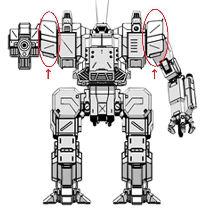
Frankly, the Dragon redesign is the one I'm not ecstatic about, and I know exactly, EXACTLY what it is about it that bothers me.

THESE:

Posted Image

If they were not included, and the arms instead mounted to the actual torso, it would avoid the over-wide look it currently screams to me. That one part being removed, right there, would make it look right! I mean, I know aesthetics are all personal opinion, but that chunk of mech on either side of the torso baffles me. Is it an actuator? Then why is it so exposed? Surely they could run the mounting directly into the side of the torso itself without requiring an additional chunk of metal?

#27 Kurayami

    Member

  • PipPipPipPipPipPipPip
  • Stone Cold
  • Stone Cold
  • 916 posts
  • LocationSochi

Posted 24 November 2011 - 10:40 PM

Redesign is pretty good - looks like a real war machine for me.

Pariah Devalis imho "things" you pointed is shoulder joint\actuator guard - just like in older designs.

#28 infinite xaer0

    Member

  • PipPipPipPipPipPip
  • 417 posts

Posted 24 November 2011 - 10:42 PM

View PostJohnathan McKenna, on 24 November 2011 - 10:09 PM, said:

I feel like MWOs version feels more proportionate than your design. I kind of feel that yours comes off as a bit top heavy.


I shrank the width of the top much more so than I did the width and spacing of the legs. So, I'm not really getting how you think my version is "a bit top heavy", considering the original has a top that's even wider in comparison to the mech's overall leg width... but that one isn't top heavy to you... ok..

#29 John Clavell

    Member

  • PipPipPipPipPipPipPipPip
  • 1,609 posts

Posted 24 November 2011 - 11:36 PM

View Postinfinite xÆr0, on 24 November 2011 - 02:00 PM, said:


Yeah, I think I unintentionally made the poll options confusing. Re-vis was supposed to refer to my re-vis of the mech, and the "original" option was supposed to refer to MWO’s original design. So in the context of my post, the poll was actually in favor of what I changed to the design, and not what the devs made. I realized that the wording was confusing, and people might have actually been intending to vote the other way, so I reset the poll and gave it clearer options.


Ahh yes thanks. I fell foul to the wording, I had voted for your 're-vis' when I though I was voting for the MWO redesign. Thanks for resetting the poll.

#30 Mchawkeye

    Member

  • PipPipPipPipPipPipPip
  • 883 posts

Posted 24 November 2011 - 11:44 PM

I prefer the MWO design, I think.

I think it's taken away the mad 80's/Dynasty/Dallas shoulder-pads and given it a good military makeover. Looks great.

It may well be slightly disproportionate, but I tend to find most mechs that have any personality are, simply by way of something about them standing out.

I think the Nova looks like a muppet: all legs. I love the Nova

I think the Timberwolf/Vulture has legs that are too skinny, but that just makes it look lithe and quick.

Even the Urbie, whilst butt-ugly has personality because it's so unbalanced and stupid looking.

Many of them have stupid proportions, but I think it simply lends them individual style.

And that is no bad thing.

#31 Alizabeth Aijou

    Member

  • PipPipPipPipPipPipPip
  • 877 posts

Posted 25 November 2011 - 07:49 AM

I think I'll prefer the Eridani Light Pony version from the 2nd post.
Either that, or this this:
Posted Image
Except with an AC/5 since we're talking DRG-1N here.

Edited by Alizabeth Aijou, 25 November 2011 - 07:50 AM.


#32 DocBach

    Member

  • PipPipPipPipPipPipPipPipPip
  • Legendary Founder
  • Legendary Founder
  • 4,828 posts
  • LocationSouthern Oregon

Posted 25 November 2011 - 08:00 AM

Something wasn't right to me, and I realized what it was looking at the design sketches - the subdued LRM rack doesn't look right to me. Looking at the concept sketches, I like the top three way more than the ones with the hidden LRMs.

#33 infinite xaer0

    Member

  • PipPipPipPipPipPip
  • 417 posts

Posted 25 November 2011 - 08:49 AM

View PostDocBach, on 25 November 2011 - 08:00 AM, said:

Something wasn't right to me, and I realized what it was looking at the design sketches - the subdued LRM rack doesn't look right to me. Looking at the concept sketches, I like the top three way more than the ones with the hidden LRMs.


Most of the sketches are awesome. I think the four sketches on the left in that pic are my favorite, however, I don't think the final art captures the feel of any of them. I mean, why's the nose of the Dragon a skewed rectangle when all the sketches have a more interesting, angled hexagonal front end? All the right angles and boxy appearance just makes the Dragon look really pudgy/fugly. And as far as the LRM10 is concerned, I don't really have a problem with its appearance, especially compared to everything else that I don't like about the mech's aesthetics..

#34 ELHImp

    Com Guard

  • PipPipPipPipPipPipPipPip
  • 1,846 posts
  • Google+: Link
  • LocationRussia

Posted 25 November 2011 - 09:39 AM

Quote

Eridani Light Pony


Quote

Light Pony


Quote

Pony
O M G P L Z N O !!!

#35 Aaron DeChavilier

    Member

  • PipPipPipPipPipPipPipPip
  • 1,422 posts
  • LocationEisen Unbegrenzt Corp HQ, Rim Collection

Posted 25 November 2011 - 09:56 AM

what throws it off for me; is the size of the redesigns cockpit. The new cockpit seems to
small for the rest of the chassis, this in turn makes everything seem bigger and more
pronounced. My personal favorite is the upper right concept sketch, the heavy straight
lines have more of a CBT feel of the original.

#36 Slender Man

    Member

  • PipPip
  • 28 posts

Posted 25 November 2011 - 09:58 AM

I always thought there were two mech designs that were truly always ugly. That was the Jager Mech and the Dragon. The only time I found the Dragon to not be ugly was in Mech Warrior 4. I agree with Strayed... but I'm voting for Re-Vis since the chances that an artist will copy a MW4 design is slim.

#37 Nakir

    Com Guard

  • PipPipPipPipPipPipPip
  • 795 posts
  • LocationItaly (Sicily)

Posted 25 November 2011 - 09:59 AM

View PostStrayed, on 24 November 2011 - 03:53 PM, said:

I think MWO version is good, wish it was a bit less fat, but to be honest I actually prefer Mechwarrior IV's design.

Posted Image


I have the same opinion ;) .Although this MWO design is a nice remake

Edited by Nakir, 25 November 2011 - 10:02 AM.


#38 phelanjkell

    Member

  • PipPipPipPipPipPip
  • 355 posts
  • LocationNorth Carolina

Posted 25 November 2011 - 10:58 AM

The old TRO artwork was good for its time, but wow I am so glad FD put his style into the design.

All of the mechs will not be 100% to the original CANNON design. I do hope everyone understands this. FD will put his touch/style on every battlemech. Which I'm thrilled about, and can not wait to see more of his designs come to life!!

For the OP, I don't think it is right to compare new to the old. BUT its not like FD is completely re-designing the entire mech. He is taking the key aspects that attract your eye to the design and incorporating them in his style, which I approve of!!

#39 Xhaleon

    Member

  • PipPipPipPipPipPipPip
  • The Money Maker
  • The Money Maker
  • 542 posts

Posted 25 November 2011 - 11:29 AM

Lemme state one thing: I asked FD on /tg/ recently on why he dropped the rounded shoulders with the arms nested in, which some of the concept sketches still keep to an extent. He responded by saying that it is really more of Piranha's idea, as the dev's didn't like the rounded shoulders and asked him to redesign that. It would be very easy to say that any drastic changes to the design of mechs appearing in official MWO art can be attributed to executive meddling the developer's vision, although a few things like the leg design are simply his style.

I really can't decide on the MW4 Dragon; its torso is too fat and stubby, and it's lost the distinctive antennae. On the other hand, its appearance is a little more recognizable at first glance to the original, although not by much. It's odd, I kinda like it, but feel more repulsed the more I look at it. Hmmm.

#40 Tierloc

    Member

  • PipPipPipPipPipPip
  • 231 posts
  • LocationWAR_Homeworld

Posted 25 November 2011 - 11:47 AM

I liked the linebacker design type in previous MW titles.


1 user(s) are reading this topic

0 members, 1 guests, 0 anonymous users