Jump to content

My Thoughts on the Dragon


63 replies to this topic

Poll: MWO Dragon (112 member(s) have cast votes)

Which version of the Dragon do you think looks better?

  1. My Re-Vis (see post below) (20 votes [17.86%] - View)

    Percentage of vote: 17.86%

  2. Voted MWO's Design (77 votes [68.75%] - View)

    Percentage of vote: 68.75%

  3. Neither (Redesign it again) (15 votes [13.39%] - View)

    Percentage of vote: 13.39%

Vote Guests cannot vote

#61 cipher

    Member

  • PipPipPipPipPipPipPip
  • 660 posts
  • Facebook: Link
  • LocationState College, PA

Posted 28 November 2011 - 07:30 AM

View PostStrayed, on 24 November 2011 - 03:53 PM, said:

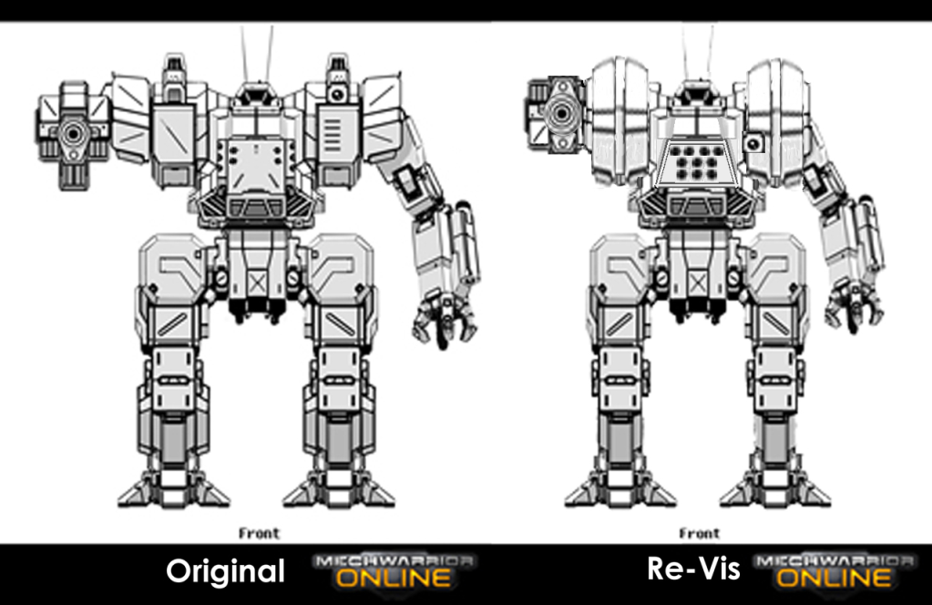
I think MWO version is good, wish it was a bit less fat, but to be honest I actually prefer Mechwarrior IV's design.

Posted Image


This. Please use this as a guide from future concept art/designs.

#62 Joachim Viltry

    Member

  • PipPipPipPipPipPip
  • Bad Company
  • Bad Company
  • 227 posts
  • LocationTexas, USA, Terra, SOL System, Inner Sphere

Posted 29 November 2011 - 11:52 PM

honestly the only things that bug me about the redesign are 1- the launcher, 2- the shoulders, and 3- the gun proportions.

1-The central launcher is one of the things that makes it a Dragon, and the split launcher is pretty goofy with tubes on the sides like that, just not my cup-o-tea.

2- Really the silhouette isn't that of a Dragon, it looks pretty good, but it doesn't have the sloped shoulders that really define the look. Both the Zeus and Awesome have the sloped shoulder style on the mini's, so i have some concern that those mechs may not have suitable profiles, and instead get the 'box' treatment that the Dragon has received.

3- the AC is awfully bulked out, Granted thefirst pair of upgrades to the dragon are an Ultra AC, or a PPC in it's place, but those shouldn't be that bulky either. I mean if THIS is an AC 5, what monstrosity are we going to hang on the arms of the Centurion and Enforcer?

*edit*
here is about 15 mins worth of effort in Paint, at 0231 in the morning...

Posted Image

Edited by Joachim Viltry, 30 November 2011 - 12:31 AM.


#63 infinite xaer0

    Member

  • PipPipPipPipPipPip
  • 417 posts

Posted 30 November 2011 - 04:38 AM

View PostJoachim Viltry, on 29 November 2011 - 11:52 PM, said:

honestly the only things that bug me about the redesign are 1- the launcher, 2- the shoulders, and 3- the gun proportions.

1-The central launcher is one of the things that makes it a Dragon, and the split launcher is pretty goofy with tubes on the sides like that, just not my cup-o-tea.

2- Really the silhouette isn't that of a Dragon, it looks pretty good, but it doesn't have the sloped shoulders that really define the look. Both the Zeus and Awesome have the sloped shoulder style on the mini's, so i have some concern that those mechs may not have suitable profiles, and instead get the 'box' treatment that the Dragon has received.

3- the AC is awfully bulked out, Granted thefirst pair of upgrades to the dragon are an Ultra AC, or a PPC in it's place, but those shouldn't be that bulky either. I mean if THIS is an AC 5, what monstrosity are we going to hang on the arms of the Centurion and Enforcer?

*edit*
here is about 15 mins worth of effort in Paint, at 0231 in the morning...


hmmm. I'm diggin your edit to my re-edit. It definitely looks better with the trapezoidal nose, sloped R/L torso armor, and properly positioned LRM10.

#64 Jack Deth

    Member

  • PipPipPip
  • 74 posts
  • LocationLondon, Ontario, Canada

Posted 30 November 2011 - 05:34 AM

I personally don't have a problem with the official redesign, its a pretty good looking mech. Only problem is, it doesn't really look like a Dragon. Some of the baby got thrown out with the bathwater, in my opinion. Without the "nose" and LRM ports up front and centre I'd have a hard time identifying it at a quick glance as a Dragon on the battlefield in the heat of combat.


1 user(s) are reading this topic

0 members, 1 guests, 0 anonymous users