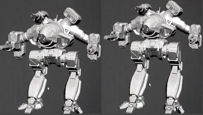
Petition: Fix Cauldron Born Model
#21
Posted 19 April 2015 - 06:32 AM
#22
Posted 19 April 2015 - 06:40 AM
The first two result in a model that, like the classic artwork and miniatures, would be all well and good for static artwork and static figurines but unacceptably ungainly & awkward for a model that needs to 1.) be able to move & 2.) look like a well-designed machine.
As a function of that, the third proposed change is likewise unneeded.
#23
Posted 19 April 2015 - 06:48 AM
#24
Posted 19 April 2015 - 06:48 AM
#25
Posted 19 April 2015 - 06:58 AM
#26
Posted 19 April 2015 - 07:04 AM
Although I need to admit, that the legs could be a little shorter. I pretty much support the petition according to legs and torso-hip-positioning. I hope, it´s not too late to fix that.
PGI please think about your customers´ thoughts.
#27
Posted 19 April 2015 - 07:04 AM
#28
Posted 19 April 2015 - 07:07 AM
Do agree the stumpy version looks cooler though.
Edited by MoonfireSpam, 19 April 2015 - 07:07 AM.
#29
Posted 19 April 2015 - 07:08 AM
What I suspect is going on is that PGI is trying to reuse the walking animation of the prior two mechs with this one - not that it is a bad thing. Limited resources and all. However, the stance on all three is too prancy and less predatory.
#30
Posted 19 April 2015 - 07:10 AM
yes, it could use some alterations which it will never, ever, ever, receive.
(just like the Awesome, Vindicator, Trebuchet, Grasshopper, Adder, Nova, Catapult, Gargoyle, Warhawk, Quickdraw and Dragon)
#31
Posted 19 April 2015 - 07:38 AM
 SpiralFace, on 19 April 2015 - 06:29 AM, said:
Look, I love Battletech and the look of the original, but this is a pure gameplay balancing thing.
You are talking about a mech with equal weight of a Hellbringer with clan tech weaponry and high weapon mounts ALSO getting a squat profile that will easily make it the smallest, most compact heavy on the field.
This thing would IMMEDIATELY nearly invalidate every other clan heavy, and instantly become one of the best heavies in the game when the profile is equal to other mechs half its size.
If they did that, they would have to give it negative quirks up the wazzoo that NO ONE would want.
I love the look of the original, but they have to balance the aesthetics of what the mech in Battletech looks like to physical game play balance in this game.
Thank you, this is a very real concern. I do have propositions, however.
1. If the game balance ramifications are truly the driving force behind abandoning the unique low profile this chassis is renowned for, and if its low profile truly does offer that significant of an advantage, then the movement attributes of the chassis can be assigned as appropriate. Turning rate, torso twist amount, and yaw/pitch rates could be made to compensate for the inherent advantages the chassis has as a result of its low profile.
2. There is a second way to look a it: the shorter the mech is, the fewer map elements there will be that are short enough that it can shoot over them naturally. Height can actually be an advantage for this mech because of the high mounts.
3. Application of the suggestions described in the OP in moderation. As I said, "I would be willing to accept a compromise".
It's not quite as elegant, but the solution could approach this:

Do you think that's a significant enough difference to aggravate game balance? We don't know the height of the WIP model and how it compares to other chassis. It may be shorter than a Stormcrow. It may be as tall as a Hellbringer. Its shoulder pods could be at the same height as the Timberwolfs' ears. We don't know that information right now, and I think that's an important factor to consider.
Open question: do you buy digital robots because they look awesome and inspire you, or do you buy them simply because they're meta-stronk?
... do you play this game at all because there are OP robots to play, or because you like the aesthetics of the stompy robots and they inspire you to git gud™ and keep playing them?
Edited by Tarogato, 19 April 2015 - 07:49 AM.
#33
Posted 19 April 2015 - 07:40 AM
#34
Posted 19 April 2015 - 07:42 AM
#35
Posted 19 April 2015 - 07:43 AM
#36
Posted 19 April 2015 - 07:47 AM

As I said in the other thread, the torso lacks some volume and flatness and legs are even longer and thinner than on the concept art, don't like steep angled ones from the original art though.
Edited by kapusta11, 20 April 2015 - 11:46 AM.
#37
Posted 19 April 2015 - 07:49 AM
 Tarogato, on 19 April 2015 - 04:33 AM, said:
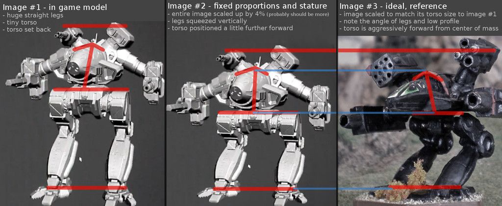
1. more aggressive angle in the leg joints
2. upper body positioned slightly more forward on the hip
3. scaling legs, torso, or whole to achieve better proportions (might not even be necessary)
Here is a more sophisticated illustration of the differences:

The hip (or highest point on the leg/thigh) should be about the halfway point along the total height of the model, which is to say it should divide the mech in half, resulting in a 50/50 torso-to-legs proportion. The WIP model currently has about a 35/65 torso-to-legs proportion. Shown by red horizontal lines.
State your opinion in this thread whether or not you'd like to see adjustments like this made to the model before it's too late and we can't go back!
Yes or no?
Tarogato, my answer is a strong and resounding YES, but you missed one aspect of the model that should change.
The upper-arm struts should be angled less deeply. They don't need to be shortened, necessarily. It wouldn't hurt to shorten them as well, but only after the struts' angle is fixed first. Their angle just needs to be brought up a bit closer to horizontal, and you instantly improve the look of the arms 90%.
Also, you forgot to mention another suggested change despite implementing it. Shaving some off the top of the enormous, diaper-like pelvis assembly. It's pretty clear in your "image #2" that you actually did this, you just didn't mention it in your list of recommended modifications.
Edited by Bloodweaver, 19 April 2015 - 07:57 AM.
#38
Posted 19 April 2015 - 07:52 AM
Just personal preference.
#39
Posted 19 April 2015 - 08:00 AM
 Bloodweaver, on 19 April 2015 - 07:49 AM, said:
The upper-arm struts should be angled less deeply. They don't need to be shortened, necessarily. Their angle just need to be brought up a bit closer to horizontal.
Thank you! There is actually a reason I don't suggest that change, however. One, it may require alterations to the actual model - changes more sophisticated than simply rescaling certain elements or altering the angle where two elements meet (i.e., knee joint, hip joint, etc.) Two, it's actually a self-balancing mechanism: the Cauldy has some pretty sexy high mounts that offer an incredible ridge-peeking advantage, you could mount a gauss or three large lasers onto that pod. The higher set the arms are, the more betterer the chassis becomes at ridge-peeking, and since it has a rather low-mounted cockpit, the advantage would be very noticeable. Having the arms slug lower is an effective way to mitigate this advantage and keep things in balance.
#40
Posted 19 April 2015 - 08:04 AM
 Strum Wealh, on 19 April 2015 - 06:40 AM, said:
Nonsense. Not only can it be done, since this is a game and real life rules do not apply, but it already has been done:

3 user(s) are reading this topic
0 members, 3 guests, 0 anonymous users
 This topic is locked


