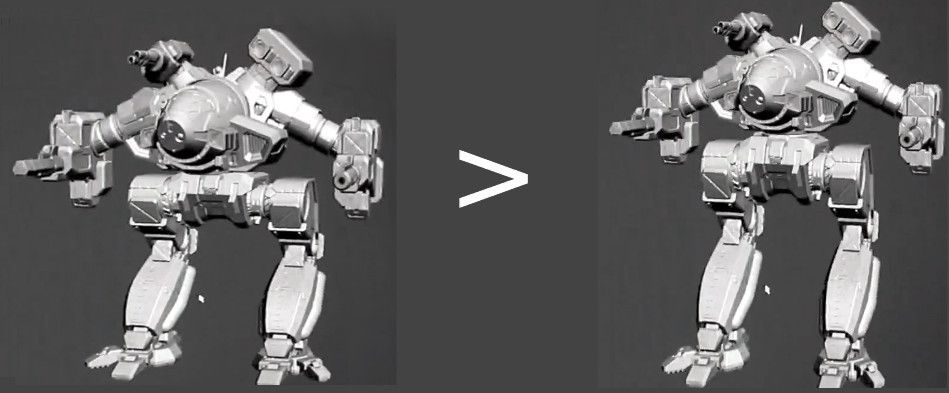
Petition: Fix Cauldron Born Model
#141
Posted 20 April 2015 - 06:49 AM
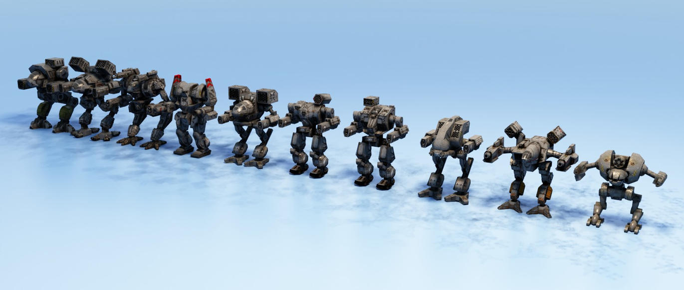
I don't want the squat mech I've seen for the past 4-6 mechwarrior games. I'd rather it be tall like a heavy :/
#142
Posted 20 April 2015 - 06:58 AM
I´d be educational as well as entertaining.
Edited by Molossian Dog, 20 April 2015 - 07:03 AM.
#143
Posted 20 April 2015 - 07:03 AM
Scout Derek, on 20 April 2015 - 06:49 AM, said:
I don't want the squat mech I've seen for the past 4-6 mechwarrior games. I'd rather it be tall like a heavy :/
wher eis that taken from? most BT miniatures may disagree, the shown Cauldron Born above is not how it originally is.
#144
Posted 20 April 2015 - 07:04 AM
Lily from animove, on 20 April 2015 - 07:03 AM, said:
wher eis that taken from? most BT miniatures may disagree, the shown Cauldron Born above is not how it originally is.
Here Lily: http://walter-nest.d...ne-Up-202336386
#145
Posted 20 April 2015 - 07:08 AM
I'd say the adjust pic in the OP is a good trade off between the polygon model and the concept art.
#146
Posted 20 April 2015 - 07:17 AM
SpiralFace, on 19 April 2015 - 06:29 AM, said:
Look, I love Battletech and the look of the original, but this is a pure gameplay balancing thing.
You are talking about a mech with equal weight of a Hellbringer with clan tech weaponry and high weapon mounts ALSO getting a squat profile that will easily make it the smallest, most compact heavy on the field.
This thing would IMMEDIATELY nearly invalidate every other clan heavy, and instantly become one of the best heavies in the game when the profile is equal to other mechs half its size.
If they did that, they would have to give it negative quirks up the wazzoo that NO ONE would want.
I love the look of the original, but they have to balance the aesthetics of what the mech in Battletech looks like to physical game play balance in this game.
Nothing is going to unthrone the Timber God any time soon. Not even a squat cauldron born. You can't argue with 75 tons of 89 kph badass.
Cauldron born needs to be low, and lethal.
Edited by Mavairo, 20 April 2015 - 07:18 AM.
#147
Posted 20 April 2015 - 07:20 AM
Tarogato, on 19 April 2015 - 04:33 AM, said:
We've been given a sneak preview of the Cauldron Born in-game model as it stands: a work in progress. Hopefully we can use this opportunity to provide constructive feedback to the modeler(s) on how to improve the model so that it can fully meet our expectations. It already looks damn sexy, as does almost every model developed from Alex's art. But it could look even sexier.
I know many people are happy with it, but there seems to be significant amount of people who do think it could be improved. You can find examples here:
- http://mwomercs.com/...pdate-04182015/
- http://mwomercs.com/...ron-born-model/
- http://www.reddit.co...auldron_born_3d
The requested changes:
1. more aggressive angle in the leg joints
2. upper body positioned slightly more forward on the hip
3. scaling legs, torso, or whole to achieve better proportions (might not even be necessary)
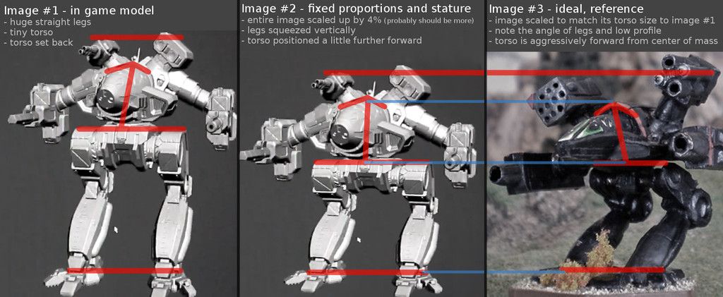
Here is a more sophisticated illustration of the differences:
The hip (or highest point on the leg/thigh) should be about the halfway point along the total height of the model, which is to say it should divide the mech in half, resulting in a 50/50 torso-to-legs proportion. The WIP model currently has about a 35/65 torso-to-legs proportion. Shown by red horizontal lines.
I would be willing to accept a compromise between Image #1 and Image #2 as illustrated above, but obviously the closer to Image #2 it becomes, the more it will resemble the source material and the more the true character of the mech will be apparent. It should be low, mean, and aggressive... not tall, mild, or prude.
State your opinion in this thread whether or not you'd like to see adjustments like this made to the model before it's too late and we can't go back!
Yes or no?
And please leave some feedback below as to why it's important to you!
Simply put, the long lean aesthetic of the concept art is precisely why I didn't order it. (Well, and I think Alex id one of his worst jobs ever on the legs of the CB and the ShadowKitty).
The way you modified it, on the other hand, would force me to by the pack.
#148
Posted 20 April 2015 - 07:52 AM
Edited by Ghost Badger, 20 April 2015 - 09:45 AM.
#149
Posted 20 April 2015 - 10:39 AM
Tarogato, on 19 April 2015 - 04:33 AM, said:
We've been given a sneak preview of the Cauldron Born in-game model as it stands: a work in progress. Hopefully we can use this opportunity to provide constructive feedback to the modeler(s) on how to improve the model so that it can fully meet our expectations. It already looks damn sexy, as does almost every model developed from Alex's art. But it could look even sexier.
I know many people are happy with it, but there seems to be significant amount of people who do think it could be improved. You can find examples here:
- http://mwomercs.com/...pdate-04182015/
- http://mwomercs.com/...ron-born-model/
- http://www.reddit.co...auldron_born_3d
The requested changes:
1. more aggressive angle in the leg joints
2. upper body positioned slightly more forward on the hip
3. scaling legs, torso, or whole to achieve better proportions (might not even be necessary)
Here is a more sophisticated illustration of the differences:
The hip (or highest point on the leg/thigh) should be about the halfway point along the total height of the model, which is to say it should divide the mech in half, resulting in a 50/50 torso-to-legs proportion. The WIP model currently has about a 35/65 torso-to-legs proportion. Shown by red horizontal lines.
I would be willing to accept a compromise between Image #1 and Image #2 as illustrated above, but obviously the closer to Image #2 it becomes, the more it will resemble the source material and the more the true character of the mech will be apparent. It should be low, mean, and aggressive... not tall, mild, or prude.
State your opinion in this thread whether or not you'd like to see adjustments like this made to the model before it's too late and we can't go back!
Yes or no?
And please leave some feedback below as to why it's important to you!
Yes!
This, folks, is the right way to give feed back and critique. I wish I could like the OP twice for it.
#150
Posted 20 April 2015 - 11:57 AM
Some of you are happy and don’t desire any changes; others want changes based on game-play, some based on aesthetics and a few are a little ambiguous.
First let me start with the issue of posting WIP. The pose of the Cauldron Born in question here is a pre-rigged T-pose. The rigged (resting) pose is far squatter and somewhat resembles the King Crab in its animation. So, in way, this thread is based on misinformation.
This does not invalidate it though.
Regarding geo modification, there are many things to consider here. We have to take hit boxes into consideration as well as animation. Hitbox adjustment is something that’s always a subject of contention and we’ve made many adjustments on almost all platforms (and will continue to do so). We try to mitigate these issues at the concept stage by finding a compromise between aesthetics and game-play, and continue tweaking well into modelling. When it comes to animating a ‘Mech, a sense of weight, balance, inertia; realism in general, is a priority. A wide legged stance for example would animate poorly, looking like a waddle, and if a constant centering of mass was applied (on cross-over), it would cause a drastic side-to-side motion that would look odd and unstable. This is one of the reasons every ‘Mech has a waist; it’s not just to accommodate torso-twist. Many of the original designs are fused at the waist which gives them a very squat appearance and would animate very poorly [if not impossibly]. The lower [or squatter] the ‘Mechs stance, the more chance of (leg) geo collision at cross-over as well, particularly with chicken-walker ‘Mechs.
One thing we are not (here in the Art Department) is polar. We do not sit absolutely left or absolutely right on anything. There is no ‘this-or-that’ attitude. We are in constantly looking for the sweet spot: the perfect grey area where aesthetics and game-play are balanced. No matter what though, we can’t please everyone, especially those who ARE polar. This is not meant as an insult to anyone’s opinion in any way. I get it, some want a ‘Mech that performs ‘perfectly’, others want a ‘Mech that looks beautiful. Some would gladly sacrifice appearance, immersion and reality for game-play; and others thirst for aesthetics, immersion and suspension of belief. We want it all; but know that’s impossible. Sacrifices, trade-offs, compromises must be made, and there’s so much complexity in the art and design of MWO that perfection can only be pursued, as achieving it is purely subjective.
It seems most of you are pretty intelligent and are understanding of these points as the well-roundedness of this conversation illustrates. We do listen, read and consider everything we can. Many changes and modifications have been made as a direct result of your feedback and many are in the works. So please, keep the feedback coming; be nice though, we artists are sensitive.
Although passion is a great reason for being rude, it’s a horrible excuse.
#151
Posted 20 April 2015 - 12:01 PM
#152
Posted 20 April 2015 - 12:29 PM
Thank you for the response.
#153
Posted 20 April 2015 - 01:20 PM
#154
Posted 20 April 2015 - 01:43 PM
Well now we can say that there won't be any changes, right?
#155
Posted 20 April 2015 - 01:45 PM
Dennis de Koning, on 20 April 2015 - 11:57 AM, said:
Some of you are happy and don’t desire any changes; others want changes based on game-play, some based on aesthetics and a few are a little ambiguous.
First let me start with the issue of posting WIP. The pose of the Cauldron Born in question here is a pre-rigged T-pose. The rigged (resting) pose is far squatter and somewhat resembles the King Crab in its animation. So, in way, this thread is based on misinformation.
This does not invalidate it though.
Regarding geo modification, there are many things to consider here. We have to take hit boxes into consideration as well as animation. Hitbox adjustment is something that’s always a subject of contention and we’ve made many adjustments on almost all platforms (and will continue to do so). We try to mitigate these issues at the concept stage by finding a compromise between aesthetics and game-play, and continue tweaking well into modelling. When it comes to animating a ‘Mech, a sense of weight, balance, inertia; realism in general, is a priority. A wide legged stance for example would animate poorly, looking like a waddle, and if a constant centering of mass was applied (on cross-over), it would cause a drastic side-to-side motion that would look odd and unstable. This is one of the reasons every ‘Mech has a waist; it’s not just to accommodate torso-twist. Many of the original designs are fused at the waist which gives them a very squat appearance and would animate very poorly [if not impossibly]. The lower [or squatter] the ‘Mechs stance, the more chance of (leg) geo collision at cross-over as well, particularly with chicken-walker ‘Mechs.
One thing we are not (here in the Art Department) is polar. We do not sit absolutely left or absolutely right on anything. There is no ‘this-or-that’ attitude. We are in constantly looking for the sweet spot: the perfect grey area where aesthetics and game-play are balanced. No matter what though, we can’t please everyone, especially those who ARE polar. This is not meant as an insult to anyone’s opinion in any way. I get it, some want a ‘Mech that performs ‘perfectly’, others want a ‘Mech that looks beautiful. Some would gladly sacrifice appearance, immersion and reality for game-play; and others thirst for aesthetics, immersion and suspension of belief. We want it all; but know that’s impossible. Sacrifices, trade-offs, compromises must be made, and there’s so much complexity in the art and design of MWO that perfection can only be pursued, as achieving it is purely subjective.
It seems most of you are pretty intelligent and are understanding of these points as the well-roundedness of this conversation illustrates. We do listen, read and consider everything we can. Many changes and modifications have been made as a direct result of your feedback and many are in the works. So please, keep the feedback coming; be nice though, we artists are sensitive.
Although passion is a great reason for being rude, it’s a horrible excuse.
Thanks for posting!! I'm glad the art department cares about the player feedback! And Dennis always very kind and patient towards the players.
But i think that the ortho/modeling stage is too late to make any geometry changes for the sake of balance. IMO those should be made during the concept phase. Or left to the quirk guys.
Here are my reasons:
1. The concept art always looks good because alex has proportions in mind when making aesthetically beautiful mech. I don't know if you believe in this but: http://en.wikipedia....ki/Golden_ratio, http://en.wikipedia....ibonacci_number (this is just a mathematical number, but i do believe that subconsciously something like this lets society gravitate towards what we collectively deem as beautiful). Alex, or any artist whether they know it or not, produces art with a similar subconscious drive. This is the same reason some people are against the tiny Catapult PPCs and Jaegermech guns, because it ruins the proportions created by the artist.
2. Concept art is publicized on the buy mech page, and advertized as such. Player expectations(as well as purchases) are set by what they see from that stage, and it shouldn't be suprising when an aesthetically pleasing mech on concept becomes one that is not that some players may be dissapointed.
3. By making needed changes at the concept phase, you can have the best of both worlds between balance and aesthetics. The concept artist can produce a mech that is both aesthetically pleasing and balanced. Plus there won't be a perceived bait and switch if the concept you show the players are already balance proof'd and no changes need occur between the concept and 3d model. (though with quirk system in place, i would argue just make mechs for aesthetics and less for balance)
Edited by Tennex, 20 April 2015 - 03:15 PM.
#156
Posted 20 April 2015 - 01:54 PM
#158
Posted 20 April 2015 - 02:09 PM
Tennex, on 20 April 2015 - 01:45 PM, said:
Thanks for posting!! I'm glad the art department cares about the player feedback!
But i think that the ortho/modeling stage is too late to reduce side torsos or to make any balance changes that way. IMO those should be made during the concept phase. Or left to the quirk guys.
Here are my reasons:
1. The concept art always looks good because alex has proportions in mind when making aesthetically beautiful mech. I don't know if you believe in this but: http://en.wikipedia....ki/Golden_ratio, http://en.wikipedia....ibonacci_number (this is just a mathematical number, but i do believe that subconsciously something like this lets society gravitate towards what we collectively deem as beautiful). Alex, or any artist whether they know it or not, produces art with a similar subconscious drive. This is the same reason some people are against the tiny Catapult PPCs and Jaegermech guns, because it ruins the proportions created by the artist.
2. Concept art is publicized on the buy mech page, and advertized as such. Player expectations are set by what they see from that stage, and it shouldn't be suprising when an aesthetically pleasing mech on concept becomes one that is not that some players may be dissapointed
and QFT
#159
Posted 20 April 2015 - 02:12 PM
Russ Bullock @russ_bullock · 30m 30 minutes ago
Regarding the Ebon Jaguar work in progress - what you saw was just the T-pose, today I saw frames of the animation - much more squat
Russ Bullock @russ_bullock · 33m 33 minutes ago
All will be well with the Cauldron Born
----------
DENNIS -
Please also look at many of us that are not polar NOR rude.
Please realize that you PGI artists have MANY fans, even though sometimes, to my liking, Alex's name is a bit overused, we know he's not the only one there doing an awesome job. I LOVE just sitting on my mechbay looking at my 3D mechs, or pausing mid game sometimes to just take a look.
Thanks for the reply.
PGI does listen at least. and now you guys let us know you listen by posting here.
Edited by Cion, 20 April 2015 - 02:13 PM.
#160
Posted 20 April 2015 - 02:20 PM
Dennis de Koning, on 20 April 2015 - 11:57 AM, said:
Some of you are happy and don’t desire any changes; others want changes based on game-play, some based on aesthetics and a few are a little ambiguous.
First let me start with the issue of posting WIP. The pose of the Cauldron Born in question here is a pre-rigged T-pose. The rigged (resting) pose is far squatter and somewhat resembles the King Crab in its animation. So, in way, this thread is based on misinformation.
This does not invalidate it though.
Regarding geo modification, there are many things to consider here. We have to take hit boxes into consideration as well as animation. Hitbox adjustment is something that’s always a subject of contention and we’ve made many adjustments on almost all platforms (and will continue to do so). We try to mitigate these issues at the concept stage by finding a compromise between aesthetics and game-play, and continue tweaking well into modelling. When it comes to animating a ‘Mech, a sense of weight, balance, inertia; realism in general, is a priority. A wide legged stance for example would animate poorly, looking like a waddle, and if a constant centering of mass was applied (on cross-over), it would cause a drastic side-to-side motion that would look odd and unstable. This is one of the reasons every ‘Mech has a waist; it’s not just to accommodate torso-twist. Many of the original designs are fused at the waist which gives them a very squat appearance and would animate very poorly [if not impossibly]. The lower [or squatter] the ‘Mechs stance, the more chance of (leg) geo collision at cross-over as well, particularly with chicken-walker ‘Mechs.
One thing we are not (here in the Art Department) is polar. We do not sit absolutely left or absolutely right on anything. There is no ‘this-or-that’ attitude. We are in constantly looking for the sweet spot: the perfect grey area where aesthetics and game-play are balanced. No matter what though, we can’t please everyone, especially those who ARE polar. This is not meant as an insult to anyone’s opinion in any way. I get it, some want a ‘Mech that performs ‘perfectly’, others want a ‘Mech that looks beautiful. Some would gladly sacrifice appearance, immersion and reality for game-play; and others thirst for aesthetics, immersion and suspension of belief. We want it all; but know that’s impossible. Sacrifices, trade-offs, compromises must be made, and there’s so much complexity in the art and design of MWO that perfection can only be pursued, as achieving it is purely subjective.
It seems most of you are pretty intelligent and are understanding of these points as the well-roundedness of this conversation illustrates. We do listen, read and consider everything we can. Many changes and modifications have been made as a direct result of your feedback and many are in the works. So please, keep the feedback coming; be nice though, we artists are sensitive.
Although passion is a great reason for being rude, it’s a horrible excuse.
I love these glimpses into the process, and will be buying a Griffin-2N in appreciation. Thanks for all your hard work, Dennis.
9 user(s) are reading this topic
0 members, 9 guests, 0 anonymous users