#21
Posted 21 April 2015 - 11:10 PM
#22
Posted 21 April 2015 - 11:11 PM
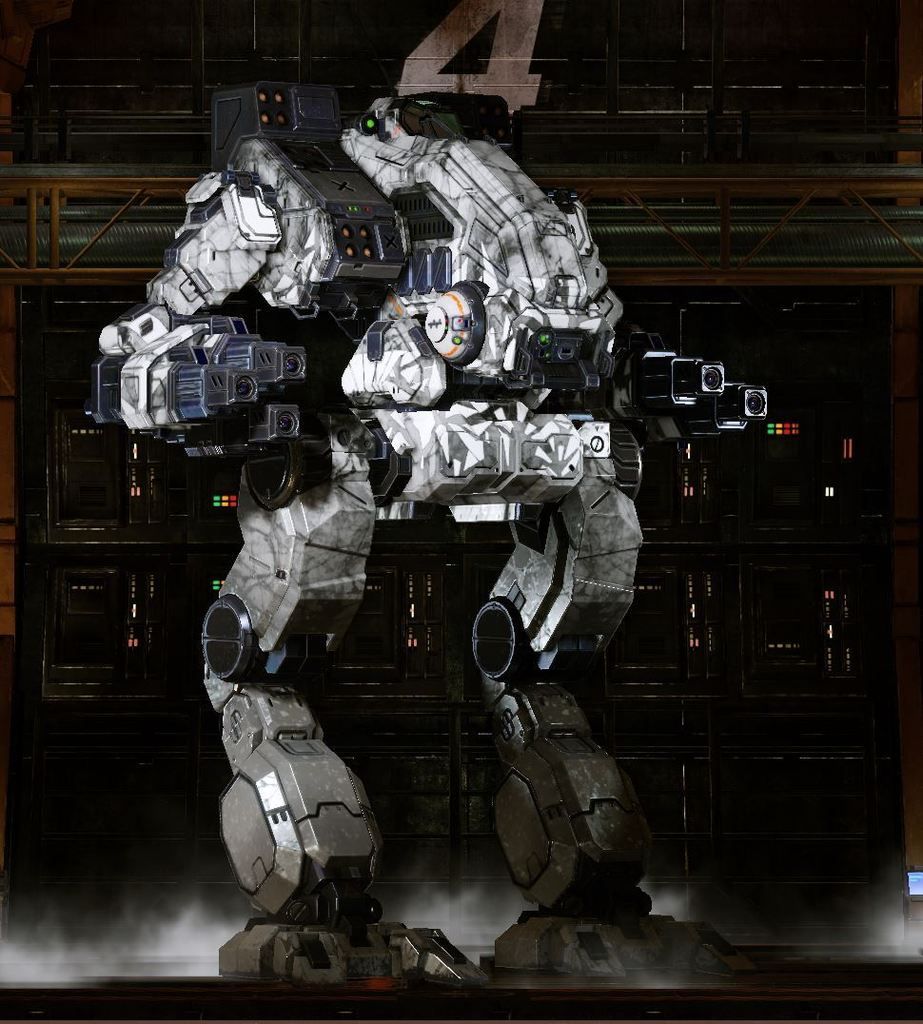
This is beyond belief.... the pixels... it hurts

Edited by Navid A1, 21 April 2015 - 11:11 PM.
#23
Posted 21 April 2015 - 11:14 PM
My bonus crab has been doing this since they came out, months ago
#24
Posted 21 April 2015 - 11:15 PM
It wouldn't be as bad (actually yes it would) if they cost only cbills, but when people are using real money to customise their mechs (that they likely got with more real money in a pack) then they really shouldn't look like ass.
#26
Posted 21 April 2015 - 11:32 PM
 Ardaz, on 21 April 2015 - 11:15 PM, said:
It wouldn't be as bad (actually yes it would) if they cost only cbills, but when people are using real money to customise their mechs (that they likely got with more real money in a pack) then they really shouldn't look like ass.
well the skin is technically free when you buy the pack... Also i like to point out that we still have some way to go before Commondore level of graphics... Trust me i was there.
#28
Posted 21 April 2015 - 11:49 PM
I was also there for Commodore 64 gaming (that's why I referenced it). Was actually there for Acorn Electron and Intellivision gaming too.
Edited by Ardaz, 21 April 2015 - 11:51 PM.
#29
Posted 22 April 2015 - 12:04 AM
maybe something the artists can fix ?
#30
Posted 22 April 2015 - 12:11 AM
This is mindboggling. It hurts my eyes.
#32
Posted 22 April 2015 - 01:08 AM
 Sarlic, on 22 April 2015 - 12:11 AM, said:
They stated multiple times that exactly this would happen and everyone wanted it. There is also no other way of unlocking the color channels.
Btw: Besides the original colors in the original order, everything else looks amazing. Especially all white Ghost Bear Mechs with some dark blue trim to them. Except the DWolf, but that's a different story (same as with the pixelated Hellbringer Phranken camo -.-)
#33
Posted 22 April 2015 - 01:09 AM
 Ully, on 21 April 2015 - 12:01 PM, said:
The Clan Ghost Bear camo looks quite strange now, before we used to only be able to change the colour of the little stripe thingie on the shoulders, as with the other clan camos.
That's still the tertiary channel for the ghost bear camo at the moment, so now the camo doesn't even use the ghost bear light blue. Which doesn't really look that nice at all, as it makes for the nice transition and the kind of "ice" effect at the top. Instead, that colour just changed to black since it has nothing assigned to it.
My suggestion would be to just merge the stripe channel with the secondary channel, since both of those are white by default anyway.
Some screenshots of my mad dog:
Before: http://i.imgur.com/1FgykEJ.jpg
After: http://i.imgur.com/r2koYs2.jpg
Hellbringer and Timber Wolf look horrible:
http://i.imgur.com/dXuRgS6.jpg
http://i.imgur.com/DYKlGKg.jpg
You are missing this light blue as 3rd color. That's it.
#34
Posted 22 April 2015 - 01:42 AM
When underlying it with 3xblack or 3xgray, it looks pretty good, imho.
Shouldn't using a lighter color beneath on the Mad Dog make it look closer to the left one?
#35
Posted 22 April 2015 - 02:23 AM
Can't decide to get ghost bear on my Nova's (own 3 atm, may own 5, got no skin), Storm crow (own 3 atm, less likely to own 5. No skin atm).
#36
Posted 22 April 2015 - 02:39 AM
 Paigan, on 22 April 2015 - 01:42 AM, said:
When underlying it with 3xblack or 3xgray, it looks pretty good, imho.
Shouldn't using a lighter color beneath on the Mad Dog make it look closer to the left one?
Using 100% white makes the blacks / dark greys turn into middle greys. looks nice but looks far from these...
#37
Posted 22 April 2015 - 04:02 AM
#38
Posted 22 April 2015 - 04:30 AM
 Paigan, on 22 April 2015 - 01:42 AM, said:
Nope.
The old "Cyan" lines of the water ripple effect have been replaced with pure black. Which is both un-editable and does not change with lighter colors. Here is what it looks like with the ENTIRE mech painted in Ghost bear white:

You cannot get rid of these black lines with any method, and as you can see with how there is still a distinct difference between the Triangles and the frame, it is overall making any color you put on the mech darker, where before it was lighter.
So that there is currently ZERO ways to get the design to look as it has been presented both in the past, and the current advertisement for future mech products:

So if you where satisfied with how it originally looked both before the patch, or in the advertisement for new products, you cannot currently replicate it as advertised or as it has appeared on your other mechs for almost a half a year now.
#39
Posted 22 April 2015 - 04:33 AM
 Tor6, on 21 April 2015 - 11:24 PM, said:

THE MORE THINGS CHANGE...
this sums up the lifespan of MWO quite nicely
If you played in CB, youre used to downgrades by now
Ive never seen a game take as many steps abckwards as MWO.
search the 'will we ever see the good old days again?' thread, and see the list of 'retired' features.
#40
Posted 22 April 2015 - 04:39 AM
 SpiralFace, on 22 April 2015 - 04:30 AM, said:
Nope.
The old "Cyan" lines of the water ripple effect have been replaced with pure black. Which is both un-editable and does not change with lighter colors. Here is what it looks like with the ENTIRE mech painted in Ghost bear white:

You cannot get rid of these black lines with any method, and as you can see with how there is still a distinct difference between the Triangles and the frame, it is overall making any color you put on the mech darker, where before it was lighter.
So that there is currently ZERO ways to get the design to look as it has been presented both in the past, and the current advertisement for future mech products:

So if you where satisfied with how it originally looked both before the patch, or in the advertisement for new products, you cannot currently replicate it as advertised or as it has appeared on your other mechs for almost a half a year now.
Look like it got smashed or something.
The latter looks way better
Edited by Sarlic, 22 April 2015 - 04:40 AM.
3 user(s) are reading this topic
0 members, 3 guests, 0 anonymous users


