
Weekend Update - 05.02.2015
#1
Posted 02 May 2015 - 05:40 PM
#2
Posted 02 May 2015 - 06:24 PM
Only if animations and 3d models were on the same level...
Seems like the mauler concept was done back in last november... intended to be put onto the first resistance pack maybe.
Edited by Navid A1, 02 May 2015 - 06:33 PM.
#3
Posted 02 May 2015 - 06:52 PM
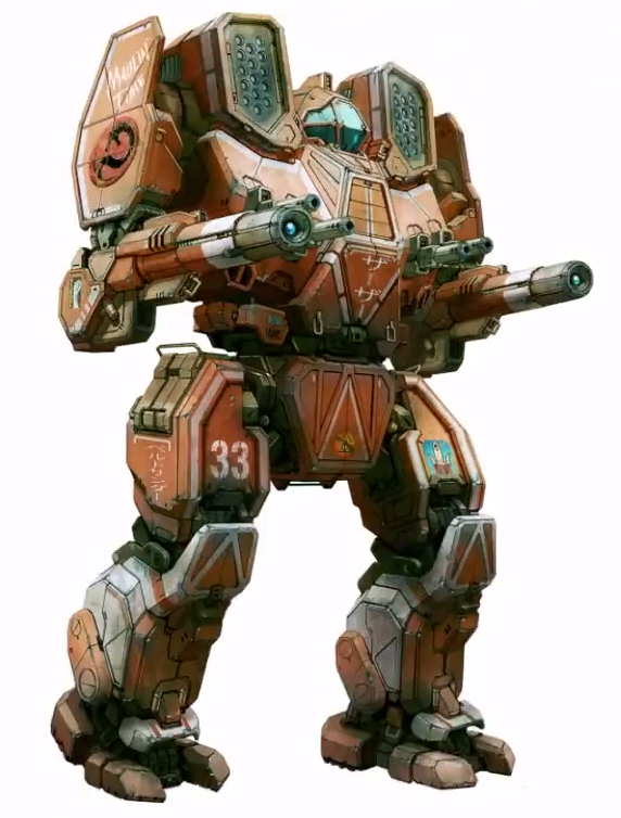
You show her to the world! (in high-quality resolution, please)
PS: now I know how the contemporaneous of the great Renaissance artists felt when watching them work. Alex Iglesias, you are the da Vinci of the mechs and I'm honored to witness history being made.
#4
Posted 02 May 2015 - 07:05 PM
Fascinating to watch the concepts get crafted, as well. How long does it take to craft each one? The time lapse looks like it covers a good many hours (just from what we saw). Also, when will we see those up on the Concept Art section on MWO's Media Page? I love being able to admire the full size, high resolution images of the mechs.
Edited by Sereglach, 02 May 2015 - 07:05 PM.
#5
Posted 02 May 2015 - 07:07 PM
Here are the two of them, side by side:
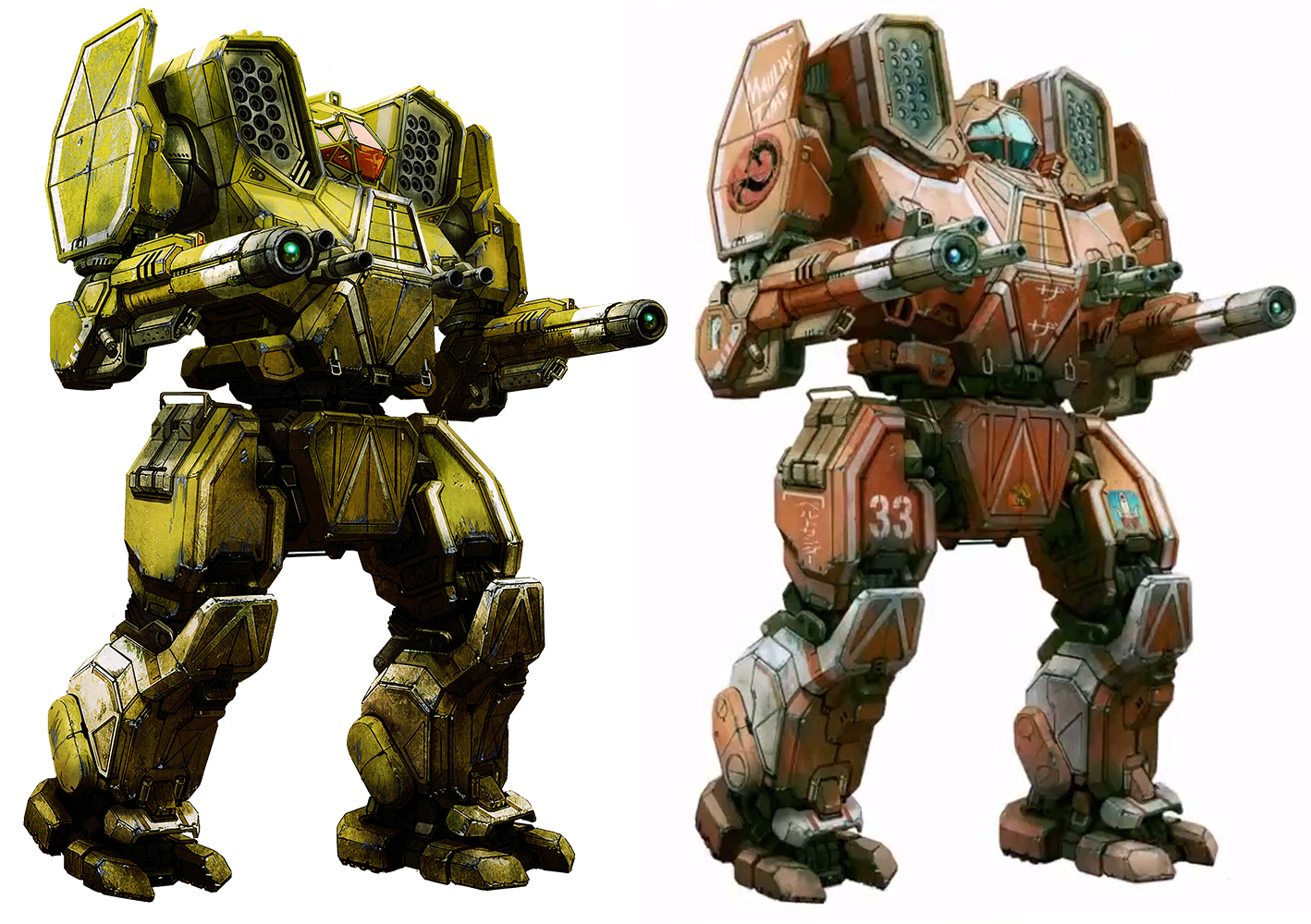
I wonder if Alex Iglesias did two different versions or just changed later one of them.
#6
Posted 02 May 2015 - 08:29 PM
#7
Posted 02 May 2015 - 09:52 PM
 Odanan, on 02 May 2015 - 07:07 PM, said:
Here are the two of them, side by side:

I wonder if Alex Iglesias did two different versions or just changed later one of them.
Based on its faction oriented paint (and the date of creation mid november last year), i'd say that it was intended for resistance 1. (resistance 1 mechs had faction specific paints on their concepts)
#8
Posted 03 May 2015 - 12:36 AM
Animations need work!!! -since Navid A1 poked at it in the first post
#9
Posted 03 May 2015 - 02:56 AM
 Odanan, on 02 May 2015 - 07:07 PM, said:
Here are the two of them, side by side:

I wonder if Alex Iglesias did two different versions or just changed later one of them.
The arms of Mauller are different in their rotation 1 the mobility but roataçao 180 degrees while the second version the design limits its rotation angle of the arms of 100 degrees but more upright.
#10
Posted 03 May 2015 - 04:39 AM
 Navid A1, on 02 May 2015 - 09:52 PM, said:
Based on its faction oriented paint (and the date of creation mid november last year), i'd say that it was intended for resistance 1. (resistance 1 mechs had faction specific paints on their concepts)
 K19, on 03 May 2015 - 02:56 AM, said:
Still, there are other differences... the torsos, the head, the missile launchers... maybe one Mauler is the special geometry?
#11
Posted 03 May 2015 - 06:49 AM
 Odanan, on 03 May 2015 - 04:39 AM, said:
The second one actually looks like it's just had more polish and refinement. There's more distinctive details and the concept looks more polished. For instance, look at all the areas that are just kind of shaded over on the basic concept. The finalized concept has those areas lit up with exceptional detail in them.
#12
Posted 03 May 2015 - 09:32 AM
#13
Posted 03 May 2015 - 10:42 PM
 Odanan, on 02 May 2015 - 07:07 PM, said:
From what I've seen in other games, ussualy there are several, up to a dozen of different initial sketches being made for a single thing, and than they look between them and choose and continue improving the concept regarding to what they think is best. It's not just as he makes it up in one afternoon and it's done.
Edited by NeoCodex, 03 May 2015 - 10:47 PM.
#14
Posted 03 May 2015 - 10:58 PM
 NeoCodex, on 03 May 2015 - 10:42 PM, said:
From what I've seen in other games, ussualy there are several, up to a dozen of different initial sketches being made for a single thing, and than they look between them and choose and continue improving the concept regarding to what they think is best. It's not just as he makes it up in one afternoon and it's done.
true... but as you can see... the first one is pretty finished. notice small details like faction insignia, texty bits, small decals.
I still say that it was already finished for first resistance pack.
#15
Posted 04 May 2015 - 10:59 AM
For Resistance II, one of the goals was to get all the mechs in a matching colors this time around instead of the usual grab-bag of paintjobs I used to do, so I had to go back and repaint the mauler.
While i was doing that, i noticed a bunch of things that i felt needed adjustment to the pose and proportions and some details, some of it was to prevent gigantism, some of it purely aesthetic.
#16
Posted 04 May 2015 - 11:43 AM
 Alex Iglesias, on 04 May 2015 - 10:59 AM, said:
For Resistance II, one of the goals was to get all the mechs in a matching colors this time around instead of the usual grab-bag of paintjobs I used to do, so I had to go back and repaint the mauler.
While i was doing that, i noticed a bunch of things that i felt needed adjustment to the pose and proportions and some details, some of it was to prevent gigantism, some of it purely aesthetic.
Very interesting to learn, but why do most of the joint areas and detail areas on the newer concept seem shaded over and covered up? It seems to lose a lot. It actually makes it look like it's the older of the two concepts.
#17
Posted 04 May 2015 - 11:50 AM
Edited by CyclonerM, 04 May 2015 - 11:50 AM.
#18
Posted 04 May 2015 - 11:53 AM
 Sereglach, on 04 May 2015 - 11:43 AM, said:
some unintentional darkening as i was adjusting color and contrast, mi culpa.
1 user(s) are reading this topic
0 members, 1 guests, 0 anonymous users


