First, thank you to PGI for putting some effort into a feature that is sorely lacking. I can safely say that this Mechlab is a step up from what we currently have. Here are my suggestions for improvements.
1. Move the Strip Mech button to the upper left with the other buttons. I nearly didn't see it down there. Ditto the Reset Mech button, tho I'm not sure why it's there honestly.
2. Add a "Max Armor" button in the same location.
3. Clan ECM appears to be lost. I'm looking for it under Equipment, with a valid mech (Hellbringer Prime) and correct torso section selected, but I don't see one in my "warehouse". In this case I know that I even own one, because I stripped one from this mech in order to play with it.
Will add here as I find more.

Thoughts On The New Mechlab
Started by Banditman, May 07 2015 11:23 AM
80 replies to this topic
#3
-
-

- WC 2017 Silver Champ

- 1,881 posts
Member
- Twitch: Link
- LocationRussia, Siberia
Posted 07 May 2015 - 11:34 AM
Little things: when you drag and drop weapons/equipment/etc you have to aim at empty slots. It would be more intuitive if you'd be able to drag'n'drop anywhere on the component.
Also would be nice to have ability to doubleclick on weapon/equipment so it automatically place itself in the hardpoint. Order of hardpoints/components should be default - hd/ct/rt/lt/ra/la/rl/ll
Also would be nice to have ability to doubleclick on weapon/equipment so it automatically place itself in the hardpoint. Order of hardpoints/components should be default - hd/ct/rt/lt/ra/la/rl/ll
#4
-
-
- The Boombox

- 20 posts
Member
Posted 07 May 2015 - 11:35 AM
Looks fantastic! Truly a vast improvement.
Only things i see that are missing are the 'max armor' button like banditman said and i can't seem to find any quirk information? A loadout save/load button would also go a long way.
Other then that looks great.
Only things i see that are missing are the 'max armor' button like banditman said and i can't seem to find any quirk information? A loadout save/load button would also go a long way.
Other then that looks great.
Edited by vesarius6, 07 May 2015 - 11:53 AM.
#5
-

-

- 112 posts
Member
- LocationSierra, Free Worlds League
Posted 07 May 2015 - 11:42 AM
I'm absolutely loving what the new mechlab is shaping up to be. Changes to the mech as a whole are easier to make, you can see where all of your armor is distributed, the Upgrades tab is now just a panel (YES!), and there's tons of extra information (clear distinction: information, not data) that's located right where it should be. Mech speed on the engine, actually telling you the exact stats of your modules, engine tonnage in the menu... The list goes on!
Change the "Modify Consumables" button in the Select 'Mech menu to be "Modify [all] Modules" and this will be one of the best patches ever.
Change the "Modify Consumables" button in the Select 'Mech menu to be "Modify [all] Modules" and this will be one of the best patches ever.
#6
-

-
- Lucky Seven

- 61 posts
Member
- Twitch: Link
- LocationKentucky
Posted 07 May 2015 - 12:04 PM
 Leigus, on 07 May 2015 - 11:42 AM, said:
Change the "Modify Consumables" button in the Select 'Mech menu to be "Modify [all] Modules" and this will be one of the best patches ever.

Seconded. This is a must have, to me. The ability to change all modules from this window means the ability to easily switch 'mechs out when in CW. That is a huge deal to me, and I would love to see it added.
#7
-

-
- Ace Of Spades

- 4,880 posts
Member
- LocationSmack dab in the middle of Ohio
Posted 07 May 2015 - 12:06 PM
I agree too. The single most frustrating thing about the current Mechlab is playing "find the module" or "find the engine" when you have it installed on an existing mech. (Also "find the cockpit item".) Fix these and it will be sheer bliss.
#8
-
-
- Lucky Seven
- 61 posts
Member
- Twitch: Link
- LocationKentucky
Posted 07 May 2015 - 12:10 PM
ScrapIron Prime, on 07 May 2015 - 12:06 PM, said:
(Also "find the cockpit item".) Fix these and it will be sheer bliss.
Oh boy. Find the cockpit item is hard mode when you have 100+ 'mechs. I haven't seen that monkey in years, I hope he is still OK. PGI plz cockpit item finder thingy.
#9
-

-

- Developer

- 1,510 posts
Producer

Posted 07 May 2015 - 12:20 PM
Added the following to the Known Issues and Suggestions list.
- Add a Max Armor button
- Add a Modify Modules button
- Classify Clan ECM as 'Equipment'
#10
-
-
- WC 2017 Silver Champ
- 1,881 posts
Member
- Twitch: Link
- LocationRussia, Siberia
Posted 07 May 2015 - 12:22 PM
can you add suggestions about drag’n'drop and ability to equip items using doubleclick?
http://mwomercs.com/...35#entry4413935
http://mwomercs.com/...35#entry4413935
#11
-

-
- Knight Errant

- 190 posts
Member
- LocationNAIS
Posted 07 May 2015 - 12:37 PM
Mech Details/Smurfy Layout buried in a drop down menu. Was actually wondering if you removed that layout after showing a preview of it.
All of the stats like heat efficiency, tonnage, slots, etc being dumped in the lower right corner makes it more of a searching game rather than a useful information panel. You can expand the mech stats window though so that's kind of neat. The small fonts at 1920X1080 fullscreen resolution has the same effect.
More lists for more clicks is bad design. This was said for UI 2.0 when it first launched for testing as a click fest. Is "Select Mech" considered part of the Mechlab for this test?
Mechlab does not retain choice when switching location. If I am loading LRM ammo in different locations I must switch to the ammo tab every time I move locations. TOO MANY CLICKS.
Dragging a component into a location and dropping on a previous component switches them. For example, dropping a DHS into the LT removed the TC1 because I dropped it on the same slot.
Double click to clear equipment = awesome, no double click to add equipment = not awesome. I also find the flashing (showcasing available locations I guess) to be more distracting and annoying than anything else. I can SEE the 14 different "EMPTY SLOT" do you really think I need it flashing me as well?
STILL SO MANY BEEPS!! Why must EVERYTHING beep? Every single line, item, icon, etc. BEEP BEEP BEEP BEEP.
No "Max Armor" button? If it's there I didn't find it. A "max armor" button would be nice.
Overall it is still very click intensive, cluttered, and noisy. Expanded layout option is nice (especially since we can build here now), but tiny fonts for weapons make it a chore finding your selection. Mouse over for filters only show "chat only to those in your unit" (if known issue disregard complaint).
A work in progess with some decent promise, but definitely needs improvement. Better font scaling is needed.
#12
-
-
- Overlord
- 246 posts
Member
- LocationSaskatchewan
Posted 07 May 2015 - 12:44 PM
Not sure if this is valid, and I'm not able to do the PTS (computer issues), but it might be useful if you were able to specify which hardpoint you wanted the weapon to go into. For example: When I was building my Atlas-RS, I had to sell all my LRM-20's and LRM-10's, then buy 1 -20, mount it, play a game, then mount the -10, just in order to get the -20 firing out of the 10-tube slot, and the -10 to fire out of the 6-tube slot. Would also be useful on 'Mechs that have energy/ballistic hardpoints at different levels on the torso.
Edit: Maybe have a tab for Inner Sphere and a tab for Clan 'Mechs, then sub-tabs of weight class etc? Help us sort out our faction 'Mechs.
Edit: Maybe have a tab for Inner Sphere and a tab for Clan 'Mechs, then sub-tabs of weight class etc? Help us sort out our faction 'Mechs.
Edited by RedEagle86, 07 May 2015 - 01:54 PM.
#13
-
-
- Developer
- 1,510 posts
Producer
Posted 07 May 2015 - 12:51 PM
Igor Kozyrev, on 07 May 2015 - 12:22 PM, said:
can you add suggestions about drag’n'drop and ability to equip items using doubleclick? http://mwomercs.com/...35#entry4413935
Done
#14
-
- Big Brother
- 1 posts
Rookie
Posted 07 May 2015 - 12:51 PM
Hello PGI, I havent seen the new mechlab but I'd like to give a suggestion to improve the Invite for group system for friends. Currently when you click a friend on your list you dont have a option to etc " Invite to group/ Form group" with the person. I playd for the first time with a friend I have IRL, and we found it hard to understand how to be in a group with eachother. Sorry for any typos or bad english, not my main language!
#15
-
-
- The Tip of the Spear

- 22 posts
Member
- LocationUK
Posted 07 May 2015 - 12:59 PM
One thing that I feel is very obvious to us veterans of the game is that some mechs are Inner Sphere, and some are Clan. This isn't explained anywhere to new players. When new people join our unit we have had several people ask us why they can't their clan equipment in their new Inner Sphere mechs.
So..
Suggestion: Inner Sphere mechs and equipment all come with a gold border. all clan mechs and equipment come with a blue border. This is the same as the cockpit HUD.
Alternatively, add a small icon onto each mech showing the Clan star symbol or an Inner Sphere symbol, as appropriate.
Suggestion: When Omnimech arms and legs are removed, show it on the model.
Suggestion: Add a "reset all changes" button.
A.
#16
-
-
- Ace Of Spades
- 1,099 posts
Member
- LocationGermany
Posted 07 May 2015 - 01:24 PM
I like the new one...
here my suggestions:
- add the equipped engine in the loadout area of 'Mech select screen
- show "used / total" instead of "unused" for hardpoints in the component window(s)
here my suggestions:
- add the equipped engine in the loadout area of 'Mech select screen
- show "used / total" instead of "unused" for hardpoints in the component window(s)
Edited by BladeXXL, 07 May 2015 - 01:39 PM.
#17
-

-
- Civil Servant

- 6,558 posts
Member
- LocationUSA

Posted 07 May 2015 - 01:25 PM
I would actually suggest...
- Change it from a dropdown to a simple button "Toggle Layout"
- Default to expanded style, not column view.
- Place the button in an obvious location, like in the middle of the screen somewhere above the paperdoll, since it affects the paperdoll layout, not the layout of the Warehouse tab.
#18
-

-
- The Devoted

- 13,891 posts
Member
- LocationOn a dropship to Terra
Posted 07 May 2015 - 01:26 PM
thats all so much better now.
#19
-
- Survivor
- 2 posts
Rookie
Posted 07 May 2015 - 01:27 PM
I would like the warehouse to be moved right next to the mech slots so I don't have to drag components over a large distance.
I also think additive filtering would be more useful than the current subtractive method. So initially all equipment filters are turned "on" so nothing is visible. Then, since the player is likely looking for a specific item, you just need to click the Energy and Laser filters (or whatever you need) to get what I want, instead of having to un-click all the other filters or memorize where the items I want are in the list of everything. There would also be a "clear" button to reset the filters.
Alternatively, make the filters remember their states per-mech. Since my Hunchback has no missile hardpoints then I will never need the missiles filter, or in fact anything but lasers. My Timberwolf does use missiles sometimes, so I would want them to appear.
Or, final suggestion, simply auto-filter the equipment based on available hardpoints.
#20
-
-
- WC 2017 Bronze Champ

- 56 posts
Member
Posted 07 May 2015 - 01:28 PM
My suggestion below:
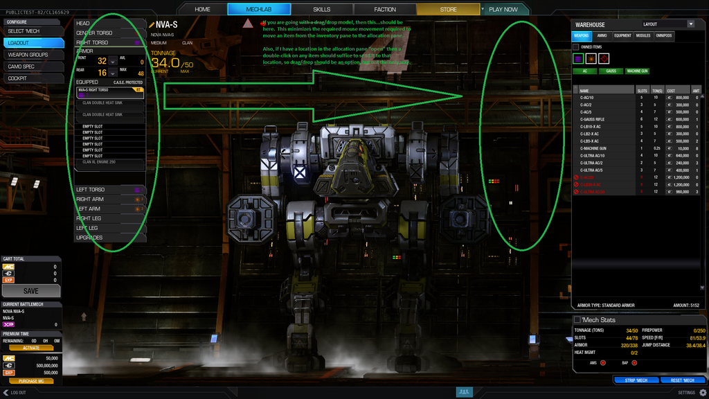
....or just make that part of the interface (circled in green) a pop-out that the user could drag wherever they wanted.
....or just make that part of the interface (circled in green) a pop-out that the user could drag wherever they wanted.
- I second the double-click to assign suggestion. It just makes sense for that to be an option if you're only viewing one location at a time.
- I'll third (or whatever massive number it is in community opinion) the need for "modify modules" vs. just consumables. Displaying the modules on the mech's "front screen" is a big step forward though.
- For Mech Selection, a small flyout on hover showing modules and loadout would be useful to avoid having to go all the way "in" to see what's on it.
Edited by R 13, 07 May 2015 - 01:31 PM.


1 user(s) are reading this topic
0 members, 1 guests, 0 anonymous users


