Please, please, please, please, please give me back the ability to see my garage as a list of 'mechs in all one list (like the current mechlab tab). I don't care if you give the ability to list it like the new version has but PLEASE don't take away the ability to list mechs the old way!

Thoughts On The New Mechlab
Started by Banditman, May 07 2015 11:23 AM
80 replies to this topic
#22
-
-

- Ace Of Spades

- 1,099 posts
Member
- LocationGermany
Posted 07 May 2015 - 02:16 PM
Some layout suggestions:
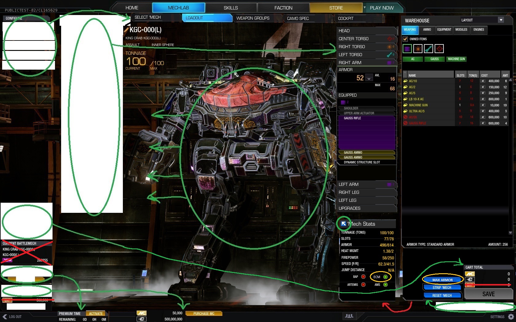
- place the sub-navigation horizontal below the top-navigation
- move the component window to the right side to have a short drag way
- move also the cart infos to the right and remove GXP (how can GXP be a part of the cart?)
- remove "current battlemech" window - we already have the mechname above and nobody needs to see XP in mechlab
- move premium and wallet windows to the footer (remove GXP infos - nobody needs them in mechlab)
- move the reset and strip button above the cart window (also other buttons like "max armor" can be placed here)
As for expandible "mech stats" plese implement a button called expand/collapse OR icons (instead of the chekbox) with arrows to the top-left for expand (if collapsed) and down-right for collapse (if expanded)
Your could also switch the positions of "cart total" and "mech stats" so the collapsed stats can be listed in one row!
NOW you have a lot of space for the mech on the left screen side and you can make the warehouse window a little bigger (even on smaller resolutions)!
PS: I Love it to see the quirks in mechlab AND opt. + max. weapon ranges as value! :-)
Edited by BladeXXL, 08 May 2015 - 01:31 AM.
#23
-

-
- Urban Commando
- 1,202 posts
Member
- LocationSelling baguettes in K-Town

Posted 07 May 2015 - 02:41 PM
Speaking of max/min armor, please don't forget dropping all modules and cockpit items buttons.
As with the mech selection option, new by class sorting makes left selection menu kinda useless, two things that make same stuff.
Absence of purchase sorting in inconvenient, have to make journey to the Store menu and look them up there - witch is far more hasle then before.
I think we should take few lessons from scrapped UI 1.0 - with large bars in weapon store list or at least we should have a choice as with alphabetical or class mech selection menu.
Really like the mech info check box to get additional data - that kind of stuff is fast and works!
Good thing: Paper doll
Bad thing: Sensory overload with even more small text things
#24
-

-
- FP Veteran - Beta 1

- 704 posts
Member
Posted 07 May 2015 - 02:56 PM
As the weapon list organization stands, everything is kinda thrown in as one big mess. I understand that you can toggle what you want to be in the list, but when all I want is a large laser, I don't want to have to unclick ballistics and missiles just to simplify the list.
Either you press the energy weapon button to only bring up energy weapons instead of toggling, or allow us to organize the list by weapon type instead of alphabetical order, and add some color coding or some form of separation so I can tell at a glace what kind of weapon each is. (Same for the chassis list, actually.)
Either you press the energy weapon button to only bring up energy weapons instead of toggling, or allow us to organize the list by weapon type instead of alphabetical order, and add some color coding or some form of separation so I can tell at a glace what kind of weapon each is. (Same for the chassis list, actually.)
#25
-
-

- 659 posts
Member
- LocationChesapeake, VA
Posted 07 May 2015 - 03:14 PM
I'm still waiting on the 6.9GB patch.
The first question on my mind is
Did they make the font any bigger?
The next question is: When I look at weapons or modules, will they be in some kind of order?
Alphabetical order would be an improvement over what we have now.
The lists appear to be really ****ing random.
Also, I recall these lists being plain old lists with the old UI.
I remember the day the little pictures showed up, in a grid, in no particular order.
I remember not being impressed.
I'm still not.
If the weapon list or module list was a text list, like before, we could have the convenience of the whole list fitting on one screen.
It might even fit on one screen with decent sized font.
Edited by Liquid Leopard, 07 May 2015 - 03:36 PM.
#26
-
-
- Knight Errant

- 190 posts
Member
- LocationNAIS
Posted 07 May 2015 - 03:20 PM
 Liquid Leopard, on 07 May 2015 - 03:14 PM, said:
I'm still waiting on the 6.9GB patch.
The first question on my mind is
Did they make the font any bigger?
The first question on my mind is
Did they make the font any bigger?
They did not.
#27
-

-
- The God

- 136 posts
Member
- LocationBrazil
Posted 07 May 2015 - 03:28 PM
Put Quirks list on your build somewhere you can scroll through.
nothing worst than abandoning a build or having to save a build half way to exit and check...
ER LL or LL.
MPulse or medium quirks....
ERPPC or normal PPC...
see what Im saying.
sorting mechs into CLAN or IS as a pulldown menu... like owned or purchaseable..
would be handy in getting a CW deck ready.
#28
-

-

- Developer

- 1,510 posts
Producer

Posted 07 May 2015 - 03:33 PM
Fluero, on 07 May 2015 - 03:28 PM, said:
Put Quirks list on your build somewhere you can scroll through.
nothing worst than abandoning a build or having to save a build half way to exit and check...
nothing worst than abandoning a build or having to save a build half way to exit and check...
In the current PTS build you can click the checkbox in the 'Mech Stats window to reveal the Quirk list, hardpoint details, etc.

#29
-
-
- Knight Errant
- 190 posts
Member
- LocationNAIS
Posted 07 May 2015 - 03:45 PM
Alexander Garden, on 07 May 2015 - 03:33 PM, said:
In the current PTS build you can click the checkbox in the 'Mech Stats window to reveal the Quirk list, hardpoint details, etc.
While this is useful info, the fact that it is hidden inside of a menu and needed to be mentioned how to access it is telling. I find a lot of the information we have is hidden behind other menus or extra clicks. UI 2.0 is a massive clickfest (and noisy with all its beeps) and this preview is no different. We have actually lost things like having our garage buried under more menus and thus clicks have increased.
#30
-
-
- The God
- 136 posts
Member
- LocationBrazil
Posted 07 May 2015 - 04:07 PM
Alexander Garden, on 07 May 2015 - 03:33 PM, said:
In the current PTS build you can click the checkbox in the 'Mech Stats window to reveal the Quirk list, hardpoint details, etc.
Great, I missed it. as mentioned above.
More sorting options is still on my pick list,
CLAN , IS and ALL
then I can select Medium, light, heavy or assault to minimise the total outlay I have to dig through. I have 135 mechs and still 20 mechbays to fill.
#31
-
-
- Civil Servant

- 358 posts
Member
Posted 07 May 2015 - 04:08 PM
Alexander Garden, on 07 May 2015 - 03:33 PM, said:
In the current PTS build you can click the checkbox in the 'Mech Stats window to reveal the Quirk list, hardpoint details, etc.
i thought that was just a bulletpoint! why would you make a single checkbox in the title field like that, it suggests it's not a togglable item. move the checkbox past the 'mech stats text and put details next to it or something.
Edited by Ragtag soldier, 07 May 2015 - 04:12 PM.
#32
-
-
- The God
- 136 posts
Member
- LocationBrazil
Posted 07 May 2015 - 04:09 PM
BladeXXL, on 07 May 2015 - 02:16 PM, said:
Some layout suggestions:
- place the sub-navigation horizontal below the top-navigation
- place the sub-navigation horizontal below the top-navigation
SUB MENU tasty.... like cookie,
#33
-
-
- The Warden

- 3,741 posts
Member
- LocationLook at my Arctic Wolf. Closer... Closer...
Posted 07 May 2015 - 04:40 PM
Instead of a Max Armor button; have a "Add extra tonnage to armor" button that will add any free tonnage to armor. this button should use available tonnage to add as much armor as allowed by tonnage in an even fashion
This would prevent error messages like "not enough tonnage to max armor" that you can get on Smurfy.
Column text needs to be bigger it is hard to read.
expanded view needs a constant warehouse view I think.
This would prevent error messages like "not enough tonnage to max armor" that you can get on Smurfy.
Column text needs to be bigger it is hard to read.
expanded view needs a constant warehouse view I think.
Edited by KursedVixen, 07 May 2015 - 04:41 PM.
#34
-

-
- The God

- 1,451 posts
Member

Posted 07 May 2015 - 05:13 PM
We should be allowed the option of selecting our mechs from the old mech grid view.
Like so.

Like so.
#35
-
-
- 659 posts
Member
- LocationChesapeake, VA
Posted 07 May 2015 - 05:46 PM
Not only did PGI leave the annoying tiny font, they added some even smaller font in some places.
The UI feedback thread from when they first ****ed this up are conveniently locked so I can’t click on “QUOTE”.
So, I’ll just copy and paste and use quotation marks.
PGI, doesn’t this look familiar?
“I have a 60" tv and I still cannot read the font in UI 2.”
“It is not the size of your monitor; it is your resolution. PGI has optimized this for 640x480
1080p is not allowed.”
“ANOTHER thread about a Very easy to fix thing PGI doesnt care about… because obviously the guys that have money to spend on the game they feel they have either tapped us out, or simply do not care about us… one of the two... a BIG MIDDLE Finger to us.. thats what it feels like.”
“What Russ is trying to tell us there is that we are all losers for not having 4K monitors, because apparently they look perfectly legible on a 4k. Come on, you have an extra $4000 to drop on a monitor for a F2P game, right?”
"i have a 40 inch monitor and i sit about 3.5 feet away from it. when its set to 1080p resolution i can hardly read the text in the interface.....WTF....why is text kept the same size in all resolutions.
With the 3/18 patch its nice to see mech loadout but why in the F cant i just hover my mouse over a mech and see it instead of having to click back and forth.....its still a hunt to see what i have on this mech or that mech. "
“55 pages of practically same feedback. Come on now, fix these issues already. Make the customization fun, as it should be. Searching for that engine or module is still a fUCKKING pain in the ass, not to mention the bleebing sound that you can't disable among other things. Cheers to your incompetence in this.
It's so sad this UIx is so crappy, when the actual game is so much fun. Now, surprise us in the next patch, thank you.”
“Having now played with the UI for a month, I can honestly say it is not just "Having to adjust to change." I am now very familiar with the current UI, and all of my prior criticism-I stand by.
Although there have been some nice changes (map mode selection!) that the UI 2.0 programming has made possible. And the store with sales is nice to be able to see (even if hard to see what is actually on the mech. TGFS. (Thank God for Smurfys).
ALSO; An additional criticism: on some mechs the white smoke routinely obscures the almost-white font on the bottom right of your screen, which is where you hide the all important "tonnage" number in the mechlab. Tonnage needs to be like giant and obvious. It is literally the single most important thing to know when building a mech.
Also, there is still less weapon information in UI 2.0 than was displayed in 1.5.
And yeah, clunky.
If you did this just to sell modules, it's not working. Because at 6 million each, they are just too expensive. Try 1 million, tops. Just like any other upgrade you buy for a mech. It already costs 15 million to build a new mech. And you need 3.”
Icemantas, on 10 March 2014 - 09:46 AM, said:
hello,
ithink that
good and easy
to use
also
continue reading? [OK][cancel]
you sure? [OK][cancel]
The UI feedback thread from when they first ****ed this up are conveniently locked so I can’t click on “QUOTE”.
So, I’ll just copy and paste and use quotation marks.
PGI, doesn’t this look familiar?
“I have a 60" tv and I still cannot read the font in UI 2.”
“It is not the size of your monitor; it is your resolution. PGI has optimized this for 640x480
1080p is not allowed.”
“ANOTHER thread about a Very easy to fix thing PGI doesnt care about… because obviously the guys that have money to spend on the game they feel they have either tapped us out, or simply do not care about us… one of the two... a BIG MIDDLE Finger to us.. thats what it feels like.”
“What Russ is trying to tell us there is that we are all losers for not having 4K monitors, because apparently they look perfectly legible on a 4k. Come on, you have an extra $4000 to drop on a monitor for a F2P game, right?”
"i have a 40 inch monitor and i sit about 3.5 feet away from it. when its set to 1080p resolution i can hardly read the text in the interface.....WTF....why is text kept the same size in all resolutions.
With the 3/18 patch its nice to see mech loadout but why in the F cant i just hover my mouse over a mech and see it instead of having to click back and forth.....its still a hunt to see what i have on this mech or that mech. "
“55 pages of practically same feedback. Come on now, fix these issues already. Make the customization fun, as it should be. Searching for that engine or module is still a fUCKKING pain in the ass, not to mention the bleebing sound that you can't disable among other things. Cheers to your incompetence in this.
It's so sad this UIx is so crappy, when the actual game is so much fun. Now, surprise us in the next patch, thank you.”
“Having now played with the UI for a month, I can honestly say it is not just "Having to adjust to change." I am now very familiar with the current UI, and all of my prior criticism-I stand by.
Although there have been some nice changes (map mode selection!) that the UI 2.0 programming has made possible. And the store with sales is nice to be able to see (even if hard to see what is actually on the mech. TGFS. (Thank God for Smurfys).
ALSO; An additional criticism: on some mechs the white smoke routinely obscures the almost-white font on the bottom right of your screen, which is where you hide the all important "tonnage" number in the mechlab. Tonnage needs to be like giant and obvious. It is literally the single most important thing to know when building a mech.
Also, there is still less weapon information in UI 2.0 than was displayed in 1.5.
And yeah, clunky.
If you did this just to sell modules, it's not working. Because at 6 million each, they are just too expensive. Try 1 million, tops. Just like any other upgrade you buy for a mech. It already costs 15 million to build a new mech. And you need 3.”
Icemantas, on 10 March 2014 - 09:46 AM, said:
hello,
ithink that
new interface is really
good and easy
not
to use
also
continue reading? [OK][cancel]
you sure? [OK][cancel]
you have selected to continue reading [OK]
thankyou for listening
Edited by Liquid Leopard, 07 May 2015 - 05:48 PM.
#36
-

-
- FP Veteran - Beta 1

- 47 posts
Member
Posted 07 May 2015 - 06:07 PM
Any chance we can get Li Song level stats: max DPS, sustained DPS, time to overheat, etc.?
#37
-
-
- The Warden
- 3,741 posts
Member
- LocationLook at my Arctic Wolf. Closer... Closer...
Posted 07 May 2015 - 06:21 PM
Add additonal stat changes to the mech's heat and firepower that reflect quirks ,targeting computer stats. maybe even include a graph that has two seprate colors one to show the mechs base stats while the other color shows the stats from targeting computers and stuff like that.
maybe just show the targeting computer effects on the tooltips that come up for weapons?
Yellow line/text:weapon base stats Blue line/text:Targeting computer added range/Projectile speed.
Show Damage points for exploding ammo on ammo tooltips
Errors:
C-ERPPC show's 10 damage instead of 15.
Clan active probe tooltip says "Range boost". It shoud be "Sensor Range Boost".
Edited by KursedVixen, 07 May 2015 - 06:34 PM.
#38
-
-
- Stone Cold

- 78 posts
Member
- LocationNew Mexico
Posted 07 May 2015 - 06:56 PM
To sum up all of the changes to the MechLab, I only have one word. AWESOME!!!!!
Yes, there are issues that need to be fixed.
Yes, not everyone will be 100% happy.
But this is a huge step forward. Remember, this is only just coming out of Alpha.
BTW, for those of you that don't like all of the BLEEPING beeping, turn off front end sounds in the settings
Yes, there are issues that need to be fixed.
Yes, not everyone will be 100% happy.
But this is a huge step forward. Remember, this is only just coming out of Alpha.
BTW, for those of you that don't like all of the BLEEPING beeping, turn off front end sounds in the settings
Edited by Ward Serpentine, 07 May 2015 - 06:58 PM.
#39
-

-
- The Bold

- 124 posts
Member
- LocationDenver, CO
Posted 07 May 2015 - 07:46 PM
I personally like being able to choose the section of mech I am working on by clicking on the mech secion in the model - not a drop down - kind of like the old UI
#40
-
-
- Elite Founder
- 30 posts
Member
Posted 07 May 2015 - 07:49 PM
Too many Clicks. Still...
Thoughts: It's nice to see expanded mode. COLUMN is AWFUL.
Tonnage location is hard to continuously look at while changing armor and stuff. I recommend moving it from the right, to the left side above cart total.
Make "Mech Stats" small on lower resolutions. And make it so that you increase the size by hovering. That way it doesn't feel like it's constricting view.
Overall, it seems like with enough time it could definitely be faster and easier to use. But it's painful on the eyes.
Really important: Under Modules, in Warehouse, It should let you see ALL the modules you own, including those on other mechs. And what mech they are on. These should be at the bottom of the list for organization's sake. And we should have the ability to click, Remove. So it removes that module from the other mech without us having to leave the current mech we are working on.
Also, If i CLICK an area in expanded or column view, (especially under modules, or other named items, such as clicking on cockpit, it should automatically pull up equipment) it should bring up the sub-menu MOST related to that area, unless previously looking at something. So, if i click WEAPON MODULES - it pulls up modules, and the modules with only weapon modules.
HERE:
Allow a right click function. Or a middle mouse button - example, Pulls up a menu like desktop on a PC, and you can select items from a list, with only items available for that area.
As in i Right-click the Right Arm of my mech, it pulls up a menu with:
Weapons>
Equipment>
AMMO>
Where in this menu we highlight the one we want. And it displays weapons (or equipment, or ammo) only allowed in that slot(area).
ALSO:
Move the flipping MODULES in warehouse to a button outside the warehouse. MODULES shouldn't be included in the warehouse IMO.
Example:
Modules is on left bottom of screen, where upgrades is located, and clicking modules pulls up your mechs current modules/ equipment. as well as the list like it already does. This improves functionality and makes the mech creation more organized.
Partial example above. I'll add more later when it's not time for me to go to bed. Including an example of right-click method.
Thoughts: It's nice to see expanded mode. COLUMN is AWFUL.
Tonnage location is hard to continuously look at while changing armor and stuff. I recommend moving it from the right, to the left side above cart total.
Make "Mech Stats" small on lower resolutions. And make it so that you increase the size by hovering. That way it doesn't feel like it's constricting view.
Overall, it seems like with enough time it could definitely be faster and easier to use. But it's painful on the eyes.
Really important: Under Modules, in Warehouse, It should let you see ALL the modules you own, including those on other mechs. And what mech they are on. These should be at the bottom of the list for organization's sake. And we should have the ability to click, Remove. So it removes that module from the other mech without us having to leave the current mech we are working on.
Also, If i CLICK an area in expanded or column view, (especially under modules, or other named items, such as clicking on cockpit, it should automatically pull up equipment) it should bring up the sub-menu MOST related to that area, unless previously looking at something. So, if i click WEAPON MODULES - it pulls up modules, and the modules with only weapon modules.
HERE:

Allow a right click function. Or a middle mouse button - example, Pulls up a menu like desktop on a PC, and you can select items from a list, with only items available for that area.
As in i Right-click the Right Arm of my mech, it pulls up a menu with:
Weapons>
Equipment>
AMMO>
Where in this menu we highlight the one we want. And it displays weapons (or equipment, or ammo) only allowed in that slot(area).
ALSO:
Move the flipping MODULES in warehouse to a button outside the warehouse. MODULES shouldn't be included in the warehouse IMO.
Example:
Modules is on left bottom of screen, where upgrades is located, and clicking modules pulls up your mechs current modules/ equipment. as well as the list like it already does. This improves functionality and makes the mech creation more organized.
Partial example above. I'll add more later when it's not time for me to go to bed. Including an example of right-click method.
Edited by Xenithos, 07 May 2015 - 07:50 PM.


1 user(s) are reading this topic
0 members, 1 guests, 0 anonymous users


