Patch Notes - 1.3.400 - 02-Jun-2015
#181
Posted 02 June 2015 - 02:52 PM
#182
Posted 02 June 2015 - 03:03 PM
#183
Posted 02 June 2015 - 03:03 PM

And for those complaining about resolution... It's 2015, I think most peoples cell phones have a higher resolution than the minimum specs >_> (No... really... my phone is 3 years old, and it's still 1920 x 1080)
Edited by Twilight Fenrir, 02 June 2015 - 03:09 PM.
#184
Posted 02 June 2015 - 03:20 PM
 Twilight Fenrir, on 02 June 2015 - 03:03 PM, said:
*facepalm*
You obviously fail to understand that your phone works on a higher pixel per inch ratio ..
There´s no way in the world a phone could take 1900xanything resolutions - because (and here´s the catch) the effin screen would have to be the same actual size as my desktop screen is to do so!!!
@PGI: If hearing your former & current userbase is too confusing to filter through for correct decisions, and anything it´d take to get some sense into your development are massive walls of negative Steam Reviews, i beg you - release on Steam ASAP!
Edited by burns, 02 June 2015 - 03:22 PM.
#185
Posted 02 June 2015 - 03:25 PM
 burns, on 02 June 2015 - 03:20 PM, said:
There´s no way in the world a phone could take 1900xanything resolutions - because (and here´s the catch) the effin screen would have to be the same actual size as my desktop screen is to do so!!!
#186
Posted 02 June 2015 - 03:26 PM
the Zeus in game has only ballistic velocity of +5%
the Zeus in the patch notes has
ballistic velocity of +5%
ballistic cool down +5%
energy range +5%
missile velocity +5%
LRM spread -5%
UAC/5 jam chance -30%
The enforcer in game has only ballistic range +10%
The enforcer in the patch notes has
ballistic range +10%
ballistic velocity +10%
ballistic cool down +5%
energy range +10%
Is this a bug or was it changed for them right before implementation?
#187
Posted 02 June 2015 - 03:28 PM
 Hubelwutz, on 02 June 2015 - 02:51 PM, said:
But i'm not finished yet. This may be some kind of a more personal thing but i really like the menu with all my mechs to scroll through. Why actually can't we have this anymore? Is it so complicated to make this window like something we all know... something we're all (or most of us) are already working with on a daily basis? Wouldn't it be good to collect the user where he already feels home? Well, let me just take one word: folder.
Yes, i'm speaking of the windows folder. You can sort according to different values - like clan or IS, but you can also chance the view of your items. You had the picture-view and now you got the list-view. Try to get a button in there to switch between and everyone will love you. If you don't want this at least give us an "expand all" button so we can see all our mechs in the list expanded in pictures.
Lost Infos:
Last but not least there are things missing. I'm not really mad that some people (including me) will need to upgrade to view the whole game, but please at least give us the loadout-overview back. You know the thingy where you could see your mech at once. Because without that it will be a hell of clicking here and clicking there before a player can be 100% sure that he got everything.
Also there is a sign in the lower left corner which tells you your XP on the mech. Wouldn't it be cool if there would be a button so you can use one click to your skilltree instead of going: skills > heavy > timberwolf > TBR-C
This also relates to the menu guidance and the design because if this becomes a button it will have to be some kind of a related style to those "purchase mc" and "activate" buttons.
Basically, PGI either doesn't have a usability and design person, or they have an incompetent usability and design person. All of this sense that you're making makes you part of the "vocal minority" so your ideas won't be reviewed just like the weeks worth of feedback in the public test forum specifically unlocked to gather that feedback was ignored.
Not only is the distance from one item to click to another item to click in order to accomplish the task not thought about at all, but the amount of clicks to accomplish a task wasn't thought about.
The color scheme here is also half-baked. The old stuff is kind of flat, boring UI-type coloring and then all of this new stuff pops more. I think the other images and buttons for things need to be updated to match.
And scaling? Why doesn't this scale?! What year is this?!
Placement of some items also seems really dumb. This needs to be reorganized by somebody who understands logical placement of things.
#188
Posted 02 June 2015 - 03:32 PM
 Ovion, on 02 June 2015 - 03:25 PM, said:
Maybe language barrier as im having trouble to see what you´re telling me ... but i stand with my statement.
(also, my personal cellphone still is a true cellphone, i can make calls with it
If your phones/tablets displayed each single pixel in the same way our desktops do - they´d have to have HUGE displays *shrugs*
The whole phone argument is in no way comparable to the problem at hand afaik.
Edited by burns, 02 June 2015 - 03:34 PM.
#189
Posted 02 June 2015 - 03:35 PM
If anyone answered my earlier question thank you and I figured out about max engine size. I have been busy this afternoon and been back and forth to the comp instead of using my off day to be playing and stuff.
#190
Posted 02 June 2015 - 03:37 PM
 burns, on 02 June 2015 - 03:32 PM, said:
(also, my personal cellphone still is a true cellphone, i can make calls with it
If your phones/tablets displayed each single pixel in the same way our desktops do - they´d have to have HUGE displays *shrugs*
The whole phone argument is in no way comparable to the problem at hand afaik.
1600x900 is a really old resolution to beat. (10+ years)
(Also, my phone can make calls, and though I don't really use it, my tablet can technically make calls through the phone)
Edited by Ovion, 02 June 2015 - 03:38 PM.
#191
Posted 02 June 2015 - 03:43 PM
 Ovion, on 02 June 2015 - 03:37 PM, said:
1600x900 is a really old resolution to beat. (10+ years)
How does this help with the problem everybody and their dog are ranting about?
You´re only saying "but my phone can do it" - great way to turn off ppl wanting to play the game.
Know what, seeing like things go nowadays, PGI should probably hire you as PR guy.
At least it´d fit the usual "yeah we changed something, don´t care if anybody like it" attitude ._:
Wait for Steam rls and see how it goes down in flames
edit: I´m running native resolution of 1650*1080 btw, so it´s not butthurt talking - but SENSE.
Edited by burns, 02 June 2015 - 03:45 PM.
#192
Posted 02 June 2015 - 03:47 PM
 xWiredx, on 02 June 2015 - 03:28 PM, said:
Wow, i actually didn't believe that anybody would read my wall of text. Now we only need to get PGI to get some design student into their company for doing this the right way because all what was mentioned by you and me was basically teached in the first 2 years of my studies...
------- offtopic ------
I mean - not that PGI would read this, but i'm still looking for a job. Though i'm more into learning maya at the moment...^^
Edited by Hubelwutz, 02 June 2015 - 03:51 PM.
#193
Posted 02 June 2015 - 03:57 PM
 Twilight Fenrir, on 02 June 2015 - 07:52 AM, said:
Maybe one of each would really be ideal, get some of the benefits of both!
They don't. Long ago, this was a bug, but no longer. UAC's never jam on the first shot; and if you just hold the button down they don't jam at all. They can only jam if you fire while on cooldown (via tapping the fire button).
Edited by Wintersdark, 02 June 2015 - 03:57 PM.
#194
Posted 02 June 2015 - 04:01 PM
#195
Posted 02 June 2015 - 04:03 PM
 burns, on 02 June 2015 - 03:32 PM, said:
Maybe language barrier as im having trouble to see what you´re telling me ... but i stand with my statement.
(also, my personal cellphone still is a true cellphone, i can make calls with it
If your phones/tablets displayed each single pixel in the same way our desktops do - they´d have to have HUGE displays *shrugs*
The whole phone argument is in no way comparable to the problem at hand afaik.
My point was more... that monitors capable of displaying the minimum resolution are ubiquitous and cheap, half the population carries one around in their pocket. It doesn't seem an unreasonable requirement to have such a basic display. Some people can't afford even that, and I understand that. I really do. But those people shouldn't hold back the 90% of people who CAN run that resolution.
Maybe there should be 2 mechlabs, leave the one we had prior to the patch for people with lower spec, and give everyone else shiny things
#196
Posted 02 June 2015 - 04:05 PM
And lets say that I want to buy a new mech ....or see all the available variants for a chassis...as usual when a new patch is coming ...one step forward two steps back. You really managed to ruin my gaming mood ...Thank you !!!!
Edited by BBP, 02 June 2015 - 04:22 PM.
#197
Posted 02 June 2015 - 04:05 PM
 Wintersdark, on 02 June 2015 - 03:57 PM, said:
Um.... No XD I put my first UAC5 on an IS mech a month ago, fired one shot and it jammed. Unless that's long ago. (no sarcasm intended, I know we all have different perspectives in that range)
 BBP, on 02 June 2015 - 04:05 PM, said:
Both suck, just in different ways... It was much faster to click through mechs on the old system. But if you have a bunch of mechs, it was awful. The new system requires as many clicks as a dolphin school for telegraph operators, (bad) but it's arguably easier to find what you're looking for...
Overall, the new mechlab is a massive improvement, IMO. There were just some really poor decisions made here and there... (Why do I have to expand the weapons tab EVERY TIME I click away from it?!?)
Edited by Twilight Fenrir, 02 June 2015 - 04:08 PM.
#198
Posted 02 June 2015 - 04:08 PM
it does not remember that i choose Clan Mechs
u forgot to add the Exit button
u forgot to add the new sorting options into the Weapon Skilltrees
I still can not even use the chat, while i am searching for a match
when i am changing the modules of one Mech, than choosing another Mech, the small menu does show i am currently in the module, but the big screen shows something different, i have to click on to something else and back on modules again, bevor it shows the right thing.
#199
Posted 02 June 2015 - 04:28 PM
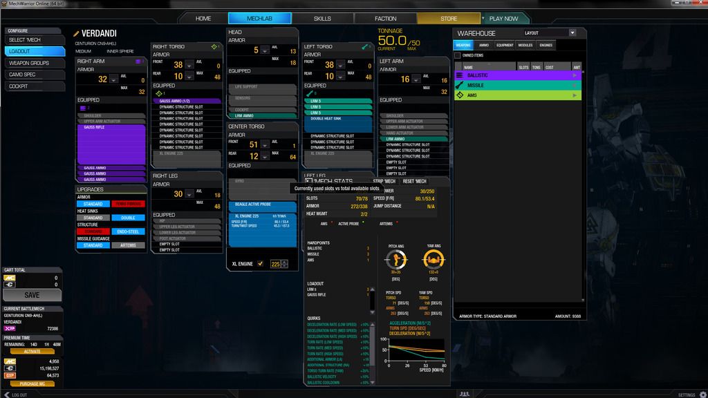
Why is the mech selection window so @%^#%$# SMALL?!?!? Damn, I have a 24" monitor, and a 5" wide mech selection window. WTF???
And I have yet to find (might be me) anywhere that shows all my mech's quirks on one screen. Am I missing something??
Once again, navigation mech-to-mech is uber-clicky.
HAPPYS:
I like the new mech loadout screen. I will have to get used to it. Strip buttons are nice!
Kinda like someone said: One step forward, one step back. fixed some UI stuff nicely, and some UI stuff is just silly again. Almost like the blind men and the elephant...
Edited by Phashe, 02 June 2015 - 04:29 PM.
#200
Posted 02 June 2015 - 04:31 PM
1 user(s) are reading this topic
0 members, 1 guests, 0 anonymous users
 This topic is locked


