Oh F****k God
#1
Posted 02 June 2015 - 10:33 AM
in the morning i have to click 2 times, to select ANY MECH.
Now its 5-7 ? EACH foking time ?
Immediate rollback I SAY.
#2
Posted 02 June 2015 - 10:34 AM
#3
Posted 02 June 2015 - 10:35 AM
#4
Posted 02 June 2015 - 10:36 AM
Although that last one really, really, REALLY should be a double-click instead of having to click on "save" (of all things).
#5
Posted 02 June 2015 - 10:47 AM
They should totally get some guy off the street to UE test the UI stuff.
I do like how the modules show up but...
Would it hurt to have a search function so I can find my modules or bring up all the mechs that have it?
Search: 300 XL or Radar Derp
Then the game conveniently lists all the mechs that have it equipped.
Also these colors remind me of our old EXCEL file reports and is so out of place with the rest of the game UI.
Someday! We will get a decent UI experience someday.
PS
The markers indicating if Artemis and such is installed is so freaking small but I like the mouseover.
#6
Posted 02 June 2015 - 10:57 AM
I am reserving judgement until I get to actually play with it.
Edited by cdlord, 02 June 2015 - 10:57 AM.
#7
Posted 02 June 2015 - 11:01 AM
#8
Posted 02 June 2015 - 11:01 AM
 cdlord, on 02 June 2015 - 10:57 AM, said:
I am reserving judgement until I get to actually play with it.
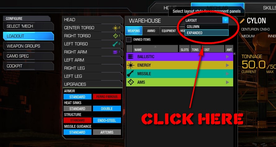
upper right "layout"
#9
Posted 02 June 2015 - 11:06 AM
 cdlord, on 02 June 2015 - 10:57 AM, said:
I am reserving judgement until I get to actually play with it.

#10
Posted 02 June 2015 - 11:16 AM
 cdlord, on 02 June 2015 - 10:57 AM, said:
I am reserving judgement until I get to actually play with it.
 RussianWolf, on 02 June 2015 - 11:01 AM, said:
 stjobe, on 02 June 2015 - 11:06 AM, said:

As long as you have a 1600*900 or greater resolution; else you are stuck with the monstrosity that is stock.
#11
Posted 02 June 2015 - 11:20 AM
I WANT IT NOW.
I dont mention the rly rly, CHILDISH red/blue button for standard armor or ferro-fibrous.
devs, U completely BLIND or wot ?
Edited by Titannium, 02 June 2015 - 11:18 AM.
#12
Posted 02 June 2015 - 11:24 AM
#13
Posted 02 June 2015 - 11:32 AM
#14
Posted 02 June 2015 - 11:34 AM
 Titannium, on 02 June 2015 - 10:33 AM, said:
in the morning i have to click 2 times, to select ANY MECH.
Now its 5-7 ? EACH foking time ?
Immediate rollback I SAY.
how many posts do you need for the same QQ? I know the younger generation has turned into attention seeking divas, but c'mon now......
#15
Posted 02 June 2015 - 11:34 AM
 XX Sulla XX, on 02 June 2015 - 11:32 AM, said:
From what I've seen; worse in every regard.
Perhaps that's just because I rage quit after trying to build something that would have taken 30 second, but did take 5 minutes.
That column view is atrocious. Mech selection takes a long ass time. Do they list modules now? That would be an improvement.
#16
Posted 02 June 2015 - 11:36 AM
 Mcgral18, on 02 June 2015 - 11:16 AM, said:
As long as you have a 1600*900 or greater resolution; else you are stuck with the monstrosity that is stock.
can't help it if people are still trying to play on tube monitors bro
 Mcgral18, on 02 June 2015 - 11:34 AM, said:
From what I've seen; worse in every regard.
Perhaps that's just because I rage quit after trying to build something that would have taken 30 second, but did take 5 minutes.
That column view is atrocious. Mech selection takes a long ass time. Do they list modules now? That would be an improvement.
and these were the exact same comments everyone made when the UI2.0 was introduced, and after 2 weeks, people got used to it, figured it out and STFU.
#17
Posted 02 June 2015 - 11:38 AM
 Bishop Steiner, on 02 June 2015 - 11:36 AM, said:
and these were the exact same comments everyone made when the UI2.0 was introduced, and after 2 weeks, people got used to it, figured it out and STFU.
1400*900 is hardly tube, it's a modern monitor. Public Test had it in this resolution for ***** sake. It's the live version that ****** up.
UI 2.0 was usable.
Have you used the Column view to build a mech? Go change Omnipods, and tell me which features they've REMOVED. It no longer swaps to the Omnipod tab, and requires you to select which section of omnipod on top of that; rather than doing it automatically like in 2.0.
It's a downgrade. Go ahead, build things in the Column view, and tell me it's better than 2.0.
#18
Posted 02 June 2015 - 11:42 AM
 Mcgral18, on 02 June 2015 - 11:38 AM, said:
1400*900 is hardly tube, it's a modern monitor. Public Test had it in this resolution for ***** sake. It's the live version that ****** up.
UI 2.0 was usable.
Have you used the Column view to build a mech? Go change Omnipods, and tell me which features they've REMOVED. It no longer swaps to the Omnipod tab, and requires you to select which section of omnipod on top of that; rather than doing it automatically like in 2.0.
It's a downgrade. Go ahead, build things in the Column view, and tell me it's better than 2.0.
why use column? I hit expanded. I will build a mech from column though just to make you happy.
#19
Posted 02 June 2015 - 11:43 AM
Functionally it actually all runs smoother.
Aesthetically - the mechlab color choices are horrendous. Like, absolutely and utterly. Also pretty sure they won't be doing any favors for the colorblind crowd that's been asking for more distinctly separate colors with the two main ones being of the same base color.
1 user(s) are reading this topic
0 members, 1 guests, 0 anonymous users
 This topic is locked


