Jump to content

How Many Clicks Does It Take To Get To The Center Of A Mechlab?

General

24 replies to this topic

#1 Ultimax

    Member

  • PipPipPipPipPipPipPipPipPipPip
  • Ace Of Spades
  • Ace Of Spades
  • 6,979 posts

Posted 05 June 2015 - 12:58 PM

You're in your Enforcer, and you decide it's time to switch to a Dire Wolf!


Posted Image

Posted Image

Posted Image

Posted Image

Posted Image

Posted Image

Posted Image


There's a point in here somewhere. :P

#2 FupDup

    Member

  • PipPipPipPipPipPipPipPipPipPipPipPipPipPip
  • Ace Of Spades
  • Ace Of Spades
  • 26,888 posts
  • LocationThe Keeper of Memes

Posted 05 June 2015 - 12:59 PM


#3 mailin

    Member

  • PipPipPipPipPipPipPipPipPip
  • Big Daddy
  • Big Daddy
  • 2,033 posts
  • LocationWisconsin, USA

Posted 05 June 2015 - 01:00 PM

It seems like it's always one more . . . maybe

#4 Andi Nagasia

    Volunteer Moderator

  • PipPipPipPipPipPipPipPipPipPip
  • Ace Of Spades
  • Ace Of Spades
  • 5,982 posts

Posted 05 June 2015 - 01:32 PM

or
1) Click Select Mech,
2) Click Clan,
3) Click DireWolf,
4) Click Variant,
5) Click Save,
Yes i got it in 5 Clicks!
What do i win? :)

#5 Squarebasher

    Member

  • PipPipPipPipPip
  • Mercenary Rank 2
  • Mercenary Rank 2
  • 125 posts

Posted 05 June 2015 - 01:41 PM

I agree the select mech screen is not good.

#6 MrPrezident

    Member

  • PipPip
  • Ace Of Spades
  • Ace Of Spades
  • 29 posts

Posted 05 June 2015 - 01:46 PM

I agree, Way too many clicks, I prefer the big mech select screen from before.

#7 Ultimax

    Member

  • PipPipPipPipPipPipPipPipPipPip
  • Ace Of Spades
  • Ace Of Spades
  • 6,979 posts

Posted 05 June 2015 - 01:50 PM

View PostAndi Nagasia, on 05 June 2015 - 01:32 PM, said:

or
1) Click Select Mech,
2) Click Clan,
3) Click DireWolf,
4) Click Variant,
5) Click Save,
Yes i got it in 5 Clicks!
What do i win? :)


You win an inefficient mech selection layout!

Congrats!

#8 D34DMetal

    Member

  • PipPipPipPipPip
  • Legendary Founder
  • Legendary Founder
  • 134 posts
  • Locationin a Mad Cat duh...

Posted 05 June 2015 - 01:52 PM

So if you hop into a clan mech for a match and then decide to switch to a new clan mech after said match you have to reselect the clan mech tab: how does this crap get past testing? The clan vs inner sphere mech selection should SAVE so you don't have to reselect after every match. It's sad to see PGI continung to drop the ball on QA, and it's a teend that is permeating the entire video game industry.

Edited by DeadMetal89, 05 June 2015 - 01:58 PM.


#9 Gigastrike

    Member

  • PipPipPipPipPipPipPip
  • FP Veteran - Beta 1
  • FP Veteran - Beta 1
  • 704 posts

Posted 05 June 2015 - 01:56 PM

Some of us appreciate the organization that folders bring.

#10 Andi Nagasia

    Volunteer Moderator

  • PipPipPipPipPipPipPipPipPipPip
  • Ace Of Spades
  • Ace Of Spades
  • 5,982 posts

Posted 05 June 2015 - 01:57 PM

have you Guys seen my Solution?
a full UI rework of the Home Tab,

Posted Image

i know its not my best work but it will do, :)
This is my Idea to Replace the Empty "Home Tab",
the DropDeck acts as the CloseBeta "4 Ready'd" Mechs,

#11 Ultimax

    Member

  • PipPipPipPipPipPipPipPipPipPip
  • Ace Of Spades
  • Ace Of Spades
  • 6,979 posts

Posted 05 June 2015 - 03:09 PM

View PostGigastrike, on 05 June 2015 - 01:56 PM, said:

Some of us appreciate the organization that folders bring.


Windows/Android/iOS all have folders.


They all also have a "search" function.


Posted Image

#12 Cyborne Elemental

    Member

  • PipPipPipPipPipPipPipPipPip
  • 3,981 posts
  • LocationUSA

Posted 05 June 2015 - 03:23 PM

OVER 9000!

Edited by Mister D, 05 June 2015 - 04:58 PM.


#13 LordKnightFandragon

    Member

  • PipPipPipPipPipPipPipPipPipPip
  • 7,239 posts

Posted 05 June 2015 - 04:07 PM

View PostAndi Nagasia, on 05 June 2015 - 01:57 PM, said:

have you Guys seen my Solution?
a full UI rework of the Home Tab,

Posted Image

i know its not my best work but it will do, :)
This is my Idea to Replace the Empty "Home Tab",
the DropDeck acts as the CloseBeta "4 Ready'd" Mechs,


Yes please? Now just add those Weight Class tabs to the right of that bottom window and perfect.

#14 Ovion

    Member

  • PipPipPipPipPipPipPipPipPip
  • The Vicious
  • The Vicious
  • 3,182 posts

Posted 05 June 2015 - 04:13 PM

Which from Home was much the same before.

Alt - Click Mechlab, Scroll through X mechs in mech select (spending a few moments looking), OR, click on Assaults, then scroll through looking., so you'd be looking at 2-6 clicks anyway.

You can check my sig, I have far more mechs than is sensible, it could take a while to find a mech.
Now it takes moments, far less time than before.
Screw clicks - it's faster here.

Now, compare making Mech.

I choose loadout, I make the damn mech.
I only need change tab if I want to do engines (or can do it via the smurfy layout), ammo or misc. items. (or modules).
At least halved the number of clicks and massively reduced the time taken there.

Vs the prior - need to click on each component > switch to relevant part / weapon / ammo / engine / omnipod there.
Move about, back and forth.
Even quickly configuring a mech could easily take upwards of 30-40+ clicks (with a reasonable amount of travel between each) just to navigate, let alone actually putting the weapons, armour, ammo and equipment on the mech.

Configuring my Adder from scratch would take 60-70 (or more) clicks with a lot of travel, not counting modules or paint (module each way was 3-5, then another 3-10 to equip, camo at least 5-10 more) (And that's a mech I know well from recently switching the same build across 3 mechs for mastering the chasis, and is a light omnimech that only has 4 weapons, after months of using the Mechlab).

New mechlab - 30-40 total, from the Home Screen to start, including everything, with less travel. After 2 days of actually using it.

It's not all just about mouseclicks.

#15 darkkterror

    Member

  • PipPipPipPipPipPipPip
  • 814 posts

Posted 05 June 2015 - 04:37 PM

It actually only takes 3. You just forgot to take a big bite out of your monitor on the third click.

#16 Gut

    Member

  • PipPipPipPipPipPip
  • Ace Of Spades
  • Ace Of Spades
  • 373 posts
  • LocationNear Dallas, TX

Posted 05 June 2015 - 04:59 PM

I prefer this to scrolling through hundreds of mechs trying to find the one you're looking for.

Even better would be a few customizable lists, like you can put your meta in one folder, your "leveling" in another, etc.

#17 Ultimax

    Member

  • PipPipPipPipPipPipPipPipPipPip
  • Ace Of Spades
  • Ace Of Spades
  • 6,979 posts

Posted 05 June 2015 - 05:13 PM

View PostGut, on 05 June 2015 - 04:59 PM, said:

I prefer this to scrolling through hundreds of mechs trying to find the one you're looking for.

Even better would be a few customizable lists, like you can put your meta in one folder, your "leveling" in another, etc.


I don't think this is awful, it just needs a few tweaks for efficiency.

"Mech-hotlist" would definitely be a great idea.

#18 LORD TSARKON

    Member

  • PipPipPipPipPipPipPip
  • Urban Commando
  • Urban Commando
  • 776 posts
  • LocationButtmunch City

Posted 05 June 2015 - 05:42 PM

View PostAndi Nagasia, on 05 June 2015 - 01:57 PM, said:

have you Guys seen my Solution?
a full UI rework of the Home Tab,

Posted Image

i know its not my best work but it will do, :)
This is my Idea to Replace the Empty "Home Tab",
the DropDeck acts as the CloseBeta "4 Ready'd" Mechs,


It just wasnt only Closed Beta.. it was 2012 through Jan 2014.... I STILL MISS IT...
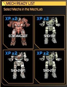
Drop Deck for CW.... READY MEch List for Puggin...

Posted Image

#19 xDust

    Member

  • PipPipPipPipPip
  • The Clamps
  • The Clamps
  • 113 posts

Posted 05 June 2015 - 05:56 PM

They fixed the Mechlab.... but then broke the easy way of selecting mechs (and rolling over icons for stats) which they had down pretty well.

Who designs their UIs?! Do they not have such as thing as common sense? Or a concept of user-friendliness?

Edited by xDust, 05 June 2015 - 05:58 PM.


#20 PappySmurf

    Member

  • PipPipPipPipPipPipPip
  • FP Veteran - Beta 1
  • 842 posts

Posted 05 June 2015 - 06:00 PM

The new mechlab truly sucks aaaaassss it is worse than the previous mechlab by far and totally unorganized.

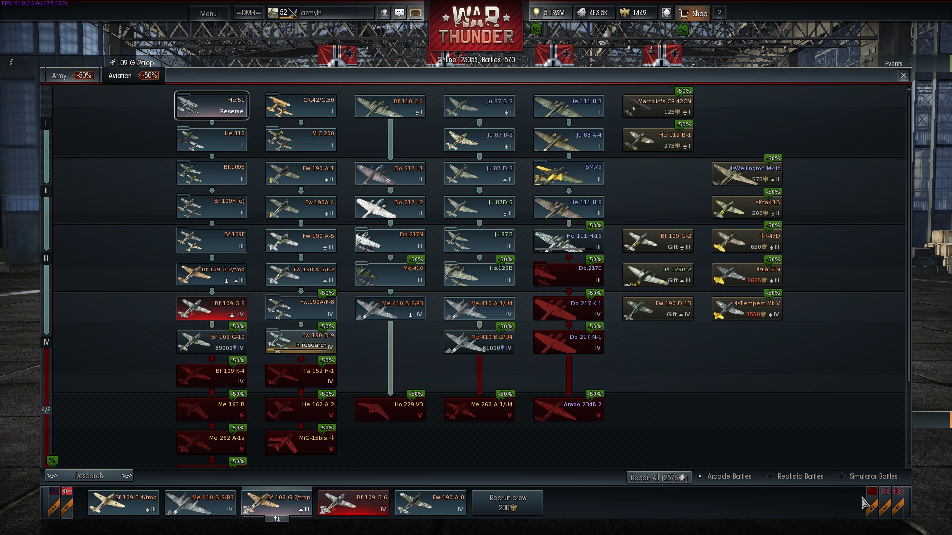
PGI look at WarThunders setup a rolodex to pick your mechs and a easy to use functional setup.

P.S download Warthunder PGI staff look at the easy functional lab setup.

Posted Image

Edited by PappySmurf, 05 June 2015 - 06:04 PM.


9 user(s) are reading this topic

0 members, 9 guests, 0 anonymous users