Jump to content

The Dragon's Weapon Visualization Pass... No. No. No. No.


43 replies to this topic

#1 TyphonCh

    Member

  • PipPipPipPipPipPipPipPip
  • The Clamps
  • The Clamps
  • 1,074 posts
  • LocationDue North

Posted 09 July 2015 - 03:02 AM

The Dragon was my very first mech in MWO. It is very dear to me... No matter how bad it is, or how 'non meta' I build it, it still has a special place in my heart :wub:

BUT SERIOUSLY?!

I'm not normally one to criticize, and criticize like an *******, but this pass was unacceptable on this particular chassis. All the other mechs, especially the Cicada, LOOK AWESOME.
But...Someone took the easy, hungover, lazy ass method here.

This almost makes me want to make a Twitter account just so I can tweet Russ about it's CT missile hard points. The new energy and right arm ballistic hard points looks great, I can live with it. But that CT must have somehow bypassed QA altogether.

It's almost as bad as the Jagermechs ballistics. I'm not even kidding.

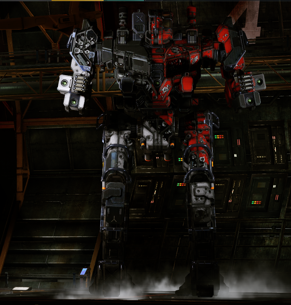
All Dragons, as you may or may not know, have a single missile hard point in their center torso. Except the 1N. It has two.

I don't even know where to start... I'll post several pictures in case you all missed the 'sneak peek'. It's bad.

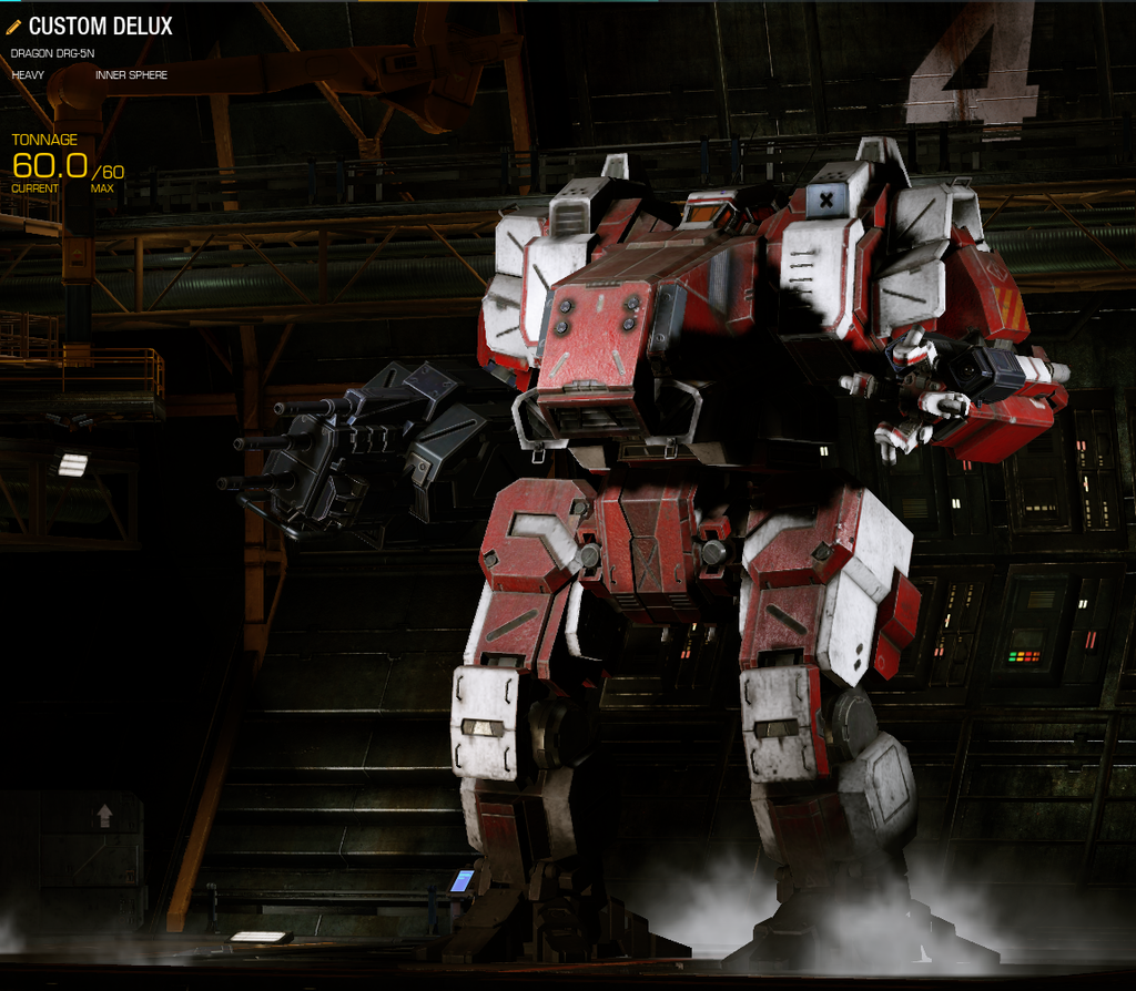
Here's a Dragon's CT before the pass (no missiles equipped). it didn't matter what you put on it, the tubes stayed the same:

Spoiler


All well and good.

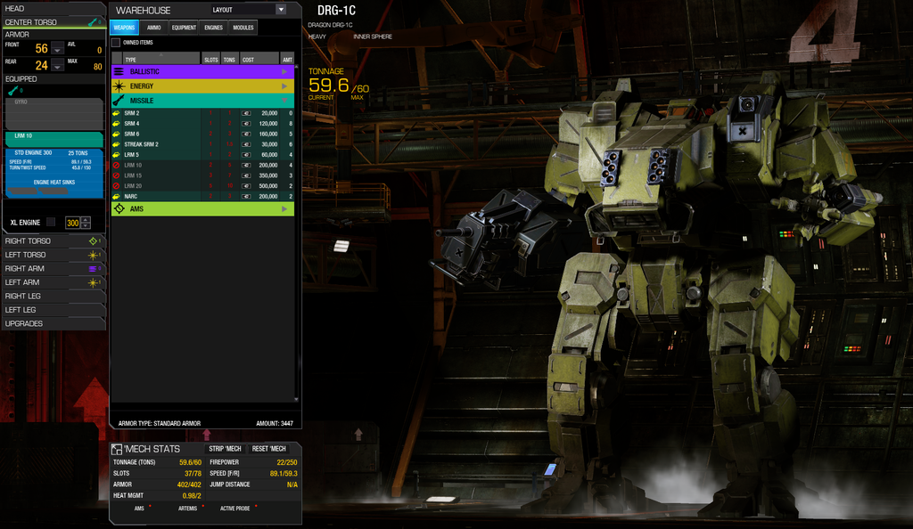
Before I get too crazy and rage post, here's the 1C as viewed in the Store, with an LRM10 in the centre torso:

Spoiler


See that? All nice and symmetrical. The dark grey to all the new mechs weapon visuals actually looks pretty good with most camo patterns.

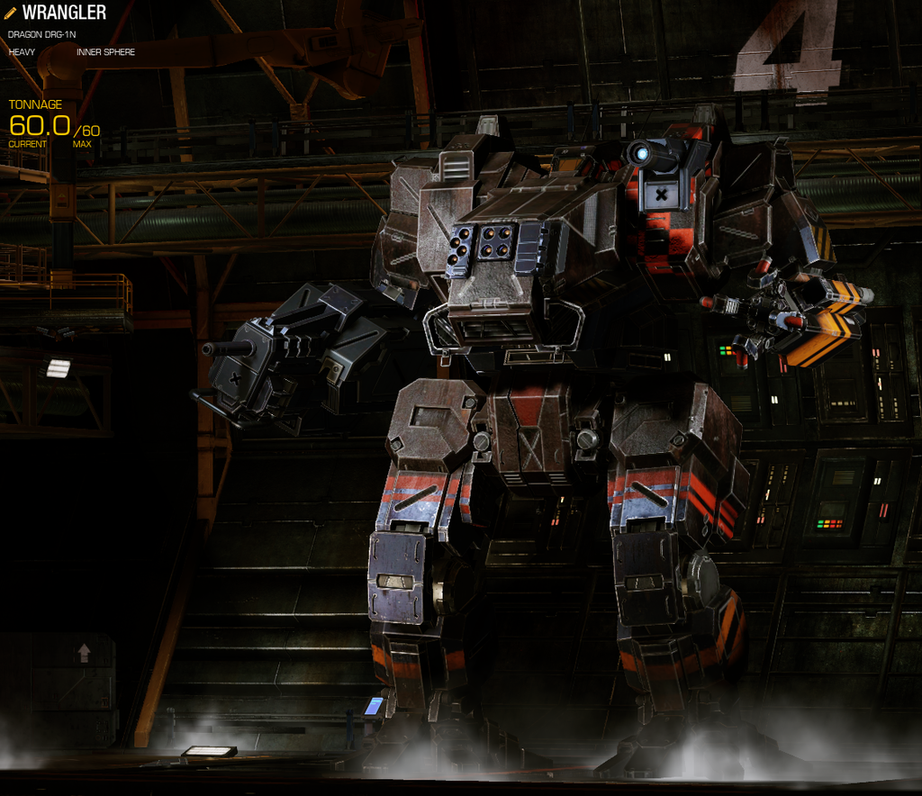
Here is the the 1N, as I have equipped currently (No AC5 rapecannon ;)). There are 2 srm4's in the CT. Keep in mind there are only 2 slots:

Spoiler


WHAT IN THE ACTUAL ****...?

It's almost like... They tried to get the second hard point to fit. They did. But they didn't. It sticks out like this big awkward haggard witch pimple in the front of your face and makes you want to call in sick for work.The first SRM4 automatically locates itself to the right side of the nose, why couldn't the second SRM4 go into the already prebuilt slot on the left side of the nose?! The little grey weapon visualization thing is already there!!!!

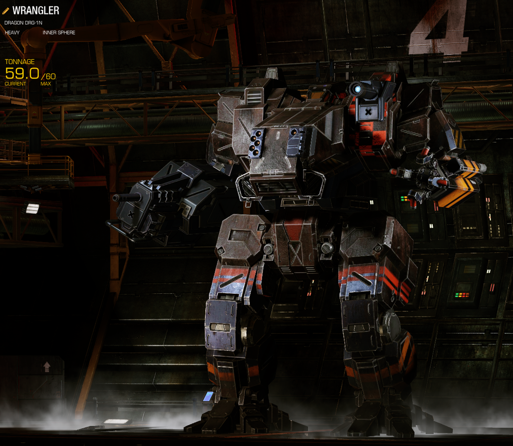
Oh, and just wait. It gets worse. After I saw the SRM4 conf*cktion, I tried a single SRM6. This takes the cake.
Spoiler


I don't even have to elaborate.................
Point. And. Laugh.
Just do it.
Don't even feel bad.
I hope the team that assigned this mechs hard points on the CT feels ashamed. I really do. I hope they read this. Absolutely unacceptable.

Edited by Team Chevy86, 09 July 2015 - 03:55 AM.


#2 Hit the Deck

    Member

  • PipPipPipPipPipPipPipPipPip
  • 4,677 posts
  • LocationIndonesia

Posted 09 July 2015 - 03:07 AM

I agree based on forum posts (because I don't have a Dragon) that she deserves a better designed and prettier center torso.

#3 oldradagast

    Member

  • PipPipPipPipPipPipPipPipPip
  • Philanthropist
  • 4,833 posts

Posted 09 July 2015 - 03:12 AM

The Awesome got mucked up badly, too. Covered in scattered missile hardpoints, with missiles on the left arm in a few variants being split up like that SRM 6 in the nose of your Dragon. They also LOWERED the energy hardpoints on the Awesome... because it needed a nerf?!

So, I feel your pain, but I doubt anyone at PGI cares.

#4 Kiiyor

    Member

  • PipPipPipPipPipPipPipPipPipPip
  • Big Daddy
  • Big Daddy
  • 5,565 posts
  • LocationSCIENCE.

Posted 09 July 2015 - 03:14 AM

That's odd - and it looks to be something completely fixable. Maybe you should PM Russ or Tina or submit a ticket.

#5 TyphonCh

    Member

  • PipPipPipPipPipPipPipPip
  • The Clamps
  • The Clamps
  • 1,074 posts
  • LocationDue North

Posted 09 July 2015 - 03:15 AM

View PostKiiyor, on 09 July 2015 - 03:14 AM, said:

That's odd - and it looks to be something completely fixable. Maybe you should PM Russ or Tina or submit a ticket.

It's all part of the 'what weapon goes on first' scenario.
The designer/programmers slacked on this chassis. That's all it was. I may PM one of them with this thread included because really, it looks bad.

#6 Speedy Plysitkos

    Member

  • PipPipPipPipPipPipPipPipPip
  • The 1 Percent
  • The 1 Percent
  • 3,460 posts
  • LocationMech Junkyard

Posted 09 July 2015 - 03:16 AM

Why is the arm so huge now ? i saw it yesterday in game, and broooo, its like hulk arm.

#7 Water Bear

    Member

  • PipPipPipPipPipPipPipPip
  • Liquid Metal
  • Liquid Metal
  • 1,137 posts

Posted 09 July 2015 - 03:18 AM

I still don't get why people care about the geo passes this much. Worst one was the Jager mech and at the end of the day, I just can't make myself care that much.

#8 MeiSooHaityu

    Member

  • PipPipPipPipPipPipPipPipPipPipPip
  • Knight Errant
  • Knight Errant
  • 10,912 posts
  • LocationMI

Posted 09 July 2015 - 03:19 AM

The arm does seem clunkier than you would think it should be. It seems passable though if less than beautiful or efficient in layout.

The SRM6 on the other hand is laughably bad. Five missiles on one side and that lone missile on the other side just reeks of laziness. It might be the worst implementation of a dynamic hard point since the VCRs on the Cat A1.

#9 TyphonCh

    Member

  • PipPipPipPipPipPipPipPip
  • The Clamps
  • The Clamps
  • 1,074 posts
  • LocationDue North

Posted 09 July 2015 - 03:20 AM

View PostWater Bear, on 09 July 2015 - 03:18 AM, said:

I still don't get why people care about the geo passes this much. Worst one was the Jager mech and at the end of the day, I just can't make myself care that much.

And hey, you know what? It got fixed. They actually look like cannons now (AC5's seem a bit too skinny, but meh)

View PostTitannium, on 09 July 2015 - 03:16 AM, said:

Why is the arm so huge now ? i saw it yesterday in game, and broooo, its like hulk arm.

Its always had this huge bulky right arm; that's where it's ballistics are. Similar to a Centurion.
Before, it never showed visually what weapon was equipped. Be it an AC20, Gauss Rifle or AC2. Try it for yourself in the Store, you can open the mech lab and swap parts. The arm does look a lot better than it did. It's the CT that makes me rage.
Not only was it easy to hit. Now it's just ugly.

Edited by Team Chevy86, 09 July 2015 - 03:31 AM.


#10 Speedy Plysitkos

    Member

  • PipPipPipPipPipPipPipPipPip
  • The 1 Percent
  • The 1 Percent
  • 3,460 posts
  • LocationMech Junkyard

Posted 09 July 2015 - 03:30 AM

View PostTeam Chevy86, on 09 July 2015 - 03:20 AM, said:

And hey, you know what? It got fixed. They actually look like cannons now (AC5's seem a bit too skinny, but meh)


bro did you see how tarded now AC5 looks on jager ? 15m long tiny pipes. NOT CANNON. ugly stuff.
And its not AA station also.

#11 Jack Corban

    Member

  • PipPipPipPipPipPipPip
  • Ace Of Spades
  • Ace Of Spades
  • 560 posts
  • LocationPort Arthur

Posted 09 July 2015 - 03:36 AM

View PostTeam Chevy86, on 09 July 2015 - 03:02 AM, said:

The Dragon was my very first mech in MWO. It is very dear to me... No matter how bad it is, or how 'non meta' I build it, it still has a special place in my heart :wub:

BUT SERIOUSLY?!

I'm not normally one to criticize, and criticize like an *******, but this pass was unacceptable on this particular chassis. All the other mechs, especially the Cicada, LOOK AWESOME.
But...Someone took the easy, hungover, lazy ass method here.

This almost makes me want to make a Twitter account just so I can tweet Russ about it's CT missile hard points. The new energy and right arm ballistic hard points looks great, I can live with it. But that CT must have somehow bypassed QA altogether.

It's almost as bad as the Jagermechs ballistics. I'm not even kidding.

All Dragons, as you may or may not know, have a single missile hardpoint in their centre torso. Except the 1N. It has two.

I don't even know where to start... I'll post several pictures in case you all missed the 'sneak peek'. It's bad.

Here's a Dragon's CT before the pass (no missiles equipped). it didn't matter what you put on it, the tubes stayed the same:

Spoiler


All well and good.

Before I get too crazy and rage post, here's the 1C as viewed in the Store, with an LRM10 in the centre torso:

Spoiler


See that? All nice and symmetrical. The dark grey to all the new mechs weapon visuals actually looks pretty good with most camo patterns.

Here is the the 1N, as I have equipped currently (No AC5 rapecannon ;)). There are 2 srm4's in the CT. Keep in mind there are only 2 slots:

Spoiler


WHAT. IN THE ACTUAL ****.

It's almost like... They tried to get make the second hard point fit. They did. But they didn't. It sticks out like this big awkward haggard witch pimple in the front of your face and makes you want to call in sick for work.The first SRM4 automatically locates itself to the right side of the nose, why couldn't the second SRM4 go into the already prebuilt slot on the left side of the nose?! The little grey weapon visualization thing is already there!!!!

Oh, and just wait. It gets worse. After I saw the SRM4 conf*cktion, I tried a single SRM6. This takes the cake.
Spoiler


I don't even have to elaborate.................
Point. And. Laugh.
Just do it.
Don't even feel bad.
I hope the team that assigned this mechs hard points on the CT feels ashamed. I really do. I hope they read this. Absolutely unacceptable.


My OCD senses are tingling.

Edited by Jack Corban, 09 July 2015 - 03:36 AM.


#12 TyphonCh

    Member

  • PipPipPipPipPipPipPipPip
  • The Clamps
  • The Clamps
  • 1,074 posts
  • LocationDue North

Posted 09 July 2015 - 03:39 AM

View PostTitannium, on 09 July 2015 - 03:30 AM, said:

bro did you see how tarded now AC5 looks on jager ? 15m long tiny pipes. NOT CANNON. ugly stuff.
And its not AA station also.

I hear ya... Compared to an AC10 they're literally 1/3 the size. Doesn't make much sense. Way too small. Jagers were my second mech, and I almost sold them after that first pass. They look... OK now.
Call me what you want, but I like my mechs functional as well as visually pleasing :P

#13 Alistair Winter

    Member

  • PipPipPipPipPipPipPipPipPipPipPip
  • Storm
  • Storm
  • 10,823 posts
  • LocationBergen, Norway, FRR

Posted 09 July 2015 - 03:46 AM

I lol'd at the SRM6. My god. What were they thinking? Probably "Let's see if I can give all 4 mechs dynamic geometry by lunch time."

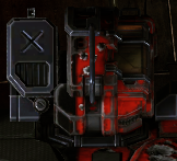
But I also really, really dislike the huge [X] tiles to indicate unused or unavailable hardpoints. It's just so lazy. We know that they don't have to be there, because the AWS-8R doesn't have huge black [X] tiles when its missile hardpoints aren't used. If you look at all the different mechs with dynamic geometry, it's pretty clear that none of the ugly solutions are a result of technical issues. It's just a combination of cheap cosmetics and lack of aesthetical sensibility.

The triple AC2 looks pretty good, but the excessive use of gunmetal does bother me. Some of those panels should have been part of the mech's overall camo pattern.

Edited by Alistair Winter, 09 July 2015 - 03:47 AM.


#14 TyphonCh

    Member

  • PipPipPipPipPipPipPipPip
  • The Clamps
  • The Clamps
  • 1,074 posts
  • LocationDue North

Posted 09 July 2015 - 03:53 AM

View PostAlistair Winter, on 09 July 2015 - 03:46 AM, said:

I lol'd at the SRM6. My god. What were they thinking? Probably "Let's see if I can give all 4 mechs dynamic geometry by lunch time."

But I also really, really dislike the huge [X] tiles to indicate unused or unavailable hardpoints. It's just so lazy. We know that they don't have to be there, because the AWS-8R doesn't have huge black [X] tiles when its missile hardpoints aren't used. If you look at all the different mechs with dynamic geometry, it's pretty clear that none of the ugly solutions are a result of technical issues. It's just a combination of cheap cosmetics and lack of aesthetical sensibility.

The triple AC2 looks pretty good, but the excessive use of gunmetal does bother me. Some of those panels should have been part of the mech's overall camo pattern.


I hate it too.


Posted Image

Spoiler

Edited by Team Chevy86, 09 July 2015 - 03:56 AM.


#15 MeiSooHaityu

    Member

  • PipPipPipPipPipPipPipPipPipPipPip
  • Knight Errant
  • Knight Errant
  • 10,912 posts
  • LocationMI

Posted 09 July 2015 - 04:44 AM

View PostTeam Chevy86, on 09 July 2015 - 03:53 AM, said:


I hate it too.


Posted Image

Spoiler


That one never bothered me too much. It's not like I expected them to remove a huge chunk of the Grasshopper's head.

I am still however shaking my head at the SRM6 launcher on the Dragon.

#16 CDLord HHGD

    Member

  • PipPipPipPipPipPipPipPipPipPip
  • Legendary Founder
  • Legendary Founder
  • 9,190 posts
  • Location"You're not comp if you're not stock."

Posted 09 July 2015 - 04:46 AM

I think they could have done a better job with the nose missiles, keeping it closer to what they looked like before, but overall I like the changes.

#17 Juodas Varnas

    Member

  • PipPipPipPipPipPipPipPipPipPip
  • Ace Of Spades
  • Ace Of Spades
  • 7,534 posts
  • LocationGrand Duchy of Lithuania

Posted 09 July 2015 - 04:55 AM

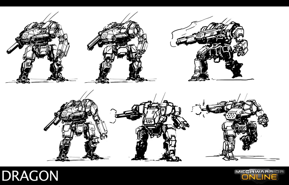
To be honest, i was really expecting them to do this for the arm.
I mean, that's how the Dragon was portrayed in every single BT artwork.
The jointed arm was only shown on the Grand Dragon (which, i'm pretty sure, is considered a separate mech)
Posted Image
Posted Image
And it probably would be a beneficial change for the mech. Definitely, an improvement over having a large, heavily low-hung arm like it does now.

Edited by Juodas Varnas, 09 July 2015 - 04:57 AM.


#18 BigBenn

    Member

  • PipPipPipPipPipPipPip
  • Mercenary
  • Mercenary
  • 571 posts
  • LocationSioux Falls, SD

Posted 09 July 2015 - 05:19 AM

I dont have any issues, I think the dragon looks fine ultimately. If there was anything that could use a tweak it would be the nose. While I don't currently own any Dragon mechs, that will change soon. I'm about to purchase a Dragon or three. :)

#19 Kira Onime

    Member

  • PipPipPipPipPipPipPipPipPip
  • The Dragoon
  • The Dragoon
  • 2,486 posts
  • Twitch: Link
  • LocationMontréal, Québec.

Posted 09 July 2015 - 06:01 AM

View PostTeam Chevy86, on 09 July 2015 - 03:02 AM, said:

Point. And. Laugh.
Just do it.
Don't even feel bad.


Posted Image

#20 Felbombling

    Member

  • PipPipPipPipPipPipPipPipPip
  • 2,978 posts
  • LocationVancouver, BC

Posted 09 July 2015 - 06:52 AM

The person in charge who is signing off on this work doesn't really have a grasp of what 'cool' looking is. That SRM 6 rack representation is horrible.


1 user(s) are reading this topic

0 members, 1 guests, 0 anonymous users