


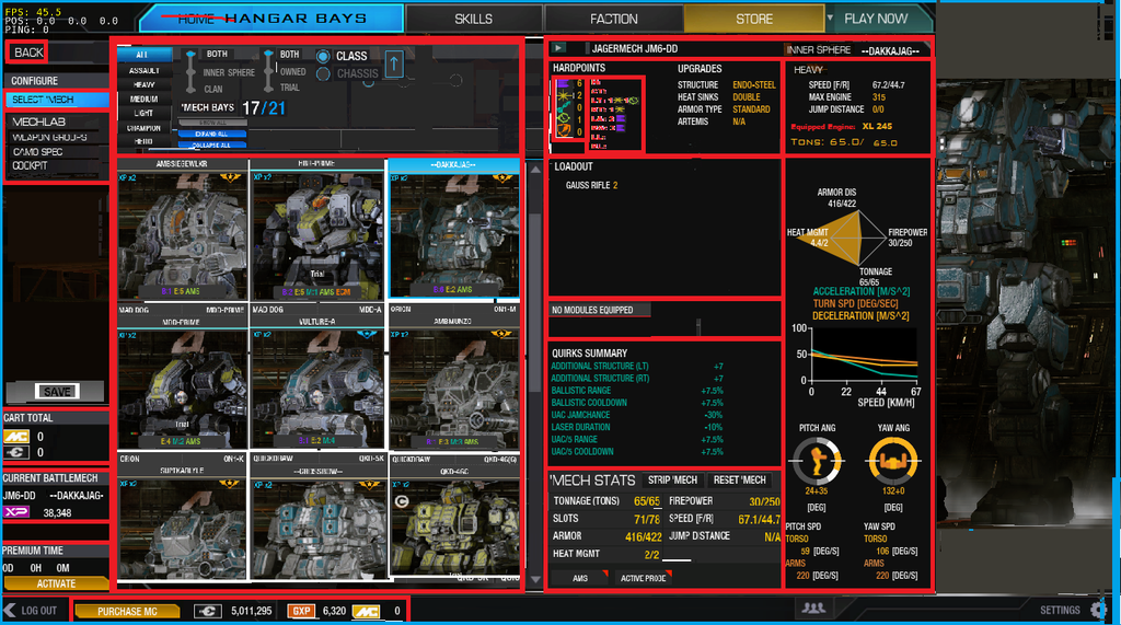
Some notable differences between this UI format and the current one are:
- No Mech Stats Pop-up window
- Compacted fonts
- Use of bar at the bottom of screen
- Compacted Dynamic Mech Portraits
- Equipped Engine Indicator - not included as a pop-up
- Module - ^^previous statement
- Relocation of "Mechlab" tab to HangarBay/Mech Select screen - Now it's really a Home screen
- Hardpoint location diagram compacted to the "H, CT, LT, RT, LA, RA, LL, RL" abreviations
Edit: This was done on the 1280x720 resolution.
This took me about 2 hours to make from screenshots and Paint.
So don't expect anything top notch. And here is what I came up with, as the final product:
-Please consider compacting the UI. We don't all stare at our screens 1cm away damaging our eyes so that we'd need the current scale of the UI.

Edited by Zephonarch II, 04 August 2015 - 03:19 PM.


