Jump to content

Compacting The Ui - Alt Version If You Will

Feedback

3 replies to this topic

#1 Zephonarch II

    Member

  • PipPipPipPipPipPip
  • Ace Of Spades
  • Ace Of Spades
  • 328 posts
  • LocationBack in the MWO and... its fun, but Nascar steamrolls still lame.

Posted 04 August 2015 - 03:06 PM

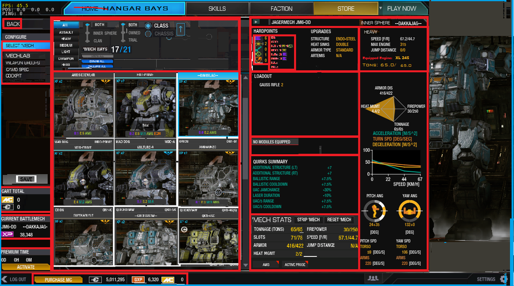
With this new Mech Select UI in place I finally chose to compact it myself to see what it would look like without all the hassles of extra tabs/lists/pop-ups that some players are complaining about.

Some notable differences between this UI format and the current one are:
  • No Mech Stats Pop-up window
  • Compacted fonts
  • Use of bar at the bottom of screen
  • Compacted Dynamic Mech Portraits
  • Equipped Engine Indicator - not included as a pop-up
  • Module - ^^previous statement
  • Relocation of "Mechlab" tab to HangarBay/Mech Select screen - Now it's really a Home screen
  • Hardpoint location diagram compacted to the "H, CT, LT, RT, LA, RA, LL, RL" abreviations
Edit: See Arrow the Right Collapseable screen. Click it and the screen will display as much of your mech as it should as seen in the "Weapon Groups" tab.
Edit: This was done on the 1280x720 resolution.


This took me about 2 hours to make from screenshots and Paint.

So don't expect anything top notch. And here is what I came up with, as the final product:
Posted Image


-Please consider compacting the UI. We don't all stare at our screens 1cm away damaging our eyes so that we'd need the current scale of the UI. :mellow:

Edited by Zephonarch II, 04 August 2015 - 03:19 PM.


#2 Jabilo

    Member

  • PipPipPipPipPipPipPipPip
  • Philanthropist
  • 1,047 posts

Posted 04 August 2015 - 03:15 PM

Make the portraits smaller and have the right hand screen collapsable to show a full view of the mech and you have already done a better job in 2 hours. Maybe they should give you a job.

#3 Luscious Dan

    Member

  • PipPipPipPipPipPipPipPip
  • The Privateer
  • The Privateer
  • 1,146 posts
  • Twitter: Link
  • LocationEdmonton, AB

Posted 04 August 2015 - 03:40 PM

Mech select menu looks way better at higher resolutions than 1280x720. When they brought in the new mechlab it was optimized for higher resolutions, and then they patched in the expanded view for 720p afterwards. I'm guessing the mech select menu is similarly optimized for higher resolutions than you use.

#4 Zephonarch II

    Member

  • PipPipPipPipPipPip
  • Ace Of Spades
  • Ace Of Spades
  • 328 posts
  • LocationBack in the MWO and... its fun, but Nascar steamrolls still lame.

Posted 06 August 2015 - 03:35 PM

Well, I'm elated that the pop-up menu is getting all these fixes. Work on what they got, not instigating info-overload. Thank goodness.

Sure the fonts and other things weren't compacted much, but the pop-up window replacing that "Mech Stats" window was a good call. And the add-ons they gave it.


The following Select 'Mech menu changes are also set to release on August 18th:
  • The currently-equipped Engine will be listed below the Jump Distance slot in the 'Mech Stats window and in the mouse-over pop-up window
  • The 'Mech performance line graph will be removed from the mouse-over pop-up window
- In its place, the pop-up will instead display the currently equipped Modules, Consumables, and Cockpit Items on that 'Mech

Edited by Zephonarch II, 06 August 2015 - 03:36 PM.


1 user(s) are reading this topic

0 members, 1 guests, 0 anonymous users