
Sounds like a feature.
While everything looks more pretty, it's less functional as a consequence.

Cool Looking Camo Select Screen.....
Started by Kira Onime, Oct 20 2015 10:59 AM
42 replies to this topic
#21
-

-

- Littlest Helper

- 29,240 posts
Member
- Location#NOToTaterBalance #BadBalanceOverlordIsBad
Posted 20 October 2015 - 05:33 PM
#22
-

-
- Star Colonel II

- 1,667 posts
Member

Posted 20 October 2015 - 06:14 PM
- Double clicking is completely unnecessary. Change everything to single clicks.
- The hex grid is way too dense at higher resolutions. Fill up that palette window!
- For lower resolutions, I can only imagine it's just as bad. A modest amount of scrolling through colors wouldn't hurt, and it shouldn't be nearly as bad as the old palette.
- The colors in the hex grid are unintuitively dispersed. I find myself overly reliant on the filters now.
- Filtered colors should not appear at all. Dynamically scale the remaining colors to fill the palette window!
- Jumping from primary to secondary to tertiary upon color selection is far more annoying than useful.
Edited by process, 20 October 2015 - 06:14 PM.
#23
-

-
- Legendary Founder
- 9,274 posts
Member
- LocationHiding in the periphery, from Bounty Hunters

Posted 20 October 2015 - 06:14 PM
lol yup,
HBS is looking more and more attractive, time to hand them more money, so I can wander around in a flight jacket and look forward to something good in the future, while this game crashes and burns next year
HBS is looking more and more attractive, time to hand them more money, so I can wander around in a flight jacket and look forward to something good in the future, while this game crashes and burns next year
#24
-

-
- CS 2022 Gold Champ

- 4,968 posts
Member
Posted 20 October 2015 - 06:57 PM
Well... the new camo select screen is much better.
But.... the revamped color screen is THE most frustrating UI i've ever used.... why not filter out the colors you do not own?...like not showing them !!!
A quick mock up:

But.... the revamped color screen is THE most frustrating UI i've ever used.... why not filter out the colors you do not own?...like not showing them !!!
A quick mock up:
Edited by Navid A1, 20 October 2015 - 08:22 PM.
#25
-

-
- Moderate Giver

- 3,776 posts
Member
- LocationAdelaide, Australia

Posted 20 October 2015 - 09:53 PM
 Navid A1, on 20 October 2015 - 06:57 PM, said:
Well... the new camo select screen is much better.
But.... the revamped color screen is THE most frustrating UI i've ever used.... why not filter out the colors you do not own?...like not showing them !!!
A quick mock up:
But.... the revamped color screen is THE most frustrating UI i've ever used.... why not filter out the colors you do not own?...like not showing them !!!
A quick mock up:
I'm not so keen on the huge squares. I think the hex is nice but needs better sorting.
Need to arrange colours in a sensible way
#26
-
-
- Elite Founder

- 794 posts
Member
Posted 20 October 2015 - 10:25 PM
+1
Camo Select = Good.
Color Select = Bad.
Many good suggestions on this thread.
Camo Select = Good.
Color Select = Bad.
Many good suggestions on this thread.
#27
-

-
- The Messenger
- 4,560 posts
Member
- LocationCanada ᕙ(⇀‸↼‶)ᕗ
Posted 20 October 2015 - 10:32 PM
Troutmonkey, on 20 October 2015 - 09:53 PM, said:
A colour wheel would be really nice.
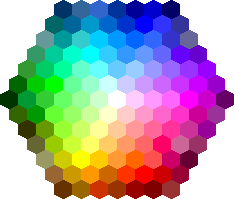
Right now it's organized by hue. Except they have purple on top instead of red. But there's a few telltale signs that hue is their primary sorting function. Which isn't bad, it's actually the best way to have sorted it next to the colour wheel.

My favorite part is that we don't need to click any colour at all to see it on the mech. Just hovering over it shows it for you.. I REALLY like that lol. But some minor tweaks to the colour sorting and making the difference between owned/unowned colours more obvious and it'll be solid.
#28
-
-
- Moderate Giver
- 3,776 posts
Member
- LocationAdelaide, Australia
Posted 20 October 2015 - 10:34 PM
MoonUnitBeta, on 20 October 2015 - 10:32 PM, said:
My favorite part is that we don't need to click any colour at all to see it on the mech. Just hovering over it shows it for you.. I REALLY like that lol. But some minor tweaks to the colour sorting and making the difference between owned/unowned colours more obvious and it'll be solid.
It's so close that it just makes it all the more frustrating, because there's a 99% chance it will stay like this for years.
I'm also curious at to how it's going to be displayed on my triple monitor setup.
#29
-

-
- Civil Servant

- 6,558 posts
Member
- LocationUSA
Posted 20 October 2015 - 10:47 PM
process, on 20 October 2015 - 06:14 PM, said:
- Double clicking is completely unnecessary. Change everything to single clicks.
- The hex grid is way too dense at higher resolutions. Fill up that palette window!
- For lower resolutions, I can only imagine it's just as bad. A modest amount of scrolling through colors wouldn't hurt, and it shouldn't be nearly as bad as the old palette.
- The colors in the hex grid are unintuitively dispersed. I find myself overly reliant on the filters now.
- Filtered colors should not appear at all. Dynamically scale the remaining colors to fill the palette window!
- Jumping from primary to secondary to tertiary upon color selection is far more annoying than useful.
</supporting loudly>
#30
-
-
- The Messenger
- 4,560 posts
Member
- LocationCanada ᕙ(⇀‸↼‶)ᕗ
Posted 20 October 2015 - 10:49 PM
Troutmonkey, on 20 October 2015 - 10:34 PM, said:
It's so close that it just makes it all the more frustrating, because there's a 99% chance it will stay like this for years.
I'm also curious at to how it's going to be displayed on my triple monitor setup.
Well, the most important thing is that we continue to give feedback in a good way. I'm sure if 3 people tweet Russ and ask him to change the colour sorting to the wheel, it'll happen. and if 5 people tweet him about giving unowned colours a red line through them on top of being darker, it'll happen.
Edited by MoonUnitBeta, 20 October 2015 - 10:55 PM.
#31
-

-
- Knight Errant
- 538 posts
Member
Posted 20 October 2015 - 10:51 PM
I like the hexes
The double click actually helps you missclicking and change the color by mistake.
But yes, unused/not owned colours should go gray or disapear.
The double click actually helps you missclicking and change the color by mistake.
But yes, unused/not owned colours should go gray or disapear.
#32
-
-
- Moderate Giver
- 3,776 posts
Member
- LocationAdelaide, Australia
Posted 20 October 2015 - 11:15 PM
MoonUnitBeta, on 20 October 2015 - 10:49 PM, said:
Well, the most important thing is that we continue to give feedback in a good way. I'm sure if 3 people tweet Russ and ask him to change the colour sorting to the wheel, it'll happen. and if 5 people tweet him about giving unowned colours a red line through them on top of being darker, it'll happen.
Already tweeted him. It's a shame that seems to be the only place he listens to feedback
Quote
We just have to make the illusion appear that there's a lot more people asking about it than there really is, and we win.
It'd be really suss if 30 people tweeted him, because he knows there's only really 24 active players

Edited by Troutmonkey, 20 October 2015 - 11:17 PM.
#33
-
-
- Moderate Giver
- 3,776 posts
Member
- LocationAdelaide, Australia
Posted 20 October 2015 - 11:31 PM
Troutmonkey, on 20 October 2015 - 10:34 PM, said:
I'm also curious at to how it's going to be displayed on my triple monitor setup.
Like farking arse. That's how it looks.


#34
-
-
- The People's Hero
- 1,061 posts
Member
Posted 20 October 2015 - 11:37 PM
The camo/color select is a big improvement. Hated the old one. I thinkTM only somebody who got reaaaly used to usting the old one could actually be frustrated with those few fixes left to make it optimal.
And I doubt they will leave this "almost finished" for years like some people are afraid. Nowadays you can't get a patch without some UI update. That new interface guy seems like a hard working fellow, and does really good job for somebody who is still tuning in to "customer specifics".
And I doubt they will leave this "almost finished" for years like some people are afraid. Nowadays you can't get a patch without some UI update. That new interface guy seems like a hard working fellow, and does really good job for somebody who is still tuning in to "customer specifics".
#35
-
-
- CS 2022 Gold Champ
- 4,968 posts
Member
Posted 21 October 2015 - 12:15 AM
Troutmonkey, on 20 October 2015 - 09:53 PM, said:
I'm not so keen on the huge squares. I think the hex is nice but needs better sorting.
Need to arrange colours in a sensible way
Need to arrange colours in a sensible way
That would only work if we had a free and large color palette.
Right now, we only have limited number of colors to choose from.... not enough for a hex system.
on top of that a player very rarely has more than 50% of the colors... which makes it even fewer.
Edited by Navid A1, 21 October 2015 - 12:16 AM.
#36
-

-
- Ace Of Spades

- 1,956 posts
Member
- LocationSweden
Posted 21 October 2015 - 12:45 AM
I think this system works great, drag and drop camo and colours, double click colours to apply to current layer, then selects then next so you don't have to.
Single click not active because it would be annoying/confusing when you drag and drop.
Single click not active because it would be annoying/confusing when you drag and drop.
#37
-
-
- Philanthropist

- 4,480 posts
Member
- LocationSweden
Posted 21 October 2015 - 05:16 AM
process, on 20 October 2015 - 06:14 PM, said:
- Double clicking is completely unnecessary. Change everything to single clicks.
- The hex grid is way too dense at higher resolutions. Fill up that palette window!
- For lower resolutions, I can only imagine it's just as bad. A modest amount of scrolling through colors wouldn't hurt, and it shouldn't be nearly as bad as the old palette.
- The colors in the hex grid are unintuitively dispersed. I find myself overly reliant on the filters now.
- Filtered colors should not appear at all. Dynamically scale the remaining colors to fill the palette window!
- Jumping from primary to secondary to tertiary upon color selection is far more annoying than useful.
QFT.
This is the perfect list of needed improvements, do it PGI!
#38
-
-
- The Spear
- 2,706 posts
Member
- LocationDark Space
Posted 21 October 2015 - 01:32 PM
It's a great first step, and still a huge improvement over scrolling through color and having it jump around when you select the next color zone.
All they need to do is have clicking the 'Owned' filter completely removed the other color options.
All they need to do is have clicking the 'Owned' filter completely removed the other color options.
#39
-
-
- The Moon

- 541 posts
Member
Posted 21 October 2015 - 02:17 PM
I agree with the comments to improve the color selection process completely. Some good suggestion above. When you select "Owned" or "Sale", having only those colors show up would be a great improvement over how it's works right now.
Also, I would love to see Basic, Standard, Premium select options come back as a sort option. (I just found the drop down menu for these  )
)
Hey... Using this drop down shows all of your colors highlighted in a white octagon around the color. Why didn't you use the same thing for the owned and sale buttons????
Even more so, I would add just one more thing to the way the color selection works. Add the name of the color to the tool tip of the cursor. That way when you hover over a color, you see the name of that color as well. This would instantly identify the color to the user.
Happy Hunting all,
Ayrmoon
PS: Two more ideas/suggestions:
1. Highlight the color group that is clicked on in the drop down menu. (Choose Davion, colors come up o the palate and the drop down "Davion" is highlighted to show the last group selected.)
2. When a color is selected, keep the selection at that place instead of moving to the next one. (Secondary color is being chosen, double click on a color and the selection moves to the tertiary color. Keep it at the secondary selection. I'm trying out colors and have to reselect secondary after each try.)
)Hey... Using this drop down shows all of your colors highlighted in a white octagon around the color. Why didn't you use the same thing for the owned and sale buttons????
Even more so, I would add just one more thing to the way the color selection works. Add the name of the color to the tool tip of the cursor. That way when you hover over a color, you see the name of that color as well. This would instantly identify the color to the user.
Happy Hunting all,
Ayrmoon
PS: Two more ideas/suggestions:
1. Highlight the color group that is clicked on in the drop down menu. (Choose Davion, colors come up o the palate and the drop down "Davion" is highlighted to show the last group selected.)
2. When a color is selected, keep the selection at that place instead of moving to the next one. (Secondary color is being chosen, double click on a color and the selection moves to the tertiary color. Keep it at the secondary selection. I'm trying out colors and have to reselect secondary after each try.)
Edited by Ayrmoon, 21 October 2015 - 06:59 PM.
#40
-
-
- The Blood-Eye

- 5,446 posts
Member
- LocationIn the mechbay, telling the techs to put extra LRM ammo on.
Posted 22 October 2015 - 12:51 AM
Personally, I find the new cammo screen cumbersome and unintuitive. It does somewhat remind me of paint selection screens from graphics programs, but not nearly as intuitive or useful..
I find the hexes a bit too tiny, and its difficult to select the color you want, plus the double click + switch to the next color slot is counter-intuitive.
I've gotten the hang of it quickly though, but is leaves the feeling it could have been done better.
I find the hexes a bit too tiny, and its difficult to select the color you want, plus the double click + switch to the next color slot is counter-intuitive.
I've gotten the hang of it quickly though, but is leaves the feeling it could have been done better.
Edited by Vellron2005, 22 October 2015 - 01:02 AM.


1 user(s) are reading this topic
0 members, 1 guests, 0 anonymous users


