First of all, a look at what the new minimap looks like compared to the old one.

https://s32.postimg....h/map_comp1.jpg
These screens are taken from the same map, the one on the right is a little fuzzy because it's taken from a captured video that I have on my hard drive from ages ago.
1) The new map has thinner, tighter lines for mech icons and is much more zoomed out.
2) The old map has more zoomed-in elements (grid coordinates, mech icons).
3) The old map has mech icons with much thicker lines and far simpler designs, simply a triangle.
4) Map terrain is much, much harder to view and understand from a gameplay perspective. Bog suffers greatly in particular from this issue. On old Bog, it was easy to determine where geographically significant structures were. New Bog is a mess of pixel art. Here is an image to demonstrate:


https://s31.postimg....aaj/old_bog.jpg --- https://s31.postimg....2nf/bog_new.jpg
Which one do you think communicates nearby terrain in a better manner?
This is what the new map looks like in map display mode:

https://s31.postimg....map_display.jpg
My take on this: the new map looks awesome in map display mode, but it is a very poor fit for the minimap. The lines are too thin and tight to be easily recogniseable in mini-map mode and the result is a mess of lines that takes a lot more effort to decipher.
The old map was easy to read at a glance and allowed you to determine the number of mechs very quickly. Leaving aside for a moment the concept of allowing the minimap to give out mech orientation data, the fact is that it's much easier to determine mech locations and positions period on the old map, regardless of orientation.
The new map rapidly becomes difficult to read and its aesthetic of tight, thin lines is not at all suited for the minimap. It does look great on the main map display.
My solution: the minimap needs to be returned to its original state. Keep the minimap simple and easy to read. Use clear, simple graphics for terrain, to allow easy navigation. For the main map screen, implement the current system - mech icons show their class. Note that I'm not asking for mech orientation to be displayed again: I don't really care about that. I'm simply asking for a simple shape to be used in the minimap rather than these complex shapes that end up achieving nothing but a mess of lines.
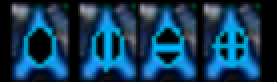
If you're not convinced, examine the following picture and ask yourself: when checking the minimap in the heat of battle, do you really care which of these icons has a line down the middle, or two lines, etc? Or do you simply want to know that there's an enemy here, and a friendly here?


https://s31.postimg....2z/newmap_3.jpg --- https://s32.postimg....dmap_canyon.jpg
Edited by Yosharian, 24 June 2016 - 11:17 AM.