Mw 3 Bar Style Damage Readout
#1
Posted 24 September 2014 - 11:30 AM
The default mech-representation damage readout is fine for starting out, and provides a quick reference for where you're getting hit, sure. But the problem is that the colors are incredibly vague about just how much damage you're taking, which is an especially large problem with Assaults. If I step into enemy fire, I need to know how quickly I'm taking damage, and how much. Is that yellow outline telling me I just got my paint scratched? Or did I just lose a quarter of my armor in one salvo?
It used to be in earlier mechwarrior games that you could toggle between layout-oriented damage readouts, and bar-oriented damage readouts. I propose that MWO would benefit from a similar feature, giving the oppertunity for clearer feedback on just how much damage you're taking in a fight.
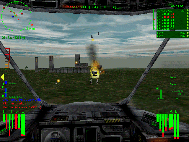
See how clear that is? Left arm gone, left front torso armor stripped. center torso doing fine. Under the yellow/orange/red system, all this would be far less obvious, at least to me.
In any event, since the game has to track these values regardless, and bar graphs are fairly modest in terms of artistic investment, I think it's a small tweak that could benefit gameplay greatly.
#2
Posted 24 September 2014 - 12:59 PM
#3
Posted 24 September 2014 - 01:11 PM
#4
Posted 25 September 2014 - 02:53 AM
Draykin, on 24 September 2014 - 12:59 PM, said:
it takes a bit to get used to but in the end once you understand it, you will never want to use anything else. At a quick glance you see exactly what is wrong with your `Mech with no guessing involved.
#5
Posted 25 September 2014 - 06:00 AM
#6
Posted 25 September 2014 - 06:25 AM
#7
Posted 25 September 2014 - 06:33 AM
#8
Posted 25 September 2014 - 06:35 AM
#9
Posted 25 September 2014 - 06:36 AM
#10
Posted 25 September 2014 - 11:46 AM
#11
Posted 25 September 2014 - 01:51 PM
Give me back my HTAL!!
Please!
#12
Posted 28 September 2014 - 07:30 PM
#13
Posted 28 September 2014 - 07:57 PM
But, alas, unless PGI would allow modding
and some kind soul would make such a mod,
we are stuck with "pretty colours".
#14
Posted 28 September 2014 - 10:54 PM
I always used the HTAL bars because they give you a much more clear picture of how much armor/internals health is remaining than "I think its kinda orange, i took .. maybe some damage?"
#15
Posted 29 September 2014 - 08:17 AM
#16
Posted 29 September 2014 - 08:32 AM
I'd like to see numbers, and have the numbers change as damage is delivered...
At least the read out for my mech.
ie
H 18
CT F 50
CT R xx
etc
#17
Posted 06 October 2014 - 07:50 PM
#18
Posted 17 October 2014 - 09:12 AM
Don't be too critical. I just did a quick image search and spent all of 10 seconds editing it. First, this image shows the targeted mech rather than the pilot's mech. I believe this level of detail should only be provided for your own mech, not the target mech. I like the current vague information about target mechs.
I only modified the arms in the image, but you get the Idea. As you take damage, the border or fill rises from the bottom up, showing the percentage of damage taken. So, in this image, the Right arm has lost about 30% of its armor while the left has lost closer to 70%
This way, you get the detailed information you want, but the readout still looks pretty and you don't lose that immersion. The color can still change as the bar fills up too, giving you a quick and accurate picture of your mech's state. I think this is the best of both worlds.
Edited by LiquidDivide, 17 October 2014 - 09:41 AM.
#19
Posted 17 October 2014 - 10:39 AM
LiquidDivide, on 17 October 2014 - 09:12 AM, said:
Don't be too critical. I just did a quick image search and spent all of 10 seconds editing it. First, this image shows the targeted mech rather than the pilot's mech. I believe this level of detail should only be provided for your own mech, not the target mech. I like the current vague information about target mechs.
I only modified the arms in the image, but you get the Idea. As you take damage, the border or fill rises from the bottom up, showing the percentage of damage taken. So, in this image, the Right arm has lost about 30% of its armor while the left has lost closer to 70%
u
This way, you get the detailed information you want, but the readout still looks pretty and you don't lose that immersion. The color can still change as the bar fills up too, giving you a quick and accurate picture of your mech's state. I think this is the best of both worlds.
That seems like a cool idea, though I'd make the armor outline start to dissapear, basically the visual opposite of your picture.
#20
Posted 17 October 2014 - 11:59 AM
Colby Boucher, on 17 October 2014 - 10:39 AM, said:
You could do this, but I think having a bunch of colors draws your attention to it more than having a mostly gray model. That way instead of flashing less and getting darker, the more you take damage it gets brighter and draws your focus to it more. Either way works, I suppose. I just think my original method is closer to what we have today and seems more realistic. It's not like your gas gauge empty light in your car is on normally and shuts off when you get near empty. As a problem occurs, it tries to draw your attention, not the other way around.
Edited by LiquidDivide, 17 October 2014 - 12:02 PM.
1 user(s) are reading this topic
0 members, 1 guests, 0 anonymous users