Jump to content

Any Good Artist Want To Redesign Insignia?


29 replies to this topic

#1 razenWing

    Member

  • PipPipPipPipPipPipPipPip
  • The Fearless
  • The Fearless
  • 1,694 posts

Posted 10 October 2016 - 10:37 PM

I know a lot of these insignia (banners) are dreamed up in the 80s. (Which, I guess is the whole point of the whole steampunk universe)

But, in 2016 (almost 17), it just seems out of date. Now, don't get me wrong, some icons do hold up against the passage of time. I think the Davion insignia is not too brazen, and portray the "protagonist" feel quite good.

The Rasalhague is also fairly good with the simple dark on dark coloration. (And house Marik is just... America. Funny how BTech imagine a free America ruled by dictators... but whatever I guess.) But man, ALL the clans have insignia that seemed to be designed by 5 year olds. I know they are based off of the whole "Soviet Red Army" thing, but that's going way overboard. I doubt even the modern Russian armies use insignia this embarrassing.

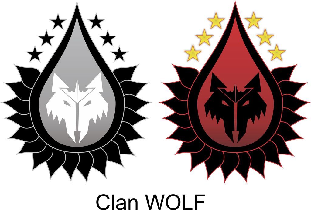
So this is a call to forum mega artists (and I know there's a lot out there) to redesign these insignia and show off your creativity. Give these pictures a proper update into the 21st century (even though it's 31st century combat... blah, you get the idea) with edgier and modern insignia.

---------------

This is slightly off-topic, but I've been wondering where theb33f got part of his old outro animation from, and apparently it's from this:


I think this is a far more modern take on imaging what Btech universe is like. And it's a nice departure from what Mechwarrior 4 portrays with the 80's sleeveless armor and all that campiness.

(there's a raging debate about Mechs vs Modern Military, and I think the difference in opinion really come from how they imagine the Universe. If you think along the line of DC Bruin's vision, you will totally agree that future is future, and just the concept of 31st century war machine should totally win out against our military. But I guess if you follow the school of Mechwarrior 4, then I guess I can totally see why you think you can one-shot a Mech cockpit with an M-1.)

(you can't)
---------------

PS before we detract into another Military vs BTech thread, what I am merely saying is the feel and presentation of the different vision of Btech Universe, and how different people take Btech lore differently. Please do not talk about whether an M-1 can ont-shot a Direwolf in this thread. Go to the other one. Use the DC Bruin as inspiration for new insignia... or go a different route. Go full campiness! I just want to see what you guys can come up with!

Edited by razenWing, 10 October 2016 - 10:42 PM.


#2 SnagaDance

    Member

  • PipPipPipPipPipPipPipPip
  • Little Helper
  • Little Helper
  • 1,860 posts
  • LocationThe Netherlands

Posted 11 October 2016 - 12:06 AM

The Marik eagle is America???

The Eagle has been in use as a state symbol for roughly 1500 years before the US even existed.

I like its angular look in BattleTech (find the decal in MWO a bit underwhelming). And that goes for a lot of the icons. Like Clan Wolf and Ghost Bear, excellent look IMO. Jade Falcon is ok but I find Smoke Jaguar to be pretty bad.

The thing is, flags/insignia are best when they are as simple as possible. That's why most flags in the world use 3 colors max and often feature very simple patterns. This makes them easier to identify at range (making it easier to 'project the power' of the symbol as well). It allows for people to easily make their own, for schoolchildren to draw them, etc. etc.

If you need to walk up real close to make out the inticrate symbol, it's not a very good symbol.

I get it, simple flags are boring in a fantasy/sci-fi universe, and modern techniques help to evolve the ease by which you can replicate a symbol but clear lines and a consistent composition help to make a good symbol and should always be taken into account.

If your symbol looks like it was designed through some computer graphics program it has already failed as a symbol (looking at you there new style MWO Clan icons that got shot down but have gotten a saving grace as alternate Clan decals). Maybe it's a fancy artictic interpretation of the actual symbol but it's not a valid symbol in its own right.

tldr: Form is great but should take Function into account. Posted Image

#3 El Bandito

    Member

  • PipPipPipPipPipPipPipPipPipPipPipPipPipPip
  • Big Daddy
  • Big Daddy
  • 26,736 posts
  • LocationStill doing ungodly amount of damage, but with more accuracy.

Posted 11 October 2016 - 12:37 AM

PGI tried new and more complex looking insignia. They kinda sucked.

IMO, FWL insignia looks just fine as is, especially since its model of government resembles USA the closest. And Thomas Marik is the best ruler in 3050's, bar none.

Edited by El Bandito, 11 October 2016 - 12:41 AM.


#4 razenWing

    Member

  • PipPipPipPipPipPipPipPip
  • The Fearless
  • The Fearless
  • 1,694 posts

Posted 11 October 2016 - 02:11 AM

View PostSnagaDance, on 11 October 2016 - 12:06 AM, said:

The Marik eagle is America???

The Eagle has been in use as a state symbol for roughly 1500 years before the US even existed.

I like its angular look in BattleTech (find the decal in MWO a bit underwhelming). And that goes for a lot of the icons. Like Clan Wolf and Ghost Bear, excellent look IMO. Jade Falcon is ok but I find Smoke Jaguar to be pretty bad.

The thing is, flags/insignia are best when they are as simple as possible. That's why most flags in the world use 3 colors max and often feature very simple patterns. This makes them easier to identify at range (making it easier to 'project the power' of the symbol as well). It allows for people to easily make their own, for schoolchildren to draw them, etc. etc.

If you need to walk up real close to make out the inticrate symbol, it's not a very good symbol.

I get it, simple flags are boring in a fantasy/sci-fi universe, and modern techniques help to evolve the ease by which you can replicate a symbol but clear lines and a consistent composition help to make a good symbol and should always be taken into account.

If your symbol looks like it was designed through some computer graphics program it has already failed as a symbol (looking at you there new style MWO Clan icons that got shot down but have gotten a saving grace as alternate Clan decals). Maybe it's a fancy artictic interpretation of the actual symbol but it's not a valid symbol in its own right.

tldr: Form is great but should take Function into account. Posted Image


I agree with the most part. That's why I like the Rasalhague insignia. I have far different opinion of ALL the Clan insignia though. I see 2 major routes in modern design philosophies. You either make it flat with sharp contrasting colors with lots of edge, or you give it subtle shadowing to make it pop out with more complex lines and shapes.

I think the Clan icons exhibit none of those.

#5 Vellron2005

    Member

  • PipPipPipPipPipPipPipPipPipPip
  • The Blood-Eye
  • The Blood-Eye
  • 5,444 posts
  • LocationIn the mechbay, telling the techs to put extra LRM ammo on.

Posted 11 October 2016 - 02:12 AM

Uuuuu, now there's a challenge!

How much creative freedom to we designers get?

Do the new logos must be reminiscent of the old ones, or do we get to make them from scratch, completely disregarding the old one's guidelines?

#6 razenWing

    Member

  • PipPipPipPipPipPipPipPip
  • The Fearless
  • The Fearless
  • 1,694 posts

Posted 11 October 2016 - 02:14 AM

View PostVellron2005, on 11 October 2016 - 02:12 AM, said:

Uuuuu, now there's a challenge!

How much creative freedom to we designers get?

Do the new logos must be reminiscent of the old ones, or do we get to make them from scratch, completely disregarding the old one's guidelines?


Go nuts, bud! Anything you want =)

#7 Vellron2005

    Member

  • PipPipPipPipPipPipPipPipPipPip
  • The Blood-Eye
  • The Blood-Eye
  • 5,444 posts
  • LocationIn the mechbay, telling the techs to put extra LRM ammo on.

Posted 11 October 2016 - 04:17 AM

Well, here's a first draft of the Clan Wolf logo, done quickly at work..

The Wolf represents, well, the wolves, the teardrop shape represents clan blood superiority, while the stars represent ancient Kerensky military might. The serration is just for visual impact ;-)

Naturally, full color, and B/W variants..


Posted Image


Its a simple, 2-dimensional design.

I could play with it some more, make it 3D or play a bit more with the color and shading, but you get the idea..

Edited by Vellron2005, 11 October 2016 - 04:35 AM.


#8 FLG 01

    Member

  • PipPipPipPipPipPipPipPipPip
  • Leutnant
  • Leutnant
  • 2,646 posts

Posted 11 October 2016 - 05:20 AM

I am not an artist, but here is my take on ComStar:

Posted Image

It is obviously inspired by stained glass, since ComStar was a pseudo-religious order taking inspiration from the medieval church.

Find more here:
http://bg.battletech...p?topic=47591.0

Edited by FLG 01, 11 October 2016 - 05:22 AM.


#9 Karl Streiger

    Member

  • PipPipPipPipPipPipPipPipPipPipPipPipPip
  • Wrath
  • Wrath
  • 20,369 posts
  • LocationBlack Dot in a Sea of Blue

Posted 11 October 2016 - 05:27 AM

View PostEl Bandito, on 11 October 2016 - 12:37 AM, said:

PGI tried new and more complex looking insignia. They kinda sucked.

IMO, FWL insignia looks just fine as is, especially since its model of government resembles USA the closest. And Thomas Marik is the best ruler in 3050's, bar none.

Didn't know you have civilian unrest on a yearly basis Posted Image
Of course, Thomas is the best leader. His bloodline is not those of maneaters, psychopaths and narcissist and other sociopaths that call themselves rulers.

Nevertheless redemption is close

#10 razenWing

    Member

  • PipPipPipPipPipPipPipPip
  • The Fearless
  • The Fearless
  • 1,694 posts

Posted 11 October 2016 - 07:29 AM

View PostVellron2005, on 11 October 2016 - 04:17 AM, said:

Well, here's a first draft of the Clan Wolf logo, done quickly at work..

The Wolf represents, well, the wolves, the teardrop shape represents clan blood superiority, while the stars represent ancient Kerensky military might. The serration is just for visual impact ;-)

Naturally, full color, and B/W variants..


Posted Image


Its a simple, 2-dimensional design.

I could play with it some more, make it 3D or play a bit more with the color and shading, but you get the idea..


This is instantly 100x better than the current Wolf insignia, kudos!! Love it. That's what I mean by modernized design. Can't wait for your work on others =)

View PostFLG 01, on 11 October 2016 - 05:20 AM, said:

I am not an artist, but here is my take on ComStar:

Posted Image

It is obviously inspired by stained glass, since ComStar was a pseudo-religious order taking inspiration from the medieval church.

Find more here:
http://bg.battletech...p?topic=47591.0


Very cool too, but The tail dragged on a bit too long and becomes a sort of distraction. Or perhaps I'm looking at it wrong, and it's more of a staff with the sphere not the focal point? Either way, cool design man!

#11 Aleksandr Sergeyevich Kerensky

    Member

  • PipPipPipPipPipPipPipPip
  • 1,187 posts

Posted 11 October 2016 - 07:37 AM

I like the campiness of the 80s!!!

Why is everything now adays about reboots...

Pfft... Darn wippersnappers!

In my day, we had to climb up and down the mountain to hunt dinosaurs because fast food is lostech!

#12 FLG 01

    Member

  • PipPipPipPipPipPipPipPipPip
  • Leutnant
  • Leutnant
  • 2,646 posts

Posted 11 October 2016 - 07:52 AM

View PostrazenWing, on 11 October 2016 - 07:29 AM, said:

Very cool too, but The tail dragged on a bit too long and becomes a sort of distraction. Or perhaps I'm looking at it wrong, and it's more of a staff with the sphere not the focal point? Either way, cool design man!


It is a bit long indeed. I remember when I created it I was not happy with it being shorter though. Perhaps it would look better if shortened (which is not a problem).

However it is not what I usually do anyway. I am more concerned with unit insignia. While they are also subjected to zeitgeisty tastes I always ask myself: how would this look on a military vehicle? How would this look when worn as an embroidered patch on a uniform? With that in mind, my interpretation of the ComStar insignia would look quite different.
So here is a better representation of what I usually do (and prefer), simple and clear designs like this:


Posted Image
3rd Lyran Guards

Edited by FLG 01, 11 October 2016 - 07:53 AM.


#13 RestosIII

    Member

  • PipPipPipPipPipPipPipPipPipPip
  • The 1 Percent
  • The 1 Percent
  • 7,322 posts
  • LocationDelios

Posted 11 October 2016 - 08:05 AM

I'll admit, the Diamond Shark main logo hasn't aged very well. Would LOVE to see a modern version. But I'm also incapable of drawing a stick figure that looks good, let alone making a proper logo.

Also, GJ to everyone so far, those all look really damn good.

#14 JC Daxion

    Member

  • PipPipPipPipPipPipPipPipPipPip
  • Liquid Metal
  • Liquid Metal
  • 5,230 posts

Posted 11 October 2016 - 08:13 AM

Maybe it is me just projecting, but Marik kinda reminds me of the old third reich symbol.. make it red, and turn the head in the other direction.. Doesn't seam all that american to me, but i guess we all see things from a unique point of view.

#15 FLG 01

    Member

  • PipPipPipPipPipPipPipPipPip
  • Leutnant
  • Leutnant
  • 2,646 posts

Posted 11 October 2016 - 09:55 AM

View PostJC Daxion, on 11 October 2016 - 08:13 AM, said:

Maybe it is me just projecting, but Marik kinda reminds me of the old third reich symbol..


And why would that be? Posted Image

Posted Image
(Quick and dirty, so no quality here).


In all seriousness, you could make pretty much everything look evil by using this paint scheme. (in order to avoid any historical and philosophical debates which almost certainly turn sour soon, we better do not explore why that is).

Edited by FLG 01, 11 October 2016 - 09:55 AM.


#16 Bombast

    Member

  • PipPipPipPipPipPipPipPipPipPip
  • Legendary Founder
  • Legendary Founder
  • 7,709 posts

Posted 11 October 2016 - 10:05 AM

For the most part, I think the faction symbols just need to be made a bit more simple. The ones that look worst are the ones that are busiest.

I'd try my hand at simplifying them, but I have the artistic skill of a drunk 3 year old.

#17 razenWing

    Member

  • PipPipPipPipPipPipPipPip
  • The Fearless
  • The Fearless
  • 1,694 posts

Posted 11 October 2016 - 12:19 PM

View PostFLG 01, on 11 October 2016 - 09:55 AM, said:


And why would that be? Posted Image

Posted Image
(Quick and dirty, so no quality here).


In all seriousness, you could make pretty much everything look evil by using this paint scheme. (in order to avoid any historical and philosophical debates which almost certainly turn sour soon, we better do not explore why that is).


To be fair, that looks more like a fat dove than an eagle. Posted Image

I know the Marik Eagle is similar in pose to the 3rd Reich Eagle, but according to lore, with the mixture of races and religions, Marik is at least in practice an attempt by the lore writers to emulate America, than {Godwin's Law} Germany. (The Civil War can also be explained by... well.. the American Civil War?)

(Though again, I think the writer messed up big time in that... you can't have a house that practice the idea of freedom ruled by a dictator. Politics don't work that way.)

#18 FLG 01

    Member

  • PipPipPipPipPipPipPipPipPip
  • Leutnant
  • Leutnant
  • 2,646 posts

Posted 11 October 2016 - 12:44 PM

View PostrazenWing, on 11 October 2016 - 12:19 PM, said:

To be fair, that looks more like a fat dove than an eagle. Posted Image


Not my fault. I just swapped the colours of the old canon insignia. I also like the HBS rendition better.

Anyway the colour swap was a joke, not a serious comparison as explained already. I think those comparisons are pointless, especially if they are based on purely superficial similarities. The BT factions are inspired by a multitude of influences, and it is flatout wrong to say a faction of BT is just a real world faction in space.

#19 Imperius

    Member

  • PipPipPipPipPipPipPipPipPipPip
  • The God
  • The God
  • 5,747 posts
  • LocationOn Reddit and Twitter

Posted 11 October 2016 - 01:49 PM

View PostRestosIII, on 11 October 2016 - 08:05 AM, said:

I'll admit, the Diamond Shark main logo hasn't aged very well. Would LOVE to see a modern version. But I'm also incapable of drawing a stick figure that looks good, let alone making a proper logo.

Also, GJ to everyone so far, those all look really damn good.

Posted Image

I might take a stab at it. I made this for my old gaming community.

#20 Wolf Ender

    Member

  • PipPipPipPipPipPip
  • 495 posts
  • Google+: Link
  • LocationSacramento, California

Posted 11 October 2016 - 01:54 PM

do not mess with the classic Clan Wolf logo. It's the best one.


5 user(s) are reading this topic

0 members, 5 guests, 0 anonymous users