 Mark Nicholson, on 12 November 2016 - 03:22 PM, said:
I like my warheads sour, not bitter! ew!
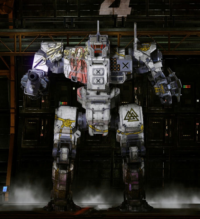
Lily, The supernova arms closely match the concept art on the store page, and I would definitely not describe them as 'stubby' in any way.
I dunno, you always make these concept arts in such a angle it is hard to describe how stubby they really turn out. There were serveral ddiscussions about soem chassis in the past about how they did end up different than the artworks, especially when it came to weapons and arms.

the suopernova is sexy becaue it has that sleek arms by the relations of length and diameter, the cocnept art make them look a lot more "fat" atm.
and you can see already that the lower 3 energy wepaons in the concept art are not actually correctly as they clearly are not a square, instead are a rectangle, that makes the concept are untrusty to begin with by.
Especially when looking and seeing which part of th concept art is the dynamic weapon itelf it will amke many loadout choices look horrible. Unless you plan to make a covering around these wepaons so the weapons are IN the arm with just the tip peaking out.
I made a cheap paint

adding a coverage much further forward that covers whatever weapon is placed there will the arm always make look awesome even if noweapon is equipped. But when those wepaon parts will be missing thats going to look very bad.
The mech is thereore running into the potential of being gimped by the dynamic geometry as the amazign centurion and his gret looking arm once was.
adding a prmanent coverage to some meches arms would have saved some to become ugly with the dynamic geometry (especially Ac 2 and 5 ones).
Edited by Lily from animove, 12 November 2016 - 04:08 PM.
 RestosIII, on 12 November 2016 - 10:15 AM, said:


