Jump to content

Scorch Camo Not As Expected


91 replies to this topic

#61 jjm1

    Member

  • PipPipPipPipPipPipPipPip
  • Hell Fork
  • Hell Fork
  • 1,384 posts

Posted 15 December 2016 - 10:44 PM

View PostRestosIII, on 15 December 2016 - 10:35 PM, said:

Am I the only one that really loves the (S) camo? Every time I see it I get a huge urge to grab the .Marauder IIC finally. And what do you have against the Star Adder dekkle?


My only problem with the (S) is that its competing with the default scheme for the blandness award.

Its a dirty flat white and has an ever so slight metallic sheen visible if you paint it dark. If you ask me it should have been full on reflective metal like the Jade Falcon scheme has.

#62 Dee Eight

    Member

  • PipPipPipPipPipPipPipPipPipPip
  • Big Daddy
  • Big Daddy
  • 6,271 posts

Posted 15 December 2016 - 10:51 PM

View PostRestosIII, on 15 December 2016 - 10:35 PM, said:

Am I the only one that really loves the (S) camo? Every time I see it I get a huge urge to grab the .Marauder IIC finally. And what do you have against the Star Adder dekkle?


NOT the decal....the pattern unlock....

#63 RestosIII

    Member

  • PipPipPipPipPipPipPipPipPipPip
  • The 1 Percent
  • The 1 Percent
  • 7,322 posts
  • LocationDelios

Posted 15 December 2016 - 10:53 PM

View PostDee Eight, on 15 December 2016 - 10:51 PM, said:


NOT the decal....the pattern unlock....


Oh FML, this is what I get for posting late at night. I thought you were referring to the pre-order dekkle, not the pattern called "Crusader". I take it back, sorry.

#64 Dee Eight

    Member

  • PipPipPipPipPipPipPipPipPipPip
  • Big Daddy
  • Big Daddy
  • 6,271 posts

Posted 15 December 2016 - 11:12 PM

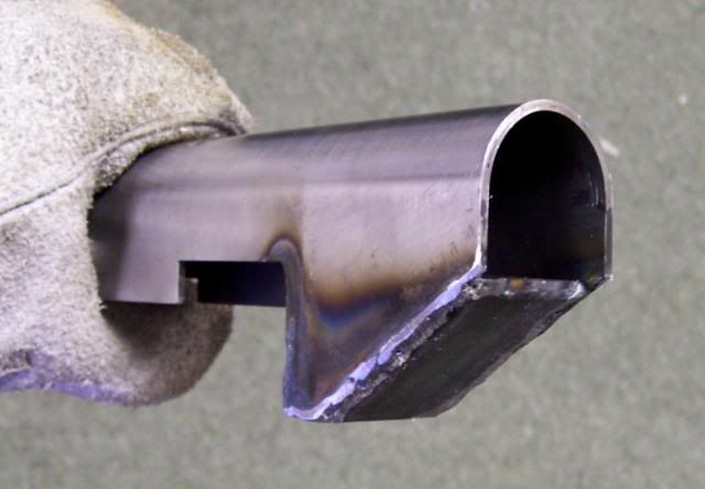
As to the locked color channels... clearly those who don't like it haven't ever welded or taken a torch to steel (and probably haven't worked with their hands at all either.... buncha nansies). The PGI artists have delivered a brilliant looking copy of heat discoloration.

Edited by Dee Eight, 15 December 2016 - 11:16 PM.


#65 BumbleBee

    Member

  • PipPipPipPipPipPipPip
  • Bad Company
  • Bad Company
  • 536 posts

Posted 15 December 2016 - 11:45 PM

Posted Image

#66 Sagamore

    Member

  • PipPipPipPipPipPipPip
  • The Blood Bound
  • The Blood Bound
  • 930 posts
  • LocationCanada

Posted 15 December 2016 - 11:51 PM

Looks almost as bland as the exclusive Project Phoenix camos (which I am finally able to change, thank god).

#67 NeoCodex

    Member

  • PipPipPipPipPipPipPip
  • The Predator
  • The Predator
  • 799 posts

Posted 16 December 2016 - 12:13 AM

View PostrazenWing, on 15 December 2016 - 06:46 PM, said:

I was going to order the Supernova champion because of the galaxy paint job. But if they botch the Scorch paint scheme this bad, I am so afraid that the Supernova galaxy will turn into some sort of sickly chicken pox paint.

So now I am going to wait till Feb. to see what it really looks like in game before any purchases.


Yeah, I bet they will botch those too. What we've seen from MAD I expect Supernova camos to be nothing like the concepts, that one looks even trickier than the MAD specials. Such beautiful concepts but terrible execution. Scorch is literally MSPaint quality.

What the Supernova special reminds me of and I think should look like is the GW2 legendary axe Astralaria:

Posted Image

Posted Image

It has a really interesting 2D inside 3D effect and pretty much spot on what the Supernova special is going for. I doubt they will pull of anything close to this on the Supernova, as it looks even more trickier as some parts on the concept look like they have an iridescent transition combined with this.

I expect SPN to be barebones look with a simple 2 color mat gradient on one of the channels just as bad as the MAD special, add some snowflakes to it and that's it.

Posted Image

Edited by NeoCodex, 16 December 2016 - 12:31 AM.


#68 jjm1

    Member

  • PipPipPipPipPipPipPipPip
  • Hell Fork
  • Hell Fork
  • 1,384 posts

Posted 16 December 2016 - 12:33 AM

View PostBumbleBee, on 15 December 2016 - 11:45 PM, said:

Posted Image


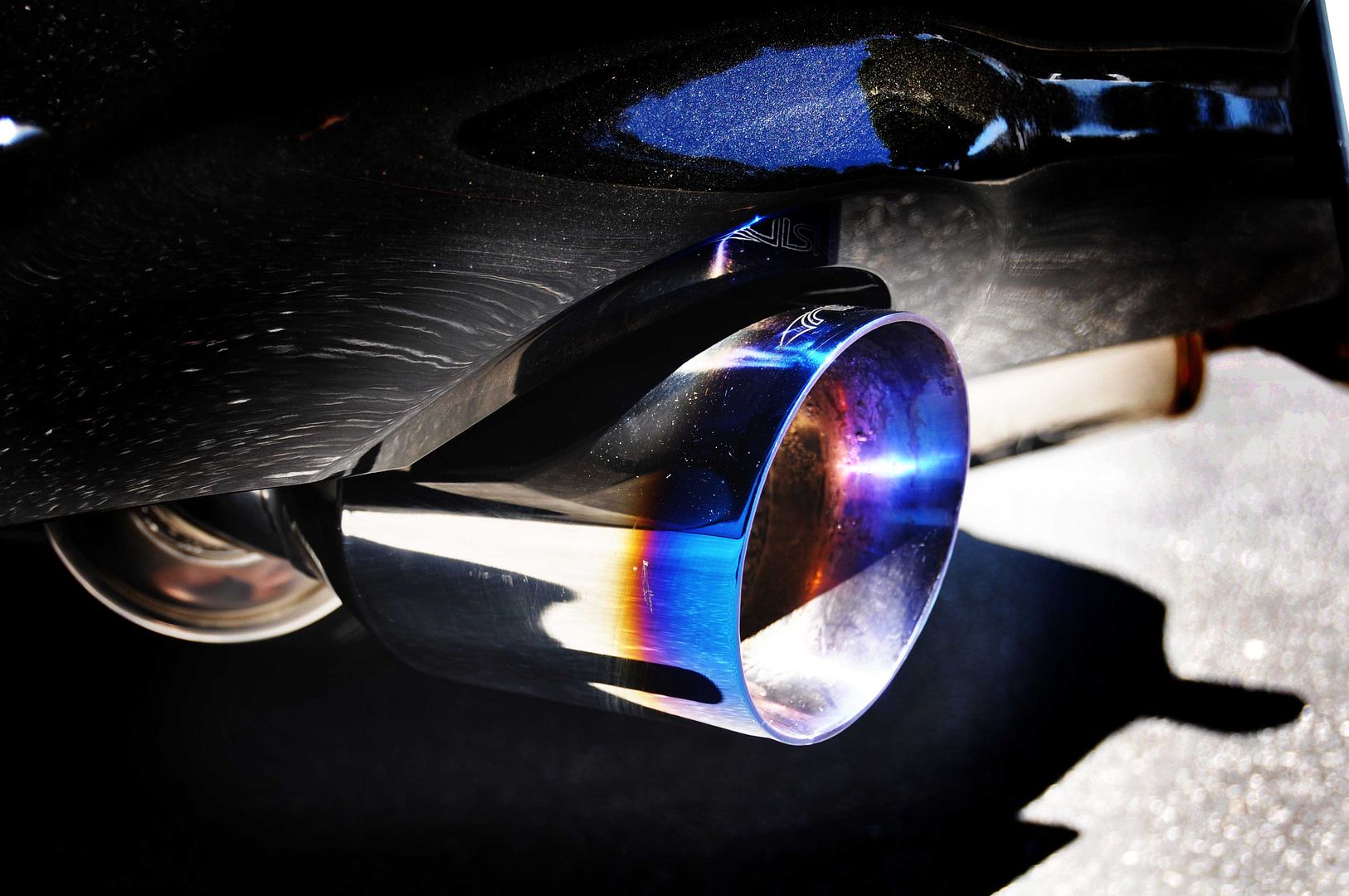
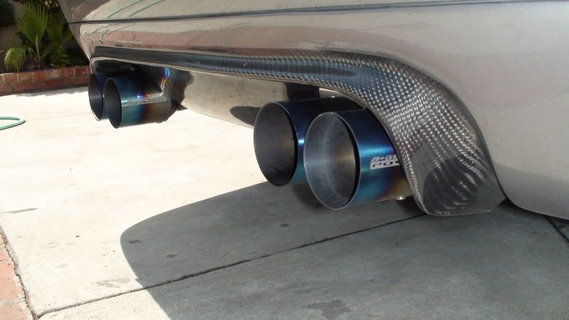
image search for burnt titanium. Its clearly the intended look based on the concept art.

#69 NeoCodex

    Member

  • PipPipPipPipPipPipPip
  • The Predator
  • The Predator
  • 799 posts

Posted 16 December 2016 - 01:09 AM

View Postjjm1, on 16 December 2016 - 12:33 AM, said:


image search for burnt titanium. Its clearly the intended look based on the concept art.


No, the they went for this instead:

Posted Image

But it just didn't come out well. Should be more vivid.

#70 NeoCodex

    Member

  • PipPipPipPipPipPipPip
  • The Predator
  • The Predator
  • 799 posts

Posted 16 December 2016 - 01:13 AM

It's close but the materials and colors are just not right.

Posted Image

View Postprocess, on 13 December 2016 - 06:34 PM, said:

Posted Image

Posted Image


First of all, the camo needs a different material/shader pass and the two burnt channels should have an iridescent gradient effect, melting into eachother like they do on the MAD special and ghost bear patterns. As it is now it's just a poor sketch, and it needs a more glossy shader first. I don't think their texture artists are working with shaders, they just make the textures.. That's why it is the way it is.

Edited by NeoCodex, 16 December 2016 - 01:17 AM.


#71 jjm1

    Member

  • PipPipPipPipPipPipPipPip
  • Hell Fork
  • Hell Fork
  • 1,384 posts

Posted 16 December 2016 - 02:03 AM

View PostNeoCodex, on 16 December 2016 - 01:09 AM, said:


No, the they went for this instead:

Posted Image

But it just didn't come out well. Should be more vivid.


but ...that's the most common result if you search for burnt titanium. So you mean yes.

#72 Zieten

    Member

  • PipPipPipPipPip
  • Ace Of Spades
  • Ace Of Spades
  • 139 posts

Posted 16 December 2016 - 02:11 AM

If only it looked anything like this, I guess nobody would be complaing (or..maybe a few..if no one is complaining something's wrong).

#73 NeoCodex

    Member

  • PipPipPipPipPipPipPip
  • The Predator
  • The Predator
  • 799 posts

Posted 16 December 2016 - 02:59 AM

It doesn't matter if it follows the burned muffler tip idea or not, yes it does, but It's, just... such a bad attempt. Literally no effort put in. It's so bad it hurts looking at it. Both hero and Special need a material/shader overhaul. They did it for FRR camos once but that was just a simple shader change, this one needs a lot more work to become anything close to the concept art. It is just too far apart from the concept.

Edited by NeoCodex, 16 December 2016 - 03:00 AM.


#74 jss78

    Member

  • PipPipPipPipPipPipPipPipPip
  • Philanthropist
  • Philanthropist
  • 2,575 posts
  • LocationHelsinki

Posted 16 December 2016 - 03:48 AM

I like the Metallurgy 101 in this thread.

Posted Image

#75 Dee Eight

    Member

  • PipPipPipPipPipPipPipPipPipPip
  • Big Daddy
  • Big Daddy
  • 6,271 posts

Posted 16 December 2016 - 05:52 AM

The second and third color channels of the special's camo blend together.

#76 Bandilly

    Member

  • PipPipPipPipPipPipPip
  • The Deadly
  • The Deadly
  • 635 posts

Posted 16 December 2016 - 06:20 AM

I think it does look burnt as intended, but it's definitely not as bright or flashy as it could be, orcas the concept. With his dull gray base color Scorch just looks like a big grey blob on the field. Color locking most of the pattern is also odd and is hurting it since we can't brighten the highlights up ourselves.

#77 JinSR

    Member

  • PipPip
  • Ace Of Spades
  • Ace Of Spades
  • 32 posts

Posted 16 December 2016 - 05:27 PM

Can we tag art devs in this?? I really do want to get this looked at

#78 Alex Morgaine

    Member

  • PipPipPipPipPipPipPipPipPip
  • Bad Company
  • Bad Company
  • 2,049 posts

Posted 16 December 2016 - 06:18 PM

View PostRestosIII, on 15 December 2016 - 10:23 PM, said:


Congratulations! You've now completed the initiation process of becoming a forum warrior by finally making a complaint! You chose well on where to finally speak up, because lord the Scorch looks bad. Here, have these pastries as a welcoming present.

Posted Image


They taste good :3

#79 Navid A1

    Member

  • PipPipPipPipPipPipPipPipPip
  • CS 2022 Gold Champ
  • CS 2022 Gold Champ
  • 4,954 posts

Posted 16 December 2016 - 06:27 PM

View PostDee Eight, on 15 December 2016 - 11:12 PM, said:

As to the locked color channels... clearly those who don't like it haven't ever welded or taken a torch to steel (and probably haven't worked with their hands at all either.... buncha nansies). The PGI artists have delivered a brilliant looking copy of heat discoloration.


ooohh... so much hate!

One of the things you should know about MWO is that its player base are way older and have real lives and specialties compared to your average understanding of an online game community!

Also... you will never be a moderator with so much hate in you! Posted Image

#80 RestosIII

    Member

  • PipPipPipPipPipPipPipPipPipPip
  • The 1 Percent
  • The 1 Percent
  • 7,322 posts
  • LocationDelios

Posted 16 December 2016 - 09:09 PM

View PostNavid A1, on 16 December 2016 - 06:27 PM, said:


ooohh... so much hate!

One of the things you should know about MWO is that its player base are way older and have real lives and specialties compared to your average understanding of an online game community!

Also... you will never be a moderator with so much hate in you! Posted Image


He also ignores me ingame when I say hello during matches. Which is incredibly rude of a Forum Warrior to do. I say we kick him out of town!


10 user(s) are reading this topic

0 members, 10 guests, 0 anonymous users