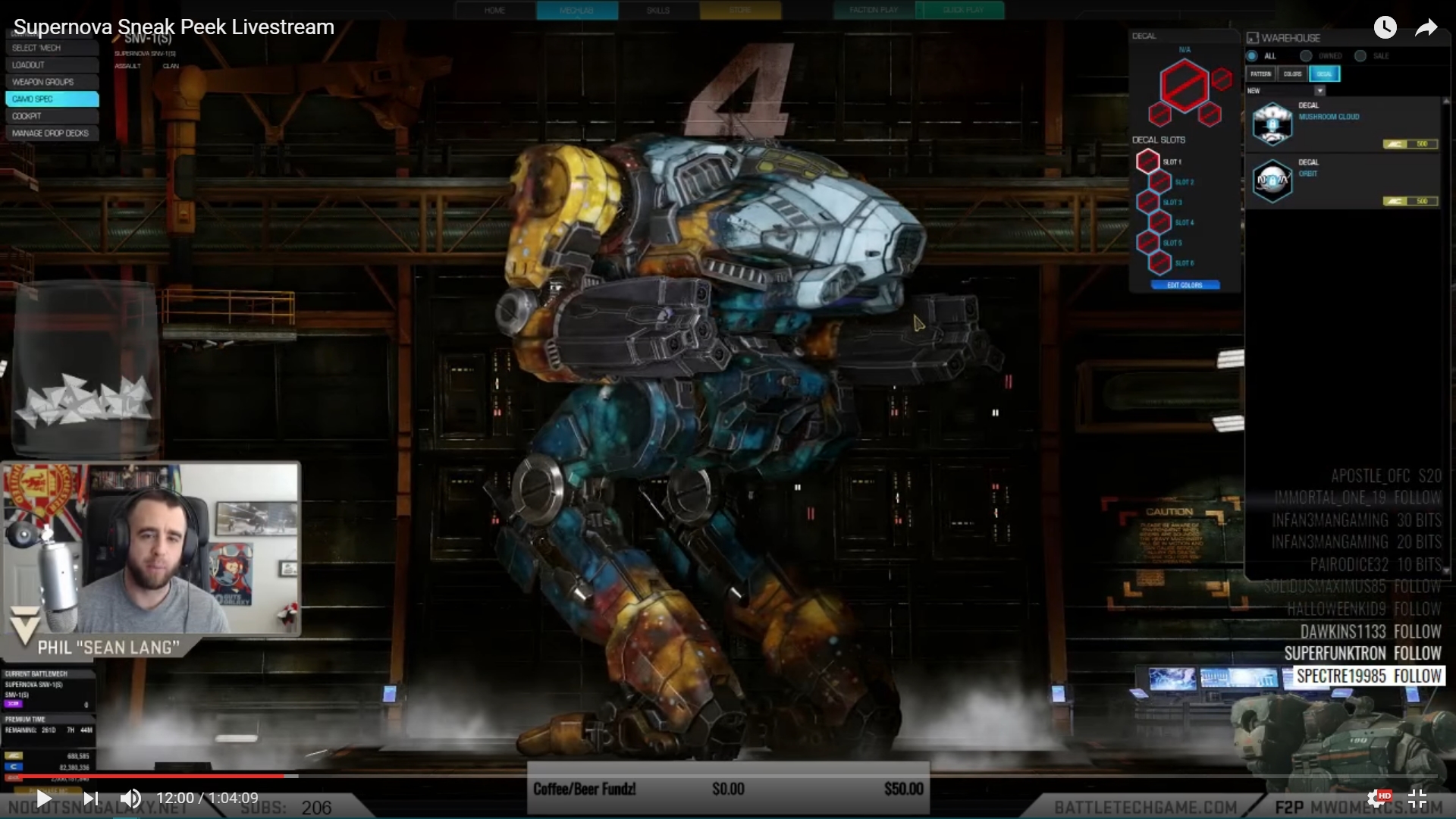
Can Anyone Post Screenshot Of The Special Variant Screenshot?
Started by razenWing, Feb 21 2017 03:59 PM
8 replies to this topic
#1
Posted 21 February 2017 - 03:59 PM
I don't want to buy it if it's going to be ugly like the Scorch.
I need to see if it's all "galaxy-like" before I make up my mind.
Thanks!
I need to see if it's all "galaxy-like" before I make up my mind.
Thanks!
#2
Posted 21 February 2017 - 04:24 PM
Better than Scorch, no I dont have anything but the Supernova standard pack but it does look better. Also didnt someone from PGI (Tina, that artist girl, Lauren?) say that they will update the Scorch paintjob and make it more gradiant possibly, in a later update?
#3
Posted 21 February 2017 - 05:32 PM
 Tordin, on 21 February 2017 - 04:24 PM, said:
Better than Scorch, no I dont have anything but the Supernova standard pack but it does look better. Also didnt someone from PGI (Tina, that artist girl, Lauren?) say that they will update the Scorch paintjob and make it more gradiant possibly, in a later update?
Im not sure about the last statement unless someone can confirm it. But all they did 2 patches ago was to unlock the color ring as customizable color channels... as if we just wanted to tweak how metal would look under fire...
I have the standard pack right now as well. One of my consideration for possibly purchasing the my first ever collector pack (which, basically 20 dollars for the special variant that offer no special quirk, no special hardpoint, and no special equipment... basically just whether 20 dollars is worth it to look better) is the magnificent Galaxy paintjob. (probably best ever... in terms of concept art)
I know they posted a side screenshot of one in action. But I like to see a full size screen shot in mechlab without all the obstructions to see what it really looks like.
Edited by razenWing, 21 February 2017 - 05:32 PM.
#4
Posted 21 February 2017 - 05:34 PM
 Tordin, on 21 February 2017 - 04:24 PM, said:
Better than Scorch, no I dont have anything but the Supernova standard pack but it does look better. Also didnt someone from PGI (Tina, that artist girl, Lauren?) say that they will update the Scorch paintjob and make it more gradiant possibly, in a later update?
"that artist girl"
Um...nevermind.
#8
Posted 21 February 2017 - 06:31 PM
What irritates me is the selection of color channels. You look at it and think, "gee, three color channels. So, the Blue Nebula, the Chest, and the Orange Nebula. Noooope. You get the Chest, the Blue Nebula, and... the Stars. You are stuck with that orange color. All across your feet and completely covering your back. 
#9
1 user(s) are reading this topic
0 members, 1 guests, 0 anonymous users


