Jump to content

Clan Nova Cat Logo


35 replies to this topic

Poll: Clan Nova Cat Logo (40 member(s) have cast votes)

Do you think that the Clan Nova Cat logo needs to be redesigned?

  1. Aff, redesign the logo to make it a bit more traditional. (35 votes [87.50%])

    Percentage of vote: 87.50%

  2. Neg, it is fine the way it is. (5 votes [12.50%])

    Percentage of vote: 12.50%

Vote

#1 Will9761

    Member

  • PipPipPipPipPipPipPipPipPip
  • Big Brother
  • Big Brother
  • 4,657 posts

Posted 15 July 2017 - 05:09 PM

VICTORY!

Posted Image

Thank you all for your support in making this happen.


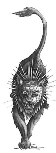
I want to bring the attention of the Clan Nova Cat logo. So far the complaint is that it looks more like a "Nova Bat" instead of the Clan totem of which it was based on. As happy as I am to see new Clans come into the game, I do agree that the logo itself does need a minor tweak to be a bit more traditional.
Posted Image
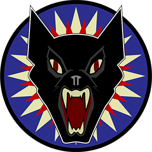
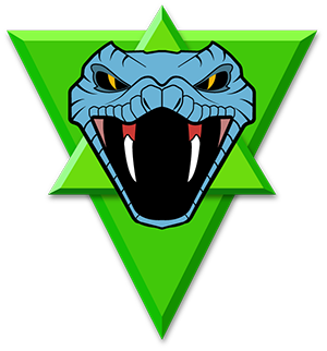
What makes it stranger, is that PGI was right on the money when it came to Clan Steel Viper's modernized logo (minus the scales). So if they could get the Steel Vipers to be accurate, why not the Nova Cats?
Posted ImagePosted Image

This is not the first rodeo that PGI did with the decals, as we all remember the massive backlash of the "revamped logos" from the past.
Posted Image

Eventually they did change it to keep it traditional while still being modernized:
Posted Image

So what do you think about the Nova Cat logo, do you think it should be tweaked or stay as it is?
Posted ImagePosted Image

Edited by Will9761, 21 July 2017 - 12:01 PM.


#2 Pariah Devalis

    Member

  • PipPipPipPipPipPipPipPipPipPip
  • The Clan Cat
  • The Clan Cat
  • 7,655 posts
  • Google+: Link
  • Twitter: Link
  • LocationAboard the NCS True Path

Posted 15 July 2017 - 05:24 PM

As it currently is, it's all sorts of .... Let us just say it needs some serious revisions. LastKhan did some quick ones, and improved it tremendously by filling in the eyebrows, widening the jaw, and adding the whiskers back in. However, how it is now is just... ugh.

I feel bad for whoever drew it, but, please.... Just because you can redesign something does not mean you should.

Edited by Pariah Devalis, 15 July 2017 - 05:44 PM.


#3 Will9761

    Member

  • PipPipPipPipPipPipPipPipPip
  • Big Brother
  • Big Brother
  • 4,657 posts

Posted 15 July 2017 - 06:17 PM

This is the first logo tweak for the Nova Cats by LastKhan with a more traditional feline appearance:
Posted Image

This is the second logo tweak by LastKhan with the sideways ears:
Posted Image

Thanks to LastKhan for the images.

#4 Y E O N N E

    Member

  • PipPipPipPipPipPipPipPipPipPipPipPip
  • The Nimble
  • The Nimble
  • 16,810 posts

Posted 15 July 2017 - 06:30 PM

Hello, hi. I have fixed it. Here is my submission:
Spoiler


...yes, they absolutely need to fix the Nova Cat emblem. It is only the background splash that makes it recognizable at all.

#5 chucklesMuch

    Member

  • PipPipPipPipPipPipPipPip
  • Shredder
  • Shredder
  • 1,424 posts
  • Google+: Link
  • LocationNew Zealand

Posted 15 July 2017 - 06:39 PM

View PostYeonne Greene, on 15 July 2017 - 06:30 PM, said:

Hello, hi. I have fixed it. Here is my submission:
Spoiler


...yes, they absolutely need to fix the Nova Cat emblem. It is only the background splash that makes it recognizable at all.


Lol...

Yup -they either need to update name and add nova bat 'lore' or use a cat image instead of a bat...

Edited by chucklesMuch, 15 July 2017 - 06:40 PM.


#6 Will9761

    Member

  • PipPipPipPipPipPipPipPipPip
  • Big Brother
  • Big Brother
  • 4,657 posts

Posted 15 July 2017 - 06:41 PM

Holy Hotfix, Batman! This will be perfect!

Oh, how I wish the Batman logo was in the game, I would fight alongside anyone wearing it with my Robin " The Blackjack Wonder".
Posted Image

#7 Will9761

    Member

  • PipPipPipPipPipPipPipPipPip
  • Big Brother
  • Big Brother
  • 4,657 posts

Posted 15 July 2017 - 06:56 PM

Just to remind anyone interested, if you do not like Clan Nova Bat, feel free to vote.

#8 Lucian Nostra

    Member

  • PipPipPipPipPipPipPipPip
  • Overlord
  • Overlord
  • 1,659 posts

Posted 15 July 2017 - 07:14 PM

Aiiiie like in the other thread it's far better than the original redo's PGI did but they could use some more work for sure. Still glad we got added, didn't notice this till it was pointed out!

Edited by Lucian Nostra, 15 July 2017 - 07:15 PM.


#9 Tarogato

    Member

  • PipPipPipPipPipPipPipPipPipPip
  • Civil Servant
  • Civil Servant
  • 6,557 posts
  • LocationUSA

Posted 15 July 2017 - 08:11 PM

I think the colours bother me the most.

But the teeth are too big, the nose is wrong, and the ears are too big. And maybe the jawline is a bit off.

#10 Will9761

    Member

  • PipPipPipPipPipPipPipPipPip
  • Big Brother
  • Big Brother
  • 4,657 posts

Posted 15 July 2017 - 09:09 PM

I will post this thread on twitter to show that people want the Nova Cat logo to be tweaked.

#11 Will9761

    Member

  • PipPipPipPipPipPipPipPipPip
  • Big Brother
  • Big Brother
  • 4,657 posts

Posted 15 July 2017 - 09:23 PM

Message sent: https://twitter.com/...454163344961536

#12 Hawk819

    Member

  • PipPipPipPipPipPipPipPip
  • The Tip of the Spear
  • The Tip of the Spear
  • 1,634 posts
  • Location666 Werewolf Lane. Transylvania, Romania Ph#: Transylvania 6-5000

Posted 16 July 2017 - 12:54 AM

It's a question of resolutions. However, it's a big difference between a decal's resolution and the cockpit hanging items. We must remember one of them is smaller than the other. I agree, it's not what we'd like it to be, and to some, it needs changing to fit our desires for a better emblem for the units we love. If they can fix it, then I say this, do so. If not, then I must say that we have to accept it and move on.

Now as for the hologram, we'll have to see how that turns out, and the same with the warhorn that is forthcoming in a later patch.

#13 Reno Blade

    Member

  • PipPipPipPipPipPipPipPipPip
  • The Blade
  • The Blade
  • 3,459 posts
  • LocationGermany

Posted 16 July 2017 - 03:11 AM

One downside with the side-ears is that Cat looks more frightened/defensive.
Not sure if Cats have distinct ear-movements for aggressiveness or defensive posture...

And the Bat looks almost like a pitbull ...

The jaw is too wide and pushed the nose so high it looks like a bat or dog.

And the stars in the background look like the Voodoo neck of the Diablo3 Witchdoktor.

Personally, I'd be perfectly fine with the one in the Signature of Pariah Devalis.

#14 Pariah Devalis

    Member

  • PipPipPipPipPipPipPipPipPipPip
  • The Clan Cat
  • The Clan Cat
  • 7,655 posts
  • Google+: Link
  • Twitter: Link
  • LocationAboard the NCS True Path

Posted 16 July 2017 - 07:04 AM

View PostReno Blade, on 16 July 2017 - 03:11 AM, said:

One downside with the side-ears is that Cat looks more frightened/defensive.
Not sure if Cats have distinct ear-movements for aggressiveness or defensive posture...

And the Bat looks almost like a pitbull ...

The jaw is too wide and pushed the nose so high it looks like a bat or dog.

And the stars in the background look like the Voodoo neck of the Diablo3 Witchdoktor.

Personally, I'd be perfectly fine with the one in the Signature of Pariah Devalis.


When a cat is angry, it tends to flatten its ears. The original logo art from BT didn't have that, so it isn't a make or break for me, just that the original art's upright ears never made sense. The field behind the head is actually supposed to be its quills. Yes, quills. The dagda feline has a collar of venomous quills around its neck.

Posted Image

The Dark Age version of CNC's logo, however, did flatten the ears.
Posted Image

It's simplified vs the original pattern of head design, yet it still looks oh so good.

Edited by Pariah Devalis, 16 July 2017 - 07:09 AM.


#15 LastKhan

    Defender of Star League

  • PipPipPipPipPipPipPipPip
  • The Vicious
  • The Vicious
  • 1,346 posts
  • Twitter: Link
  • LocationIn Dropship DogeCafe

Posted 16 July 2017 - 09:17 AM

View PostWill9761, on 15 July 2017 - 06:17 PM, said:

This is the first logo tweak for the Nova Cats by LastKhan with a more traditional feline appearance:
Posted Image

This is the second logo tweak by LastKhan with the sideways ears:
Posted Image

Thanks to LastKhan for the images.


In all honesty i prefer the first one. My intentions was to keep it like the original CNC logo and alter the PGI version a little bit so it wasnt going to be completely redone by their staff. I understand they went for a more "streamlined" version like the previous clan logos before but it seems they were way off again. Not to throw shade at the artists but maybe they do not know what a cat's snout looks like at all and went to put their own spin on it. Granted i shouldve maybe squared off the chin a bit and reduced the "snout" lines a bit, but at its current modified state its a step up.

Edited by LastKhan, 16 July 2017 - 09:20 AM.


#16 Will9761

    Member

  • PipPipPipPipPipPipPipPipPip
  • Big Brother
  • Big Brother
  • 4,657 posts

Posted 16 July 2017 - 01:35 PM

Statement from Russ on Twitter.

Russ Bullock said:

I'm sure we will strongly consider a tweak.


#17 Pariah Devalis

    Member

  • PipPipPipPipPipPipPipPipPipPip
  • The Clan Cat
  • The Clan Cat
  • 7,655 posts
  • Google+: Link
  • Twitter: Link
  • LocationAboard the NCS True Path

Posted 16 July 2017 - 01:36 PM

View PostWill9761, on 16 July 2017 - 01:35 PM, said:

Statement from Russ on Twitter.


"I'm sure" when used in a sentence rarely means it's certain, and "strongly consider" isn't a yes. :(

#18 Will9761

    Member

  • PipPipPipPipPipPipPipPipPip
  • Big Brother
  • Big Brother
  • 4,657 posts

Posted 16 July 2017 - 02:24 PM

Well, let's not give up yet.

#19 Pariah Devalis

    Member

  • PipPipPipPipPipPipPipPipPipPip
  • The Clan Cat
  • The Clan Cat
  • 7,655 posts
  • Google+: Link
  • Twitter: Link
  • LocationAboard the NCS True Path

Posted 16 July 2017 - 02:25 PM

Give up, no. Expect a miracle? Also no. I am happy they are aware there is a lack of satisfaction with the faction emblem redesign. I am happy they may look into it. I won't count my chickens until they've hatched, however.

#20 Will9761

    Member

  • PipPipPipPipPipPipPipPipPip
  • Big Brother
  • Big Brother
  • 4,657 posts

Posted 16 July 2017 - 02:34 PM

And if it doesn't work out, let the fires of the backlash consume him. At least Russ is looking into it, I'm not going to get angry about it.


1 user(s) are reading this topic

0 members, 1 guests, 0 anonymous users