Jump to content

Amatuer Mechlab Design


5 replies to this topic

#1 Spheroid

    Member

  • PipPipPipPipPipPipPipPipPipPip
  • Veteran Founder
  • Veteran Founder
  • 5,064 posts
  • LocationSouthern Wisconsin

Posted 17 April 2018 - 02:04 PM

Posted Image

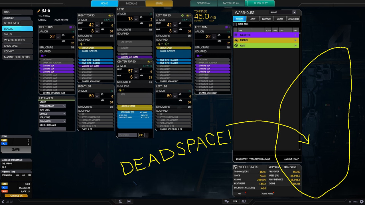
Why is there so much deadspace? The right column contributes nothing. Why was the internal loadout not stretched down and to the right to fill the space while the component list was moved to the margin?

Alternatively why not shift the mentioned elements to the right and enlarge the left side to improve readability or font size?

Don't say it is a concession to 4:3 users. Its 2018 that is not even an issue any more.

#2 ANOM O MECH

    Member

  • PipPipPipPipPipPipPip
  • Survivor
  • 993 posts

Posted 17 April 2018 - 02:06 PM

While not attributable to 4:3 it does scale with different resolutions.

#3 Spheroid

    Member

  • PipPipPipPipPipPipPipPipPipPip
  • Veteran Founder
  • Veteran Founder
  • 5,064 posts
  • LocationSouthern Wisconsin

Posted 17 April 2018 - 02:08 PM

My problem is that this error is present in 16x9 1080 by far the most common resolution across most platforms. That should not be the case. The design is bad.

#4 ANOM O MECH

    Member

  • PipPipPipPipPipPipPip
  • Survivor
  • 993 posts

Posted 17 April 2018 - 02:57 PM

Well good on your sharp eye for noticing this egregious error some what...five years later???

So much going on in the game right now and you are mad at dead space.

Good luck in your future endeavours.

#5 Funky Bacon

    Member

  • PipPipPipPipPipPipPip
  • 629 posts

Posted 17 April 2018 - 03:22 PM

I actually like having that space there so I can see some of the mech geometry changes as I play around with weapon loadouts.

#6 Angel of Annihilation

    Member

  • PipPipPipPipPipPipPipPipPipPip
  • The Infernal
  • The Infernal
  • 8,881 posts

Posted 17 April 2018 - 04:01 PM

View PostFunky Bacon, on 17 April 2018 - 03:22 PM, said:

I actually like having that space there so I can see some of the mech geometry changes as I play around with weapon loadouts.


I actually wish they would show a miniature version of the mech showing off the geometry as you swap weapons and such. I hate using column view but often need to see where my mounts are going because of the screwy game mechanic that likes to shift weapons around to insure it is either impossible or painfully frustrating mounting specific weapons in the locations you want them to reside in <sigh>. Seriously PGI why the frack can't we just mount the damn weapons in the slot we want without having to load energy weapon in a certain sequence just to make sure the damn PPC gets the top slot.???!!!


1 user(s) are reading this topic

0 members, 1 guests, 0 anonymous users