Old MW4 Ranger, on 13 July 2018 - 11:37 PM, said:
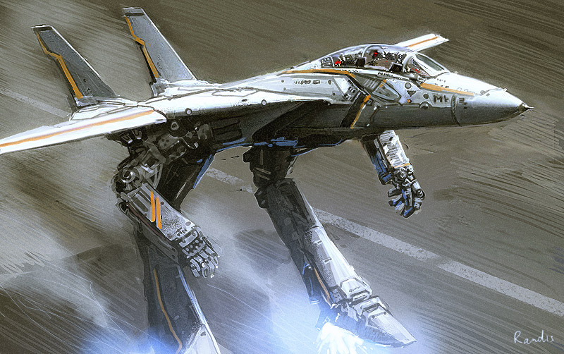
the style of the Arms and in this Position make its ugly and terrible looking and make the Arms useless (hey its can only rotate the arms to a Single axis)...
When I did some theorycrafting to my satisfaction and ordered the base pack, the arms were always stripped of armour and used to shield the torsos. Heck, only two of the six variants have weapon hardpoints in the arms. For the variants without hardpoints in the arms they offer torso protection while for the variants with arm hardpoints they offer a decent peeking profile and torso protection.
And part of the Champion's design is its wing-like arms, so there's that too. The Champion is a bit of an odd duck, and PGI's design captures it well.