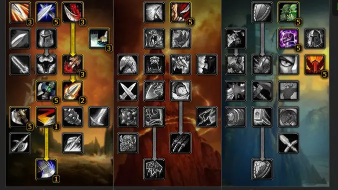
a big problem with the tree is presentation.
Lots of little nodes, visually mostly identical. There are lessons to be learnt from fantasy here.

Ignoring the exact contents of the tree,
this is a much more readable progression tree. Each node has a unique tooltip, making them visually distinct. Some nodes eat up multiple progression points, so you have a single node with increasing value rather than 5 or so small identical nodes, cluttering up the tree. Each descending row requires a set amount of investment above it (Row 2 passives only become available with 5 points of investment in that tree, row 3 with 10, row 4 with 15, so on). Arrows denote passives requiring a prerequisite (mortal strike in the arms tree can't be taken without putting a point in sweeping strikes). The bottom nodes (requiring the most investment) require you to lean into one tree over the other, and the heaviest or most significant nodes are placed at the bottom to reflect that, not unlike MWO. Indeed in many many ways this
is very similar to MWO's skill tree, only significantly cleaner, more readable, and more polished.
Edited by pbiggz, 01 October 2021 - 05:14 AM.


