#2481
Posted 05 July 2012 - 07:13 AM
#2482
Posted 05 July 2012 - 07:53 AM
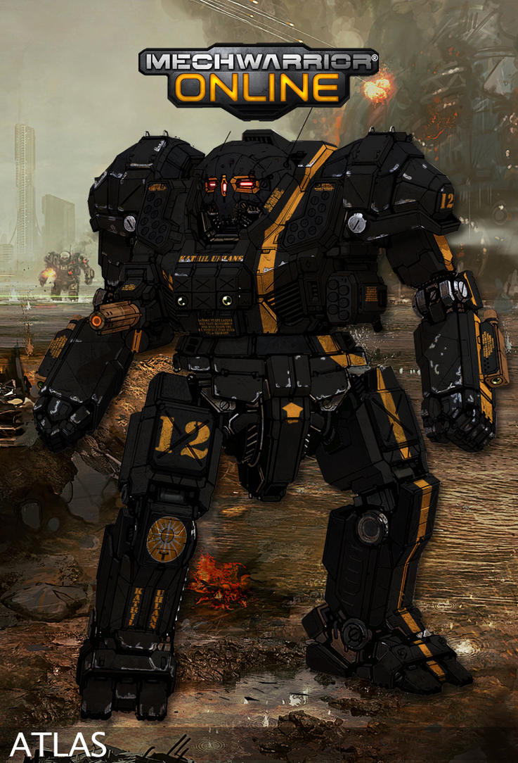
Excellent chassis redesign from Mr. Iglesias + Excellent repainting community = Win for everyone.
It gets increasingly difficult to pick a primary mech. I want to play with most of them, and these repaints just make it all the harder.
#2484
Posted 05 July 2012 - 08:28 AM
#2485
Posted 05 July 2012 - 11:19 AM
#2486
Posted 05 July 2012 - 11:35 AM

original JagerMech

JagerMech with 4x AC/5s
To do list:
- proper repaints of the JagerMech;
- to make a JagerMech with 2 AC/20s ("King Jager");
- to make a JagerMech with 2 Gauss ("JagerNaught");
- to make a JagerMech with 4 UAC/5s ("JagerMesh");
- to make a JagerMech with 2 AC/10s ("JagerMaster");
- to make a JagerMech with 5 AC/2s ("JagerFlak");
- to make a JagerMech with 12 MGs and 2 Large Lasers ("JagerMG");
- to hope for someone to make a JagerMech JM6-A (2 LRM-15s and 2 AC/2s).
Edited by Odanan, 08 July 2012 - 11:08 AM.
#2488
Posted 05 July 2012 - 12:22 PM
Looking good there =)
#2489
Posted 05 July 2012 - 02:14 PM
#2490
Posted 05 July 2012 - 02:44 PM
 Ernst Murdoch, on 30 June 2012 - 09:27 AM, said:

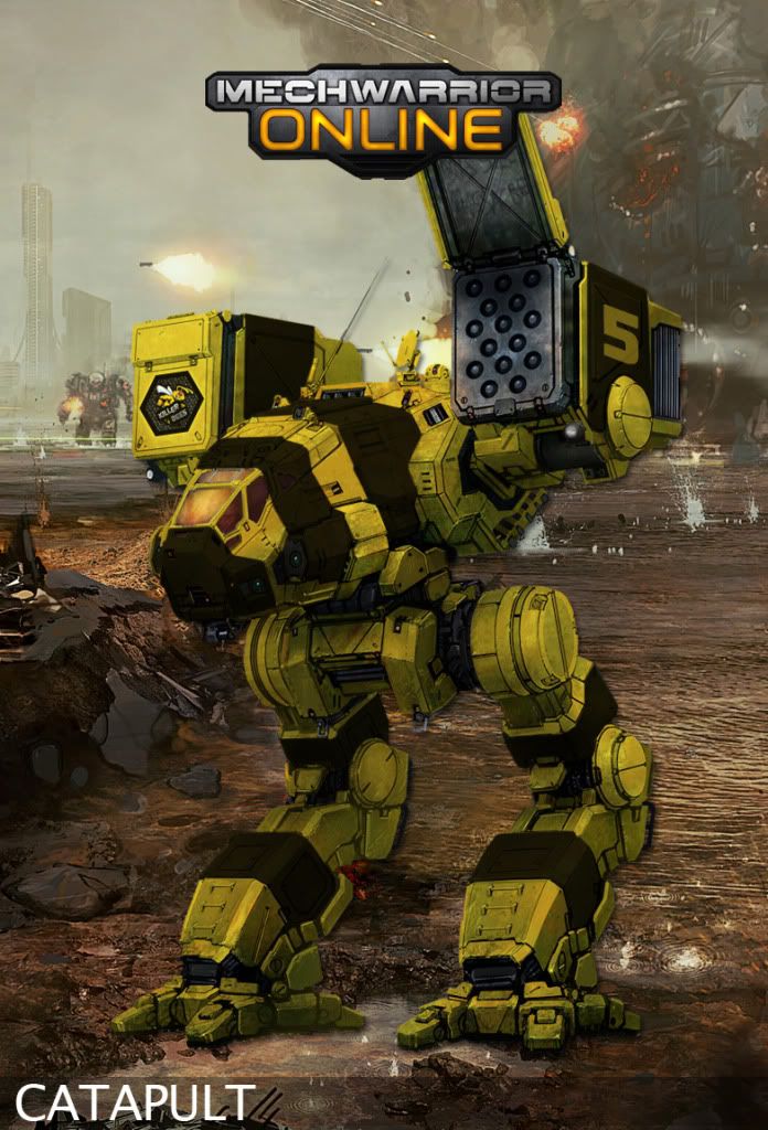
Repaint for the Killer Bees Mercenaries'
Thanks for the PSD file to do this
Much appreciated
Just wanted to say that this is easily my most favourite repaint in the thread. I mean I feel ashamed that there are repaints on here that are just so sublime (Nacon, that Raven? Wow), but I get roped in by the bumblebee. Honestly love this thing so much, I really really really hope to see this on the battlefield.
#2491
Posted 05 July 2012 - 03:04 PM

This is the paint sceam im using all my mechs had a design similar to this in my head can i use it?
#2492
Posted 05 July 2012 - 03:04 PM
 Feroce, on 05 July 2012 - 11:54 AM, said:
It is, that's artwork from Hellgate: London.
*shrug* I didnt care what it was from, just looked cool.
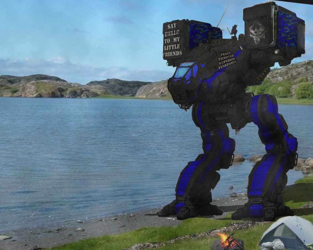
anyway. another mech in landscape.

again. background isnt mine. just looks cool.
is it just me or do the lines on the Catapult remind anyone else of a classic muscle car?
oh, btw, Nacon, Ironhawk, Hayden, yall got any ideas how to make the mechs look more.... realistic/less cartoony? been playing with different layers. making several copies of the mech and using chrome, plaster, so on, with different levels of opacity and fill but nothing seems to get the job done.
Edited by Rychard Starheart, 05 July 2012 - 03:34 PM.
#2493
Posted 05 July 2012 - 04:35 PM
#2494
Posted 05 July 2012 - 04:58 PM
#2495
Posted 05 July 2012 - 05:05 PM
 Rychard Starheart, on 05 July 2012 - 03:04 PM, said:
I can't speak for Ironhawk and Hayden, but Graphic Art is what I do for living. I know what you're asking and that sort of thing requires rational understanding how to fix an image. Also rational understanding how to work with your tools. In other words, I didn't have an process steps to do what I needed, mostly doing things one step at a time and build from there. All I could tell you is just take your time understand what is the problem and how to fix it.
However, I do develop my own rules about how to work with an image. In your case, one of my rules is never use photo for a hand drawn imagine unless you took one part of the photo into it than using the whole photo. You used a photo for the background, which has a lot of things in it. Sky, lake, shore, mountain... etc etc. That's a lot of "objective" image in contract with one main focus... which was the hand drawn Mech. That's where the "style contract" comes in. So you just need to balance out both of them into the grey area of that style contract.
Like... Edit the photo a bit, add some explosions in background or something like dropship burning through the skyline with reflection on water. And add some reflection and ambiance lighting on the mech. Dodge/Burn some lines around its edges for details and such.
Basically... take your time with it.
#2496
Posted 05 July 2012 - 05:36 PM
1- one layer for highlights. You have sunlight in your image so you need to figure out the sun orientation and highlight the proper shapes. Take your time to figure it out. Love the 'Mech and it will become easy. Just like a woman (except that they have curves, FD's 'Mechs do not...) do not overdo highlights. Play with layer transparency until you're satisfied.
2- one layer for shading. For further contrast realism against that sunlight, use the same 'love your 'Mech as a woman' technique to figure out the areas within the 'Mech's volume that warrant further shading.
3- I'd select that cockpit window zone and reflect landscape into it for some realism
4- I'd use the image's color tones to determine the tints of the 'Mech's colors. Black will become gray somewhat in sunlight, but maybe with a hint of green-yellow in it because of a slight grass reflection in the color. Blue would have the same treatment: perhaps less bold, less saturated, with a hint of green in it. You can do that using several techniques but as a simple, no risk method, you can do a color overlay layer effect with a low opacity percentage for that.
5- you got the 'Mech's shadow right I think. You may want to give it a slight blur.
... Anyway main theme is: play with it, use reference (other than women is acceptable), be patient, listen to your best music and most of all, have fun.
There you go. Most of my recipe is there. Except maybe alcohol, which I do know Hayden and I may use from time to time to spice up the process. (careful though with this, an excellent repaint under influence may look like sh*t somehow when you look at it the next day...)
#2497
Posted 05 July 2012 - 06:37 PM
 Nacon, on 05 July 2012 - 05:05 PM, said:
I can't speak for Ironhawk and Hayden, but Graphic Art is what I do for living.
******
Basically... take your time with it.
 Ironhawk, on 05 July 2012 - 05:36 PM, said:
*******
There you go. Most of my recipe is there. Except maybe alcohol, which I do know Hayden and I may use from time to time to spice up the process. (careful though with this, an excellent repaint under influence may look like sh*t somehow when you look at it the next day...)
I thank both of you for your answers. I took some classes(like 3 years worth) for game design a few years back but got to the point were my skills(or lack there of) couldnt keep up with the requirements of the more advanced stuff. This is honestly the first time Ive touched photoshop since then so Im trying to get my feet back.
Im already starting to see some(slight) improvement from day to day but I will totally sit down and go back over things with what yall said.
Thank you.
Edited by Rychard Starheart, 05 July 2012 - 06:38 PM.
#2498
Posted 05 July 2012 - 06:56 PM
....
Needs more ComStar designs.
Seriously guys, great work. I wish I could've been more involved recently but I got a job and stuff. Barely any time to do anything but lurk these days. (Not that my repaints were any good.)
#2499
Posted 05 July 2012 - 07:23 PM
 lahyenne, on 05 July 2012 - 06:56 PM, said:
....
Needs more ComStar designs.
Seriously guys, great work. I wish I could've been more involved recently but I got a job and stuff. Barely any time to do anything but lurk these days. (Not that my repaints were any good.)
This is an excellent point.
There's a distinct lack of ComGuard mechs on display. Someone's got to be guarding those ComStar HPG stations.
Not that there's a hidden army lurking on Terra or anything...That's just crazy talk.
#2500
Posted 05 July 2012 - 10:41 PM
 lahyenne, on 05 July 2012 - 06:56 PM, said:
....
Needs more ComStar designs.
Seriously guys, great work. I wish I could've been more involved recently but I got a job and stuff. Barely any time to do anything but lurk these days. (Not that my repaints were any good.)
Your art is great. Come back any time to post some and keep some sanity from the job and stuff... This insane thread loves ya!
>Hawk out.
5 user(s) are reading this topic
0 members, 5 guests, 0 anonymous users


