#3323
Posted 10 November 2012 - 05:31 PM
#3325
Posted 10 November 2012 - 05:50 PM
#3328
Posted 11 November 2012 - 05:18 AM

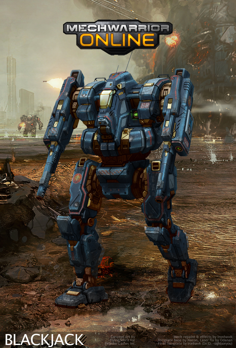
Still a lot of work to do.
EDIT: some decals.
EDIT: replaced the "ejecting seats" decal for a "warning laser" decal (thanks IH).
EDIT: semi-final version.
Edited by Odanan, 13 November 2012 - 05:06 PM.
#3329
Posted 11 November 2012 - 08:21 AM
Always bugged me to see a jumping mech with feet flat on the ground.
#3330
Posted 11 November 2012 - 08:27 AM
#3331
Posted 11 November 2012 - 10:06 AM
#3333
Posted 11 November 2012 - 10:56 AM
 Odanan, on 11 November 2012 - 05:18 AM, said:
Still a lot of work to do.
EDIT: some decals.
Good to see this piece progress like that, Odanan. IMHO, there should be at least 4 exhausts to these JJ's, including each leg and the back for balance. No biggy though some airforce or navy savvy folks may notice the decal underneath your laser is usually for ejection seats. The fx are uber-cool and you've done a very nice job with that foot.
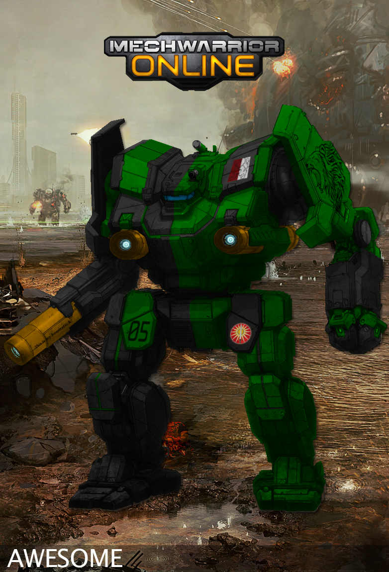
Another 'Mech is out of the IH paint shop... Felt like this dude needed a lance mate. For this 2nd Ceti, I tried another approach for that medium laser pre-fire effect. Credit goes to Hayden for the excellent job on that 2nd Ceti insignia.

EDIT: just added the missing URL... And a credit.
Edited by Ironhawk, 11 November 2012 - 11:00 AM.
#3335
Posted 11 November 2012 - 01:27 PM

#3336
Posted 11 November 2012 - 01:34 PM
 Adridos, on 10 November 2012 - 02:45 AM, said:
It's just how I see your repaints. Mainly because of the multi-colored cockpits and weapons treatment... but that's just me and they look great no matter how I see them.
Ah, that makes sense. Thank you.
 Ironhawk, on 10 November 2012 - 11:16 AM, said:
Tristan, this is definitely the one I like best. Excellent job on that 1KU! Nice insig job as well.
Thank you.
I'm looking forward to seeing more of your progress on your Blackjack as well, Odanan. It looks wonderful so far.
I just finished a reworking of one of my earlier pieces for the 1st Capellan Dragoons, and I'm pretty happy with it (especially with figuring how to get the silly logos to place better).
For comparison:
Before:

After:

#3337
Posted 11 November 2012 - 02:29 PM

Thought I'd try a Jagermech as well:

If you can't tell, I have no idea how to get rid of decals cleanly via being a noob at this.
Edit: Changed host.
Edited by EmperorMyrf, 12 November 2012 - 07:14 AM.
#3338
Posted 11 November 2012 - 02:45 PM
 EmperorMyrf, on 11 November 2012 - 02:29 PM, said:
If you can't tell, I have no idea how to get rid of decals cleanly via being a noob at this.
We all started somewhere (look at my Raven).
I liked it! But there is something wrong with the red/wine painting - we can barely see the black outlines.
Edited by Odanan, 11 November 2012 - 02:47 PM.
#3339
Posted 11 November 2012 - 02:47 PM
 Odanan, on 11 November 2012 - 02:45 PM, said:
We all started somewhere (look at my Raven).
I liked it! But there is something wrong with the red/wine painting - we can barely see the black outlines.
Thanks! I'm not sure what happened, the lines were much more defined before I exported it. I'll probably crank back the darkness on it and hopefully it'll come out cleaner.
Edit: it's imgur, the quality gets lost when I upload.
Edited by EmperorMyrf, 11 November 2012 - 02:54 PM.
#3340
Posted 11 November 2012 - 07:45 PM

EDIT: Adding a 3039 ally to this 3rd Crucis Lancers veteran; a Wolf's Dragoons Delta Provisional...

Edited by Ironhawk, 12 November 2012 - 08:19 PM.
#3341
Posted 11 November 2012 - 07:50 PM
 Tristan Arc, on 11 November 2012 - 01:34 PM, said:
Ah, that makes sense. Thank you.
Thank you.
I'm looking forward to seeing more of your progress on your Blackjack as well, Odanan. It looks wonderful so far.
I just finished a reworking of one of my earlier pieces for the 1st Capellan Dragoons, and I'm pretty happy with it (especially with figuring how to get the silly logos to place better).
For comparison:
Before:
...
After:

Agreed it is much better. You are certainly getting the hang of this. Quick tip (though Hayden gave the same one a few pages back), try desaturating your colors a bit for more realism. In real life, that green would appear somewhat duller.
#3342
Posted 12 November 2012 - 06:20 AM
20 user(s) are reading this topic
0 members, 20 guests, 0 anonymous users


