Jump to content

Repainted Concept Art

Art

7732 replies to this topic

#521 Dranon

    Member

  • PipPip
  • 48 posts

Posted 05 January 2012 - 01:49 PM

I like that blue and white jenner, but all look cool

#522 Striker 2054

    Member

  • PipPipPip
  • Knight Errant
  • Knight Errant
  • 69 posts
  • LocationLost as hell

Posted 05 January 2012 - 03:34 PM

View PostLiam, on 05 January 2012 - 04:41 AM, said:


Really interesting one! How about to put arms lower with more distance from the torso.
This would make it looking more aggressive and proportioned without ears like look.


Then run one top centerline and add a pair of chin lasers. :P

#523 Ironhawk

    Member

  • PipPipPipPipPipPipPipPip
  • Ace Of Spades
  • Ace Of Spades
  • 1,333 posts
  • LocationMontreal

Posted 05 January 2012 - 05:06 PM

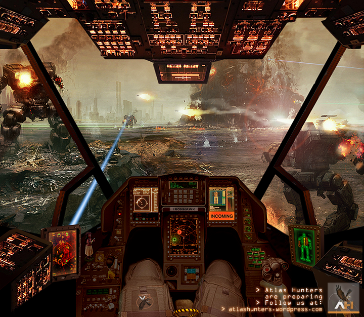
Hi guys, since we are getting into collage type art, I figured it's be nice to have an 'in-cockpit' view of the MWO battle concept art. Here's the result done for the Atlas Hunters. Cockpit design is freestyle really (i.e. no specific Mech in particular).

Posted Image

#524 phelanjkell

    Member

  • PipPipPipPipPipPip
  • 355 posts
  • LocationNorth Carolina

Posted 05 January 2012 - 06:03 PM

Ironhawk, freaking awesome good sir!

#525 Threat Doc

    Member

  • PipPipPipPipPipPipPipPipPip
  • The Bowman
  • The Bowman
  • 3,715 posts
  • LocationO'Shaughnnessy MMW Base, Devon Continent, Rochester, FedCom

Posted 05 January 2012 - 06:13 PM

Holy crap, Ironhawk! That's AWESOME, and friggin' realistic, too.

#526 Roach

    Member

  • PipPip
  • The Patron
  • The Patron
  • 22 posts
  • Locationlurking in the shadows

Posted 06 January 2012 - 04:31 AM

These are great bro! You're really talented, so keep up the good pace... :P

I've always wanted to see an Atlas in a tuxedo, so if you have some time... ;)

#527 Adridos

    Member

  • PipPipPipPipPipPipPipPipPipPipPip
  • Bridesmaid
  • 10,635 posts
  • LocationHiding in a cake, left in green city called New A... something.

Posted 06 January 2012 - 04:37 AM

View PostIronhawk, on 05 January 2012 - 05:06 PM, said:

Posted Image


Hula girl ! :P

#528 AdamBaines

    Member

  • PipPipPipPipPipPipPipPip
  • Elite Founder
  • Elite Founder
  • 1,384 posts

Posted 06 January 2012 - 07:37 AM

View PostIronhawk, on 05 January 2012 - 05:06 PM, said:

Hi guys, since we are getting into collage type art, I figured it's be nice to have an 'in-cockpit' view of the MWO battle concept art. Here's the result done for the Atlas Hunters. Cockpit design is freestyle really (i.e. no specific Mech in particular).

Posted Image


Dig the Hula Girl :-)

Edited by AdamBaines, 06 January 2012 - 07:38 AM.


#529 Ironhawk

    Member

  • PipPipPipPipPipPipPipPip
  • Ace Of Spades
  • Ace Of Spades
  • 1,333 posts
  • LocationMontreal

Posted 06 January 2012 - 08:12 AM

Thanks for the feedback. Kay, re: realistic aspect, it's mainly due to 1) addition of highlight and flare effects on MWO concept art background explosion and missile exhaust to give it more of a movie-like feel, and 2) cockpit interior collage (with lots of tweaking) from various (no copyright bound) pictures such as space shuttle ceiling, F35 dash, Mig29 joystick, etc... and of course the Hula doll. My friend Thunderbird's idea. We had to have one!

#530 Threat Doc

    Member

  • PipPipPipPipPipPipPipPipPip
  • The Bowman
  • The Bowman
  • 3,715 posts
  • LocationO'Shaughnnessy MMW Base, Devon Continent, Rochester, FedCom

Posted 06 January 2012 - 09:11 AM

The point is, it took a hell of a lot of work, and I see it in the quality. Well done... very nice.

#531 Adridos

    Member

  • PipPipPipPipPipPipPipPipPipPipPip
  • Bridesmaid
  • 10,635 posts
  • LocationHiding in a cake, left in green city called New A... something.

Posted 06 January 2012 - 09:29 AM

Well, I know it is not a cockpit of any specific mech but from the first time I saw it, I do not see anything else than Vulture. :P

#532 Garth Erlam

    Member

  • PipPipPipPipPipPipPipPipPip
  • 2,756 posts
  • Facebook: Link
  • YouTube: Link
  • LocationVancouver, BC

Posted 06 January 2012 - 09:43 AM

View PostIronhawk, on 06 January 2012 - 08:12 AM, said:

Thanks for the feedback. Kay, re: realistic aspect, it's mainly due to 1) addition of highlight and flare effects on MWO concept art background explosion and missile exhaust to give it more of a movie-like feel, and 2) cockpit interior collage (with lots of tweaking) from various (no copyright bound) pictures such as space shuttle ceiling, F35 dash, Mig29 joystick, etc... and of course the Hula doll. My friend Thunderbird's idea. We had to have one!


It's fantastic work - we love seeing stuff like that over here. That kind of imagination, skill, and craft from fans is always a treat to see.

#533 Dihm

    Member

  • PipPipPipPipPipPipPipPipPip
  • 3,312 posts
  • Google+: Link
  • LocationPlanet Trondheim

Posted 06 January 2012 - 09:44 AM

Few more unit repaints done, have the Hunchback and Jenner. Next stop, Catapult.

Posted Image
Posted Image
Posted Image

Edited by Dihm, 06 January 2012 - 09:55 AM.


#534 Threat Doc

    Member

  • PipPipPipPipPipPipPipPipPip
  • The Bowman
  • The Bowman
  • 3,715 posts
  • LocationO'Shaughnnessy MMW Base, Devon Continent, Rochester, FedCom

Posted 06 January 2012 - 09:45 AM

View PostAdridos, on 06 January 2012 - 09:29 AM, said:

Well, I know it is not a cockpit of any specific mech but from the first time I saw it, I do not see anything else than Vulture. :P
It's funny you should mention that, my friend, because I was thinking more Timberwolf, but then there's no center windshield horizontal spar like there are on the sides, so I think you're probably right. Still, this is just awesome-sauce, right here, regardless of whether or not it goes to any particular 'Mech.

Lookin' good, Dihm, bring on that Catapult, man. Can't wait to see it.

Edited by Kay Wolf, 06 January 2012 - 09:46 AM.


#535 Ironhawk

    Member

  • PipPipPipPipPipPipPipPip
  • Ace Of Spades
  • Ace Of Spades
  • 1,333 posts
  • LocationMontreal

Posted 06 January 2012 - 11:37 AM

Yes indeed a lot of work went into this one. I didn't expect that much positive feedback.

Thanks, and thanks Garth. If Piranha can throw just a few more inspiring action, terrain and mech concept images our way, this would even inspire us further ;-) ... no undue pressure here, just enthusiasm!

#536 TheTeacher

    Member

  • PipPipPipPipPipPip
  • 275 posts
  • LocationTennessee

Posted 06 January 2012 - 01:10 PM

Wow. I spent hours going through this stuff. Incredible....I envy your skills...all of you!

#537 Adridos

    Member

  • PipPipPipPipPipPipPipPipPipPipPip
  • Bridesmaid
  • 10,635 posts
  • LocationHiding in a cake, left in green city called New A... something.

Posted 06 January 2012 - 02:09 PM

Nice repaints Dihm. :mellow:

Looking forward to see the Catapult as well. ;)

#538 Dihm

    Member

  • PipPipPipPipPipPipPipPipPip
  • 3,312 posts
  • Google+: Link
  • LocationPlanet Trondheim

Posted 06 January 2012 - 02:21 PM

I'm really rather happy with how this turned out... my favorite of the ones I've done so far I think. I went with both doors open, it seems more menacing. ;)

Posted Image

Edited by Dihm, 06 January 2012 - 02:22 PM.


#539 Ironhawk

    Member

  • PipPipPipPipPipPipPipPip
  • Ace Of Spades
  • Ace Of Spades
  • 1,333 posts
  • LocationMontreal

Posted 06 January 2012 - 02:26 PM

Very nice, Dihm. Not easy to get this 'black' feeling. You have to skillfully distribute those shades of dark gray... well done! Love the accent lines too.

#540 Threat Doc

    Member

  • PipPipPipPipPipPipPipPipPip
  • The Bowman
  • The Bowman
  • 3,715 posts
  • LocationO'Shaughnnessy MMW Base, Devon Continent, Rochester, FedCom

Posted 06 January 2012 - 03:44 PM

Oh, my, Dihm, that is absolutely fantastic... good stuff.


12 user(s) are reading this topic

0 members, 12 guests, 0 anonymous users