3
Sketches/Doodles/WIPs & Drawfriends Thread
Started by ethnic minority, Mar 21 2012 08:33 PM
6 replies to this topic
#1
Posted 21 March 2012 - 08:33 PM
Hey guys, just starting up a sketch/doodle/WIP and collab thread where we can all share mech-related stuff that isn't worth making a whole new topic on. Maybe we can even pick up on each others' doodles and collaboratively develop them as a community art exercise!
Here's some of my own garbage...
Boxhands McGee w/ fail legs
Jennhurr
Here's some of my own garbage...
Boxhands McGee w/ fail legs
Jennhurr
#2
Posted 21 March 2012 - 09:37 PM
K, big edit with lots of pictures. These are my current finished Battletech drawings; I do them all freehand - nothing but pencil, eraser, paper, and source material to look at. Speaking of source material, I'm gonna say again that pretty much none of my stuff is original - it's just my (sometimes) tweaked versions of art from the Technical Readouts I have at home. I have no artistic creativity, I'm just halfway decent at drawing what I see. Also, I realize that the lined paper looks horrible; however, I like the lines for measurement, lack the editing software to remove the lines, and may not even have all of the original drawings to trace onto unlined paper. I am currently (kinda - I've been "taking a break" for the last month or so) working on a 3025 Shadow Hawk, though, and plan to trace it onto unlined paper once it is (eventually) finished
Red Shift. In hindsight, I wish I had smoothed the transition from brightly-lit left torso to heavily-shaded left torso - I usually try to do so, and am not sure why I didn't with this
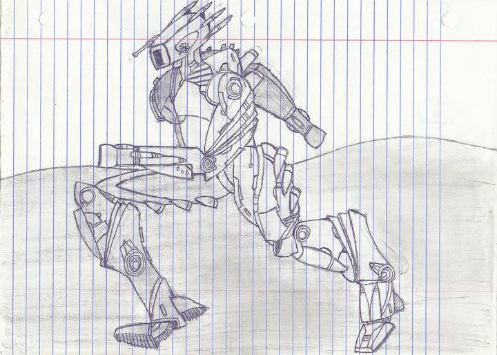
Reseen Ostscout -9CS, with the most ugly satellite/radar/whatever dish mankind has ever seen in the background
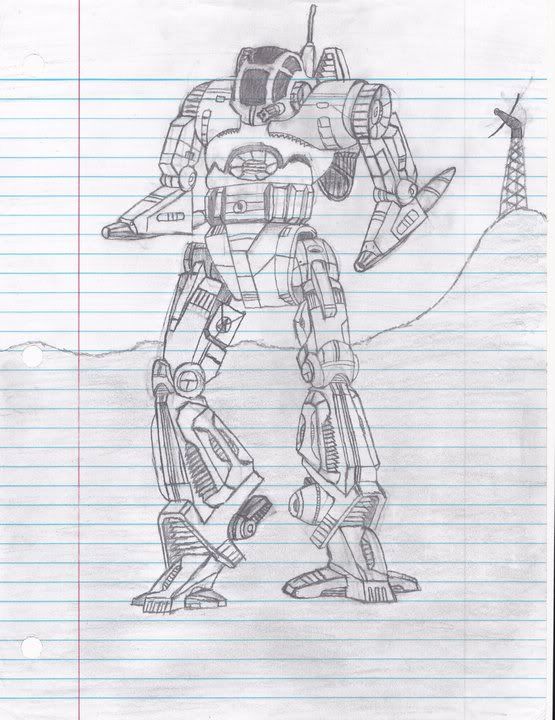
Spirit. I like the background on this one the best; I just punched a few things into Google and did my whole "freehand copy" thing with what I liked. I also used a photo editing program called Picasa to sharped up some of the lines; still not too sure how I feel about that. Makes things pop, but that includes my screw-ups/eraser marks; it also messed with my shading a bit. Plus it made it look like I draw in pen lol
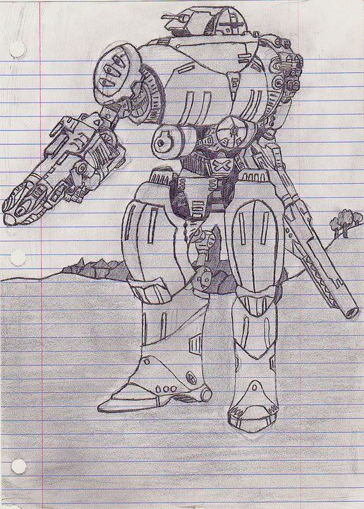
Scylla. My most recent (finished) drawing, and probably my main motivation for switching to unlined paper (Poor ER Large Laser )
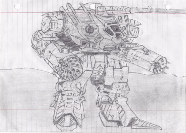
Pack Hunter. I'm rather proud of how I did the jump jets firing, but the hips and arms make me cringe
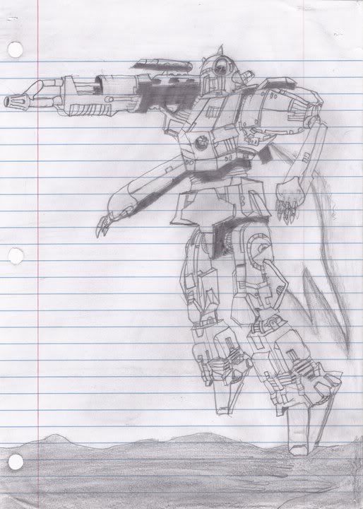
Stalking Spider - an old favorite of mine... Only thing I'm really disappointed about is that I couldn't fit the whole thing on the paper; I started too low, and was far enough in that when I realized my error, restarting wasn't an attractive option.
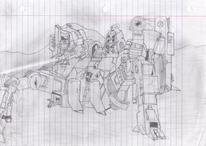
Stiletto. As you can see, there's a good reason I've only ever done one "night scene"... This was also before I started going back over all the lines once I've finished shading, so much of the 'Mech's outline is rather hard to make out.
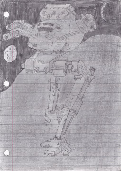
Sentry. This is the drawing I like the least; not because of the 'Mech itself (which I think looks pretty decent - in particular, this was the first time I managed to draw hands without the results being horrifying), but because of the complete lack of background or shading. Also, more reason not to use lined paper - pretty sure the laser isn't supposed to have a hole through the middle of the barrel
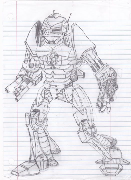
Sagittaire. Like with the Stalking Spider, I started too low and realized it too late. I'm also not very happy with the "damage" to the right shoulder, and I started hating the lasers as soon as I was finished scanning the thing. Add in the fact that I screwed up some of the bits and pieces in terms of perspective (the nose is a rather glaring example), and I'm not too sure I did this great design justice.
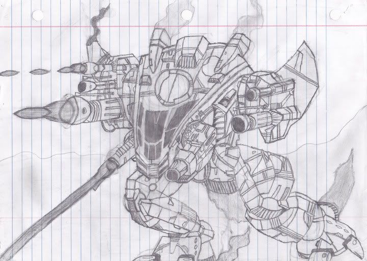
Gurkha. As far as I'm concerned, this is definitely one of my best - I didn't screw the hands up, the thing looks just as mean as it does in the TRO, and I basically feel I made a lot fewer mistakes than usual
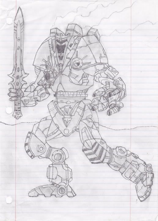
Hollander. I decided to mess with the head on this one, because the old version just looked silly. I tried to go for a more mean, intimidating design. Not sure how well I succeeded, but I still like it better than the old head.
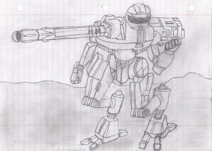
Alright, last one until I finally motivate myself to finish the Shadow Hawk. This is one of my more major modifications in that it involved actually changing a 'Mechs armament (Highly doubt it would be possible, though, due to weight restrictions - I just liked the look), but it still consisted of copying what I saw in the book. It started out as a reseen Wasp -3L; however, as I was paging through the Project: Phoenix TRO, I noticed that the Wolverine -8D's RAC-2 was pretty cool, and that it would visually fit rather neatly where the Wasp's ER Medium laser was currently mounted. While I really like this drawing overall, I'm not too sure what I was smoking when I did the effect of the laser striking the 'Mech's left arm. Don't know how I'd do it now, but that isn't it
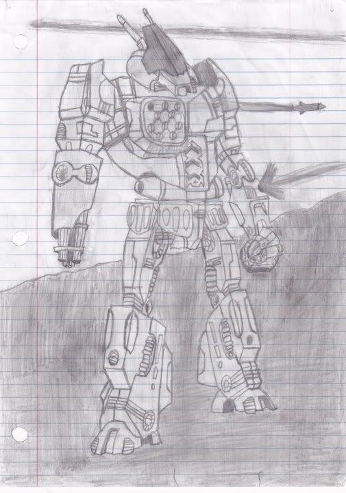
Edited by GDL Irishwarrior, 22 March 2012 - 10:40 PM.
#3
Posted 21 March 2012 - 10:09 PM
All i can do here is LOOK and appriciate, can't draw for sh**
Edited by SirDenOfYork, 21 March 2012 - 10:10 PM.
#4
Posted 22 March 2012 - 02:52 AM
Excellent drawing. With these skills, you must be a professional artist in RL! If not, do consider it.
#5
Posted 22 March 2012 - 07:14 PM
GDL Irishwarrior, on 21 March 2012 - 09:37 PM, said:
I posted some of my drawings when I first started out, but I'm sorry to say that none of them are truly original - they're all freehand versions of art I like from the Technical Readouts (I'm not all that creative - I'm just decent at drawing what I see). If you want, though, I can edit them into this post
DO eeet
Edited by ethnic minority, 22 March 2012 - 07:15 PM.
#7
Posted 10 November 2013 - 08:05 AM
Good work on those drawings. I just started to draw, learning 1 and 2 point perspective (lots of good videos on youtube showing) - that made it easier to design from imagination without having to copy other designs. My first two are just for practice, something between a Flea and a Locust but mostly just blocks
This first one I did to get the feel of one point perspective and thought I'd play around with some sense of a starburst behind him. I don't usually do much with colour, so it was fun.
This second one was two point perspective and I ran it through some effects afterwards to get the grungy feel to it.
I encourage anyone drawing to learn these techniques - doesn't take a lot of practice because there is very little guesswork required Now trying to do curved armour pieces is something I'm trying next
Off-topic - I also have some photos in Flickr from a local heavy duty equipment (forestry stuff) scrapyard that I use sometimes for mech related background images etc. on my website.
Thanks for starting this thread, it's encouraging!
Edited by allergen, 10 November 2013 - 08:07 AM.
1 user(s) are reading this topic
0 members, 1 guests, 0 anonymous users