Jump to content

New Style For Future Camo Patterns


16 replies to this topic

Poll: New Style For Future Camo Patterns (16 member(s) have cast votes)

I think the camo pattern style discussed would be:

  1. More appealing than current choices (10 votes [62.50%])

    Percentage of vote: 62.50%

  2. Less appealing than current choices (3 votes [18.75%])

    Percentage of vote: 18.75%

  3. Indifferent/don't use camo/etc (3 votes [18.75%])

    Percentage of vote: 18.75%

Vote Guests cannot vote

#1 aspect

    Member

  • PipPipPipPipPipPip
  • 491 posts

Posted 09 December 2012 - 12:38 PM

I would greatly prefer some patterns that aren't based on coloring different parts of my mechs. I know it's tempting for the artists to get clever with each chassis and do something super custom and include variations in color/tone so you can still make out the mech components (ie darker leg sections between brighter knees, solid-color gun barrels, solid-color feet, vertical lines to show the separation between upper legs and torso), but honestly I would be a lot happier with something that just looked like a thick opaque skin plastered on top of the mech that completely obscured the detail below it.

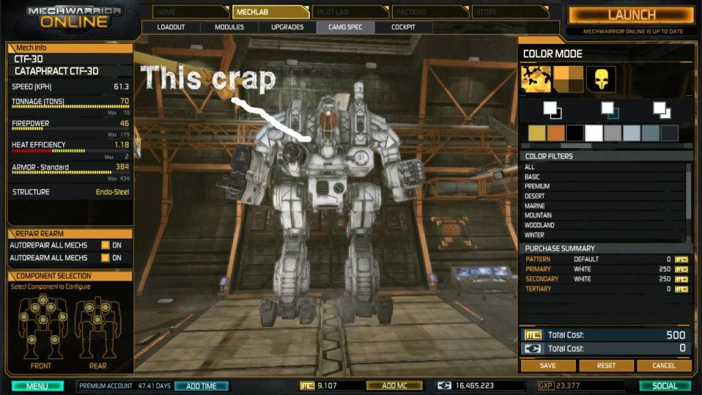
This is kinda what I'm trying to show...this is the new urban block camo, with all 3 colors set to white, and there's still lots of huge darker areas that show a lot of detail. The little vents, ladder rungs, gunports, etc are great (they add a lot of depth to the look) but I don't like the big black sections under the missile pods, on the legs, etc. In my opinion, it also makes my mech look dingy and old which is not exactly what I would prefer.

Posted Image

There's nothing wrong with this approach for some patterns, but it's not really what I would like to see from a CAMO pattern (it's a little more weathered-paintjob-esque).

I would also like camo patterns that are not quite so evenly spaced and symmetric. There's a bit of asymmetry in the urban block patterns, but I'd like it to go a bit farther in terms of variation in colored section size and orientation...still too many parts that are evenly divided into two or three square sections, imo (ie, the perfect 3x3 grid on the front of the missile doors, the 2x2 grid on the sides of the upper thigh joint, etc).

I have no problem with their being both styles, as many people are going to want lots of visible detail and still be able to create some matching unit colors, etc. Seems like we could do both!

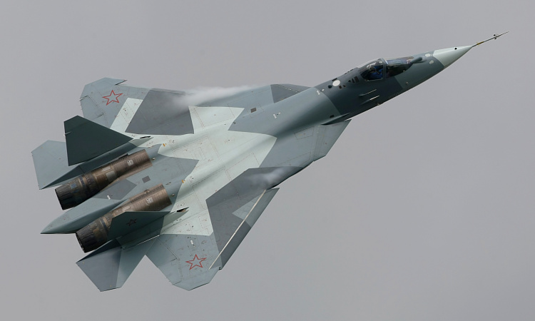
Some examples of vehicle camo that are more like what I am attempting to describe, all of which attempt to mask the mechanical details of the vehicles and try to avoid symmetry:

Posted Image
Posted Image
Posted Image
Posted Image
Posted Image
Posted Image


I know this one isn't a real camo (pretty sure there's no milspec F458), but this style is what I would much rather buy than what's currently available. In this case, it's just a vinyl wrap that obscures pretty much all the fine details of the car. Simple.

Posted Image


Other thoughts?

Edited by aspect, 10 December 2012 - 07:36 AM.


#2 Onyx Rain

    Member

  • PipPipPipPipPipPipPipPip
  • 1,017 posts
  • LocationOklahoma, EARTH MK II

Posted 09 December 2012 - 01:12 PM

I agree...I like the current way (sometimes it kinda mucks up your plans though since the joint/area colors mess up your scheme), but I also like this way...so seeing a mix would be nice.

#3 aspect

    Member

  • PipPipPipPipPipPip
  • 491 posts

Posted 09 December 2012 - 09:04 PM

Yep, no reason why we can't do both. I'm sure they have plenty of patterns in the works, but I'd really like to see this become a priority. Any other thoughts?

#4 aspect

    Member

  • PipPipPipPipPipPip
  • 491 posts

Posted 10 December 2012 - 07:36 AM

Added poll!

#5 Onyx Rain

    Member

  • PipPipPipPipPipPipPipPip
  • 1,017 posts
  • LocationOklahoma, EARTH MK II

Posted 10 December 2012 - 08:28 AM

The patterns you show and basic idea inspired and would compliment my dart frog post ideas...

Posted Image

More here...
http://mwomercs.com/...-camo-patterns/

#6 Alois Hammer

    Member

  • PipPipPipPipPipPipPipPip
  • 1,296 posts
  • LocationHooterville

Posted 10 December 2012 - 08:53 AM

View Postaspect, on 09 December 2012 - 12:38 PM, said:

Other thoughts?


Yes- I think all the schemes you've used to illustrate your point are very much like the Mech schemes you're complaining about. Note all the non-camouflaged wheels, wheel wells, treads, turret/hull splits? Wanna bet on whether the landing gear and wheel wells on the aircraft are camouflaged? Weapons, tailpipes, exhausts all clearly visible like the joints on the Mechs.

Not seeing the issue, personally. You camouflage what you can, and hope it breaks up the profile enough to do the job.

#7 Onyx Rain

    Member

  • PipPipPipPipPipPipPipPip
  • 1,017 posts
  • LocationOklahoma, EARTH MK II

Posted 10 December 2012 - 09:04 AM

View PostAlois Hammer, on 10 December 2012 - 08:53 AM, said:


Yes- I think all the schemes you've used to illustrate your point are very much like the Mech schemes you're complaining about. Note all the non-camouflaged wheels, wheel wells, treads, turret/hull splits? Wanna bet on whether the landing gear and wheel wells on the aircraft are camouflaged? Weapons, tailpipes, exhausts all clearly visible like the joints on the Mechs.

Not seeing the issue, personally. You camouflage what you can, and hope it breaks up the profile enough to do the job.


I took it to mean he was talking about stuff like this...
Posted Image

That mech is painted all white...all 3 color selections are white...why the hell isn't it white there by the canopy and some other places? It bugs me...It doesn't look like what I wanted.

Look at the feet/lower legs too...that sucks.

Edited by Onyx Rain, 10 December 2012 - 09:07 AM.


#8 aspect

    Member

  • PipPipPipPipPipPip
  • 491 posts

Posted 10 December 2012 - 02:20 PM

View PostAlois Hammer, on 10 December 2012 - 08:53 AM, said:


Yes- I think all the schemes you've used to illustrate your point are very much like the Mech schemes you're complaining about. Note all the non-camouflaged wheels, wheel wells, treads, turret/hull splits? Wanna bet on whether the landing gear and wheel wells on the aircraft are camouflaged? Weapons, tailpipes, exhausts all clearly visible like the joints on the Mechs.

Not seeing the issue, personally. You camouflage what you can, and hope it breaks up the profile enough to do the job.


Not sure how to respond...you think the picture I posted with the arrows looks the same as say, the aircraft? Again, that picture is a pattern with all three colors set to the same white...there is not supposed to be any black. If you change the pattern, the black parts move around, so it's not like all mechs have certain parts that cannot be colored.

You certainly have a point with the treads and wheels, but that doesn't relate to what I'm asking for. Clearly things that are spinning and made from rubber, or cockpit glass, or the muzzle of weapon barrels would not be camouflaged. But when you compare the mech pic I took vs say, the blue/white F15...the aircraft has around 3% surface area (excluding the huge cockpit) non-colored (and all the colors are bright and uniform). Even the interior of the cockpit is painted to match one of the camo colors. The mech has about 25% of its area non-colored, and even when it's all set to the brightest color available it looks dingy and old.

Not sure how you can't see the difference, so I guess we will just have to disagree on whether this has merit.

Thanks for the feedback.

Edited by aspect, 10 December 2012 - 02:24 PM.


#9 Justgreen

    Member

  • Pip
  • 16 posts
  • LocationQuébec (Canada)

Posted 11 December 2012 - 06:45 AM

Those camo patterns look very cool, but what I'd like to see is a way to paint a Mech parts by parts.

Kind of like you go get a replacement car door from the scrap yard...

#10 Alois Hammer

    Member

  • PipPipPipPipPipPipPipPip
  • 1,296 posts
  • LocationHooterville

Posted 11 December 2012 - 08:01 AM

View Postaspect, on 10 December 2012 - 02:20 PM, said:

Not sure how to respond...you think the picture I posted with the arrows looks the same as say, the aircraft? Again, that picture is a pattern with all three colors set to the same white...there is not supposed to be any black. If you change the pattern, the black parts move around, so it's not like all mechs have certain parts that cannot be colored.


Come at it from the perspective of a scale modeler- nearly every single arrow on your picture is pointing to a seam, joint, or point of some form of articulation. Those points, on a real vehicle, collect dirt/debris/grease and on a scale model those areas are where the weathering wash (commonly a drop or two of certain colors dissolved into a quarter-ounce bottle of thinner) collects.

My point is simply that the areas you want colored are areas that look to me like any color on them would last about the duration of one shakedown mission after a thorough cleaning and repainting. -shrug-

#11 Zypher

    Member

  • PipPipPipPipPipPip
  • Survivor
  • Survivor
  • 418 posts

Posted 11 December 2012 - 08:11 AM

I would agree with what you are asking, but as a texture artist I would be bummed that my hard work was covered up with flat paint everywhere. Basically it would be like just creating a model and then your texture work is just patterns.

It would be nice maybe to have a grunge, mechanical, or wear layer where the opacity could be changed so people could have anything they wanted and the artists wouldn't feel like their work would go unoticed all the time.

#12 aspect

    Member

  • PipPipPipPipPipPip
  • 491 posts

Posted 11 December 2012 - 09:58 AM

View PostAlois Hammer, on 11 December 2012 - 08:01 AM, said:


Come at it from the perspective of a scale modeler- nearly every single arrow on your picture is pointing to a seam, joint, or point of some form of articulation. Those points, on a real vehicle, collect dirt/debris/grease and on a scale model those areas are where the weathering wash (commonly a drop or two of certain colors dissolved into a quarter-ounce bottle of thinner) collects.

My point is simply that the areas you want colored are areas that look to me like any color on them would last about the duration of one shakedown mission after a thorough cleaning and repainting. -shrug-


Fair point. The scale is a bit off for that kind of impact though...the vertical black line on the upper thigh joint, for instance, looks to be about 2 feet wide. An actual rotating mechanism there would probably not destroy that amount of paint. Here's a picture to show the catapult scale, in reference to a person:

Posted Image
Also, again, this is just one paint scheme. Others do not have the black line there. This is the PC gamer skin, also set to all-white:

Posted Image

As you can see, there's a pretty different amount of blackened-out stuff. It still does look awfully dull though, considering it's the brightest possible color selection on the brightest possible pattern in the game. Not to say that's bad if you want something beat-up looking, of course...but personally I would like the option.

View PostZypher, on 11 December 2012 - 08:11 AM, said:

I would agree with what you are asking, but as a texture artist I would be bummed that my hard work was covered up with flat paint everywhere. Basically it would be like just creating a model and then your texture work is just patterns.

It would be nice maybe to have a grunge, mechanical, or wear layer where the opacity could be changed so people could have anything they wanted and the artists wouldn't feel like their work would go unoticed all the time.


Absolutely, that's a great idea. I think there should be plenty of options and a toggle-able layer or series of layers that showed dirt, scrapes, or even battle damage would be cool. Nothing too serious of course, but a few big scrapes that go down to shiny metal or a few dented panels would be slick.

The reason I made this thread was to voice my opinion that it would be nice to see some variety, and that I would like to see some brighter patterns with more camo coverage as part of the available art styles going forward.

This is kinda what I'd like to see....concept art for YLW:

Posted Image

Perhaps part of the problem is how grey/green/dark the game environment usually is. I can barely make out people's camo patterns in game unless they are 50m away, or have the "dazzle" pattern set to white and yellow or something. It would be pretty cool to look down from a ridge and see 4 or 5 mechs moving up on you from 400m away that all clearly looked like the ferrari in my first post. IMO, of course!

Again, thanks for feedback.

#13 Juggalo12

    Rookie

  • Elite Founder
  • Elite Founder
  • 1 posts
  • LocationMass

Posted 16 December 2012 - 10:28 AM

I think we should be able upload our own patterns, or be able to choose whatever we want
for example the 3D text screen saver you choose to use a picture as the as the texture hence camo

#14 aspect

    Member

  • PipPipPipPipPipPip
  • 491 posts

Posted 29 December 2012 - 05:14 PM

Bump.

#15 Ranzear

    Member

  • PipPipPipPipPip
  • 193 posts

Posted 29 December 2012 - 07:41 PM

The only camo I want is one that doesn't cost eight dollars and goes away permanently if I decide on a different one.

#16 General Taskeen

    Member

  • PipPipPipPipPipPipPipPipPipPip
  • 5,737 posts
  • LocationCircinus

Posted 30 December 2012 - 12:11 PM

What they need to add is a better way to choose where you want a color or pattern to appear on the Mech.

It is currently impossible to make a lot of these types of schemes (using Awesome as examples):

Posted Image

Posted Image

Posted Image

Posted Image

Posted Image


It would be nice if the whole game was more vibrant in color as well. Too dull and blurry.

Edited by General Taskeen, 30 December 2012 - 12:13 PM.


#17 Zyllos

    Member

  • PipPipPipPipPipPipPipPipPip
  • 2,818 posts

Posted 30 December 2012 - 04:50 PM

View PostGeneral Taskeen, on 30 December 2012 - 12:11 PM, said:

...
Posted Image


This picture is exactly what I am waiting for...if it isn't obvious. ;)


1 user(s) are reading this topic

0 members, 1 guests, 0 anonymous users