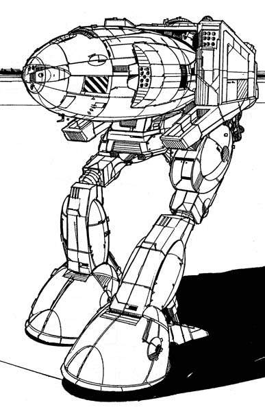
The Stalker Screenshots Look...uhhh...
#21
Posted 13 December 2012 - 12:49 AM
#24
Posted 13 December 2012 - 01:14 AM
#25
Posted 13 December 2012 - 01:33 AM
PGI already made it better looking, than the BT technical readouts..

Edited by Kain, 13 December 2012 - 01:34 AM.
#29
Posted 13 December 2012 - 02:23 AM
 General Taskeen, on 13 December 2012 - 01:55 AM, said:
The original goes both ways. The 'knee' joint bends both ways on the old design, which I thought was kind of interesting.

hehehe, the little door with the 21 on it looks like it has a person peaking out from behind it... probably a wepon but to me looks like an eyeball lol
#30
Posted 13 December 2012 - 03:10 PM
 Thontor, on 13 December 2012 - 02:42 PM, said:
Quote
after doing the concept, and the orthos, and then watching it get modeled, a few issues came to my attention that did lead to it getting changing a bit.
1. Figuring out the mech's nose length was a balancing act between making it look like the concept, making sure it actually look balanced, and keeping in mind that it's actual length would severely impact how easy or hard it was to destroy it's side torsos
2. Those missile doors had to be able to cover the launchers, and the arms themselves had to be able to aim downwards especially when twisting. This lead to the arms being raised slightly to avoid clipping issues with the upper legs.
3. The mech's torso itself needed to be able to pitch up and down while twisting, preferably without also clipping into the upper legs.
4. Also there's simply a matter of perspective. Sometimes a design will look differently when actually built and put into a 3d environment than how i imagine it would look like from my imagination.
Hmm, I am no artist, but how in the heck was the arms going to clip the legs being a bit lower? The only thing those arms should do is pivot around the middle of the torso. So if the torso was looking as far down/up, twisting those arms around in the Y axis should never be clipping.
Actually, I am surprised they even allow the arms to pivot at all. It looks like to me it should all be aiming dead center on the torso redicule with no option to be aiming anywhere else.
#31
Posted 13 December 2012 - 07:36 PM
 Arkmaus, on 12 December 2012 - 11:07 PM, said:
I was expecting it to look a lot more like the artwork from the first post in the "Battlemech 12: Stalker" thread.
Anybody else think the upper torso relative to the lower torse just looks completely out of place?
I didn't look too hard but the first thing I noticed was that the taper of the nose was sharper in the screenshot compared to the concept. These things are bound to happen from time to time as the modeler translates concepts. I guess I can live with it...
Edited by Creepy, 13 December 2012 - 07:45 PM.
#32
Posted 13 December 2012 - 08:05 PM
 Thontor, on 13 December 2012 - 03:13 PM, said:
And the arms still have upper arm actuators, they need to be able to tilt up and down to aim the lasers mounted on them.
See in the picture below how the missile doors barely clear the legs when the arms are pointed straight forward? now imagine those arms tilting downwards.. clipping occurs

Why not have the doors fold out to the side then?
It is a redesign afterall.
#33
Posted 13 December 2012 - 08:26 PM
#34
Posted 13 December 2012 - 08:27 PM
 Thontor, on 13 December 2012 - 08:17 PM, said:
Maybe they thought the way the missile doors open was cool and didn't want to change them?
http://www.sarna.net/wiki/Stalker
To look at all the pics of the Stalker on sarna. They all have that forward protrusion from the bottom of the arms. While they don't appear to be missile doors in that artwork, the missile doors opening downward was clearly Alex's homage to that artwork. Maybe that tie in to the classic artwork was not something they were willing to sacrifice.
Which way the doors open is hardly that big of a deal when compared to the hieght, shape, and size of the actual mech.
I'd much rather have the mech look like the Concept Art but with side-opening doors rather than what has been shown with drop-down doors. Seriously....doors take precedence over the entire mech? Ok.
"Hey, Mr Shelby, the lights on the Mustang interfere with the trunk hood."
"Ok, let's change the shape of the hood, angle of the doors, and height of the bumper."
"Or, we could just move the lights or make them smaller?"
"Nah."
lol
 Tuku, on 13 December 2012 - 08:26 PM, said:
Very slow with a lot of weapons. That's how it pilots.
Edited by Arkmaus, 13 December 2012 - 08:31 PM.
#35
Posted 13 December 2012 - 08:29 PM
 Arkmaus, on 13 December 2012 - 08:27 PM, said:
Which way the doors open is hardly that big of a deal when compared to the hieght, shape, and size of the actual mech.
I'd much rather have the mech look like the Concept Art but with side-opening doors rather than what has been shown with drop-down doors. Seriously....doors take precedence over the entire mech? Ok.
Very slow with a lot of weapons. That's how it pilots.
they could simply limit the arms from going that far down. you cant see that far down anyway. the would-have-been limited arm range is basically the lower blind spot of the cockpit.
they ruined this mech for a crappy reason
Edited by Tennex, 13 December 2012 - 08:29 PM.
#36
Posted 13 December 2012 - 08:29 PM
It's not going to change. And if the minor change to the Stalker from Concept Art to Reality are having you in fits, how have you managed to continue playing this game with the horrid FPS, sub par graphics, mech bay glitches, and **** poor net code?
Me thinks people's priorities are out of order here.
Myself I fully intend on buying at least one stalker with CBills. Just so I can mount as many SRm6s and Large Lasers as physically possible to vape some poor unsuspecting fool.
#37
Posted 13 December 2012 - 08:31 PM
 Mavairo, on 13 December 2012 - 08:29 PM, said:
It's not going to change. And if the minor change to the Stalker from Concept Art to Reality are having you in fits, how have you managed to continue playing this game with the horrid FPS, sub par graphics, mech bay glitches, and **** poor net code?
Me thinks people's priorities are out of order here.
Myself I fully intend on buying at least one stalker with CBills. Just so I can mount as many SRm6s and Large Lasers as physically possible to vape some poor unsuspecting fool.
With all those things wrong with the game. The coolness of the IP, the concepts, the promises was the only thing really left. Thats why i'm fighting so hard for this at least.
the awesome mechs was one of the few things this game has going for it
Edited by Tennex, 13 December 2012 - 08:33 PM.
#38
Posted 13 December 2012 - 08:34 PM
 Mavairo, on 13 December 2012 - 08:29 PM, said:
It's not going to change. And if the minor change to the Stalker from Concept Art to Reality are having you in fits, how have you managed to continue playing this game with the horrid FPS, sub par graphics, mech bay glitches, and **** poor net code?
Me thinks people's priorities are out of order here.
Myself I fully intend on buying at least one stalker with CBills. Just so I can mount as many SRm6s and Large Lasers as physically possible to vape some poor unsuspecting fool.
I have solid performance, good graphics, and minimal issues with the netcode so far outside of sporadic things here and there. Having said that, I also pay money for Mechs.
It's the look and "coolness" of the mechs that keep me coming back and draw me into spending money. If MWO lacks there, than no, I won't be coming back.
Edited by Arkmaus, 13 December 2012 - 08:36 PM.
8 user(s) are reading this topic
0 members, 8 guests, 0 anonymous users


