[Updated W/ Pics] Colors Are Too Drab/monochrome
#41
Posted 01 February 2013 - 05:33 AM
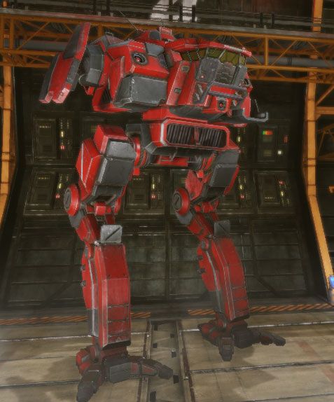
Give me some COLOUR like the images posted.
#42
Posted 01 February 2013 - 06:31 AM
#43
Posted 01 February 2013 - 06:38 AM
Edited by CapperDeluxe, 01 February 2013 - 06:38 AM.
#44
Posted 01 February 2013 - 06:56 AM
Keep the current versions as "dusk" or "dawn" versions.
Which of these you drop on will be decided with random chance when you get the map with daylight setting.
Btw, you should start a thread about a JANGL map... it would be so cool.
Edited by Chavette, 01 February 2013 - 07:00 AM.
#45
Posted 02 February 2013 - 01:15 AM
 Chavette, on 01 February 2013 - 06:56 AM, said:
Keep the current versions as "dusk" or "dawn" versions.
Which of these you drop on will be decided with random chance when you get the map with daylight setting.
Btw, you should start a thread about a JANGL map... it would be so cool.
It's not a problem of the "type" of map like dusk/dawn versions, it's the crappy filters that they stick over the screen to try and keep everything the same ugly brown colour. It needs to go. I really can't believe i'm the only one that is so bothered by this, when you look at the comparison screenshots and see how much better the game COULD look.. EASILY with this engine.. it just makes me weep.
#46
Posted 02 February 2013 - 05:58 AM
#47
Posted 02 February 2013 - 06:47 PM
#48
Posted 03 February 2013 - 07:45 PM
#49
Posted 03 February 2013 - 09:10 PM
#50
Posted 04 February 2013 - 01:10 AM
The two left ones both leave me with a more Battletech-like feel. I think things like devastation, loneliness, apocalypse.
I also really like the lower right one. Maybe a battle in the early morning of some remote ocean world!?
But the upper right one just looks a bit too flashy and happy for me, especially the grass. I do like the mountains in the back, maybe a little less green hue.
So I agree more colors would be nice, but don't overdo it.
Edit: also, I don't see any overwhelming brown on the frozen city map ;-p
Edited by Silencer84, 04 February 2013 - 01:12 AM.
#51
Posted 04 February 2013 - 03:14 AM
I would definitely be happy to see a more colourful MWO, even if only on specific "noon" or "sunny" map variants.
#52
Posted 04 February 2013 - 03:29 AM
#53
Posted 04 February 2013 - 03:40 AM
 Paradoxum, on 02 February 2013 - 01:15 AM, said:
It's not a problem of the "type" of map like dusk/dawn versions, it's the crappy filters that they stick over the screen to try and keep everything the same ugly brown colour. It needs to go. I really can't believe i'm the only one that is so bothered by this, when you look at the comparison screenshots and see how much better the game COULD look.. EASILY with this engine.. it just makes me weep.
Don't worry, you're not. I haven't played in weeks, because between this and the film grain, I just can't bear to play more that one-two rounds at a time, the game's just ugly.
#54
Posted 05 February 2013 - 01:09 PM
 costi, on 04 February 2013 - 03:40 AM, said:
Don't worry, you're not. I haven't played in weeks, because between this and the film grain, I just can't bear to play more that one-two rounds at a time, the game's just ugly.
I feel the same way, I mean I like the gameplay, but the style and graphics have to at least catch my interest or it just gets dull. Really disappointed that this wasn't touched upon at all in the recent "CREATIVE DIRECTOR UPDATE"
Do they not think it's a big deal at all or something?
#55
Posted 05 February 2013 - 01:42 PM

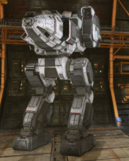
Or my white Stalker... stands out like a sore thumb on any non-snow map (and likes it that way!)

Edited by focuspark, 05 February 2013 - 01:45 PM.
#56
Posted 05 February 2013 - 02:14 PM
Now it looks like im playing Barbie...
#58
Posted 07 February 2013 - 03:22 PM
Edited by JuiceCaboose, 07 February 2013 - 03:30 PM.
1 user(s) are reading this topic
0 members, 1 guests, 0 anonymous users


