Jump to content

Hunchback


51 replies to this topic

#41 Purgatus

    Member

  • PipPipPip
  • Knight Errant
  • 97 posts
  • LocationSan Diego, CA

Posted 25 May 2012 - 07:35 AM

I like the Concept for MWO a great deal mostly because they make them look more like big *** tanks, which is what I thought they should look like.

P.S. and yes they MW:T Hunchback looks godaweful.

#42 Damocles

    Member

  • PipPipPipPipPipPipPipPip
  • The Hammer
  • The Hammer
  • 1,527 posts
  • LocationOakland, CA

Posted 25 May 2012 - 07:36 AM

I like the old lineart. Some of us grew up just reading the novels and enjoying what we could from the few illustrations in the back of them. Their vagueness allowed us to use something called imagination.

But I do like what FD has done with most of the redesigns.

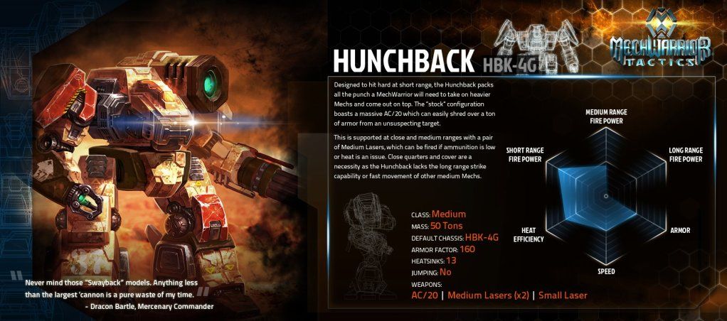
However on MWT subject;
*** IS THIS

Posted Image

#43 Thomas Hogarth

    Member

  • PipPipPipPipPipPip
  • Elite Founder
  • Elite Founder
  • 463 posts
  • LocationTharkad

Posted 25 May 2012 - 07:41 AM

View PostShiinore, on 24 May 2012 - 10:32 PM, said:

Nitpick moar plz.

We should be honored that FD came up with such an amazing re-design of the Hunchback. We're worlds apart from what MW:T got.
Posted Image


..... Could they at least get the autocannon in the right torso location? That's 30 seconds of research to double check you got that right, and a fix is as easy as a geometry flip.

#44 Kymlaar

    Member

  • PipPipPipPipPip
  • Ace Of Spades
  • Ace Of Spades
  • 154 posts
  • LocationSeattle Region

Posted 25 May 2012 - 07:43 AM

MW:T seems to be going down some sort of semi-anime route with their designs. It's like a transition from Battletech to Gundam.

#45 Kittygrinder

    Member

  • PipPipPipPipPipPip
  • 231 posts
  • Google+: Link
  • Facebook: Link
  • LocationRocking the boat.

Posted 25 May 2012 - 07:45 AM

View PostKymlaar, on 25 May 2012 - 07:43 AM, said:

MW:T seems to be going down some sort of semi-anime route with their designs. It's like a transition from Battletech to Gundam.


Except you know... the majority of Battletech and Gundam Mechs all looked bad ***. Id say they are they are take the terrible part of them and combining them to make ultra terrible mechs.

#46 Helmer

    Member

  • PipPipPipPipPipPipPipPipPip
  • Stone Cold
  • 3,272 posts
  • LocationColumbus, Ga

Posted 25 May 2012 - 07:47 AM

I'm all in favor of the new Hunchback design. FD is a mad genius.


Cheers.

#47 Rejarial Galatan

    Member

  • PipPipPipPipPipPipPipPipPip
  • Elite Founder
  • Elite Founder
  • 4,312 posts
  • LocationOutter Periphery

Posted 25 May 2012 - 07:54 PM

View PostDamocles, on 25 May 2012 - 07:36 AM, said:

I like the old lineart. Some of us grew up just reading the novels and enjoying what we could from the few illustrations in the back of them. Their vagueness allowed us to use something called imagination.

But I do like what FD has done with most of the redesigns.

However on MWT subject;
*** IS THIS

Posted Image

W T F!! dear god that is worse than anything! looks like a REAL atlas and Optimus got it on and this happened <BARF>

#48 bert bargo

    Member

  • PipPipPip
  • 53 posts

Posted 25 May 2012 - 08:00 PM

In the new pic we definitely have some Wanzer influences going on... I approve! So long as it has a similar loadout, I will be happy

View PostRejarial Galatan, on 25 May 2012 - 07:54 PM, said:

W T F!! dear god that is worse than anything! looks like a REAL atlas and Optimus got it on and this happened <BARF>

Lol Atlases arent supposed to be missile boats...

#49 whiteknight

    Member

  • PipPipPipPipPip
  • 171 posts
  • LocationToronto, ON

Posted 25 May 2012 - 08:08 PM

View Postbert bargo, on 25 May 2012 - 08:00 PM, said:

In the new pic we definitely have some Wanzer influences going on... I approve! So long as it has a similar loadout, I will be happy


Lol Atlases arent supposed to be missile boats...


20 LRMs is a pretty good number for 3025, not many mechs in the era threw that many or more, Archers, Longbows, the odd Awesome mod, but most everything threw less.

#50 PewPew2

    Member

  • PipPipPipPipPip
  • Elite Founder
  • Elite Founder
  • 148 posts

Posted 25 May 2012 - 08:11 PM

I started a thread on the MW Tactics forums about the hunchback in that game. Worst looking mech I've ever seen. Atlas is pretty bad too. The orion looks pretty cool though.

IMO the devs alienated alot of they're fanbase with that aweful art.

#51 Sassori

    Member

  • PipPipPipPipPipPipPip
  • Rage
  • Rage
  • 884 posts
  • LocationBlackjack

Posted 25 May 2012 - 09:16 PM

I dislike the MW:T Hunchback art, it takes the worst thing I hate about a Dragon (The torso) and plants it onto mega-legs.

However, a lot of MW:T art I do like, and a lot of people like some of the FD redesigns that I do not. The hips/legs on the mechs look to similar imho but some of this isn't FD's fault, PGI picked some mech's I truly dislike artistically. The Jenner is a very sound layout, but the original art is fugly, and that design simply can't be made cool imho, not appearance wise. All mech's need definable arms imho. The Catapult also has this problem as it's really easy to think those launchers are torso and not arms too. Still a lot of people like it, and there are parts I do like (Like the snub nose, love that and the beefier legs).

So, different strokes, people like different things. I dislike country and rap music but hey, they're still making millions of dollars so some people do have to like it.

#52 Karyudo ds

    Member

  • PipPipPipPipPipPipPipPip
  • Knight Errant
  • Knight Errant
  • 1,706 posts
  • LocationChaos March

Posted 25 May 2012 - 09:26 PM

The Atlas model in game looks better than this image. The hunchback though I guess don't get. I had no clue what it was until they labeled it. That's bad. Maybe they'll fix it when modeling it. I would hope.


2 user(s) are reading this topic

0 members, 2 guests, 0 anonymous users