Jump to content

Dear Pgi

Menu Gameplay

101 replies to this topic

#1 Col Jaime Wolf

    Member

  • PipPipPipPipPipPipPipPip
  • Bad Company
  • Bad Company
  • 1,214 posts

Posted 03 June 2015 - 06:48 PM

hire competent people especially in the UI department. i know i didnt vote for this so i dont want to hear any BS about "the players wanted a better UI". i wanted a more tuned UI yes but not this garbage.

no reason to remove the old layout just because you wanted to add a new one. the old one augmented by the drop down lists and the choice to use elements of both/either would have been a better overall solution vs hamfisting everything.

more clicks to select a mech

no clear and one click solution to view the loudoat of a mech

i still cant find how to buy a new mech

not real window windows that have headers but you cant move or position them how you like

takes longer and more clicks to do anything and everything including select a single mech. think LONG and HARD about that one.

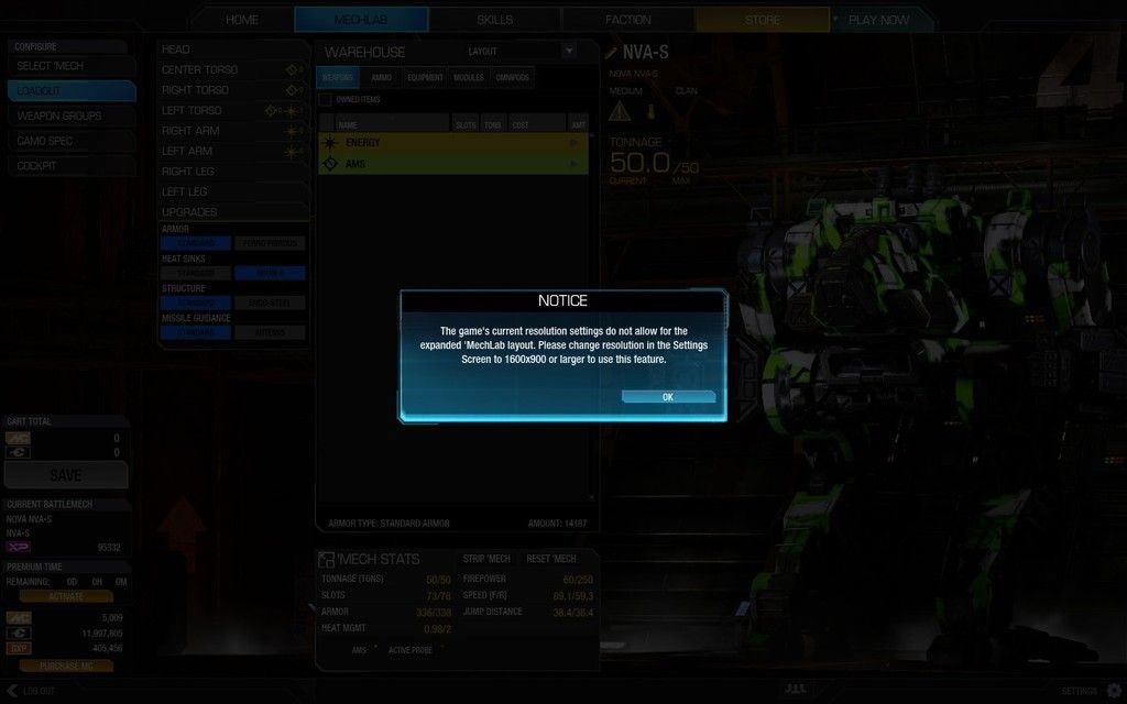
a text spreadsheet massacre omg why no icons? why no flow? why no color coding? why all grey? why remove old features instead of fine tuning?

cant figure out modules, one because it makes no sense also i can hardly read the text in fact i can read hardly any of the text on my monitor and i already got a headache from work today so its really a #$#$ all kinda day.

but lastly this feels like when microsoft removed the start menu for win8 and look how well that worked out. oh ya they are giving out free upgrades to win 10 and win 9 got canned outright.

clap clap clap now go do yourself a favor and hire competent designers because if you havent noticed its because of this kind of thinking that you never get anything TRULY DONE.

you need to learn to take a good idea and work with it STOP REINVENTING THE WHEEL, make a better wheel.

Edited by Mellifluer, 03 June 2015 - 06:50 PM.


#2 Koda Shy

    Member

  • PipPipPip
  • Legendary Founder
  • Legendary Founder
  • 94 posts
  • LocationTriPoint-Kapenja

Posted 03 June 2015 - 07:14 PM

I agree...its absolute garbage....a new player has no chance figuring this crap out.

#3 Nightmare1

    Member

  • PipPipPipPipPipPipPipPipPipPip
  • Ace Of Spades
  • Ace Of Spades
  • 7,636 posts
  • Twitch: Link
  • LocationPeeking over your shoulder while eating your cookies.

Posted 03 June 2015 - 07:24 PM

I actually like the new UI better than the last one.
Give it time.

#4 Lexx

    Member

  • PipPipPipPipPipPipPip
  • The Clamps
  • The Clamps
  • 740 posts
  • LocationSlung below a mech's arm shooting nothing but dirt

Posted 03 June 2015 - 07:27 PM

Posted Image

I think most of the players are complaining about the new UI mostly because it's different and they aren't used to it yet.

I like everything better except for the mech select window and colors that look like they should be painted on to an Easter egg.

Edited by Lexx, 03 June 2015 - 07:30 PM.


#5 Stelar 7

    Member

  • PipPipPipPipPipPip
  • The Raider
  • The Raider
  • 315 posts

Posted 03 June 2015 - 07:31 PM

New UI is good, creating _another_ whining about the UI thread is bad. You have done a bad thing and should feel ashamed.

#6 Mcgral18

    Member

  • PipPipPipPipPipPipPipPipPipPipPipPip
  • CS 2019 Top 8 Qualifier
  • CS 2019 Top 8 Qualifier
  • 17,987 posts
  • LocationSnow

Posted 03 June 2015 - 07:32 PM

View PostLexx, on 03 June 2015 - 07:27 PM, said:


I think most of the players are complaining about the new UI mostly because it's different and they aren't used to it yet.


Not that it's lacking several features that the previous mechlab had, or the fact it shafts some players completely by removing one of the few positive aspects?


No double clicking or equip button, no auto switching menus, Column only view that sucks balls and no mech overview.

View PostStelar 7, on 03 June 2015 - 07:31 PM, said:

New UI is good, creating _another_ whining about the UI thread is bad. You have done a bad thing and should feel ashamed.


See above; they've shafted so many convenient aspects.


But, hey, you can filter ammo now. It's got that going for it. Not like you needed to actually see the mech loadout in its entirety, did you? I hope you don't mind clicking 10 additional more times for the same thing that took 2 in the previous version.


Straight up improvement!

#7 Kiiyor

    Member

  • PipPipPipPipPipPipPipPipPipPip
  • Big Daddy
  • Big Daddy
  • 5,564 posts
  • LocationSCIENCE.

Posted 03 June 2015 - 07:36 PM

I prefer this. Vastly.

There are a few areas that need work - especially the part where you actually find the mech you want to pilot (it's like someone installed a BattleTech hedge maze between the barracks and the hangar), but in general, outfitting mechs is, IMHO, an order of magnitude easier than it used to be.

What i'd like to see:
  • Layout default to expanded
  • Saving loadouts would be nice, but it's a pipe dream
  • Need an easier way to select mechs. I vote for a list on the RHS of the UI.
  • Option to auto-expand the equipment dropdowns
  • Quirks are important, and need to be displayed more prominently
  • The escape key should take you back a layer in the UI.
There's probably more, but they're my key issues. Basically, I think all they really need to do now is work on cutting down on the number of mouseclicks required to drive the interface, and we'll have something not-quite-smurfy-but-better-than-it-used-to-be.

#8 FupDup

    Member

  • PipPipPipPipPipPipPipPipPipPipPipPipPipPip
  • Ace Of Spades
  • Ace Of Spades
  • 26,888 posts
  • LocationThe Keeper of Memes

Posted 03 June 2015 - 07:36 PM

The new lab seems to be overall less bad than the previous one, but it still has plenty of kinks and LosTech to get straightened out. Something something two steps forward one step backwards.

#9 Lexx

    Member

  • PipPipPipPipPipPipPip
  • The Clamps
  • The Clamps
  • 740 posts
  • LocationSlung below a mech's arm shooting nothing but dirt

Posted 03 June 2015 - 07:37 PM

View PostMcgral18, on 03 June 2015 - 07:32 PM, said:


Not that it's lacking several features that the previous mechlab had, or the fact it shafts some players completely by removing one of the few positive aspects?


No double clicking or equip button, no auto switching menus, Column only view that sucks balls and no mech overview.


See above; they've shafted so many convenient aspects.


But, hey, you can filter ammo now. It's got that going for it. Not like you needed to actually see the mech loadout in its entirety, did you? I hope you don't mind clicking 10 additional more times for the same thing that took 2 in the previous version.


Straight up improvement!


You can see the whole mech loadout in the expanded view, that replaces the need for a mech overview. Even without it the column view is similar to what we had to use before, so I don't see how it's worse.

#10 Mcgral18

    Member

  • PipPipPipPipPipPipPipPipPipPipPipPip
  • CS 2019 Top 8 Qualifier
  • CS 2019 Top 8 Qualifier
  • 17,987 posts
  • LocationSnow

Posted 03 June 2015 - 07:40 PM

View PostNightmare1, on 03 June 2015 - 07:24 PM, said:

I actually like the new UI better than the last one.
Give it time.


After they fix the **** they broke.

Double clicking, not requiring Click and Drag

Mech Details page for the sub 1600*900 peasants.

Auto switching menus (Omnipods, weapons, ammo)


Half of those things were REMOVED when they swapped, with nothing replaced. It's a damned downgrade.

#11 Cyborne Elemental

    Member

  • PipPipPipPipPipPipPipPipPip
  • 3,964 posts
  • LocationUSA

Posted 03 June 2015 - 07:40 PM

Mechlab UI itself (features and functionality during a build) = 5 steps forward.

Mech Selection MAIN UI = 2 steps backwards.

#12 Mcgral18

    Member

  • PipPipPipPipPipPipPipPipPipPipPipPip
  • CS 2019 Top 8 Qualifier
  • CS 2019 Top 8 Qualifier
  • 17,987 posts
  • LocationSnow

Posted 03 June 2015 - 07:40 PM

View PostLexx, on 03 June 2015 - 07:37 PM, said:


You can see the whole mech loadout in the expanded view, that replaces the need for a mech overview. Even without it the column view is similar to what we had to use before, so I don't see how it's worse.


**** YOU says PGI.

Posted Image

All I've got is rubbish.

#13 Corbon Zackery

    Member

  • PipPipPipPipPipPipPipPip
  • Elite Founder
  • Elite Founder
  • 1,363 posts

Posted 03 June 2015 - 07:43 PM

The strip all Armor/Modules/Weapons/Equipment needs to come back. I have to agree with 125 mech clicking and loading a single mech in the mechlab is very tedious. I don't think there was a need to split the mech into IS/Clan tabs.

But hey the 4th times the charm.

#14 Ollorin

    Member

  • PipPipPip
  • Philanthropist
  • Philanthropist
  • 56 posts

Posted 03 June 2015 - 07:45 PM

The only thing the new UI has going for it, is that it's more colorful. That's it. Aside from that it's a horrible example of a UI. I just spent a good 15 minutes trying to figure out what mech I had a particular engine on. At least with the last UI I didn't have to go open up each loadout and check, I could just use the mech details button. I also didn't need to change my resolution in order to get an actual useful view. The column view is absolutely useless. so basically I need to change my resolution to use my mechlab then change it back to get the smoother fps durring gameplay.

PGI really needs to just fire the entire team working on the UI and start over. I think at this point they've proven than they can't get it right.

#15 Stelar 7

    Member

  • PipPipPipPipPipPip
  • The Raider
  • The Raider
  • 315 posts

Posted 03 June 2015 - 07:47 PM

View PostMcgral18, on 03 June 2015 - 07:32 PM, said:


Not that it's lacking several features that the previous mechlab had, or the fact it shafts some players completely by removing one of the few positive aspects?


No double clicking or equip button, no auto switching menus, Column only view that sucks balls and no mech overview.


See above; they've shafted so many convenient aspects.


But, hey, you can filter ammo now. It's got that going for it. Not like you needed to actually see the mech loadout in its entirety, did you? I hope you don't mind clicking 10 additional more times for the same thing that took 2 in the previous version.


Straight up improvement!


Waaaaahhhh..

Seriously almost all of these are pure hyperbole. I hated having to click every location to see what the armor values were. Now I don't need to load smurfies and build a mech to build a mech. Mech select is fine I can get through all my chassis quickly and intuitively. It took me seconds to adjust now I'm having fun with new features and actually playing the game.

The folks who can't use the expanded views, I do feel for them. Why you would want to play this game on a laptop I can't imagine, but to each their own. Lots of folks got hosed when Win XP fell away too. It doesn't mean that I still feel for them, it's time to upgrade.

However the level of QQ and hyperbolic butt hat syndrome, is ridiculous. Whist do you people do in real life when things change? Are you this absurdly emotive about every minor inconvienance?

#16 Mcgral18

    Member

  • PipPipPipPipPipPipPipPipPipPipPipPip
  • CS 2019 Top 8 Qualifier
  • CS 2019 Top 8 Qualifier
  • 17,987 posts
  • LocationSnow

Posted 03 June 2015 - 07:50 PM

View PostStelar 7, on 03 June 2015 - 07:47 PM, said:

Waaaaahhhh..

Seriously almost all of these are pure hyperbole. I hated having to click every location to see what the armor values were. Now I don't need to load smurfies and build a mech to build a mech. Mech select is fine I can get through all my chassis quickly and intuitively. It took me seconds to adjust now I'm having fun with new features and actually playing the game.

The folks who can't use the expanded views, I do feel for them. Why you would want to play this game on a laptop I can't imagine, but to each their own. Lots of folks got hosed when Win XP fell away too. It doesn't mean that I still feel for them, it's time to upgrade.

However the level of QQ and hyperbolic butt hat syndrome, is ridiculous. Whist do you people do in real life when things change? Are you this absurdly emotive about every minor inconvienance?


And you're going to ignore the helpful features that were removed?


I didn't expect a widescreen LCD monitor to be ****** over...by one and only one game. Seems to be an issue on their part.

Besides...it's also an issue on the opposite end:
Posted Image


Totally Working as Intended™

Edited by Mcgral18, 03 June 2015 - 07:50 PM.


#17 Novakaine

    Member

  • PipPipPipPipPipPipPipPipPipPip
  • Veteran Founder
  • Veteran Founder
  • 5,715 posts
  • LocationThe Republic of Texas

Posted 03 June 2015 - 07:54 PM

Posted Image

#18 RagingOyster

    Member

  • PipPipPipPipPipPip
  • Bad Company
  • Bad Company
  • 462 posts
  • LocationBaltimore, Maryland

Posted 03 June 2015 - 07:54 PM

So,,,

I don't mind the new lab. I do miss the strip button (unless it's there and I've just missed it?) and I think the quirks should be more prominently displayed but on the whole I think the changes are welcome (and most of the player base seems to agree with me). It too me a few minutes of clicking through everything to get the feel for the new UI.

Creating a whining "dear pgi" thread calling their team incompetent is not the way to voice your complaints. B****ing and moaning every time something changes accomplishes nothing. If you have a complaint, be an adult about it and voice it instead of hurling insults at PGI and the other people in the thread.

My 2 cents

Edit: the resolution issues are clearly a problem that needs to be addressed. I imagine a hotfix incoming in the next few days.

Edited by RagingOyster, 03 June 2015 - 07:55 PM.


#19 Kira Onime

    Member

  • PipPipPipPipPipPipPipPipPip
  • The Dragoon
  • The Dragoon
  • 2,486 posts
  • Twitch: Link
  • LocationMontréal, Québec.

Posted 03 June 2015 - 07:59 PM

View PostCorbon Zackery, on 03 June 2015 - 07:43 PM, said:

The strip all Armor/Modules/Weapons/Equipment needs to come back. I have to agree with 125 mech clicking and loading a single mech in the mechlab is very tedious. I don't think there was a need to split the mech into IS/Clan tabs.


It never left.

#20 Col Jaime Wolf

    Member

  • PipPipPipPipPipPipPipPip
  • Bad Company
  • Bad Company
  • 1,214 posts

Posted 03 June 2015 - 07:59 PM

never said i didnt want the new UI im just dissapointed that i couldnt choose between them to mix and match or like move windows and the general flow to me feels wrong. feels very betaish even by PGI beta standards

still dont know how to buy a new mech someone plx enlighten me.

Edited by Mellifluer, 03 June 2015 - 08:00 PM.


1 user(s) are reading this topic

0 members, 1 guests, 0 anonymous users