Jump to content

Guillotine and Thug


32 replies to this topic

#1 TG Xarbala

    Member

  • PipPipPipPipPip
  • 106 posts
  • LocationCan I get back to you on that?

Posted 25 July 2012 - 04:21 PM

Chris Daranouvong again. A little while back I did some commissioned art for a fan-made TRO, TRO:3063, including working with Anthony "ShimmeringSword" Scroggins on the cover. I figure you guys might appreciate this. Or might not. The Guillotine I did replaced the previous sketch in the TRO entry, and it's a fairly straightforward sharpening up of the canon design. You can tell I was aping FD's art style with it, though, and careful examination will show the torso is a mite janky. It's literally the first TRO-style illustration I ever did that wasn't just a sketch or messing around. The Thug, on the other hand, was a dramatic redesign and I felt I could only get away with it because 1) nobody likes the canon Thug design and 2) the Thug specifically isn't considered iconic or especially notable in the way more famous `Mechs are.

While sketching I mostly just have fun with shapes and try to get forms down, I lack an engineer's eye for these things and my work suffers for my tendency to "wing it." For something like a TRO illustration, I try to pack on more detail than I would have a mind to in color work (which I'm also new at!) and more often than not when I find myself wondering what to do with a piece of `Mech that needs detailing, I take a look at what FD does.

When it comes to constructing appealing-looking `Mechs and their shapes and silhouettes it was always David White's work that inspired me most. In my mind, the MW4 Fafnir and Owens have completely shoved aside the TRO art for what their respective `Mech designs should be. However, when it comes to fine detailing and dealing with those pesky joints, Alex Iglesias has been a revelation in the BT art world and he's easily the giant in whose footsteps I try, and usually fail, to follow. His work takes the love of detailed machinery you see in Armored Core games or "Real Robot" mecha anime production materials and applies them to the much more solid and industrial-feeling Battletech aesthetic, and it's easy to see why his work was chosen to represent the face of BT and MechWarrior to a new gaming generation.

But enough talk! Have at you!

Canon art of these `Mechs can be found here, and all caveats to the quality of old Battletech art apply:
http://www.sarna.net/wiki/Guillotine
http://www.sarna.net/wiki/Thug

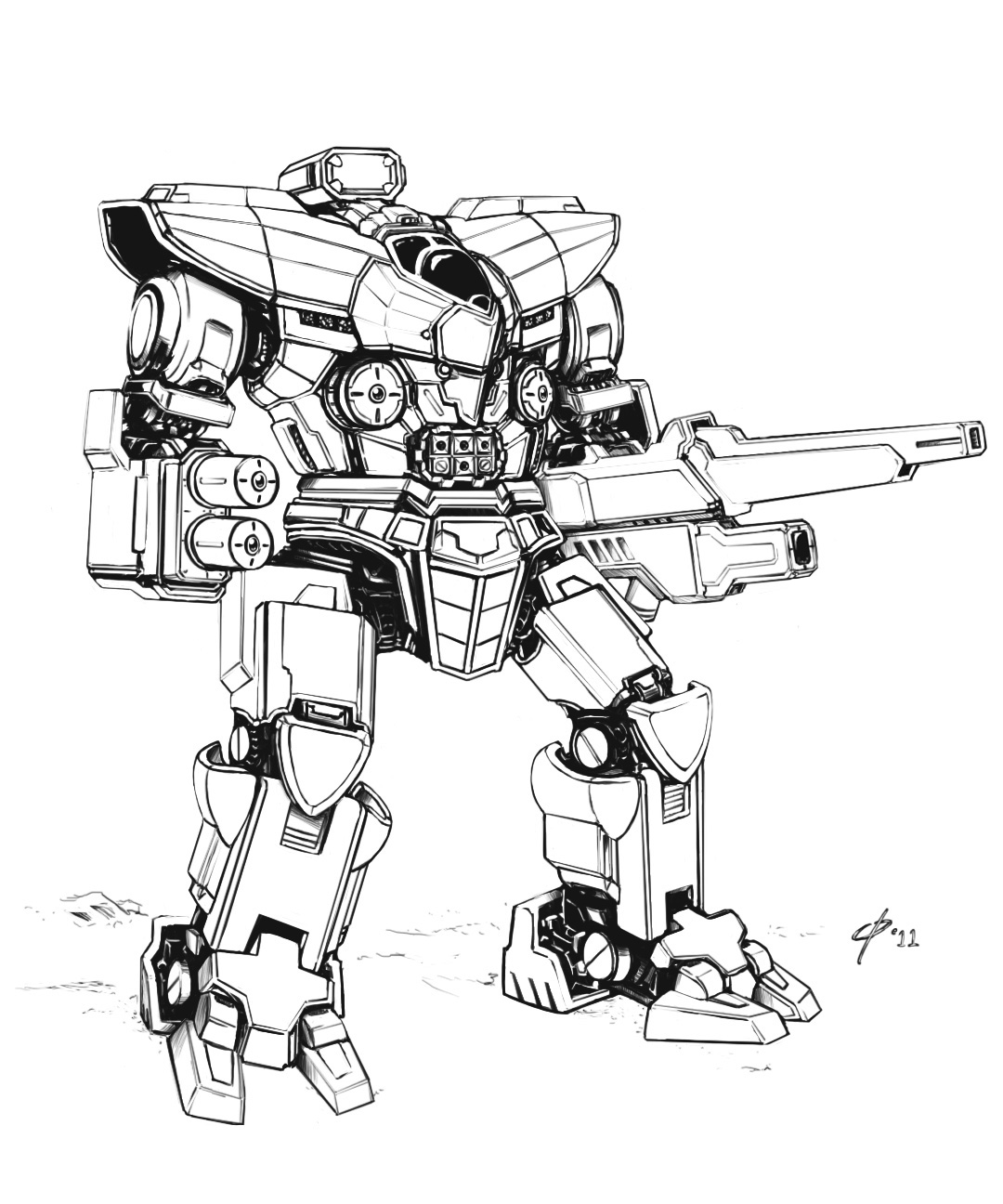
So here's the Guillotine:
Posted Image

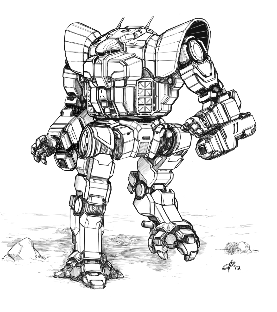
And here's the Thug:
Posted Image


So when the game goes live (or even just open beta) and you find me pubbing it up in a match, feel free to tell me to stop playing MWO and to get back to work.

#2 Stygian Steel

    Member

  • PipPipPipPipPipPip
  • 238 posts
  • Facebook: Link
  • Locationohio

Posted 25 July 2012 - 04:28 PM

looks great man

#3 Hawkeye 72

    Member

  • PipPipPipPipPipPipPipPip
  • 1,890 posts
  • Google+: Link
  • Facebook: Link
  • LocationArcadia

Posted 25 July 2012 - 04:34 PM

Guilottine is good.

That Thug...is gorgeous.

#4 Will9761

    Member

  • PipPipPipPipPipPipPipPipPip
  • Big Brother
  • Big Brother
  • 4,592 posts

Posted 25 July 2012 - 04:38 PM

The Thug is a good mech and I like the style of your work. :blush:

#5 CaptainIvan

    Member

  • PipPip
  • The Ogre
  • The Ogre
  • 20 posts

Posted 25 July 2012 - 04:42 PM

i like both of your redesigns but my only minor, minor, minor complaint, is that i kinda liked the thug better without hands. but still excellent work!

#6 Bishop Steiner

    ForumWarrior

  • PipPipPipPipPipPipPipPipPipPipPipPipPipPipPip
  • The Hammer
  • The Hammer
  • 47,187 posts
  • Locationclimbing Mt Tryhard, one smoldering Meta-Mech corpse at a time

Posted 25 July 2012 - 04:44 PM

I like youur line work and subtle shading/ abstracted inner workings. I dig the Guilly a lot, but there is something about the THUG... it's not that I dislike it, just that it doesn't quite feel like a Thug.\

IDK, it looks cool, but just something is nagging me.....

#7 Wooj

    Member

  • PipPipPip
  • Elite Founder
  • Elite Founder
  • 61 posts
  • LocationSparta, IL

Posted 25 July 2012 - 05:51 PM

And I am just the opposite of Bishop Steiner. I am not a fan of the arms on the Guillotine, they look a little to... Gundam-y, for my tastes. The rest of the mech looks good though.

The Thug, though... Pure perfection. If they looked like that I would actually consider driving one, despite the fact that they are a poor-man's version of the Warhammer.

#8 TG Xarbala

    Member

  • PipPipPipPipPip
  • 106 posts
  • LocationCan I get back to you on that?

Posted 25 July 2012 - 05:54 PM

View PostCaptainIvan, on 25 July 2012 - 04:42 PM, said:

i like both of your redesigns but my only minor, minor, minor complaint, is that i kinda liked the thug better without hands. but still excellent work!


Thug's always had hands, actually. They're usually hidden behind big paddle arms though.

View PostBishop Steiner, on 25 July 2012 - 04:44 PM, said:

I like youur line work and subtle shading/ abstracted inner workings. I dig the Guilly a lot, but there is something about the THUG... it's not that I dislike it, just that it doesn't quite feel like a Thug.\

IDK, it looks cool, but just something is nagging me.....


Considering said paddle arms are the other distinctive feature besides the shoulders, that's fair. The paddle arms were dropped for this particular piece because the TRO entry was concerning a noncanon ERLL variant and it felt a little odd to give so much `Mech real estate to lasers, however large.

Besides that, though, the silhouette of the Thug is largely retained. The main reasons why it feels like a major departure from the canon Thug is because the canon Thug looks like a disappointed Awesome without much definition to its torso glacis and because here there's a clear demarcation where the head ends and the rest of the body begins. The canon Thug also has bulbous SRM launchers, and it much more rounded in the belly and front. I brought the roundness from the launchers up to the chest, giving it some much-needed definition.

Thanks to the changed head and moved-around "rounded" elements, it looks like a completely new `Mech. The client liked the result despite the dramatic change, which was what I was most worried about.


View PostWooj, on 25 July 2012 - 05:51 PM, said:

And I am just the opposite of Bishop Steiner. I am not a fan of the arms on the Guillotine, they look a little to... Gundam-y, for my tastes. The rest of the mech looks good though.

The Thug, though... Pure perfection. If they looked like that I would actually consider driving one, despite the fact that they are a poor-man's version of the Warhammer.


Funny story, I was actually looking for inspiration for the Light Gauss rifle on the Guillotine (and while the main gun arm is supposed to lack a lower arm actuator, the original sketch this replaced did have an elbow, so regardless of whether the original pic was in error I kept the detail) I went looking at Eric Ou/Eriance's work. His stuff is pretty detailed and solid, though he has a clear anime influence in his work and is a known Gundam fan. This might have seeped into the final product.

This particular Thug loses the ER PPCs in favor of ERLLs and boasts 4 Streak SRM-4 launchers.

This is no Warhammer, boy! No Warhammer.

(That thing's got more armor and power than a Warhammer, it's completely different!)

Edited by TG Xarbala, 25 July 2012 - 06:00 PM.


#9 DerMaulwurf

    Member

  • PipPipPipPipPipPipPip
  • Legendary Founder
  • Legendary Founder
  • 599 posts
  • LocationPotato Tier

Posted 26 July 2012 - 03:28 AM

Very clean and overall nice designs. I quite like the contrast between the armor plates and the beneath parts (joints and so on).

And teehee, you're Guillotine has laser nipples.

@Bishop Steiner: It could be the hip joint. As in that the original doesn't have one. It's a nice mech for sure, but it does have a different vibe.

#10 Bishop Steiner

    ForumWarrior

  • PipPipPipPipPipPipPipPipPipPipPipPipPipPipPip
  • The Hammer
  • The Hammer
  • 47,187 posts
  • Locationclimbing Mt Tryhard, one smoldering Meta-Mech corpse at a time

Posted 26 July 2012 - 02:05 PM

View PostDerMaulwurf, on 26 July 2012 - 03:28 AM, said:

Very clean and overall nice designs. I quite like the contrast between the armor plates and the beneath parts (joints and so on).

And teehee, you're Guillotine has laser nipples.

@Bishop Steiner: It could be the hip joint. As in that the original doesn't have one. It's a nice mech for sure, but it does have a different vibe.


That is part of it. I also think that the shoulder flares don't quite match the rest, with their rounding, and they combine to give the mech an improbably flat look to the torso.

Lastly, the feet just don't really fit the design (to my mind's eye, anyhow) in either size or shape.

#11 TG Xarbala

    Member

  • PipPipPipPipPip
  • 106 posts
  • LocationCan I get back to you on that?

Posted 26 July 2012 - 05:18 PM

View PostDerMaulwurf, on 26 July 2012 - 03:28 AM, said:

Very clean and overall nice designs. I quite like the contrast between the armor plates and the beneath parts (joints and so on).

And teehee, you're Guillotine has laser nipples.


But wait! Now imagine the laser nipples as "eyes" and the SRM rack as a mouth.

View PostBishop Steiner, on 26 July 2012 - 02:05 PM, said:

That is part of it. I also think that the shoulder flares don't quite match the rest, with their rounding, and they combine to give the mech an improbably flat look to the torso.

Lastly, the feet just don't really fit the design (to my mind's eye, anyhow) in either size or shape.


I knew I was going to court some controversy with this redesign, though apparently out of the `Mechs in the Marik section of TRO:3063 it was to be one of the best-received going by feedback from the guys putting the fanTRO together., especially since the canon Thug is notoriously ugly without having the same degree of charm as other "ugly" `Mechs. (Like the original Jagermech, which could be best described as an urbie on stilts. It's ugly, but it's got an appeal to the design with the unconventionality of it all.) Now if I could get away with using this Thug design in a canon TRO, that would be a real coup. As it stands, though, I'm still very proud that it's showing up in the same publication, albeit an unofficial one, that FD, ACS, and David White contributed art to.

The feet, well. I'll admit I went off the original design request and right into personal whim when I went from the canon "horse hoof" foot to a splayed-out elephantine weight distribution look. I could just as easily swap out the feet for the sort of feet FD's MWO Stalker has, which I'll admit makes the horse-hoof design work.

I'm pretty public about my intentions: I want to see this Thug, or at least a more canon-friendly take on this general Thug design, used in a canon TRO someday. I will most likely bug CGL's Art Director about this after GenCon ends.

Edited by TG Xarbala, 26 July 2012 - 05:18 PM.


#12 Ramseti

    Member

  • PipPipPipPipPip
  • Bad Company
  • Bad Company
  • 130 posts

Posted 27 July 2012 - 04:32 PM

I've been following the TRO: 3063 work for a while, and while I love the Guillotine, the Thug is simply amazing. My jaw hit the floor the first time I saw it. And for what it's worth, I love the feet.

#13 Brian Banzai

    Member

  • PipPipPipPipPipPipPip
  • The Phoenix
  • The Phoenix
  • 731 posts
  • Google+: Link
  • Facebook: Link
  • LocationLebanon, TN

Posted 28 July 2012 - 07:33 AM

Why does the Guillotine seem to have an extra weapon under slung on the left arm Large laser?

#14 Bishop Steiner

    ForumWarrior

  • PipPipPipPipPipPipPipPipPipPipPipPipPipPipPip
  • The Hammer
  • The Hammer
  • 47,187 posts
  • Locationclimbing Mt Tryhard, one smoldering Meta-Mech corpse at a time

Posted 28 July 2012 - 08:09 AM

View PostTG Xarbala, on 26 July 2012 - 05:18 PM, said:


But wait! Now imagine the laser nipples as "eyes" and the SRM rack as a mouth.


I knew I was going to court some controversy with this redesign, though apparently out of the `Mechs in the Marik section of TRO:3063 it was to be one of the best-received going by feedback from the guys putting the fanTRO together., especially since the canon Thug is notoriously ugly without having the same degree of charm as other "ugly" `Mechs. (Like the original Jagermech, which could be best described as an urbie on stilts. It's ugly, but it's got an appeal to the design with the unconventionality of it all.) Now if I could get away with using this Thug design in a canon TRO, that would be a real coup. As it stands, though, I'm still very proud that it's showing up in the same publication, albeit an unofficial one, that FD, ACS, and David White contributed art to.

The feet, well. I'll admit I went off the original design request and right into personal whim when I went from the canon "horse hoof" foot to a splayed-out elephantine weight distribution look. I could just as easily swap out the feet for the sort of feet FD's MWO Stalker has, which I'll admit makes the horse-hoof design work.

I'm pretty public about my intentions: I want to see this Thug, or at least a more canon-friendly take on this general Thug design, used in a canon TRO someday. I will most likely bug CGL's Art Director about this after GenCon ends.


I totally agree with you on that, and every "artist" (not sure I count myself as one, I dabble, but FD, SS, David White and yourself put me to shame, and I ain't ashamed to admit it) is going to have different perspectives on what does and doesn't work b(for instance, I think Shimmering Sword is immensely talented, but I hate, Hate, HATE, his take on the Marauder. Just looks way to fat and heavy for me. Maybe as a MAD-II, but just not a MAD-3R). n I would love to get your take on my Thug redesign, but refuse to be a d-bag and post it on your thread. My line art is nowhere up to par with your, but I do think I got most of the basic elements to work with it, though as you mention, the paddles are somewhat difficult to do satisfactorily.


I have no complaints with your stated goal either, if you follow any of my posts you will see I have the same, though mine is primarily around getting quality Unseens to be re-published. Anyhow, I totally dig the quality of your work. I may also be a bit picky because the Thug is one of my favorite Mechs.

#15 TG Xarbala

    Member

  • PipPipPipPipPip
  • 106 posts
  • LocationCan I get back to you on that?

Posted 29 July 2012 - 05:05 PM

Oh. You're possibly the first person I've run into who has a soft spot for the classic Thug. I understand, I really went off on a different direction with the design idea there.

I actually really, really like ACS' Marauder precisely because it's bulkier and heavier than the old licensed Regault Zentraedi pod design. It's a 75-ton sniper just on the brink of being an Assault and I agree with the decisions he made concerning it. The original unseen looks gangly and the new reseen looks ungainly and still retains the gangly wobbly-limbs look of the original. Which, I suppose, gives it some points for a degree of unfortunate faithfulness.

Everybody has their own take on the unseens and it's very hard to satisfy everyone, or even most, many, or some people (see: Project Phoenix). The best we can do is have everyone's Reseen designs duke it out. Ring of fire in the forest, Steiner Rules style. Last `Mech standing gets to be made into a mini.


EDIT:

View Postmaxoconnor, on 28 July 2012 - 07:33 AM, said:

Why does the Guillotine seem to have an extra weapon under slung on the left arm Large laser?


That's because this is a noncanon variant from TRO:3063. That underslung gun is actually an ERLL, while the main gun is a Light Gauss Rifle.

As you can probably guess by that description, this is from the Marik section of the book.

Edited by TG Xarbala, 29 July 2012 - 05:12 PM.


#16 zer0imh

    Member

  • PipPipPipPipPipPipPip
  • Elite Founder
  • Elite Founder
  • 581 posts
  • LocationFomalhaut

Posted 29 July 2012 - 05:19 PM

epic illustrations... believable/lifelike looking :D

#17 Bishop Steiner

    ForumWarrior

  • PipPipPipPipPipPipPipPipPipPipPipPipPipPipPip
  • The Hammer
  • The Hammer
  • 47,187 posts
  • Locationclimbing Mt Tryhard, one smoldering Meta-Mech corpse at a time

Posted 29 July 2012 - 05:31 PM

Well, I would not say I am in love with the design in that regard, but there are elements to it that I really do like. The old Solaris 7 Box Set had a picture in it of a Thug that had dispatched an Archer, I believe, and there was something very "gorilla-esque" to it that fit it's name.

As for being ugly.. that is exactly what the Thug should be, IMO. A hulking Brute, a Zombie Mech, that just keeps grinding after you. If I can keep my computer running long enough to scan, I finally will add my cleaned up version to my own thread. Nowhere near as well executed as yours (I gotta say I am envious of yours and David Whites line art, the crispness of it, my hand is too nervous). but just my "personal" vision of a Thug is FASA would have stopped hiring half blind 5 year olds to draw their mechs.

As for SS's Marauder, like ya said, all one can really do is agree to disagree. I think his re-design makes for a fine 100 ton Marauder II, because it's so bulky it looks slow. I agree the original MAD-3R was gangly, but within reason, that is precisely why I feel it should stay that way. Aside from the umpteen million novel descriptions, I just personally feel that any Re-Seen versions should be faithful to the spirit and feel of the original, while different enough to avoid legal issues. It's why I have issues with the Project Phoenix designs. Many have zero connecting features to their "origins", and then some, like the Thunderbolt and Warhammer, took mechs traditionally described as squat and stout, burly looking mechs, and made anorexic mockeries of them.

I gotta know, how do you get such crisp linework, is it free hand, computer done, or do you just edit your hand drawn work on a computer? I am totally self taught in every aspect, so I admit there is a LOT I don't know how to do. (especially when it comes to the computer side.)

#18 TG Xarbala

    Member

  • PipPipPipPipPip
  • 106 posts
  • LocationCan I get back to you on that?

Posted 29 July 2012 - 05:48 PM

View Postzer0imh, on 29 July 2012 - 05:19 PM, said:

epic illustrations... believable/lifelike looking :D


Thanks mate!

View PostBishop Steiner, on 29 July 2012 - 05:31 PM, said:

Well, I would not say I am in love with the design in that regard, but there are elements to it that I really do like. The old Solaris 7 Box Set had a picture in it of a Thug that had dispatched an Archer, I believe, and there was something very "gorilla-esque" to it that fit it's name.

As for being ugly.. that is exactly what the Thug should be, IMO. A hulking Brute, a Zombie Mech, that just keeps grinding after you. If I can keep my computer running long enough to scan, I finally will add my cleaned up version to my own thread. Nowhere near as well executed as yours (I gotta say I am envious of yours and David Whites line art, the crispness of it, my hand is too nervous). but just my "personal" vision of a Thug is FASA would have stopped hiring half blind 5 year olds to draw their mechs.

As for SS's Marauder, like ya said, all one can really do is agree to disagree. I think his re-design makes for a fine 100 ton Marauder II, because it's so bulky it looks slow. I agree the original MAD-3R was gangly, but within reason, that is precisely why I feel it should stay that way. Aside from the umpteen million novel descriptions, I just personally feel that any Re-Seen versions should be faithful to the spirit and feel of the original, while different enough to avoid legal issues. It's why I have issues with the Project Phoenix designs. Many have zero connecting features to their "origins", and then some, like the Thunderbolt and Warhammer, took mechs traditionally described as squat and stout, burly looking mechs, and made anorexic mockeries of them.

I gotta know, how do you get such crisp linework, is it free hand, computer done, or do you just edit your hand drawn work on a computer? I am totally self taught in every aspect, so I admit there is a LOT I don't know how to do. (especially when it comes to the computer side.)


Well, we do have different tastes but I'll agree with you wholeheartedly on the Thunderbolt and the Warhammer reseens. Balls were seriously dropped there. I can also understand where you're coming from on the Thug though my real issue with the classic Thug was its overreliance on callbacks to the Awesome's design. Which is unfortunate as it's supposed to be a scaled up knockoff of the Warhammer (this is why the head and top of my Thug's torso looks a little like the croc-head structure on the top of the Warhammer's torso if you squint from a distance).

As far as how I get my linework done, I learned it from FD. More precisely, I actually didn't really know how FD does his linework until he made a post about it (I think on 4chan, or maybe on his dA) where he explained that he got his clean, straight lines through judicious use of Photoshop's Shift+Mouse1 function to not only draw straight lines but also to erase straight lines (a quick way to carve out "white" in a mass of black space). All this being made easier with a wacom tablet, and I draw everything straight to photoshop now unless I'm just sketching throwaway ideas on paper. The rest was mostly just practice in traditional media, and when I learned how FD got his lines done everything just started to "click."

#19 Bishop Steiner

    ForumWarrior

  • PipPipPipPipPipPipPipPipPipPipPipPipPipPipPip
  • The Hammer
  • The Hammer
  • 47,187 posts
  • Locationclimbing Mt Tryhard, one smoldering Meta-Mech corpse at a time

Posted 29 July 2012 - 05:57 PM

View PostTG Xarbala, on 29 July 2012 - 05:48 PM, said:


Thanks mate!


Well, we do have different tastes but I'll agree with you wholeheartedly on the Thunderbolt and the Warhammer reseens. Balls were seriously dropped there. I can also understand where you're coming from on the Thug though my real issue with the classic Thug was its overreliance on callbacks to the Awesome's design. Which is unfortunate as it's supposed to be a scaled up knockoff of the Warhammer (this is why the head and top of my Thug's torso looks a little like the croc-head structure on the top of the Warhammer's torso if you squint from a distance).

As far as how I get my linework done, I learned it from FD. More precisely, I actually didn't really know how FD does his linework until he made a post about it (I think on 4chan, or maybe on his dA) where he explained that he got his clean, straight lines through judicious use of Photoshop's Shift+Mouse1 function to not only draw straight lines but also to erase straight lines (a quick way to carve out "white" in a mass of black space). All this being made easier with a wacom tablet, and I draw everything straight to photoshop now unless I'm just sketching throwaway ideas on paper. The rest was mostly just practice in traditional media, and when I learned how FD got his lines done everything just started to "click."


*Sigh* I am really gonna have to give up my Luddite ways I guess. I just dislike the lack of "original" copy, especially for commission work. Obviously we are talking illustrating, essentially vs the next Mona Lisa, but I do think even this medium has it's place as legit art.. but how does one "Collect" rare pieces?

Plus I admit, I find photoshop totally bewildering. It feels like it was designed to allow computer programmers to draw, not to be used by "traditional media" artists, because NOTHING is remotely intuitive. Someone reccomended GIMP to me as a more "logical" alternative. As for the Tablets... they scare me, lol. I dunno, I just like the feel of pens and pencils in my hand. Probably always gonna hold me back form getting on in this type of forum.

#20 TheTeacher

    Member

  • PipPipPipPipPipPip
  • 275 posts
  • LocationTennessee

Posted 30 July 2012 - 07:52 AM

These are nice. I have always liked the Thug and wanted to build one but the paper model isn't that hot. You redesign looks like it really belongs in the MWO universe. Well done!


1 user(s) are reading this topic

0 members, 1 guests, 0 anonymous users