Jump to content

Timber Wolf Tribute


63 replies to this topic

#1 AzureTempest

    Member

  • Pip
  • Elite Founder
  • Elite Founder
  • 15 posts
  • LocationIowa, USA

Posted 07 November 2011 - 06:30 PM

Hello fellow Mechwarrior fans. Making my first post and shout out in anticipation of this game. While back, when the first teaser "fragments" started flying about online, i started up my own little render of my personal favorite, the Timber Wolf/Mad Cat to get psyched up for more info and details...

Update 7/12/2012...New Version up, tweeked the design a bit, this time in a more "lunar" style environment...enjoy =)

Posted Image


Though any suggestions/requests, I would love to hear =)
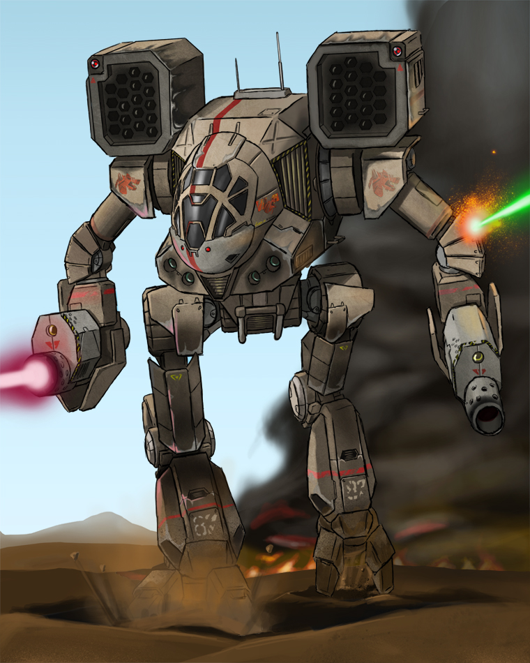
Posted Image

*Update* 11-9-11
Not sure if you guys had hoped for more in a side-profile. Something made up quick for roughly what i had in mind, mainly the lower slung arms closer to the original renders from the old school drawings, vs the higher up like in the games.

Posted Image

Edited by AzureTempest, 12 July 2012 - 05:14 AM.


#2 phelanjkell

    Member

  • PipPipPipPipPipPip
  • 355 posts
  • LocationNorth Carolina

Posted 07 November 2011 - 06:38 PM

I'm not even going to lie, I like.... haha It is a huge change from the original, but shares allot of similarities. Could I say one thing, do more, and see which ver everyone likes the most?

But again, hands down I do enjoy!

#3 zudukai

    Member

  • PipPipPipPipPipPipPipPip
  • Trinary Star Captain
  • Trinary Star Captain
  • 1,707 posts

Posted 07 November 2011 - 06:41 PM

i like the smaller profile of the nose, and the angled center, i wonder, can you make a side profile? if it has the same feel i think i'd really like this! even with the classic arms. (IMO MW4 arms make more sense, guarding the nose somewhat.)

#4 Der BruzZzler von Wiesndoof

    Member

  • PipPipPipPipPipPipPipPip
  • Legendary Founder
  • Legendary Founder
  • 1,494 posts
  • LocationAm Grill

Posted 07 November 2011 - 06:41 PM

Eeeh! That Timber Wolf use inner sphere-lasers! :) :D

#5 DFDelta

    Member

  • PipPipPipPipPipPip
  • 358 posts
  • LocationGermany

Posted 07 November 2011 - 07:13 PM

I really like hot that Timberwolf looks, actually, I think I even like that slender nose in your version more then the bulky one of the original.

#6 Colddawg

    Member

  • PipPipPipPipPipPip
  • Legendary Founder
  • Legendary Founder
  • 317 posts
  • LocationYork, Pennsylvania

Posted 07 November 2011 - 07:25 PM

I approve.

Great job.

#7 Skorpio

    Rookie

  • 8 posts

Posted 07 November 2011 - 07:29 PM

its amazing i just saved it as my background : )

#8 phelanjkell

    Member

  • PipPipPipPipPipPip
  • 355 posts
  • LocationNorth Carolina

Posted 07 November 2011 - 08:21 PM

Azure, can we see a few more angles of this mech? Side, Back?

#9 HanaYuriko

    Member

  • PipPipPipPipPipPipPip
  • Knight Errant
  • 588 posts
  • LocationPNW

Posted 07 November 2011 - 09:52 PM

Darn it! I was going to do a knee joint similar to that for my model. Now I need to think of a different approach.

Excellent reworking, by the way.

#10 phelanjkell

    Member

  • PipPipPipPipPipPip
  • 355 posts
  • LocationNorth Carolina

Posted 08 November 2011 - 04:59 AM

View PostHanaYuriko, on 07 November 2011 - 09:52 PM, said:

Darn it! I was going to do a knee joint similar to that for my model. Now I need to think of a different approach.

Excellent reworking, by the way.


And why can't you continue to use it? This is only art, and it looks good.

#11 AzureTempest

    Member

  • Pip
  • Elite Founder
  • Elite Founder
  • 15 posts
  • LocationIowa, USA

Posted 08 November 2011 - 07:35 AM

@Phelanjkell
Thanks! I had wanted my own take, but i didn't want to make it so different that it wouldn't be noticeable, being a very iconic mech and all to battletech, wanted to stay true to it. And i'd be happy to sketch up more profiles of it soon.

@Zudukai
I should have a side profile sketched up within the week =)

@The_Birdeater
Haha! yeah...i was conflicted on how to portray the lasers. In some of the books and Mech3, clan or inner sphere, i noticed they had done with blue-small, green-medium, and red-large vs Mech4(and again, even in some of the books) Inner sphere-red, clan-green. If its one or the other, i wouldn't mind knowing, saves me the headache for the other ones i'm working on, lol.

@HanaYuriko
I say go for it...im certain somewhere down the road, even i got the look/feel from somewhere else.

And for everyone else, thank for the comments! Helps inspire me to keep on with my projects =)

#12 HanaYuriko

    Member

  • PipPipPipPipPipPipPip
  • Knight Errant
  • 588 posts
  • LocationPNW

Posted 08 November 2011 - 12:25 PM

View Postphelanjkell, on 08 November 2011 - 04:59 AM, said:


And why can't you continue to use it? This is only art, and it looks good.

View PostAzureTempest, on 08 November 2011 - 07:35 AM, said:

@HanaYuriko
I say go for it...im certain somewhere down the road, even i got the look/feel from somewhere else.

And for everyone else, thank for the comments! Helps inspire me to keep on with my projects =)


That's alright guys. I have an idea based on an older model I've done.

Still, good design tweaks posted here.

#13 Ra-ul

    Member

  • PipPipPipPipPip
  • Rage
  • Rage
  • 122 posts
  • LocationAustria

Posted 08 November 2011 - 01:38 PM

Nice design, it´s immeditaly recognized as Timberwolf although you have changed it quite a bit (looking at the TRO at least). I still don´t know how missiles of that size could be stored in those shoulder launchers though (or transferred from torso to launchers), but that´s a common problem of all original Battlemech designs. Battletech not = Logitech :) You might think of that in another study.

#14 WolfHound5223

    Rookie

  • Knight Errant
  • 4 posts

Posted 08 November 2011 - 07:12 PM

Love your design! It always bothered me that most of the original artwork for the Timber Wolf had an all panelled glass cockpit, so I like that you've armored yours a bit.

#15 zudukai

    Member

  • PipPipPipPipPipPipPipPip
  • Trinary Star Captain
  • Trinary Star Captain
  • 1,707 posts

Posted 09 November 2011 - 12:17 AM

any thoughts to doing another slight update to the arms to vulture omni arms?

also, joints look a little un-armored.

Edited by zudukai, 09 November 2011 - 12:18 AM.


#16 Stormwolf

    Member

  • PipPipPipPipPipPipPipPipPip
  • Elite Founder
  • Elite Founder
  • 3,951 posts
  • LocationCW Dire Wolf

Posted 09 November 2011 - 04:39 AM

Nice, I'll take 5 :)

#17 FlystreesVagann

    Member

  • PipPipPip
  • 55 posts

Posted 09 November 2011 - 05:27 AM

Nice pice of art you got there,kudos *

#18 StonedDead

    Member

  • PipPipPipPipPipPip
  • 488 posts
  • LocationOn a rock, orbiting a giant nuclear reactor

Posted 09 November 2011 - 10:37 AM

Very, Very nice. The staple of Mech warfare. My favorite mech by far, nothing fancy, but it has it where it counts. I would take one of these over an army of varied assault mechs. BRAVO!

#19 phelanjkell

    Member

  • PipPipPipPipPipPip
  • 355 posts
  • LocationNorth Carolina

Posted 09 November 2011 - 06:27 PM

Patiently awaiting some more updates.... or I should say, trying to be patient!!

#20 AzureTempest

    Member

  • Pip
  • Elite Founder
  • Elite Founder
  • 15 posts
  • LocationIowa, USA

Posted 09 November 2011 - 08:03 PM

Haha, sorry for the lateness of the side-shot. Currently working on a Stormcrow/Ryoken with Jade Falcon colors, and its taking longer than i had first hoped.


3 user(s) are reading this topic

0 members, 3 guests, 0 anonymous users