Ui 2.0 - Feedback
#801
Posted 05 February 2014 - 11:09 PM
It messed up the actual game for me though, it reset all my graphics settings, now, no matter what I do I seem be be running the game at least 20 FPS lower then before, and some of the graphics just look ugly.
UI 2 promised so much I was hoping it would revive some of the love I used to have for this game but too little to late.
#802
Posted 05 February 2014 - 11:51 PM
#803
Posted 06 February 2014 - 12:40 AM
End result : Closed the game without launching a match, and I guess I won't be starting until CW (surely to just get a chuckle out of the "all you can dream of CW")... but given the apparent use of our feedback, I'm pretty sure that the UI will not have changed a bit except for the mechlab.
Just a quick question, how could you let THAT kind of mechlab pass in the initial build? Has nobody tested out the time needed to configure a mech in UI "1.5" and this one before validating it for release?
#804
Posted 06 February 2014 - 12:58 AM
 HRR Mary, on 06 February 2014 - 12:40 AM, said:
End result : Closed the game without launching a match, and I guess I won't be starting until CW (surely to just get a chuckle out of the "all you can dream of CW")... but given the apparent use of our feedback, I'm pretty sure that the UI will not have changed a bit except for the mechlab.
Just a quick question, how could you let THAT kind of mechlab pass in the initial build? Has nobody tested out the time needed to configure a mech in UI "1.5" and this one before validating it for release?
UI 2.0 is quicker than UI 1.5. Mech lab works just fine.
#805
Posted 06 February 2014 - 01:41 AM
Transitions from choosing your 'Mech and then wanting to unlock skills/efficiencies seems too convoluted at present.
Current procedure example:
1, Click Select 'Mech button to open that menu.
2, Make your choice of 'Mech.
3, Click on Skill button at top of screen.
4, Select 'Mech Chassis type.
5, Select desired variant 'Mech tree.
6, review/unlock 'Mech efficiencies.
Possible solution:
Have the option to review/unlock the skills in the 'Mech selection menu via a shortcut button situated just above or below the Configure button. This would allow the player to directly access the 'Mech efficiencies of their chosen 'Mech variant without unnecessarily complicating things.
Possible Solution Procedure:
1, Click Select 'Mech button to open that menu.
2, Make your choice of 'Mech.
3, Select Skills/Efficiencies button (which would be situated either above or below the configure button).
4, Review/unlock 'Mech efficiencies related to that particular variant.
#806
Posted 06 February 2014 - 02:25 AM
 Greenomen, on 05 February 2014 - 04:16 PM, said:
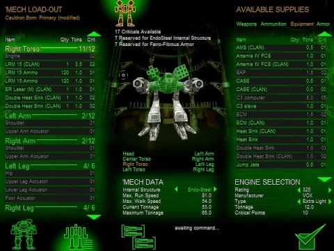
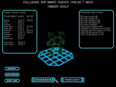
You know what? I'm actually going to say it: It doesn't look pretty. It's got a better color scheme, but it's actually far far inferior to the mechlab of, say, freaking MechWarrior 2.
SUPERIOR

IN EVERY

WAY

Imagine that with updated graphics and then UI 2.0 will make you cry.
#807
Posted 06 February 2014 - 02:26 AM
 Victor Morson, on 06 February 2014 - 02:25 AM, said:
You know what? I'm actually going to say it: It doesn't look pretty. It's got a better color scheme, but it's actually far far inferior to the mechlab of, say, freaking MechWarrior 2.
SUPERIOR

IN EVERY

WAY

Imagine that with updated graphics and then UI 2.0 will make you cry.
Did you just say the MW2 Mechlab was superior? Oh my... that's just awful
#810
Posted 06 February 2014 - 02:31 AM
 Dymlos2003, on 06 February 2014 - 02:29 AM, said:
Can't take you seriously anymore, not that I did before.
Hey, at least you could flick through your variants and they'd present you with information about them, right?
Imperfect as it may be, it also fits about 5 screens worth of UI 2.0 into each screen. heh
Edited by Victor Morson, 06 February 2014 - 02:32 AM.
#811
Posted 06 February 2014 - 02:32 AM
 Dymlos2003, on 06 February 2014 - 12:58 AM, said:
UI 2.0 is quicker than UI 1.5. Mech lab works just fine.
Read carefully : Time to configure a mech in UI 2.0, comparing to UI 1.5. It took me almost twice the time to configure a mech in the new UI, which is a point that should have been checked by design prior to any release.
Now I appreciate that you want to defend PGI, but really, given the enormous delay to get that UI out, the end result is less than satisfactory.
#812
Posted 06 February 2014 - 02:33 AM
 HRR Mary, on 06 February 2014 - 02:32 AM, said:
Read carefully : Time to configure a mech in UI 2.0, comparing to UI 1.5. It took me almost twice the time to configure a mech in the new UI, which is a point that should have been checked by design prior to any release.
Now I appreciate that you want to defend PGI, but really, given the enormous delay to get that UI out, the end result is less than satisfactory.
Anyone who thinks UI 2.0 is faster than UI 1.0 has not had to search for an engine in a library of 'mechs bigger than 30.
#813
Posted 06 February 2014 - 02:36 AM
 Victor Morson, on 06 February 2014 - 02:31 AM, said:
Hey, at least you could flick through your variants and they'd present you with information about them, right?
Imperfect as it may be, it also fits about 5 screens worth of UI 2.0 into each screen. heh
UI 2.0 presents more info than the mech2 one. Also the Mech2 one takes as many clicks/menus as UI2.0. Do I sense a double standard?
 HRR Mary, on 06 February 2014 - 02:32 AM, said:
Read carefully : Time to configure a mech in UI 2.0, comparing to UI 1.5. It took me almost twice the time to configure a mech in the new UI, which is a point that should have been checked by design prior to any release.
Now I appreciate that you want to defend PGI, but really, given the enormous delay to get that UI out, the end result is less than satisfactory.
I don't know, I have a video proving the opposite but ok. I figured out this mechlab the first test that had it. It's the same exact one that we had in the original UI. Just has some missing info in some places.
#814
Posted 06 February 2014 - 02:44 AM
 Dymlos2003, on 06 February 2014 - 02:36 AM, said:
Ok, you have a video proving, then I must be wrong.
I'm not engaging a debate, not on a feeback thread. My feeling is that this new UI is time consuming, barely logical, and visually unattractive.
We will eventually debate once I check back the forums, which will be around CW release.
Until then, have fun.
#815
Posted 06 February 2014 - 02:49 AM
#816
Posted 06 February 2014 - 03:03 AM
Now onto 2.1
#817
Posted 06 February 2014 - 03:09 AM
 Waladil, on 05 February 2014 - 04:20 PM, said:
I think this should be a priority as it is not really hard to accomplish. Even though an internal search engine would be the best, my suggestion is the following:
- Add equipped items to the inventory list (list them with a special symbol)
- When clicked, the equipment shows on the right which mechs (in a simple list - not a shopping cart grid!) have that module/weapon
- Have a button to Configure that mech and jumping automatically to the section that item is installed
- Have a button to remove the component from that mech without configuring it - this would facilitate mass component removal (for instance, remove all engines/components/cockpit items from all mechs would be easy)
 Waladil, on 05 February 2014 - 04:20 PM, said:
3.) The inventory menu's "save" button reads "checkout" even when no C-bills or MC are being spent. IMO, "checkout" has such a strong real-world money-spending connotation to it, it should only be used when MC -- real money -- is being spent. If the button were to change description and color based on the changes being made, that would actually be a huge improvement. "Return to Lab" (grey) -- no changes. "Save" (green) -- changes only involving owned items. "Confirm" (orange) -- purchasing items with C-Bills. "Checkout" (red) -- purchasing items with MC.
My opinion is that this checkout area, as well as the MC/C-Bills amount indicators, should be bigger and made more important. I disagree with Waladil regarding the button color and label. It should be simple:
- Button "Commit changes" or "Save changes" - not Checkout!
- If there is anything to pay, the popup shows up asking which currency you want to use - would be great if it allowed partial payments by using both currencies
- Close and you're done
 Waladil, on 05 February 2014 - 04:20 PM, said:
4.) As of now, the only way to go back within the menu structure is to click, well, back. This can be a PITA especially given that the back button is relatively small. There's an easy fix, however. Add a keyboard or mouse command that will always go back. Common commands for this include right-clicking (anywhere), or pressing escape, shift, or tab. This would even partially alleviate problem 2.
Yes, keyboard shortcuts are a must. However, as someone else pointed out, the back button could be replaced by a tree structure, preventing so many menu-screens and speeding up the process of going back (you can go back and jump to the section you want to go next directly).
 Waladil, on 05 February 2014 - 04:20 PM, said:
6.) Speaking of that pop-up menu...
6a.) It only pops up when you mouse-and-hold. I'd like a place to click where it'd stay open. Maybe even add some further tooltips onto that menu. I thought that the little triangle in the corner was the button to make that menu pop up for a little bit.
6b.) If you click the mech (like anyone would do if they want to select it), the menu wont pop up unless you mouse off the mech and back onto it. Fix.
6c.) The point of having the menu be a pop-up is so that it doesn't always conceal the pretty picture of the mech. Well, if you've got it popped up on a mech in the rightmost column, you can sometimes jerk your mouse over to the menu area quickly and the menu stays popped up. Relatively minor. Still, fix.
This is a major issue. Not only the information is not there, as the information hierarchy is wrong. Hardpoints and weapons installed should have a more important feel rather than torso twist. The font is so small, it can be overlooked easily. it's hard to track and to compare with other mechs. Also, the hovering is not a really good option. Here's my suggestion:
- Cut the width of the grid/list in order to prevent the overlay of the hover information on the mech
- Allow the information panel to be toggled and not disappear on mouse-out. Place a checkbox like "Show/Hide Specs" next to the Mech model, and the user could make that permanent.
- A two-step info panel should be implemented. When opened, the panel shows ONLY the most important things - just like the old interface. Special information (torso speed, angles, etc) are interesting but are second level. Should be positioned inside that menu (in a "See more" section or behind an expand button).
- Hovering over a mech that is not selected, would bring some information next to the thumbnal - crucial information only. That would allow quick comparison between models (as both info are displayed) while we don't have a true comparison system implemented.
 Waladil, on 05 February 2014 - 04:20 PM, said:
That was a point that was hammered during the PTS and was completely ignored. The problem is that filters are of single selection (here's another design problem). Both left menu (the one with 'light', 'medium', ect... and the filter menu 'owned', 'purchasable' could be condensed into ONE single element of interface. At the left, a number of check boxes would appear like this:
Class
[ ] - Light
[X] - Medium
[ ] - Heavy
[ ] - Assault
Type
[ ] - Hero
[ ] - Trial
[ ] - Champion
Features (or whatever)
[X] - ECM
[ ] - Jump Jets
[ ] - AMS
Installed Engine
[X] - XL
[ ] - Standard
[ ] - Not installed
...
And this filter would show up a Cicada 3M
This is called Layered Navigation and is a common modern approach to catalog filtering, replacing the traditional and limited tree of categories.
 Waladil, on 05 February 2014 - 04:20 PM, said:
I think it will be a matter of time. IMHO, they did well on not spending resources on it at the moment.
 Waladil, on 05 February 2014 - 04:20 PM, said:
Yes, we need favorite mechs (like the 4 mechs we had on last interface). A perfect place would be at the welcome screen. Maybe, like the iron-man suit room.
 Waladil, on 05 February 2014 - 04:20 PM, said:
10a.) No XP functions are available if you don't currently own a mech of a given variant. For example, I have Awesomes mastered but only own one. Therefore, I must have some XP and skills on at least two other Awesomes. I cannot see which skills the unowned mechs do and do not have, nor can I exchange XP to GXP on those sold mechs. This may be intentional... but I disagree with it.
Yes, I agree with you. Information should be open to every mech even if you don't own it.
 Waladil, on 05 February 2014 - 04:20 PM, said:
Completely! It induces confusion and does not follow the KISS rule at all.
 Waladil, on 05 February 2014 - 04:20 PM, said:
This was actually a point that made me mad and totally destroyed my expectations for this patch. There was SO MUCH valuable feedback after the PTS that there isn't really an excuse for some aspects to be released like they did. Seemed like the hours we spend testing for free (and writing about it) were for nothing.
I hope they catch up in the following updates.
#818
Posted 06 February 2014 - 03:52 AM
#819
Posted 06 February 2014 - 05:10 AM
That said, I still haven't had the patience to search for all my missing modules, so running without them for now..
Fast updates for filtering stuff please.. .. LOL @ that.
#820
Posted 06 February 2014 - 05:58 AM
 Dymlos2003, on 06 February 2014 - 02:36 AM, said:
UI 2.0 presents more info than the mech2 one. Also the Mech2 one takes as many clicks/menus as UI2.0. Do I sense a double standard?
I don't know, I have a video proving the opposite but ok. I figured out this mechlab the first test that had it. It's the same exact one that we had in the original UI. Just has some missing info in some places.
Please post the video.
1 user(s) are reading this topic
0 members, 1 guests, 0 anonymous users

 This topic is locked


