 LakeDaemon, on 22 June 2013 - 01:27 PM, said:
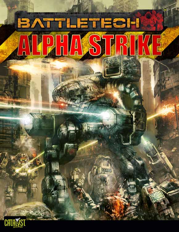
I would agree that the MWO Raven did lose some of the characteristic profile with a straight nose but I prefer the updated look of the sculpted angular chassis over a rounded simple egg for most other designs e.g. Stalkers and Catapults. Those look far better now and, imo, represent the new standard over past games and way over the simple, anachronistic look of the 80s drawings. The MadCat here looks like a brawny, fierce combat machine with polished hard faces while also looking graceful and well crafted. I like this better than, say, some of the Madcats from other art that are long thin legged, copper-skinned, with arms like vaccum hoses. I respect and embrace TT and the original art but Im in the "keep an eye to canon but make it look more like a combat machine and not 50's martians" camp. FD's MadCat above looks utterly cool imo.
Yeah, I agree. Rounded Mechs are a little outdated now and I'm loving the newer designs. I personally think the Timber Wolf art looks really nice and I'd love to see how the Prime came out. A shame it's not MWO concept art.
To be honest after seeing all the Timber Wolf hate threads I'd consider this version to be quite acceptable too. The torso is relatively small in comparison to the arms and legs. Would make balancing a little less argumentative; even if the 'ears' were LRM-20's and a part of the L/R torso.
I'd personally show my full support to this design, I think it resolves quite a few of the major drawbacks people have been arguing about all this time. And all it took was a reduction of the torso size. Who'd have thought it so simple?!
Edited by KelesK, 23 June 2013 - 08:59 PM.


