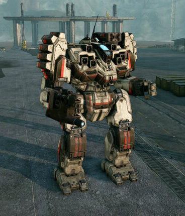
Phoenix Mech Image Collection: All Images So Far
#61
Posted 08 October 2013 - 02:44 PM
#63
Posted 08 October 2013 - 03:45 PM
 Jin Ma, on 08 October 2013 - 02:30 PM, said:
 Jin Ma, on 03 October 2013 - 12:20 PM, said:


Hrm... The SHD is parked next to the rear hangar in the BLR pic, but they do look like they may have similar head heights, although the head is in a bit lower position on the BLR's body. Still, it makes for a short, squat BLR and a tall, thin SHD
#64
Posted 08 October 2013 - 03:56 PM

#65
Posted 08 October 2013 - 04:13 PM
 DirePhoenix, on 08 October 2013 - 03:45 PM, said:
Hrm... The SHD is parked next to the rear hangar in the BLR pic, but they do look like they may have similar head heights, although the head is in a bit lower position on the BLR's body. Still, it makes for a short, squat BLR and a tall, thin SHD
The problem with that is the fact the BLR is like 100-150m away from the SHD's position, and is further from the hangar in its picture. This creates a false sense that the BLR is short, and the SHD is just as tall in conjunction with the higher pov of the BLR picture. If you bring the BLR closer or to the exact position of the SHD, I can almost guarantee that the SHD will be at least below the cockpit of our BLR.
Edited by Alek Ituin, 08 October 2013 - 04:14 PM.
#66
Posted 08 October 2013 - 04:59 PM
 MarsAtlas, on 03 October 2013 - 04:23 PM, said:
But yeah, its really obtrusive, and that aesthetic won't be so appealing once I get cored because I can't see **** (sir). If you're unwilling to change the geometry of it, at least make it thinner. If you reduced thickness of all of the bars by 50%, you'd maintain the aesthetic while probably making these complaints non-existent.
you won't be playing from that FoV (any cockpit becomes obtrusive) and truth to tell, the Locust is not supposed to be a mech people WANT to pilot for any length of time. It's an Econo-Mech. Hence it's not gonna be as nicely laid out.
#67
Posted 08 October 2013 - 05:16 PM
 Bishop Steiner, on 08 October 2013 - 04:59 PM, said:
I want to pilot it for an extended period of time.
Annoy the f**k out of people as I pewpew them with MG's and an MLas with my XL-190 engine.
#68
Posted 08 October 2013 - 05:31 PM
Locust pilots are the weirdest.
I will be the court jester!
Whoop! Whoop! Whoop!
#69
Posted 08 October 2013 - 05:40 PM
#70
Posted 08 October 2013 - 07:37 PM

its pauldrons also got massive.
#71
Posted 08 October 2013 - 07:42 PM
 Jin Ma, on 08 October 2013 - 07:37 PM, said:
[snip]
its pauldrons also got massive.
Actually they're the same size as in the concept art. The missile box on both of them comes up flush to the top of the pauldron, meaning they're the same size in both.
The gun design however is odd, but I like the in-game version better. Also, I don't understand why they swapped the missile and energy hardpoints.
Edited by Alek Ituin, 08 October 2013 - 07:45 PM.
#72
Posted 08 October 2013 - 07:46 PM
 Alek Ituin, on 08 October 2013 - 07:42 PM, said:
Actually they're the same size as in the concept art. The missile box on both of them comes up flush to the top of the pauldron, meaning they're the same size in both.
In game missile box looks a little bigger, which may be that the torso height shrunk
Or the missile box AND pauldrons are bigger
#73
Posted 08 October 2013 - 07:49 PM
 Alek Ituin, on 08 October 2013 - 07:42 PM, said:
Actually they're the same size as in the concept art. The missile box on both of them comes up flush to the top of the pauldron, meaning they're the same size in both.
They look slightly fatter though, and the geometry stands out much more in the shot. They are really close, just feel slightly off and 3D
 Alek Ituin, on 08 October 2013 - 07:42 PM, said:
I sort of like the under-arm version myself but I'm wondering if this made swappable weapon models easier.
#74
Posted 08 October 2013 - 08:08 PM
 Karyudo ds, on 08 October 2013 - 07:49 PM, said:
Could be a game balance decision, too. As much as people love the cataphract, they love to ***** about those underslung arm weapons.
 Alek Ituin, on 08 October 2013 - 07:42 PM, said:
They didn't swap them. That version of the concept art has been flipped (look at the 4).
#75
Posted 08 October 2013 - 08:08 PM
 Alek Ituin, on 08 October 2013 - 07:42 PM, said:
Actually they're the same size as in the concept art. The missile box on both of them comes up flush to the top of the pauldron, meaning they're the same size in both.
The gun design however is odd, but I like the in-game version better. Also, I don't understand why they swapped the missile and energy hardpoints.
they're both a bit bigger.
This is how it'd look if the proportions were the same as the concept.
lol it would have been so easy for them to mess around with the proportions of various parts during modeling.

Edited by Jin Ma, 08 October 2013 - 08:16 PM.
#77
Posted 08 October 2013 - 08:20 PM
1. The PPC is now on the outside of the forearm instead of under it, which I approve of. I hate shooting the building or dirt berm I am standing behind instead of the enemy.
2. The cockpit window looks like they added a crossbar, making the part of the glass that is the "head" a lot smaller and harder to hit.
As for the 2nd thumb/pinky I didn't notice it in the concept art, but now that the 3D model picture is out I can see it was there the whole time. I'm not crazy about that design concept, but as it has zero effect on anything it isn't a big deal. I just sort of gives me the creeps as I think about how that poor guy got his pinky broken and see it hanging limp and mangled like it is.
Also, the fact that the PPC is positioned where it is might be closer to the old art, where the battlemaster actually was carrying a two handed, twin barrled blaster gun (it had a handle sticking out of the left side for the left hand to grab onto while the anime pilot fired his gun).
Edited by Hans Von Lohman, 08 October 2013 - 08:23 PM.
1 user(s) are reading this topic
0 members, 1 guests, 0 anonymous users


