Jump to content

Marauder Concept / Design Contest - (Unofficial) - Ended


389 replies to this topic

#361 vetal l

    Member

  • PipPipPipPipPipPipPip
  • Overlord
  • Overlord
  • 583 posts
  • LocationVRGD

Posted 11 November 2013 - 02:16 PM

View PostFherot, on 11 November 2013 - 01:52 PM, said:

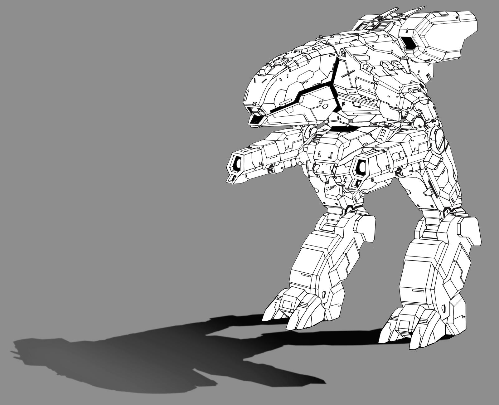
This is the original scanned inked drawing (minus background and shadow for contrast). I'm actually working on a Crusader now that's going to be black and white + grayscale shading. I'm more of a technical mind than a creative painter's mind... And lazy..


one thing annoying me - where is a viewport? =)

#362 FireSlade

    Member

  • PipPipPipPipPipPipPipPip
  • 1,174 posts
  • LocationStrana Mechty

Posted 11 November 2013 - 02:24 PM

View Postvetal l, on 11 November 2013 - 12:17 PM, said:

the waiting is literally killing me.
may you guys discuss pics i've posted here? this is not a submission - so feel free to tell me everything =)
i'll try to draw some more then.

Posted Image

Posted Image

Really well done considering that it was done on google sketchup (used it before and it is tough to do anything accurate with it) and for the most part I like it. My biggest gripe about it would be the arms sitting a little bit too high; it looks like the elbow joint is connected to the shoulder. The arms could also extend back from the elbow a bit to add to the aesthetics and be a counter balance weight. I am a sucker for the armored vents that you would see on a few mechs and I think would go a long way to improve the Marauder’s design; I see a few points that could be used for this and just that high detail is tough with sketchup. You could also differentiate the PPC barrel from that of the laser unless they are both lasers on the arms and possibly add shoulder armor to help protect the side torsos and upper ballistic mount. Still I like the design.

Some of the criteria that I use for considering a Marauder and this could be expanded on:
  • Cataphract’s Legs (because of lore)
  • Similar body shape to a Timber Wolf (because or lore)
  • Cockpit on the front of the mech
  • Ballistics mount on top

These are just some things that I could think of and I am ok with just about any design as long as these are a part of it. Personally, I did not like the original much since it used an anime design, which is based more on a light fantasy style rather than a heavy military/tank style that you would expect from Battletech. (I am going to get hate mail for that statement)

On a side note I have been wondering why no one has ever considered offsetting the ballistics mount like this: (Sorry about the link. I do not know how to upload pics to mwmercs)

https://drive.google...dit?usp=sharing

This would differentiate from the Unseen while still holding true to it and to a point still following the lore and rules.

#363 Fherot

    Member

  • PipPip
  • Shredder
  • Shredder
  • 43 posts

Posted 11 November 2013 - 02:33 PM

View Postvetal l, on 11 November 2013 - 02:16 PM, said:


one thing annoying me - where is a viewport? =)


Round TIE fighter-like viewport right infront.

#364 SloCat

    Member

  • Pip
  • 10 posts

Posted 11 November 2013 - 02:49 PM

View PostFherot, on 11 November 2013 - 01:52 PM, said:
Posted Image

This is the original scanned inked drawing (minus background and shadow for contrast). I'm actually working on a Crusader now that's going to be black and white + grayscale shading. I'm more of a technical mind than a creative painter's mind... And lazy..


Very nice linework. I dig it! Especially all the small details. Congrats. Look forward to cheking out the Crusader when you get her finished up... :P

#365 vetal l

    Member

  • PipPipPipPipPipPipPip
  • Overlord
  • Overlord
  • 583 posts
  • LocationVRGD

Posted 11 November 2013 - 02:54 PM

View PostFireSlade, on 11 November 2013 - 02:24 PM, said:

Really well done considering that it was done on google sketchup (used it before and it is tough to do anything accurate with it) and for the most part I like it. My biggest gripe about it would be the arms sitting a little bit too high;

the point was to defend long sidetorso that is a pretty target

Quote

it looks like the elbow joint is connected to the shoulder.

for same reason. there is no place for longer arms but under the torso - that i do not want.

Quote

The arms could also extend back from the elbow a bit to add to the aesthetics and be a counter balance weight.

if only for aesthetic. look for my older pics - there is a back part that contain engine. and front part contain just a cockpit.

Quote

You could also differentiate the PPC barrel from that of the laser unless they are both lasers on the arms and possibly add shoulder armor to help protect the side torsos and upper ballistic mount.

the weapon was taken from 9M variant (i've made submitted design with many weapons) - it is double ERLL.

Quote

Still I like the design.
thanks. wonder what will you say about submitted one =)

Quote

Some of the criteria that I use for considering a Marauder and this could be expanded on:
  • Cataphract’s Legs (because of lore)
worst thing i found out. because i found out this too late. and 'phract already have an MWO legs.


Quote

  • Similar body shape to a Timber Wolf (because or lore)


thanks god there is no madcat in game - so torso can be any.


Quote

On a side note I have been wondering why no one has ever considered offsetting the ballistics mount like this: (Sorry about the link. I do not know how to upload pics to mwmercs)

https://drive.google...dit?usp=sharing

This would differentiate from the Unseen while still holding true to it and to a point still following the lore and rules.

great idea indeed! but also too late as for submitted as for this one.

#366 Drakari

    Member

  • PipPipPip
  • 74 posts

Posted 11 November 2013 - 05:37 PM

For Vetal (not quoting because that would require going back to find a relevant post), it overall looks great, though not as "cool" as the more concept-art-styled fancy drawings since it's just a textureless model. My first complaint is that the top ballistic weapon looks like it has a very flimsy connection to the torso; it doesn't seem that bad compared to the small barrel size of the rotary gun, but a RT ballistics hardpoint could equip everything up to an AC/20 and I just don't see that attaching to such a small joint without the recoil ripping it off.

The arms took a little while to figure out, but now I can see that you've reversed the normal axes by putting the horizontal movement in the shoulders and the vertical movement in the elbows. Granted, MWO mechs seem to act like their elbows are ball joints and don't really rotate their shoulders at all (unless I'm remembering wrong), but I see what you're going for if not necessarily WHY. The elbows are definitely underbuilt, and I really think a longer upper arm would help the proportions a bit.

I would also say that the front side torsos could be a bit less concave, right now the shoulders really jut out in a way that doesn't seem well designed. If you want, you could pull the arms in a bit, and also move them UP to get more clearance to extend the upper arms, but I'm not entirely sure on that option.

The "mouth" and "cheek" weapons (or so they look to me) also strike me as larger than they should. I mean, the "cheeks" look like they've only got single weapons and some of the weapons' volume could be integrated into the torso, yet each one is still comparable to an arm that mounts two weapons and doesn't have anywhere to hide it components. Part of it might be that the arms are a bit undersized (though I think they look fine) but I think the torso ones are still too big.

#367 Janitor101

    Member

  • PipPipPipPipPipPip
  • Guardian
  • Guardian
  • 307 posts
  • LocationNew Hampshire

Posted 12 November 2013 - 07:02 PM

Dadrick's design of all those presented wins hands down in my opinion, its familiar, yet new with a more modern flair to it, plus that little wing/ear off the left torso is ripe for an alternate hardpoint, like the ballistic mounted on the left side rather then right, or an LRM launcher.

Edited by Janitor101, 12 November 2013 - 07:08 PM.


#368 GalaxyBluestar

    Member

  • PipPipPipPipPipPipPipPipPip
  • 3,748 posts
  • Location...

Posted 12 November 2013 - 07:41 PM

View PostJanitor101, on 12 November 2013 - 07:02 PM, said:

Dadrick's design of all those presented wins hands down in my opinion, its familiar, yet new with a more modern flair to it, plus that little wing/ear off the left torso is ripe for an alternate hardpoint, like the ballistic mounted on the left side rather then right, or an LRM launcher.


my POV is opposite, we don't need familliar looks we need interesting looks, that's evolution and the attraction of a mech game stuff looking different. it reminds me of a catapult especially the shoulder joints and the puny ac is the same problem we have now with the ppc mounts on the k2.

still i'll never deny a voter his rights so if you feel it's what meets your expectations go for it.

#369 Snitchkilla

    Member

  • PipPip
  • Overlord
  • Overlord
  • 38 posts
  • LocationTortuga Prime Tortuga Dominion

Posted 13 November 2013 - 05:52 AM

View PostAdridos, on 10 November 2013 - 01:09 AM, said:

Why are you posting old Bishop's designs here, again?

because they are awesome and are better then any of the presented designs

Edited by Snitchkilla, 13 November 2013 - 05:53 AM.


#370 Foxdie

    Member

  • PipPipPipPipPip
  • Overlord
  • Overlord
  • 109 posts
  • LocationUSA

Posted 13 November 2013 - 06:38 AM

Wish I hadn't been too late to enter this. Noticed the contest the LAST night . Didnt finish but this is what I had

http://i33.photobuck...m/MADdraft2.jpg

#371 Foxdie

    Member

  • PipPipPipPipPip
  • Overlord
  • Overlord
  • 109 posts
  • LocationUSA

Posted 13 November 2013 - 07:06 AM

When is the poll going up today, and where?

#372 vetal l

    Member

  • PipPipPipPipPipPipPip
  • Overlord
  • Overlord
  • 583 posts
  • LocationVRGD

Posted 13 November 2013 - 07:18 AM

View PostFoxdie, on 13 November 2013 - 06:38 AM, said:

Wish I hadn't been too late to enter this. Noticed the contest the LAST night . Didnt finish but this is what I had

http://i33.photobuck...m/MADdraft2.jpg

ahhh nice one.
girls in your bucket - also (as other mech concepts).

#373 Foxdie

    Member

  • PipPipPipPipPip
  • Overlord
  • Overlord
  • 109 posts
  • LocationUSA

Posted 13 November 2013 - 07:21 AM

View Postvetal l, on 13 November 2013 - 07:18 AM, said:

ahhh nice one.
girls in your bucket - also (as other mech concepts).

Yeah dont know if it would have stood up against the other, but ah well

Girls in my bucket? Wat?

#374 vetal l

    Member

  • PipPipPipPipPipPipPip
  • Overlord
  • Overlord
  • 583 posts
  • LocationVRGD

Posted 13 November 2013 - 07:56 AM

View PostFoxdie, on 13 November 2013 - 07:21 AM, said:

Yeah dont know if it would have stood up against the other, but ah well

Girls in my bucket? Wat?

go to your link and press right link on page.
like this one for example

oic never mind guys =)

Edited by vetal l, 13 November 2013 - 07:58 AM.


#375 MoonUnitBeta

    Member

  • PipPipPipPipPipPipPipPipPip
  • Philanthropist
  • Philanthropist
  • 4,560 posts
  • LocationCanada ᕙ(⇀‸↼‶)ᕗ

Posted 13 November 2013 - 08:08 AM

View PostFoxdie, on 13 November 2013 - 07:06 AM, said:

When is the poll going up today, and where?

Won't be until tonight when I get off work. (I just got back from holidays) I'll post link in this thread's OP tonight, depending how it goes, It could take a while....

#376 MoonUnitBeta

    Member

  • PipPipPipPipPipPipPipPipPip
  • Philanthropist
  • Philanthropist
  • 4,560 posts
  • LocationCanada ᕙ(⇀‸↼‶)ᕗ

Posted 13 November 2013 - 05:58 PM

Voting thread is now up! Go go go go go!

#377 Jetfire

    Member

  • PipPipPipPipPipPipPipPip
  • Legendary Founder
  • Legendary Founder
  • 1,746 posts
  • LocationMinneapolis, MN

Posted 13 November 2013 - 06:05 PM

Votes out, actually liked about 80% of the designs on their own merits but stuck to the ones I thought were best and closest to what could and should appear in game.

#378 MustrumRidcully

    Member

  • PipPipPipPipPipPipPipPipPipPipPip
  • Legendary Founder
  • Legendary Founder
  • 10,644 posts

Posted 14 November 2013 - 12:47 AM

Amazing turnout, I think. There are a lot of interesting designs in there. Thank god I don't have to vote for the top one on my own.

#379 Farix

    Member

  • PipPipPipPipPipPipPip
  • Bad Company
  • Bad Company
  • 890 posts

Posted 14 November 2013 - 03:40 AM

I voted for three of them, all had very similar designs, just minor differences in interpretation and details. My criteria were 1) Had to have clean, sleek lines. 2) Had to appear balanced and wouldn't tip over and fall on it's face as it moved or even stand still. 3) Arms had to be robust enough to handle the weight of the weapon. 4) Be able to torso twist. 5) Legs had to be robust enough to support the mech's weight. 6) Autocannon had to be on the right torso (no shoehorning it onto the center torso).

#380 Firenze

    Member

  • PipPipPipPipPip
  • The Raider
  • The Raider
  • 104 posts

Posted 14 November 2013 - 05:24 AM

Thanks for Running the Contest Moonunit! Its got me drawing even MORE marauders in my spare time!

Posted Image


5 user(s) are reading this topic

0 members, 5 guests, 0 anonymous users