Jump to content

Bryan Is Showing Ui 2.0, Dx11 And Moon Map On Twitch


174 replies to this topic

#21 Karpundir

    Member

  • PipPipPipPipPipPip
  • Elite Founder
  • Elite Founder
  • 395 posts
  • LocationToronto, Canada

Posted 21 October 2013 - 11:47 AM

View Postwintersborn, on 21 October 2013 - 11:18 AM, said:

Good to see some improvements but I would rather have hit reg/box or what ever the issue is fixed on the Spider.


According to a screenshot I saw from a match with Garth in it, he claims that the Spider is not broken, so there is no reason to fix it.

#22 AdamBaines

    Member

  • PipPipPipPipPipPipPipPip
  • Elite Founder
  • Elite Founder
  • 1,384 posts

Posted 21 October 2013 - 11:48 AM

View PostKunae, on 21 October 2013 - 11:44 AM, said:

They've never given any details on a potential, maybe, if it's their position at that time, soon, spectator mode. They've only ever mentioned that it is something they'll think about... later... much later.

All "UI 2.0" makes me think about, is how well that would work for a console controller...


Ug..........

#23 PropagandaWar

    Member

  • PipPipPipPipPipPipPipPipPip
  • Overlord
  • Overlord
  • 2,495 posts
  • LocationCalifornia

Posted 21 October 2013 - 11:53 AM

So its "Our Moon". This base seems odd and very DeathStar. Its cool but it why gray? Plenty of moons aren't gray. You would think it would be lit up "alot". Plus the mech seems to be running all over important stuff that would make that "factory?" break in seconds. Where are the living quarters? Dropships? Wheres the poweder coated metal bits to help humans not get lost and know what areas they are going too? How do humans travel from place to place.

I am asking these questions because I know its a WIP. Hopefully youll make changes. It would be cool to see automation. These maps for the most part fill very lifeless. Having floating astronaughts that we can bump into would be cool.

#24 Warge

    Member

  • PipPipPipPipPipPipPipPip
  • 1,027 posts
  • LocationKiyiv

Posted 21 October 2013 - 11:54 AM

View PostKunae, on 21 October 2013 - 11:25 AM, said:

Where's the damn paper-doll?

Same question.

#25 POWR

    Member

  • PipPipPipPipPipPipPip
  • Bridesmaid
  • 553 posts
  • LocationAarhus, Denmark

Posted 21 October 2013 - 11:54 AM

View PostEcto Cooler, on 21 October 2013 - 11:45 AM, said:


Yeah, I was hoping that feature would be able to be turned off...

It really needs to be :) otherwise, looking pretty good.

#26 RandomLurker

    Member

  • PipPipPipPipPipPip
  • 393 posts

Posted 21 October 2013 - 12:07 PM

Screenshots or it didn't happen!

Joking. But really, I hate twitch and I hate digging through videos for information that I can get in 5 seconds from a screenshot. Pretty please?

#27 r4plez

    Member

  • PipPipPipPipPipPipPip
  • Bad Company
  • Bad Company
  • 812 posts
  • LocationFoundry

Posted 21 October 2013 - 12:09 PM

After watching twitch - wow Bryan E. dont know what he's doing : hitting random buttons - really :?, but UI 2.0 looks promising


Edit:

Bryan E. presenting UI. 2.0
Posted Image

#28 3rdworld

    Member

  • PipPipPipPipPipPipPipPipPip
  • 3,562 posts

Posted 21 October 2013 - 12:11 PM

Looks like menu hell to me.

The moon map and spectator look pretty bad *** though.

#29 Barantor

    Member

  • PipPipPipPipPipPipPipPipPip
  • Elite Founder
  • Elite Founder
  • 2,592 posts
  • LocationLexington, KY USA

Posted 21 October 2013 - 12:13 PM

Guess the moon base is called "HPG Manifold", and looks pretty good.

I like the UI, looks pretty slick. Love all the graphs.

#30 Kes Moreau

    Member

  • PipPip
  • The Ardent
  • The Ardent
  • 40 posts
  • LocationJade Falcon Invasion Corridor

Posted 21 October 2013 - 12:20 PM

When I heard a lunar base was coming I imagined plenty of craters and such not so much the Borg Ship Death Star/HPG but it looks fine & fun. Can't wait to play it. Please tell me there's an option to curb that 2.0 racket. That got old fast.

#31 DoktorVivi

    Member

  • PipPipPipPipPipPip
  • Elite Founder
  • Elite Founder
  • 239 posts
  • LocationWyoming

Posted 21 October 2013 - 12:24 PM

View PostPropagandaWar, on 21 October 2013 - 11:53 AM, said:

So its "Our Moon". This base seems odd and very DeathStar. Its cool but it why gray? Plenty of moons aren't gray. You would think it would be lit up "alot". Plus the mech seems to be running all over important stuff that would make that "factory?" break in seconds. Where are the living quarters? Dropships? Wheres the poweder coated metal bits to help humans not get lost and know what areas they are going too? How do humans travel from place to place.

I am asking these questions because I know its a WIP. Hopefully youll make changes. It would be cool to see automation. These maps for the most part fill very lifeless. Having floating astronaughts that we can bump into would be cool.


It's a hyperpulse generator, not a factory (basically a sci-fi communications array). But yeah, the design seems weird. All that stuff on the outside that you walk over seems like it should be flat, protective plates to protect the systems underneath, but the amount of detail makes it look like you're just marching 100 tons of mech across delicate, breakable stuff. Makes more sense on the walls / ceilings, but the floor? Where things walk / drive across?

#32 JokerVictor

    Member

  • PipPipPipPipPipPipPip
  • Bad Company
  • Bad Company
  • 515 posts
  • LocationA happy place far from this bitter wasteland

Posted 21 October 2013 - 12:32 PM

That catastrophe of a UI took over a year to develop, awesome.

Another stupid arena map...

I've seen enough.

#33 focuspark

    Member

  • PipPipPipPipPipPipPipPipPip
  • The Ardent
  • The Ardent
  • 3,180 posts

Posted 21 October 2013 - 12:34 PM

looks like a confusing mess to me. just a prettier, but just as poorly designed, UI as the current version.

has no one and PGI looked at the third part mech labs? Some of them have really nice UI elements.

View PostJokerVictor, on 21 October 2013 - 12:32 PM, said:

That catastrophe of a UI took over a year to develop, awesome.

Another stupid arena map...

I've seen enough.

I do believe the UI itself was done quickly - the ability to actually do the UI took a year.

Software development can be like that. The underlying, non-sexy, part takes the bulk of the work. What you see is usually the easy part.

#34 Adridos

    Member

  • PipPipPipPipPipPipPipPipPipPipPip
  • Bridesmaid
  • 10,635 posts
  • LocationHiding in a cake, left in green city called New A... something.

Posted 21 October 2013 - 12:41 PM

View PostDoktorVivi, on 21 October 2013 - 12:24 PM, said:

It's a hyperpulse generator, not a factory (basically a sci-fi communications array). But yeah, the design seems weird.

It should be an HPG, which looks like this:

Posted Image

Posted Image

Instead, it looks more like one of the Solaris arenas from MW2, or Core Prime from T:A.

#35 Roland

    Member

  • PipPipPipPipPipPipPipPipPipPip
  • 8,260 posts

Posted 21 October 2013 - 12:41 PM

Having more information about the specifics of the mechs is good.

I'm very disappointed to hear that we won't even get any of this in the test server (including DX11) until next month though.

#36 Kibble

    Member

  • PipPipPipPipPipPipPip
  • Elite Founder
  • Elite Founder
  • 539 posts
  • LocationOakland, CA

Posted 21 October 2013 - 12:41 PM

Looks too clunky for me. Too much stuff on the screen at once. Now the new players will be confused in game and out :) retention is not PGIs strong suit it seems.

#37 PropagandaWar

    Member

  • PipPipPipPipPipPipPipPipPip
  • Overlord
  • Overlord
  • 2,495 posts
  • LocationCalifornia

Posted 21 October 2013 - 12:43 PM

View PostDoktorVivi, on 21 October 2013 - 12:24 PM, said:
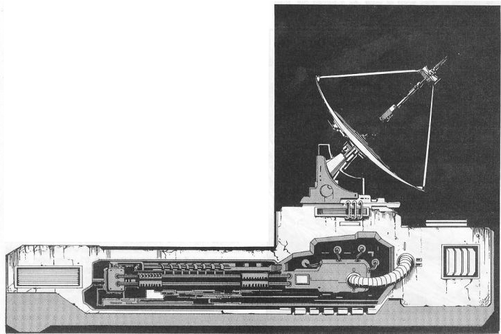

It's a hyperpulse generator, not a factory (basically a sci-fi communications array). But yeah, the design seems weird. All that stuff on the outside that you walk over seems like it should be flat, protective plates to protect the systems underneath, but the amount of detail makes it look like you're just marching 100 tons of mech across delicate, breakable stuff. Makes more sense on the walls / ceilings, but the floor? Where things walk / drive across?

yeah was watching it in mini mode. When I when I went full blown I noticed it was HPG running around on it made even less sense. Anywho the forest moon of Endor was well a friggin forest so they could have at least changed its color. Well I guess I better start saving up for some Proton Torpedo's

Edited by PropagandaWar, 21 October 2013 - 12:45 PM.


#38 N a p e s

    Member

  • PipPipPipPipPipPipPipPip
  • The People's Hero
  • The People
  • 1,688 posts
  • LocationQuebec

Posted 21 October 2013 - 12:43 PM

View PostSkinless2, on 21 October 2013 - 11:36 AM, said:

Is anyone else getting a hit of Total Annihilation nostalgia while looking at the new map? I swear that main arena area looks just like Core Prime would in FPV.


Totally thought of that too

#39 Appogee

    Member

  • PipPipPipPipPipPipPipPipPipPipPip
  • Ace Of Spades
  • Ace Of Spades
  • 10,966 posts
  • LocationOn planet Tukayyid, celebrating victory

Posted 21 October 2013 - 12:59 PM

New map looks great. New UI looks ... interesting, though it's going to confuse the hell out of new players.

#40 K o i l

    Member

  • PipPip
  • 34 posts

Posted 21 October 2013 - 01:02 PM

  • Where are the modules?

  • Map is huge...different game mode for this map? Teleporters? Less gravity?

  • Needs the "smurfy" elements. Strip mech, Max Armor, Standard loadout, etc.

  • Lose the mouse over noise

..and again...
  • PROFILES - We need profiles for each mech where we can set them up for certain situations at a click, instead of reconfiguring the whole thing over and over.


20 user(s) are reading this topic

0 members, 20 guests, 0 anonymous users