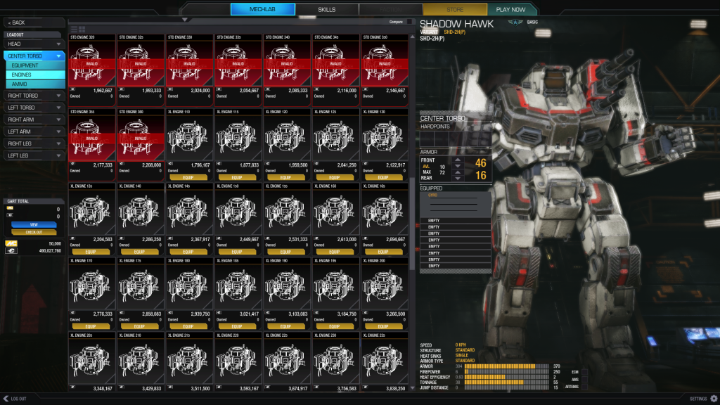
 Niko Snow, on 28 October 2013 - 03:06 PM, said:
1) What is it that you like about the UI 2.0 Preview? Please enter as many items as you wish.
2) What do you like least about the UI 2.0 Preview?
3) In what ways does the UI 2.0 Preview appear to be superior to the previous UI?
4) Any new issues encountered?
5) Any other comments or concerns?
1)
Looks nice.
Will hopefully become a lot better than original once completed.
Will hopefully allow you to integrate many things you have promised it will.
2) (I assume I can list several things here as well)
With fullscreen using a fullHD television as monitor the text is a bit small.
Testng grounds and tutorial buttons are in a weird place imo. Didn't notice them first so I figured I can choose them after pressing "play now" (neded a restart -> still no cancel option when searching for game).
Settings button should IMO be in top left since that's where people are used to have it (not only in MWO but in most programs I've ever used the settings/preferences etc are in top-left).
Log out should present an option for logging out or exiting the program completely.
Double clicking items doesn't install or remove them anymore.
Doesn't display tonnage (used/remaining/max) clearly enough. This is the one most important info you need when configuring mech so it should be clearly vieved with big numbers.
3)
Looks much better.
Gives more information (although the information could be more clear in some cases)
4)
Nothing not mentioned above
5)
My FPS was hugely improved over the production (in testing grounds) Since the production is also going through patching I can't verify if it's the test build or did the new drivers from NVIDIA make that big of a difference (Core2Duo E8400, 650ti, 4GB ram)

 This topic is locked


