Jump to content

Public Test - Ui 2.0 Preview Survey


174 replies to this topic

Poll: Public Test - Ui 2.0 Preview Survey (275 member(s) have cast votes)

Did you find and try the following features?

  1. Settings Menu (255 votes [7.84%] - View)

    Percentage of vote: 7.84%

  2. Full-Screen Mode (244 votes [7.51%] - View)

    Percentage of vote: 7.51%

  3. Owned Mech Filter (250 votes [7.69%] - View)

    Percentage of vote: 7.69%

  4. Unowned Mech Filter (232 votes [7.14%] - View)

    Percentage of vote: 7.14%

  5. Mech Info Pop-up (227 votes [6.98%] - View)

    Percentage of vote: 6.98%

  6. Mech Purchase (204 votes [6.27%] - View)

    Percentage of vote: 6.27%

  7. Mech Configuration (247 votes [7.60%] - View)

    Percentage of vote: 7.60%

  8. Weapon Group Configuration (230 votes [7.07%] - View)

    Percentage of vote: 7.07%

  9. Loadout Configuration (243 votes [7.47%] - View)

    Percentage of vote: 7.47%

  10. Hardpoints List (159 votes [4.89%] - View)

    Percentage of vote: 4.89%

  11. Armour Management (204 votes [6.27%] - View)

    Percentage of vote: 6.27%

  12. Weapon/Equipment Purchase (229 votes [7.04%] - View)

    Percentage of vote: 7.04%

  13. Mech Skill Trees (232 votes [7.14%] - View)

    Percentage of vote: 7.14%

  14. Testing Grounds (180 votes [5.54%] - View)

    Percentage of vote: 5.54%

  15. Tutorials (115 votes [3.54%] - View)

    Percentage of vote: 3.54%

Please rate the Ease of Use of the preview

  1. Excellent (11 votes [4.00%] - View)

    Percentage of vote: 4.00%

  2. Satisfactory (82 votes [29.82%] - View)

    Percentage of vote: 29.82%

  3. Needs Improvement (132 votes [48.00%] - View)

    Percentage of vote: 48.00%

  4. Poor (50 votes [18.18%] - View)

    Percentage of vote: 18.18%

Please rate the Artistic Direction of the preview

  1. Excellent (112 votes [40.73%] - View)

    Percentage of vote: 40.73%

  2. Satisfactory (99 votes [36.00%] - View)

    Percentage of vote: 36.00%

  3. Needs Improvement (50 votes [18.18%] - View)

    Percentage of vote: 18.18%

  4. Poor (14 votes [5.09%] - View)

    Percentage of vote: 5.09%

Please rate the Overall Performance of the preview

  1. Excellent (41 votes [14.91%] - View)

    Percentage of vote: 14.91%

  2. Satisfactory (105 votes [38.18%] - View)

    Percentage of vote: 38.18%

  3. Needs Improvement (99 votes [36.00%] - View)

    Percentage of vote: 36.00%

  4. Poor (30 votes [10.91%] - View)

    Percentage of vote: 10.91%

Please rate the Overall Stability of the preview

  1. Excellent (18 votes [6.55%] - View)

    Percentage of vote: 6.55%

  2. Satisfactory (67 votes [24.36%] - View)

    Percentage of vote: 24.36%

  3. Needs Improvement (125 votes [45.45%] - View)

    Percentage of vote: 45.45%

  4. Poor (65 votes [23.64%] - View)

    Percentage of vote: 23.64%

Please rate the Overall Quality of the preview

  1. Excellent (33 votes [12.00%] - View)

    Percentage of vote: 12.00%

  2. Satisfactory (103 votes [37.45%] - View)

    Percentage of vote: 37.45%

  3. Needs Improvement (117 votes [42.55%] - View)

    Percentage of vote: 42.55%

  4. Poor (22 votes [8.00%] - View)

    Percentage of vote: 8.00%

Overall, is UI 2.0 better, about the same, or worse than before?

  1. Much Better (35 votes [12.73%] - View)

    Percentage of vote: 12.73%

  2. Better (103 votes [37.45%] - View)

    Percentage of vote: 37.45%

  3. About The Same (56 votes [20.36%] - View)

    Percentage of vote: 20.36%

  4. Worse (56 votes [20.36%] - View)

    Percentage of vote: 20.36%

  5. Much Worse (25 votes [9.09%] - View)

    Percentage of vote: 9.09%

Vote

#41 Marchant Consadine

    Member

  • PipPipPipPipPip
  • Veteran Founder
  • Veteran Founder
  • 148 posts

Posted 29 October 2013 - 10:27 AM

View PostNiko Snow, on 28 October 2013 - 03:06 PM, said:

Please answer the following questions in your response.

1) What is it that you like about the UI 2.0 Preview? Please enter as many items as you wish.

2) What do you like least about the UI 2.0 Preview?

3) In what ways does the UI 2.0 Preview appear to be superior to the previous UI?

4) Any new issues encountered?

5) Any other comments or concerns?


1)
Looks nice.
Will hopefully become a lot better than original once completed.
Will hopefully allow you to integrate many things you have promised it will.

2) (I assume I can list several things here as well)
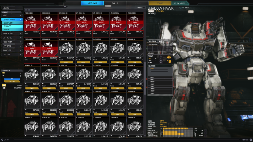
With fullscreen using a fullHD television as monitor the text is a bit small.
Testng grounds and tutorial buttons are in a weird place imo. Didn't notice them first so I figured I can choose them after pressing "play now" (neded a restart -> still no cancel option when searching for game).
Settings button should IMO be in top left since that's where people are used to have it (not only in MWO but in most programs I've ever used the settings/preferences etc are in top-left).
Log out should present an option for logging out or exiting the program completely.
Double clicking items doesn't install or remove them anymore.
Doesn't display tonnage (used/remaining/max) clearly enough. This is the one most important info you need when configuring mech so it should be clearly vieved with big numbers.

3)
Looks much better.
Gives more information (although the information could be more clear in some cases)

4)
Nothing not mentioned above

5)
My FPS was hugely improved over the production (in testing grounds) Since the production is also going through patching I can't verify if it's the test build or did the new drivers from NVIDIA make that big of a difference (Core2Duo E8400, 650ti, 4GB ram)

#42 Zerberus

    Member

  • PipPipPipPipPipPipPipPipPip
  • Overlord
  • Overlord
  • 3,488 posts
  • LocationUnder the floorboards looking for the Owner`s Manual

Posted 29 October 2013 - 10:30 AM

1) What is it that you like about the UI 2.0 Preview? Please enter as many items as you wish.

I liked the artistic diretion and background music, as well as the ability to filter my mechs by class or type.

2) What do you like least about the UI 2.0 Preview?

Stability is a major issue, but for me what was most annoying was the infinitely small text (42" screen 3 yards away). However, that may be a known scaling issue w/ 1920x1080 fullscreen. I must admit that I did not find the mechbay as intuitive as the previous version, but that could be me conditioned to use the old one. But it seems overly complicated.....

Resulting Recommendations:

1. A Slider Bar that allows teh User to scale teh UI to their preference. That way somebody with a 14" monitor sitting 10 feet away can read the text just as well as someone with a 200" screem sitting 12 inches away.

I don`t mind mechs dropping off the bottom making the list scrollable if it means I can read it without having to hunch forward like an olympic sprinter to read a price. ;)

2. Perhaps keep the list "working style" of the current build, i.e If I`m on equipment (btw icons would be nice if possible) and I switch from CT to LL, then stay on equipment, instead of switching back to whatever is on top.

I would love to make more suggestions, but tbh the small text hurt my eyes (and back) after about 15-30 minutes so I had to stop, sorry ;)

3) In what ways does the UI 2.0 Preview appear to be superior to the previous UI?

mechbay seems to display more and more detailed information, which is a good thing. Definitely looks more modern.

4) Any new issues encountered?

Possibly. I purchased a Boars head and atlas, ehm, (rs I think) to test teh skill tree.

The third atlas I wanted to level (due to text size I can`t remember if it was the boar or the rs) crashed the client every time I tried to open the skill tree. 4 times I think, and that`s when I stopped testing.

5) Any other comments or concerns?

I do not mean to be a whiner in any way, and I do truly appreciate you all showing us the work in progress. But I personally feel that the major bugs in this build are so pervasive and "this kills little children"-level that it would have possibly been a better use of resources to do some more work on this before releasing it for public test.
That said, I understand the immeasureable value of numbers and community input, and do not mean to second guess your decisions, as I do truly feel that you are doing the best you can and should keep it up. Just my 2c as an end user that admittedly sometimes confuses testing with playing. :)

Edited by Zerberus, 29 October 2013 - 12:18 PM.


#43 Poppaukko

    Member

  • PipPipPipPipPipPip
  • The Privateer
  • The Privateer
  • 236 posts
  • LocationFinland

Posted 29 October 2013 - 10:31 AM

1) What is it that you like about the UI 2.0 Preview? Please enter as many items as you wish.

- Background music
- Fullscreen mechlab
- Weapon grouping in mechlab

2) What do you like least about the UI 2.0 Preview?

- Too much clicking sounds
- Can't click mech to change what part I'm viewing
- A lack of the view where you can see all the parts, hardpoints, equipment and weapons all at once.
- Can't doubleclick an item to remove it.

3) In what ways does the UI 2.0 Preview appear to be superior to the previous UI?

- Mech listing and filtering. Overall look of the UI.

4) Any new issues encountered?

- No warning that you are about to lose any changes in a loadout when changing from mechlab to Skills/Home tab.
- While in-game, press escape and go to Options. Pressing esc here causes the pause menu to go away but not the Options menu.

5) Any other comments or concerns?

- Favorite Mechs/Most used/Now using/[Player named] category in addition to the existing (All/Light/Medium/Heavy/Assault/Champion/Hero) categories in which the player can add mechs of his/her choosing would be useful.
- In weapon grouping menu, it would be helpful to know which side of the mech the weapons are.

Edited by Poppaukko, 29 October 2013 - 10:47 AM.


#44 Curccu

    Member

  • PipPipPipPipPipPipPipPipPip
  • Liquid Metal
  • Liquid Metal
  • 4,623 posts

Posted 29 October 2013 - 10:33 AM

Up the text size of items you can put into your mech (in this pictures engine names and ratings)


Posted Image

#45 thebman

    Member

  • PipPip
  • Bad Company
  • Bad Company
  • 31 posts
  • Locationkansas

Posted 29 October 2013 - 10:36 AM

After using it for half of the testing period one of the best features is the ability to easily go through my owned mechs and all of the info on the weapons and other items is outstanding. The full screen is great and can't wait to try out the camo and other parts that will be installed.

what i liked least was the amount of info that was there and proscessing it and coming from the old UI. After a bit i was able find my way around it.

My client would crash to desktop after about ten minutes of use and it usually happened when hitting the back button.

#46 Tarl Dichari

    Member

  • PipPip
  • 26 posts
  • LocationSan Diego, CA

Posted 29 October 2013 - 10:37 AM

First impressions, this thing is way more complicated than it needs to be. I suggest looking back at some "older" Mechwarrior games......MW4 Mercs for instance.

The mechlab should be simple and easy to change out/load things....not difficult. Something as simple as showing the entire mech/slots.........and just cycling thru the weapons and dragging it into the slot would be nice. Double click and it's gone. Info like mech loadout, weapon ranges, heat and weight should be at the forefront of what you see when cycling thru the hardware.

Not sure if it's by design or not, none of my owned mechs are shown or available (from the normal game).

One of my main dislikes is when you click on a mech the right window (a big window mind you) comes up and it shows the mech.....then in the lower left of that window it shows firepower, heat, speed...etc. But it gives me nothing in that window of weapons loadout or where the weapons are equipped. I think that would be a big improvement. Click on the mech in the left window.......right windows shows the mech, all the pertinent info and loadout/weapon placement. Then I can either pick that mech or go to the next one.....now I gotta hit configure, then weapons groups just to see what is on the mech. FAIL.


Even the current interface is complicated........I'm all about simplicity........make it simple to configure/build mechs......so more time can be spent on the battlefield versus sifting thru the mechlab and trying to figure how things work. If you want double heat sinks or endo/FF it should be as easy and 1 click......not multiple clicks, multiple menus ...etc.

Owned items, modules and such should be readily avail to click on and see what you own/have, then just drag onto the mech.

Graphics/music wise....a plus........but keep it simple.

Edited by Tarl Dichari, 29 October 2013 - 10:51 AM.


#47 Dymlos2003

    Member

  • PipPipPipPipPipPipPipPip
  • Moderate Giver
  • Moderate Giver
  • 1,473 posts
  • LocationCalifornia

Posted 29 October 2013 - 10:37 AM

The only gripe I have is that I can't see the loadouts of the mechs without customizing them. We should be able to see the loadouts of the mechs when buying them and when in the mechbay in some way.

Edited by dymlos2003, 29 October 2013 - 10:41 AM.


#48 Scoots

    Member

  • PipPip
  • FP Veteran - Beta 1
  • 48 posts
  • LocationGermany

Posted 29 October 2013 - 10:38 AM

1) What is it that you like about the UI 2.0 Preview? Please enter as many items as you wish.

-Art Style
-Sounds
-Descriptions for Weapons, Modules etc.
-Usability
-Compactness of the UI
-the "quick info popup" when you hover over a Mech. I really love it and would like to see even more informations in that thing(maybe an option in the config menu for advanced players to enable that, since too much information in that popup could be the overkill for new players)


2) What do you like least about the UI 2.0 Preview?-

-The new Loadout Screen is too complicated now for my tastes. I guess new guys would have it even harder with the new screen. Please bring back the paper model(especially important for the armor configuration) or a overlay for the mech on the right side of the screen so that you can, just like in the old UI click on parts of the Mech to configure them
-Some fonts/text sizes are to small on higher resolutions, please make them bigger fo improved readability
-The Crashes I experienced


3) In what ways does the UI 2.0 Preview appear to be superior to the previous UI?

-Usability
-Compactness of the UI


4) Any new issues encountered?

-Texture and Shadow flickering when turning the Mechs with your Mouse(on the Rocket Pods of the Catapult for example)
-Some Crashes
+when I wanted to config one Mech -> game stopped working(happened several times)
+game was showing me the "Saving Battletech loadout. Please wait..." Screen after I clicked "config weapon Groups" had to restart the game


5) Any other comments or concerns?

Edited by Scoots, 29 October 2013 - 10:42 AM.


#49 Tiamat of the Sea

    Member

  • PipPipPipPipPipPipPipPip
  • Guardian
  • Guardian
  • 1,326 posts

Posted 29 October 2013 - 10:38 AM

View PostNiko Snow, on 28 October 2013 - 03:06 PM, said:

Please answer the following questions in your response.

1) What is it that you like about the UI 2.0 Preview? Please enter as many items as you wish.

Pretty much everything. You promised an improved, easier, cleaner-looking UI that provided more information, and as far as I have been able to see, this is what UI 2.0 is. It also seems to transit between screens a bit faster.

View PostNiko Snow, on 28 October 2013 - 03:06 PM, said:

2) What do you like least about the UI 2.0 Preview?

Funny enough, it's the choice of music. But you know, that's a taste thing. I'd prefer something a little less 'tension-building', perhaps a bit more 'working in the garage'. Just me.

View PostNiko Snow, on 28 October 2013 - 03:06 PM, said:

3) In what ways does the UI 2.0 Preview appear to be superior to the previous UI?

Of the things that are currently functional, I'd have to say 'all', with the possible exception that the silly useless 'Firepower' and 'Heat Efficiency' numbers are still actually present in the UI.

View PostNiko Snow, on 28 October 2013 - 03:06 PM, said:

4) Any new issues encountered?

A whole slew, actually.
  • Endo-steel, Ferro-Fibrous, and Double Heat Sink upgrades appear to be inaccessible. If they are accessible, they're not available through any expected means and randomly clicking around likely areas for several minutes still didn't let me reach them. The endo-steel and F-F things being missing is mildly annoying, but lacking the option for DHS makes it pretty much impossible to use any 'mechs with reasonable weapons loadouts, even in Testing Grounds.
  • The 'Mech Bay frequently fails to resolve loadout changes. This seems to happen most often the first time editing a variant of a given chassis, but sometimes triggers by the user spending an extended time working over one. It also appears to be more frequent when the changed loadout is at the maximum tonnage for the chassis, which can be avoided by removing a few points of armor but is still aggravating.
  • Even if the 'Mech bay does resolve a loadout change, sometimes it will 'hiccup' after you leave and the 'mech will be restored to default loadout. This happened with the altered Battlemaster 1G, but not with the Thunderbolt SS, so I'm not sure what specifically is related to the issue.
  • Sometimes when you purchase a 'mech and then look at it in your 'mech bay, it will display as the wrong variant. This appears to resolve when leaving the Mechbay and returning, or when purchasing another 'mech and looking at the Mechbay again.
  • Custom names for 'mechs don't show up in the Mechbay for some reason.
  • The Testing Grounds map selection is strange. Selecting Alpine Peaks repeatedly put me on Tourmaline Desert, Forest Colony kept getting me Frozen City, and Frozen City deposited me on Caustic Valley every time.

View PostNiko Snow, on 28 October 2013 - 03:06 PM, said:


5) Any other comments or concerns?


There doesn't seem to be a space anywhere for the 'social' material, I'm a bit concerned it might take space currently given to something else.

The current method of listing components (Tab-down menus by location purely) isn't the smoothest or most easy to use. If you could use something more like Smurfy's, which shows the whole 'mech and will simply disallow dropping things into illegal locations, it would streamline the process and let players spend more time playing and less tabbing through 'mech locations looking for where they left that last heatsink/ton of ammo/etc.

You continue to display the 'Firepower' and 'Heat Efficiency' numbers.

To this day, I cannot decipher what gives the Heat Efficiency its number, although I can discern that 1.4 is hugely superior to 1.1 (nevermind 0.9). If you're going to measure heat efficiency, please actually provide a way for the player to figure out what actually makes 1.4 different from 1.3 and by how much.

Firepower is worse, as it's simply a measure of the likely damage you'll deal if you fire every weapon on the 'mech and hit with all of them- once. This number is absolutely only useful for alpha strikes, and providing it encourages alpha strike builds, which you have repeatedly claimed you want to avoid. Worse, it's considerably less useful for a player whose weapons don't have the exact same range profile, meaning that if you want it to be accurate, you pretty much have to boat. Now, I haven't ever actually worked on a commercially-provided game, but it seems to me that if you're trying to avert boating and alpha striking, providing a measurement of how good your 'mech is at alpha striking that is more accurate the more you boat seems like a bad idea. I could be crazy (and probably am, come to think of it), but I'm pretty sure I'm right on this one.

The 'Home' screen shows by default your 'mech selected on the right, the tabs for the base menus on the left, and a whole lot of empty space. I'm presuming this is going to be filled by the same 'current image/links' mess that's in the center of UI 1.5, but if not, you need to do something with the space.

Edited by Elli Gujar, 29 October 2013 - 10:39 AM.


#50 Alkabeth

    Rookie

  • Little Helper
  • Little Helper
  • 6 posts

Posted 29 October 2013 - 10:39 AM

1) I like the large mech view and being able to rotate it. Overall the colors are nice

2) Lack of comprehensive view of the weapons loadout.

I couldn't easily tell which of the gogzillion engines I owned. The tiny 1/0 is the only visual distinction between what I have and what I'd have to buy.


UI is very chatty. Way too many click/hover sounds.

3) More mechs on the screen make it easier to select a mech to setup the next mech I'm going to run.

4) Backing out of a change, the info popup is initially incorrect. It shows the changes even though changes have been erased.

It crashed while poking around on it.

The font scaling isn't very good.

The 4 elite skills take up 8 spaces making the Master skill hidden.

I was able to size the window so that I couldn't access the settings button.

5) I'm worried that quick changes will require many clicks. If I want to move my gauss and pilot modules to another mech, it shouldn't take too many clicks to do it.

Being unable to see my weapons loadout on an info screen is totally unacceptable.

#51 Hibiki Silvana

    Member

  • PipPip
  • 32 posts
  • LocationBergen

Posted 29 October 2013 - 10:40 AM

1) What is it that you like about the UI 2.0 Preview? Please enter as many items as you wish.

I definitely like the style of it, and particularly like the new garage. A means of sorting mechs was really needed


2) What do you like least about the UI 2.0 Preview?

LOADOUTS! The loadout system feels hard to use and clunky, I have to search for what body part contains what still. I'd really like to see something between what you're using and this: http://mwo.smurfy-net.de/mechlab#i=106
Where the entire loadout can be changed all at once rather than needing to manually move from part to part to configure each piece of the body one at a time.


3) In what ways does the UI 2.0 Preview appear to be superior to the previous UI?

Artistically it is better by far. The settings and menu navigation is much better It's nice to see fullscreen actually make the garage fullscreen as well.


4) Any new issues encountered?

I had a few crashes while navigating the UI, but cannot find something in particular that is causing it.


5) Any other comments or concerns?I think this is generally heading in a good direction, and just needs a usability pass. If the loadouts were easier to manipulate I'd have no problems at all.

Edited by Hibiki Silvana, 29 October 2013 - 10:42 AM.


#52 Masterrix

    Member

  • PipPipPipPipPip
  • 194 posts

Posted 29 October 2013 - 10:40 AM

1) What is it that you like about the UI 2.0 Preview? Please enter as many items as you wish.
- nice look
- nice music
- more informations
- better mech-selection screen

2) What do you like least about the UI 2.0 Preview?
- unconfortable mechlab
--- 3 steps to open "loadout" ("weapon config" should be in the "loadout" screen, saving 1 step)
--- bodyparts no more highlighted if selected -> can't see how "hitboxes" are designed
--- cant select bodyparts by using 3D-model
--- no "smurfy-like" doll, every bodypart still has to be selected single -> to much clicks
- low stability
- very slow, many delays

3) In what ways does the UI 2.0 Preview appear to be superior to the previous UI?

- looks better
- better mech selection
- but still too slow and unintuitive
- loadout-screen (most inportant part of mechbay) is as pedestrian as before

4) Any new issues encountered?

5) Any other comments or concerns?

overall, I'm dissapointed.
the most important part, the loadout screen, doens't feel improved, only alternative


.

Edited by Masterrix, 29 October 2013 - 10:51 AM.


#53 sabujo

    Member

  • PipPipPipPipPipPipPip
  • 531 posts

Posted 29 October 2013 - 10:44 AM

1) What is it that you like about the UI 2.0 Preview? Please enter as many items as you wish.
  • The graphics in overall. A lot tidier and modern looking. Liked the color scheme as well.
  • The infographs regarding mech and weapons
  • Hability to rotate mech everywhere
  • Thumbnails with coloschemes (w00t!)
  • Background music

2) What do you like least about the UI 2.0 Preview?
  • The table view for components and the overall sense of "what's installed on my mech". Felt lost and found many aspects really unpratical (check 5).
  • Not being able to click directly on the mech to select parts.
  • In general, the system requires heavy usability testing (with people strange to the game).
3) In what ways does the UI 2.0 Preview appear to be superior to the previous UI?
  • It's cleaner and seems a lot growth-friendly, leaving room for more features to show up.
4) Any new issues encountered?
  • Adding armour inflicts a price of around 20.000 c-bills. This issue was happening on every mech, but once I checkout, it didn’t show up anymore on any mech.
  • Application crash while accessing Skills. Couldn’t reproduce.
  • Application crash while browsing Unowned mechs. Couln’t reproduce.
  • Skill list starts a bit short sometimes – and it “goes crazy” after a few scrolls.
  • In Skills, when clicking Unlock, pressing Enter in the Yes/no dialog, means ‘No’. This doesn't make sense.
  • In Skills, when all chassis have reached Elite and one of them gets all the items unlocked for that tier, the green stripe ‘ELITE’ disappears from the mech in the table.

5) Any other comments or concerns?

First, congratulations on the work done so far, and thank you for the preview!
My concerns/suggestions are usability related. I restrained myself from putting up the features that I want because I know many things are already being developed and we need to cover small things first in order to move to more significant changes. Here it goes:
  • The filter Owned/Unowned has a very small size on the interface and it is very important. Took me a while to find where
  • The hardpoint color-coding barely distinguishes ballistic from laser, for the two colours are almost the same.
  • Buttons that hold special function such as “Save”, “Reset” and “Cancel” should be different to other that function as tabs. The grouping isn’t enough.
  • While Weapon Group doesn’t need a confirm action (you hit back and it’s saved) it doesn’t provide necessary feedback it saved due to the fact that it’s sibling page (Loadout) requires Check Out to be pressed in order to save.
  • The table view for the loadout is, in my opinion, very inefficient when we need to browse. This kind of layout is good when the picture is the main element of differentiation and this isn’t definitely the case, especially on components such as engines where everything looks the same. I know there will be a list version, however I don’t see a point for table view in this section.
  • Especially in fullscreen, there is the need to tweak the proportion between the space occupied by the component list/table and the area that shows what is actually installed on the mech. This last part is just a little bigger than a single item on the item table.
  • The weapon/equipment’s that we own (should have a different highlight, even if it’s placing is invalid. We should also be able to filter between Owned/Unowned.
  • The select armour part is worse than before. Now you need to cycle between lots of screens. Not practical at all. The Front/Rear armor isn’t very explicit. Needs some “usability tendering”.
  • I think you shouldn’t drop the click and highlight feature directly on the mech. I find myself a bit lost regarding which part of the mech I am looking at.
Thanks and keep up the good work!</p>

#54 Modo44

    Member

  • PipPipPipPipPipPipPipPipPip
  • Bad Company
  • 3,559 posts

Posted 29 October 2013 - 10:44 AM

1) What is it that you like about the UI 2.0 Preview? Please enter as many items as you wish.

Lots of info readily available. Super fast filling of an empty mech to create a build. The full-screen rendered mech looks glorious (2560x1600 FTW).

2) What do you like least about the UI 2.0 Preview?

It is not fully stable, obviously. Double-clicking does not equip/unequip stuff, nor does it open the mech chassis categories for mech skills. The free tonnage and slots are not visible enough. Rotating the mech with the window set to a high-resolution is very jerky. Mech rotation still causes motion blur for no reason.

3) In what ways does the UI 2.0 Preview appear to be superior to the previous UI?

Finding mechs is much easier. Building appears to be faster -- requiring fewer clicks in a smaller area. Detailed mech and equipment data is readily available, some of it for the first time in the game client. The clickable things are bigger -- good for players with high sensitivity.

5) Any other comments or concerns?

The weapon range display should spell out optimal range, and the range graph needs to show more points on the scale. The current basic graph is too vague. At the very least, you should be able to see optimal, half, and zero damage ranges at a glance.

All of the main build setup buttons should be in one area. You can add equipment very quickly to an empty mech, which is great. However, the armor change buttons are on the other side on the screen, when they really should sit close to the location selector. The same goes for mech upgrades when implemented -- their UI should be available in the same quarter of the screen.

You should be able to select which confirmation messages are displayed. (A "Don't show again" checkbox or something like that would be appreciated.) After playing for a while, they get annoying.

The weapon grouping UI should include chain fire configuration, preferably with advanced timing/grouping options.

At this stage, it is hard to say if any missing thing is not planned, not implemented, or broken.

Edited by Modo44, 29 October 2013 - 11:20 AM.


#55 Dyson Ring

    Member

  • PipPipPipPipPip
  • Legendary Founder
  • Legendary Founder
  • 178 posts
  • LocationSouth Australia, Australia

Posted 29 October 2013 - 10:44 AM

View PostNiko Snow, on 28 October 2013 - 03:06 PM, said:

Please answer the following questions in your response.

1) What is it that you like about the UI 2.0 Preview? Please enter as many items as you wish.

2) What do you like least about the UI 2.0 Preview?

3) In what ways does the UI 2.0 Preview appear to be superior to the previous UI?

4) Any new issues encountered?

5) Any other comments or concerns?


1): Being able to see, select and organize 'Mechs much easier is a great improvement.
The area dedicated to the current 'Mech that you are using, as well as the ability to swivel them around, is nice.

2): Some text is a little too small, such as the information about the current 'Mech being used.

3): To me, just about all of it is an improvement.

4): A couple of issues I've found:
  • When you've purchased a 'Mech, it will be counted as both being unowned and owned by the 'Mech filter.
  • The client crashes when you try to enter the 'Mech tree of a 'Mech you've purchased. May be related to the above issue. It doesn't happen when trying to enter the 'Mech tree of one of the provided 'Mechs.
5): It'd be nice if there were an option to be able to have the Mechlab windowed but when playing the game have it be in fullscreen like it is currently.

#56 Mr Friday

    Member

  • PipPipPip
  • Bad Company
  • Bad Company
  • 63 posts
  • LocationYorkshire, England

Posted 29 October 2013 - 10:46 AM

View PostNiko Snow, on 28 October 2013 - 03:06 PM, said:

1) What is it that you like about the UI 2.0 Preview? Please enter as many items as you wish.

It feels so much more polished and straight forward. Plus it actually looks like it fits in with the theme of "giant future robots".

View PostNiko Snow, on 28 October 2013 - 03:06 PM, said:

2) What do you like least about the UI 2.0 Preview?

The tonnage meter is a bit too unobvious when editing a mechs loadout. It took me a few seconds to find it the first time, and afterward I still had to search for it in the info-box below the mech. Perhaps making it a unique colour or moving it to the top of the list?

It took me far too long to figure out how to buy a mech. Changing the mechlab list from 'owned' to 'unowned' wasn't obvious. A button toggle would work much better, or anyother way of making it obvious that this is how you buy a mech.

View PostNiko Snow, on 28 October 2013 - 03:06 PM, said:

3) In what ways does the UI 2.0 Preview appear to be superior to the previous UI?


Information displayed. While I have some concerns about one or two parts, the sheer amount of info available compared to the previous UI is brilliant.

View PostNiko Snow, on 28 October 2013 - 03:06 PM, said:

4) Any new issues encountered?


The mechlab seems to have a math error in relation to tonnage. If you check the following picture, you'll see that my Heavy Metal has 1 ton spare, 1 empty heat sink slot in the engine and plenty of money to buy a heat sink. Yet the mech lab tells me I cannot equip another heat sink. It seemed to do this with other 1 ton items on other mechs as well.
Spoiler


I don't know if this is what you meant by "Tabbing back and forth from the Mech Lab and Skills tabs causes the Mech skill list to not load properly".

After playing around in the mechlab with the Heavy Metal and swapping back to the skills list, the display box was too small to fully display the mech selection boxes leading to them being unselectable. It also jerked about as if it was trying to autoscroll when I tried to scroll the list.
Spoiler


In the skills list, after buying all the efficiencies for one 'level' the slanted banner stating "basic", "elite" or "master" dissapears and a box pops up in the mechs images top right. It looks like something is supposed to be in that box but isn't loading.
Spoiler


View PostNiko Snow, on 28 October 2013 - 03:06 PM, said:

5) Any other comments or concerns?


In regards to the weapons loadout you can't currently toggle chainfire on or off either with the mouse, or the keyboard.

When you first install AMS the weapons loadout says that the AMS is toggled in to some weapon groups, yet you are unable to turn them off. Not really important as it isn't button triggered, but odd none the less.

Finally, the bars for indicating the weapon group and weapon selected are blue. As are the toggled weapon groups. This makes the list really hard to use as any selected row or column almost covers any selected group. Changing one to a different colour would work better.

All in all, I'm really impressed with what is here so far. Fix the few issues and it would be nigh perfect.

#57 Malinon

    Rookie

  • Ace Of Spades
  • Ace Of Spades
  • 1 posts

Posted 29 October 2013 - 10:48 AM

Well Client Crashes every time i want to skill the Yen-Lo-Wang

#58 Sybreed

    Member

  • PipPipPipPipPipPipPipPipPip
  • 3,199 posts
  • LocationQuebec

Posted 29 October 2013 - 10:49 AM

aright, it's not gonna be that much constructive (haven't had the time to try out the new UI so much) but here are the 2 things that I noticed 2 seconds after loading the UI.

1. Music! Yay! It's pretty good too! Much better than I expected.
2. OMG THE WRITING IS SO SMALL, I'M HURTING MY EYES JUST TRYING TO READ THE INFO ON THE MECHLAB DEAR GOD WHY.

More feedback incoming, those were the 2 things that jumped in my face :)

N.B.: Agreed with several people saying a mechlab à la Smurphy would have been better... I don't really like the "choose the mech component" on the left of the screen when I'm configuring my mech. Might be because I'm not used to, but I actually liked the old UI better in that regard, in that you choose the mech component then apply modifications.

New feedback! When I add/remove stuff on my mech, I'd like to have only one confirmation at the end, saying how much it'll cost me. Having a pop-up everytime I add armor/heatsinks/new guns/ammo is VERY annoying. A single confirmation at the end that summarizes the changes would be plenty better IMO!


(Aright, let's follow Niko's protocol)

1. -Esthetically wise, it's 10x better than the old UI. It does give mech great justice by making them look so badass to the right of the screen. It looks like a modern game UI and it was about ******* time ;)
-More info on weapons, max engine limits, heat capacity (i still don't know what 0.9/2 is supposed to mean), etc
- Music!
- It's nice to be able to filter mechs by weight classes

2. - Writing font is too small in several occasions, it actually hurt my eyes and made me adjust my imaginary glasses
- Would have kept a paperdoll like mechlab à la UI 1.5. I don't really like choosing a component on the left of the screen. It could be just me though...
- Add a legend for hardpoints. There was one hardpoint that I didn't know what it was. It wasn't missile/ballistic/energy. I'm guessing AMS?
- At first, the mechlab is very overwhelming, but once you get used to it... it's better (not really a dislike comment)
- Receiving too many "please confirm" pop-ups. When I configure a mech, I'd rather have one pop-up when I hit "save" and it shows precisely how much it's gonna cost.
- I need a message that says "owned" even when I'm browsing all mechs, not just the ones I own. I could end up buying several of the same variants if I'm not careful ;)

3. Superior in terms of looks, that's for sure. Music is a nice addition too. Mechs look so much better, I can't wait to configure paint jobs. It's more functionnal in terms of organizing mechs thanks to the filters.

4. No big issues, except that there's a few hangs that last 2-3 seconds when I switch menus. I would have thought it was gonna be more smooth, but I'm sure it'll improve in the future. It crashed when I was switching menues.

5. I like where this is going. I would have done a few things differently specifically about the mechlab UI (paperdoll please), but this is something I could deal with until you decide to implement it. My main concern is: Is it all the work that is done? If so, I'm afraid we won't see this new UI until early 2014 :S

Edited by Sybreed, 29 October 2013 - 11:03 AM.


#59 Most Twisted

    Member

  • PipPip
  • 45 posts
  • LocationA state of confusion

Posted 29 October 2013 - 10:50 AM

View PostNiko Snow, on 28 October 2013 - 03:06 PM, said:

Please answer the following questions in your response.

1) What is it that you like about the UI 2.0 Preview? Please enter as many items as you wish.

2) What do you like least about the UI 2.0 Preview?

3) In what ways does the UI 2.0 Preview appear to be superior to the previous UI?

4) Any new issues encountered?

5) Any other comments or concerns?


1. There is more useful information available for specific mechs (Torso twist, elevation, range of arm motion etc).

When building or modifying a mech the options require less "jumping" between menus to reach the same point.

Selecting items gives immediate information about them.

Weapon grouping in lab is a great addition.

I {think} I like the new mech bay layout. It seems to be easier to grasp overall with the exception of my inability to arrange owned mechs to my liking.


2. The font is very small in places and vital stats are hard to read/find at times. Heat efficiency being a example in the loadout screen.

It would be nice to be able to move mechs around in your bay for the purpose of organization in some way. Drag and drop would be best.

Overall the UI seems a bit crowded and cluttered but that impresion seemed to get better with the more I used it.


3. Weapon groupings, available info.
More direct navigation (after getting used to it).
Impact of changes to a loadout easily found (not easily seen however)
View of mech in mechlab is cool the way it is done.


4. There were a couple of crashes but they were listed under known issues before I played.


5. I like the overall direction of the UI, especially knowing that it unlocks the door to more desired features in the future. I'm a bit concerned about the "in your face" crowding of the UI when you first see it. That impression seems to improve with use.

#60 Kelhadar

    Member

  • Pip
  • Ace Of Spades
  • Ace Of Spades
  • 10 posts
  • LocationUSA

Posted 29 October 2013 - 10:51 AM

View PostNiko Snow, on 28 October 2013 - 03:06 PM, said:

Please answer the following questions in your response.

1) What is it that you like about the UI 2.0 Preview? Please enter as many items as you wish.

2) What do you like least about the UI 2.0 Preview?

3) In what ways does the UI 2.0 Preview appear to be superior to the previous UI?

4) Any new issues encountered?

5) Any other comments or concerns?


1) I like the general layout of the UI.
- Seeing all of my mechs like cards in one menu is pretty cool.
- The information popups are well done.
- The Restrictions section for Weapons and Equipment is very useful.

2) It seems like you would have to leave the Select Mech menu to go to the testing ground...
- There is nothing telling me how much I would be spending if I am adding new things as i go. If I want to check my c-bill totals I have to use the Check Out button and then back out.
- The Mech Skills menu is painful to use. Having to click on the small arrow instead of the entire tab is unintuitive, and I feel that the Elites block can be shortened so we wont have to scroll down for the Master Efficiency.
- The color code for Weapon Hardpoints between Ballistic and Energy is too similar to understand. Ballistic was brown and energy was a dark orange? I would like to see yellow for Ballistics and a brighter red for energy.

3) UI 2.0 feels cleaner and less cluttered.

4) Torso Lock needs to be changed to Throttle Decay.

5) The Radar Chart on mech popups shows Tonnage which I feel doesnt need to be there. This could easily be replaced by Speed where it compares to the top speed of the largest engine with Speed Tweak.
- As of yet I dont know where I would go for Team management and I dont think that I should have to go to the Home menu to use these functions.
- I agree with an earlier post that it can be difficult to find which engines you already own and a possible solution could be: Equipped/Green Card, Owned/White Card, Not Owned/ Red Card, Unable to Install/ Red Card with Invalid.
- I still hope that we will be able to change the Nickname of a mech after purchase.

Edited by Kelhadar, 29 October 2013 - 11:25 AM.


1 user(s) are reading this topic

0 members, 1 guests, 0 anonymous users