Okay another long post with pics.
This is for the Devs.
Configuring Issues;
1) No easily way to save your configurations. as it turns out it is this button:

This button is hard to find and can be hard to read with the white on yellow. I suggest (this will come up a lot) you make the buttons bigger, and The text more color pronounced.
2) No Endo, DBL Heatsinks, or Artemis buttons to test.
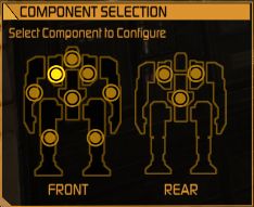
3) Only the Tabs work for Editing your mech. - - What this means is that there is no longer a "
Rag Doll" or Mech itself To click to locate your parts. You now MUST use the annoying bars on the sides for your parts. Please at least allow us to click on the mech's Left arm to access it's left arm at least.
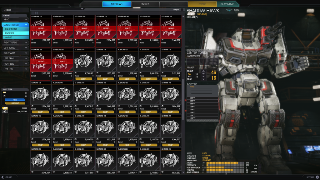
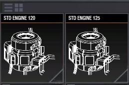
4) The Equipment Icons are far too big. I can see the "
Detail" list button in the upper left. But it isn't working. The Icon size is way too big If you are looking through the engine's this is absurdly annoying.
5) Item Data is useless. Similar to 4, the Icons for each item only display the Name, # owned, and C-bill cost. This is useless. The items should show the important data: Damage, Tonnage, and Slots for weapons. Engine size, Tonnage, and # of Heatsinks For Engines.
6) Leaving Configuration without saving. It took me twice to figure out the little "checkout" button. Why can I click Back, Home, or Any other buttons that leave the configuration without saving it? The first thing it should do (like our current UI) Is confirm a save when trying to leave the config section.
7) View Button Does Nothing. No clue on this one.
8) Info window stays open if a tab is quickly changed. See Image:
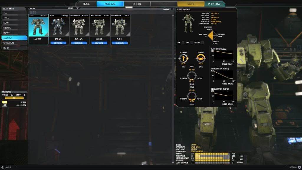
As you can see, a spider is a bit heavier then an Atlus.
Text Size:
1) Overall The text seems small, It feels hard to locate everything in the beginning. Where is the overall tonnage of my mech? Oh...
thrown down on the bottom right like it wasn't important. Given all the "eye candy" And focus on parts. Wouldn't you make the current tonnage of your mech easier to notice?
2) Bigger Screen, Less Info. It feels like you've taken the whole screen but are conveying LESS information to the user. I now have to Hover over EVERYTHING to see the information. Or Look all the way across the UI to notice details (like tonnage) while I'm flipping through a mechs arms on the Left side of the screen. To locate the parts, which are shown on the Right side of the screen. Things are far too spread out.
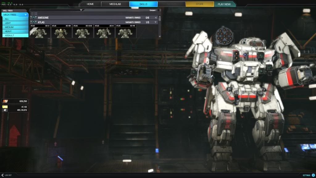
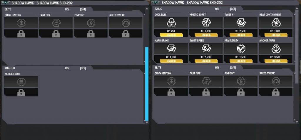
Skills:
1) Skill menu can be Glitched. If you rapidly click between the Mech labs Trial mechs, and the Skill Tabs Lights bar you can eventually produce this error.
Where the Skill bar is far too small to be used. Scrolling with it will actually move down to the next mech. Not granting you access to any of the buttons on the Mechs themselves.
2)Clicking Mechs Name should Open the Drop down. Right now you have to click the tiny gray arrow to the right to open the drop box to access your mechs skills. It should be accessible much like it is in our current UI. just clicking the name should open it.
3) Master Level must be scrolled to view. When you've finally unlocked Master, you can't seem to find it anyone. The Menu is only half size (for some reason.) and a big gray area shows up at the bottom. Not showing the Master Skill until you scroll down. This should be fixed. I guess by the gray open area you've tried to do that, but it didn't work quite right.
4) When Buying Mech Skills, why does the confirm window pop up so far away? Why can't a simple confirm window show up somewhere NEAR my mouse, so I don't have to go chasing it down? Just a gripe on my part.
Options:
1) Why is there no throttle Decay Option?
Weapon Groups:
1) Switching to "weapon Groups" requires a Mech save. This is probably a good thing. But why is it the only place that seems to cause a save. And twice for me caused a freeze. I can click on Home, or Skills without saving my loadout.
2) Blue Bars make it hard to ID a Lit Number. Change the Lit numbers to yellow, or make the blue bars Hollow. This way they are easier to see what is set up.
Home:
1) The Home Button Text Doesn't Load. When you first enter the game there is no "HOME" until you hover over it.

2) Select Mech Under HOME is a redundant Menu. It simply opens up the Mech bay. I hope this button has a further use in the future.
Purchasing Mechs:
1) Why was it so hard to figure out how to purchase a mech? I had to locate the Filter button and select the "Unowned" section. This isn't very intuitive and will lead new players to get quite frustrated.
2) Two Menus to buy one mech. There does not need to be a popup menu asking if I want to pay with C-bills or MC. Of course I want to pay with C-bills. Now I understand some may want to use MC. Bring back the dual buttons, there's room for a second button under there just like in our current UI. Purchase C-bill, and Purchase MC. It's not hard and it saves on a menu. Also Makes Purchases Smoother.
Gameplay:
1) Testing Grounds Doesn't take you to the correct Locations (already known)
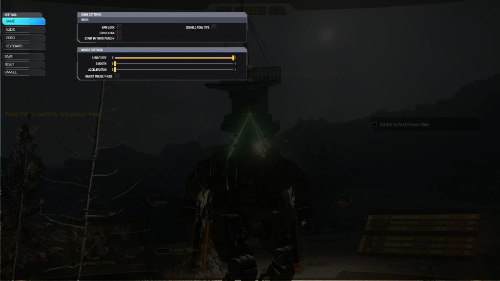
2) Options Menu Overlay Error. If you enter the testing grounds or the Training grounds this error can occur. Hitting ESC brings up the menu. Clicking 'Options' and hitting ESC brings you back to the game with the Options menu still open:
3) The In Game Font was changed. Was this for a specific reason? If not I'd like it returned to the old Font Myself. Otherwise Just a personal Gripe.
4) Graphical Lag on map Load. When the player goes through the startup sequence for the mech, He eventually Leans back and looks through his monitor. At that moment The HUD used to flick on instantly. Now there is often times a two or three second delay. Is this fixable?
Crashes:
1. When I went to "Weapon Groups" it required me to "Save" my configuration. After 5 minutes of waiting, I decided it was frozen, Restarted.
2. Clicking through the Mechs under Skills produced a Crash To Desktop
Good Stuff:
1) The Detail Popups of the mechs look Gorgeous.
2) You only have to click once to bypass all the opening videos.
Overall:
I'm not impressed. I feel the original UI did more with less. But maybe I'm just against change. Keep up the good work on UI 2.0 and I hope it becomes excellent.
I would like to see the Mech Lab a bit more streamlined. Able to see most of the information you need quickly and without clutter. Much like the current UI is. And if you are going to show off the mech so well, at least have the mech do something, or be intractable with. (like clicking the limbs opens up that limbs configuration)
Edited by Enzane, 29 October 2013 - 11:18 AM.

 This topic is locked

 Niko Snow, on 28 October 2013 - 03:06 PM, said:


 (honestly i still prefere the gray style of the MW5 trailer
  )
) )
)


