Jump to content

Public Test - Ui 2.0 Preview Survey


174 replies to this topic

Poll: Public Test - Ui 2.0 Preview Survey (275 member(s) have cast votes)

Did you find and try the following features?

  1. Settings Menu (255 votes [7.84%] - View)

    Percentage of vote: 7.84%

  2. Full-Screen Mode (244 votes [7.51%] - View)

    Percentage of vote: 7.51%

  3. Owned Mech Filter (250 votes [7.69%] - View)

    Percentage of vote: 7.69%

  4. Unowned Mech Filter (232 votes [7.14%] - View)

    Percentage of vote: 7.14%

  5. Mech Info Pop-up (227 votes [6.98%] - View)

    Percentage of vote: 6.98%

  6. Mech Purchase (204 votes [6.27%] - View)

    Percentage of vote: 6.27%

  7. Mech Configuration (247 votes [7.60%] - View)

    Percentage of vote: 7.60%

  8. Weapon Group Configuration (230 votes [7.07%] - View)

    Percentage of vote: 7.07%

  9. Loadout Configuration (243 votes [7.47%] - View)

    Percentage of vote: 7.47%

  10. Hardpoints List (159 votes [4.89%] - View)

    Percentage of vote: 4.89%

  11. Armour Management (204 votes [6.27%] - View)

    Percentage of vote: 6.27%

  12. Weapon/Equipment Purchase (229 votes [7.04%] - View)

    Percentage of vote: 7.04%

  13. Mech Skill Trees (232 votes [7.14%] - View)

    Percentage of vote: 7.14%

  14. Testing Grounds (180 votes [5.54%] - View)

    Percentage of vote: 5.54%

  15. Tutorials (115 votes [3.54%] - View)

    Percentage of vote: 3.54%

Please rate the Ease of Use of the preview

  1. Excellent (11 votes [4.00%] - View)

    Percentage of vote: 4.00%

  2. Satisfactory (82 votes [29.82%] - View)

    Percentage of vote: 29.82%

  3. Needs Improvement (132 votes [48.00%] - View)

    Percentage of vote: 48.00%

  4. Poor (50 votes [18.18%] - View)

    Percentage of vote: 18.18%

Please rate the Artistic Direction of the preview

  1. Excellent (112 votes [40.73%] - View)

    Percentage of vote: 40.73%

  2. Satisfactory (99 votes [36.00%] - View)

    Percentage of vote: 36.00%

  3. Needs Improvement (50 votes [18.18%] - View)

    Percentage of vote: 18.18%

  4. Poor (14 votes [5.09%] - View)

    Percentage of vote: 5.09%

Please rate the Overall Performance of the preview

  1. Excellent (41 votes [14.91%] - View)

    Percentage of vote: 14.91%

  2. Satisfactory (105 votes [38.18%] - View)

    Percentage of vote: 38.18%

  3. Needs Improvement (99 votes [36.00%] - View)

    Percentage of vote: 36.00%

  4. Poor (30 votes [10.91%] - View)

    Percentage of vote: 10.91%

Please rate the Overall Stability of the preview

  1. Excellent (18 votes [6.55%] - View)

    Percentage of vote: 6.55%

  2. Satisfactory (67 votes [24.36%] - View)

    Percentage of vote: 24.36%

  3. Needs Improvement (125 votes [45.45%] - View)

    Percentage of vote: 45.45%

  4. Poor (65 votes [23.64%] - View)

    Percentage of vote: 23.64%

Please rate the Overall Quality of the preview

  1. Excellent (33 votes [12.00%] - View)

    Percentage of vote: 12.00%

  2. Satisfactory (103 votes [37.45%] - View)

    Percentage of vote: 37.45%

  3. Needs Improvement (117 votes [42.55%] - View)

    Percentage of vote: 42.55%

  4. Poor (22 votes [8.00%] - View)

    Percentage of vote: 8.00%

Overall, is UI 2.0 better, about the same, or worse than before?

  1. Much Better (35 votes [12.73%] - View)

    Percentage of vote: 12.73%

  2. Better (103 votes [37.45%] - View)

    Percentage of vote: 37.45%

  3. About The Same (56 votes [20.36%] - View)

    Percentage of vote: 20.36%

  4. Worse (56 votes [20.36%] - View)

    Percentage of vote: 20.36%

  5. Much Worse (25 votes [9.09%] - View)

    Percentage of vote: 9.09%

Vote

#61 Dr Killinger

    Member

  • PipPipPipPipPipPipPipPip
  • Big Brother
  • Big Brother
  • 1,236 posts
  • LocationJohannesburg, South Africa

Posted 29 October 2013 - 10:51 AM

View PostNiko Snow, on 28 October 2013 - 03:06 PM, said:

Please answer the following questions in your response.

1) What is it that you like about the UI 2.0 Preview? Please enter as many items as you wish.

2) What do you like least about the UI 2.0 Preview?

3) In what ways does the UI 2.0 Preview appear to be superior to the previous UI?

4) Any new issues encountered?

5) Any other comments or concerns?


1:
I loved the music- seemed like Unreal Tournament 99 meets Mechcommander.
Seemed to load a bit quicker.
I liked the new font in-game.
Feels more streamlined.
Mech selection is much better for those of us with too many of them.

2:
Buying of mechs is unintuitive (having to filter etc). I'd expect a buy button or something?
The confirmation/back buttons seemed to be in an odd place (I would guess bottom right for confirmation buttons), but once I found them it was easy.
Would love to double click to add something to a mech instead of having to drag.
There is a disconnect between the vertically-listed mech sections during customization. Having them listed in such a way doesn't seem to give us an idea of what part of our mech is being changed. I didn't like the highlighting in UI1.5, but I found myself missing it. Some kind of visual confirmation might be nice, but I could get used to this as well.

3:
In every way imaginable.

4:
My mech did flicker in and out of view when I bought it and I was returned to the mechbay.
Rotating the Heavy Metal wasn't smooth, not sure if it's there for other mechs.

5:
I couldn't get into testing grounds. Also had no idea where to find hardpoint list.
I still feel like smurfy's is better for fiddling- it's just quicker. That said, the new mechlab is far better than the old one.

I forgot it is also patch day, and now I'm excited all over again.

Edited by Dr Killinger, 29 October 2013 - 10:58 AM.


#62 Black Templar

    Com Guard

  • PipPipPipPipPipPip
  • Veteran Founder
  • Veteran Founder
  • 300 posts
  • LocationGermany

Posted 29 October 2013 - 10:56 AM

1) What is it that you like about the UI 2.0 Preview? Please enter as many items as you wish.

+ Artistic style
+ Music
+ Fullscreen
+ Weapon grouping in the mechlab

2) What do you like least about the UI 2.0 Preview?

+ Any way to include the personal stats in the client?
+ Clicking and dragging the mech preview around causes stuttering.
+ Some mech like the Atlas, Battlemaster or the Centurion etc. don't fit in the preview completely.
+ Building an actual mechs is still no intuitive enough: individual mech locations are not clickable (e.g. right torso), overuse of drop down lists.
+ Although not fully implemented yet: the Skills' drop down list seems to be out of proportion. I would like to see the whole barr clickable and not just only the small arrow to the right.

3) In what ways does the UI 2.0 Preview appear to be superior to the previous UI?

+ Filters and organization of mechs

4) Any new issues encountered?

5) Any other comments or concerns?

+ During an actual run in the testing grounds, I encounterd a heavy decrease in my framerate (55fps down to 33fps).

#63 WM Fochs

    Member

  • PipPip
  • Legendary Founder
  • Legendary Founder
  • 23 posts
  • LocationFlorida

Posted 29 October 2013 - 10:58 AM

1) What is it that you like about the UI 2.0 Preview? Please enter as many items as you wish. It was full screen and was easy to move between the screens once you learned them (both Where they were and what they were)

2) What do you like least about the UI 2.0 Preview? unable to find some of the equipment and all the CTD's I could not find the camo menu

3) In what ways does the UI 2.0 Preview appear to be superior to the previous UI? Full screen and more audio properties.

4) Any new issues encountered? CTD switching from Lab to Skill menu. CTD in skill menu and from Mech menu into Editing menu

5) Any other comments or concerns? The FPS were about mid 30's-40's on high which is actually better then the previous builds.

I will post more when I find out more

#64 BFett

    Member

  • PipPipPipPipPipPipPip
  • 751 posts
  • LocationA galaxy far far away...

Posted 29 October 2013 - 10:59 AM

-Warning this will be a long post-.

1) What is it that you like about the UI 2.0 Preview? Please enter as many items as you wish.
I like the sound effects of the buttons when you hover over them and the game music that plays. I also like the art style although it's hard to appreciate with the way things are organized.

2) What do you like least about the UI 2.0 Preview?
I don't like the UI crashing on me when I change from the mechlab to the Skills Screen.

3) In what ways does the UI 2.0 Preview appear to be superior to the previous UI?
Art and color pallet.

4) Not Applicable, this is my first time using UI 2.0

5) Since this is my first time using UI 2.0 I decided to write out questions and comments as they came to me. Screen shots are provided where applicable.

When I first loaded the new UI up I initially though it was messy. I easily found the mech lab and and started looking at a Thunderbolt that I owned. I noticed that the Energy/Missile/Ballistic hard points were unclear. I later figured out that the numbers in the square were fractions for the various hard points. Equipment icons in the center column were too large.

Weapon information did not display exact values for optimal weapon range or the rang at which the weapon begins to do zero damage.
Spoiler


I then looked for Endo Steel, Single Heat Sinks, Ferro Fibris upgrade tabs and couldn't find them.
After that I decided to try to configure my weapon groups and found that I can't use the mouse to click on the numbers to assign groups. Please enable this in future updates.
Spoiler


I then went to the skill tree to unlock the basics on one of the mechs that I owned. I discovered that I had to click a small traingle to open up the mech category as opposed to clicking any part of the whole bar to activate the drop down list.
Spoiler

After selecting the triangle and clicking the blue Mech Tree button I noticed that when I unlocked a Basic Efficiency I would receive a warning saying that I would be charged XP for the transaction. Upon pressing YES I noticed that I was being charged GXP.

I then decided to do some more exploring in the Mech Lab. I couldn't figure out how to sell a mech I owned, nor could I compare the hard points of different mech variants to one another if I did not own the mech.
While in this screen I noticed that the current values were darker than the maximum values which I found strange because I would think that the current values would be as important if not more important than the maximum values.
Spoiler


Last but possibly not least I found that I had un-owned mechs in my Owned Tab (Exceeding 21) and that I was able to pilot these mechs in the Training Grounds.

PS: I know back in launch Bryan was showing how you could rename mechs in UI 2.0 I couldn't find this feature so I'm unsure if it's not in this build or if it's just hidden.

Thanks for reading!

#65 JuiceKeeper

    Member

  • PipPipPipPipPip
  • The Territorial
  • The Territorial
  • 172 posts

Posted 29 October 2013 - 11:02 AM

[color=#959595]
1) What is it that you like about the UI 2.0 Preview? Please enter as many items as you wish.
new mechlist, info about mechs, filters and sorting, weapon groups. ability to see mech when you purchasing it and rotate it,
pilot trees, new icons for weapons engines ammos etc in mechlab when purchasing stuff
2) What do you like least about the UI 2.0 Preview?
not able to select particular part of mech in mechlab like in older UI, overall color of UI(older UI colorwise feels better connected to ingame experience and HUD)
3) In what ways does the UI 2.0 Preview appear to be superior to the previous UI?
fullscreen, solidity, informations about mechs weapons etc, icons of equipment and mechs.
5) Any other comments or concerns? [/color]
[color=#959595]
weapon groups screen was missing that game wasnt highlighting weapon placement on mech
I wasnt able to equip Artemis or FF or Endosteel I just wasnt able to find it all in mechlab, maybe its not there i missed it in known issues[/color]

#66 Steadfast

    Member

  • PipPipPipPipPipPipPip
  • FP Veteran - Beta 1
  • FP Veteran - Beta 1
  • 767 posts
  • LocationBerlin, Germany

Posted 29 October 2013 - 11:02 AM

View PostNiko Snow, on 28 October 2013 - 03:06 PM, said:

Please answer the following questions in your response.

1) What is it that you like about the UI 2.0 Preview? Please enter as many items as you wish.

The music, the artwork, the general direction.

Quote

2) What do you like least about the UI 2.0 Preview?

I feel lost in the menues. they are not quite intuitive. for example, in the pilot tree I clicked for nearly half a minute until I noticed the arrow symbol. Why only make the mechtree open up if you hit the arrow, why not if you hit the name of the mech? Just behind that the fact that you STILL cannot bind the mousewheel up or down. STILL!

Quote

3) In what ways does the UI 2.0 Preview appear to be superior to the previous UI?

guessing from the startup sequence, it saves and loads much faster. Wich In really would appreciate, sitting in the old UI for nearly half a minute sometimes just top reload a module... couldnt quite test that though cause nearly everytime I tried something wich required saving of the mech the game hang up.

Quote

4) Any new issues encountered?

As this preview crashed more often than not, I say new issue is gamestability.

Quote

5) Any other comments or concerns?

I don't quite like the fact that the paperdoll is totally missing. I don't know I thought that part was tottaly intuitive in the old game. Also, armour would be great to have on one page, where I could type or if you really want those arrows, armour up or down on one page and would not have to click and point over half my monitor to just up a few amourpoints. its not very egonomic imo.

under weapongrouping it would be great to highlight the part of the mech where the currently choosen weapon is located. I myself often configure my groups around the location of the weapon, aka left or right.

I would like to have an information about the total Amount of ammunition I got curently loaded with my mech. either under weapon group config or better somewhere in the miniinfo (if youn are able to someday see wich wepaons you got in a mech not only a iagram of the possible firepower etc...)

Edited by Steadfast, 29 October 2013 - 11:08 AM.


#67 DarthPayne

    Member

  • PipPipPip
  • Big Brother
  • 51 posts
  • LocationLucerne, Switzerland

Posted 29 October 2013 - 11:04 AM

View PostNiko Snow, on 28 October 2013 - 03:06 PM, said:

1) What is it that you like about the UI 2.0 Preview? Please enter as many items as you wish.

That it is resolution independent. Makes managing many mech much easier.

2) What do you like least about the UI 2.0 Preview?

Feedback to the user often has a (too) negative touch. Too much red and "INVALID". See below for details.

3) In what ways does the UI 2.0 Preview appear to be superior to the previous UI?

See above.

4) Any new issues encountered?

Most are on the known issues list. I have a few comments I put under 5).

[Visual] Mech Preview: Rotating the mech causes stuttering. It feels like it rotates +5° then -2° then +5° and so on (if you take it frame for frame). At any rate, the rotation is not smooth at all.
5) Any other comments or concerns?

UI 2.0 definitely takes some getting used to. It shows promise, though.

[Visual] Inconsistency of left-side menu (All/Light/Medium/Heavy/Assault) between Mechlab and Mech Tree. The one from the mechlab seem to better fit the general look&feel.

[Visual] MouseOver on a mech in the mechlab opens a spec sheet. It slides in from the left and then fades out to the right on MouseLeave. I find this too nervous. I'd do a fade-in/fade-out in place (i.e. without x/y movement).

[Visual] It feels like there are too many different fonts and font variants being used.
[Usability] Skills/Mech Trees: Please allow double-click on Mech name (not just single-click on the triangle) to open and close the section.

[Usability] I personally don't care about trial mechs. I'd therefore prefer if trial mechs got a separate "FILTER" entry in addition to "OWNED" and "UNOWNED". Under normal circustances, I only want to see my owned mechs when I'm on "ALL". Yes, that would filter the trial mechs from two axes, so maybe I'd actually prefer the filter approach rather than having a "TRIAL" section in the "Select Mech" menu.

[Usability] Mechlab: I can't figure out what the gray triangle in the lower right of a mech thumbnail is supposed to do. Is that for selecting the 4 "ready mechs"?

[Usability] Mechlab Loadout: It feels a bit like the excessive use of modal dialog boxes in UI 1.0 that you guys use a red background with the string "INVALID" to mark equipment that cannot currently be added to the mech. That causes too much focus on "bad situations". "INVALID" is also a very negative term. How about "unavailable" (lower case) or "too heavy"/"no slot"? I'd rather have a "positive" approach, marking equippable stuff green and unequippable stuff gray or neutral. Of course, introducing green might not fit into the current color scheme so nicely. How about an option to just hide equipment that cannot currently be added (checkbox next to "Compare"?)

[Usability] Mechlab Loadout: The number of items for a particular owned equipment part is smaller than the price. But IMO, the number of owned items is more important than what it costs. I can concern myself with the cost once I know that I don't have the item I want to add to the mech.

[Usability] Mechlab Loadout: Please allow doubleclicks to add and remove items like in UI 1.0. That makes for faster modifications.

[Usability] Mechlab Loadout: I find the "ARMOR" and "HARDPOINTS" boxes hard to interpret. For "HARDPOINTS", I'd rather have a simple list:
ENERGY 0/2
MISSILE 1/2
For "ARMOR", how about something like the gauges at the bottom, just with arrows left and right plus the value as a number to the right? Needs two gauges obviously (front/rear). That would give more immediate visual feedback on the distribution and easier access.

[Visual] Mechlab Loadout: the box "EQUIPPED" is not as wide as the two boxes above it ("HARDPOINTS" and "ARMOR").

[Visual] If I have the client on "full window" and then switch to "windowed", I can't resize my window and I can't move it so I have access to the "settings" button to revert that change. Since the UI 2.0 was designed to be resolution independent, I'd expect there to be a possibility to resize the window as any other window. But that's not so important. I prefer full window or full screen anyway.

[Request][Usability] I haven't seen one in UI 2.0, yet, but please don't use modal dialog except for real errors. A bad example in UI 1.0 is the modal dialog for the feedback that a group was created. That one is just so annoying. In general, I think it wouldn't be a bad idea to get a user experience consultant to review UI 2.0. I've seen great results in software projects I worked in.


#68 Frostflower

    Rookie

  • 9 posts

Posted 29 October 2013 - 11:05 AM

1) What is it that you like about the UI 2.0 Preview? Please enter as many items as you wish.

Fullscreen, new mechlab in general. Everything looks great.

2) What do you like least about the UI 2.0 Preview?

Weapons in loadout screen weren't properly listed by size: (lrm20, srm4, lrm5, lrm10, lrm15, narc, srm2, srm6, ssrm2).
Suggestion: (lrm5, lrm10, lrm15, lrm20, srm2, srm4, srm6, ssrm2, narc).

3) In what ways does the UI 2.0 Preview appear to be superior to the previous UI?

In every aspect.

4) Any new issues encountered?

Nope.

5) Any other comments or concerns?

Nope.

#69 elde

    Member

  • PipPipPip
  • Overlord
  • Overlord
  • 77 posts

Posted 29 October 2013 - 11:06 AM

1) What is it that you like about the UI 2.0 Preview? Please enter as many items as you wish.
  • Liked the full screen mechlab.
  • Loved the borderless full-screen window.
  • Liked the color theme. Orange theme is too aggressive to my liking.
2) What do you like least about the UI 2.0 Preview?
  • So much stuff is still hidden away. All the text is so small, since it doesn't scale with resolution, at 2560x1440 I felt like I needed to squint and look closer.
  • You still can't see the whole mech at once. Modifying armor is a chore, since you have to select each mech part individually and then click on the small up or down buttons.
  • I couldn't find the place to select upgrades, DHS etc. Hidden away or not in this public test?
  • Information about the mech is really disorganized. Items are all around the screen, and while there's plenty of new information available, you can't e.g. see what engine is installed in a particular mech. See the thumbnail.


    Posted Image
  • UI elements are all around the screen. When using exp in the mech tree, one needs to click on unlock on top left corner, then move the cursor to th e middle of the screen to press "Yes". No keyboard shortcuts here, except that Enter is the same as "No".
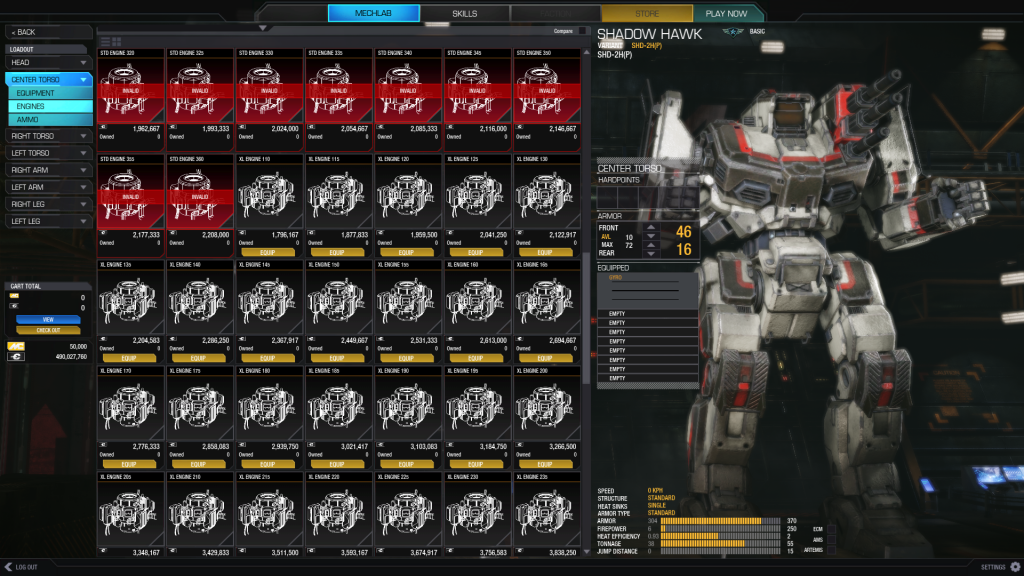
  • In mechlab, there are is no other information than tooltips that appear a bit too late. Select an engine, and you won't see how many slots it takes, how much it weighs or how many heatsinks it has. Still, half of the screen is empty and could be used to display information.


    Posted Image
  • In mech trees, when you use exp, you see a ribbon in the top left corner of the mech picture telling you at what stage the mech is. Complete that stage (i.e. buy all the basic or all the elite advances) and the ribbon disappears. See the thumbnail.


    Posted Image
  • I was wondering why I couldn't change the config of my SDR-5KC. Turns out it was one of the trial mechs, in my owned mechs -list.
  • There should be a way to see all the hardpoints in the mech.
  • Orange half-square means energy weapons, cyan missiles. Why not just write them down, like in the current client? At least use different symbols for them. See the thumbnail.

    Posted Image
  • Trying to save my mechs changed configuration left the game in a loop, inresponsive.
  • Only way to save the config was to go into weapon groups.
  • Weapon groups coloring is bad. Selected group is blue, unselected grey, bars are blue-gray. See the thumbnail.

    Posted Image

3) In what ways does the UI 2.0 Preview appear to be superior to the previous UI?
  • It is more appealing visually. It is more flawed than UI 1.0 in use.
  • Menu music is nice.
4) Any new issues encountered?
  • Trial mechs in the Owned mechs -section
  • Can't save mech configs without crashing.
5) Any other comments or concerns?
  • Good first iteration, but still lots of room for improvement.
  • Please test the UI on high resolutions (2560x1440) too.

Edited by elde, 29 October 2013 - 11:07 AM.


#70 CyclonerM

    Tina's Warrior

  • PipPipPipPipPipPipPipPipPipPip
  • FP Veteran - Beta 2
  • FP Veteran - Beta 2
  • 5,685 posts
  • LocationA 2nd Wolf Guards Grenadiers JumpShip

Posted 29 October 2013 - 11:07 AM

) What is it that you like about the UI 2.0 Preview? Please enter as many items as you wish.

-New "techno" art style. It fits well in your "modernize Battletech!" philosophy ;) (honestly i still prefere the gray style of the MW5 trailer :ph34r: )

-Weapons images (do they really come straight from a TRO? ;) )

-Home screen, simpler and more immersive than the old one.

-Music. Nice. But anything from previous MechWarrior games in the future? ;)

-'Mechs type filters (Weight classes, Hero, Trial, etc.)

-Finally weapon groups screen!

2) What do you like least about the UI 2.0 Preview?
-A couple of things releated to the easy of use. Owned / unowned 'Mech filters is even smaller than the trial/owned filter in the previous UI and 'Mech skills screen, i would have preferred something like that we have now.

-Worst of all: Loadout customization screen. This is important because that is why i voted "worse" in the last question of the survey. Yes, only for that screen. It is really difficult to see what your 'Mech has, i found even not so easy to see which engine it mounted. Why the components list on the left instead of the paper doll we have now? I came to the point that to see which weapons a 'mech had i chose to check the weapon groups screen instead of the main loadout screen.

In the UI we already have it is a lot easier to check and quickly change my loadout because i can associate in my mind the image of the component on the 'Mech with the slots screen which displays what is mounted there. <_<

It was easier to balance the armor, too. This is the main thing i do not like and would love to see changed, but seems to be late to change it.. :unsure:
3) In what ways does the UI 2.0 Preview appear to be superior to the previous UI?
-Artistic style
-Simpler home screen
-music and overall immersion
-full screen!
-weapon groups screen!
4) Any new issues encountered?

-If i go to windows with Alt+Tab while going back after a drop in the testing grounds the launcher crashes, same issue we already have , seems related to the launcher itself, but not so bad after all.
5) Any other comments or concerns?

My main concerns have been already explained and are about the Mechlab screen. Apart from that, i like the overall design of the UI, maybe a bit chaotic in some screen.
]Maybe it looks like less similar to the usual F2P games' UIs, mainly WoT. :)

Good job anyway and thanks for the preview!

Edited by CyclonerM, 29 October 2013 - 11:16 AM.


#71 Sulf

    Member

  • PipPipPipPipPipPip
  • 256 posts

Posted 29 October 2013 - 11:09 AM

Switching between two and one Monitor while the game is open makes the mechlab window go black until switching back.

Somehow still has this aspect ratio problem from closed beta where the window goes under the start bar and blocks out important buttons. I kinda thought you would have fixed this by now. I get I can change to full screen, but this is unrealistic when using teamspeak.
Posted Image

Full Windowed is the same as Fullscreen.

No way to filter trial mechs out of mech list.

No way to reorganize mech list.

Light mechs have no visible feet. same problem with all mechs to a lesser extent.

All text is tiny and much of it (thinking tonnage here) is grey and blends into the background.

No longer able to click directly on mech components to select.

I found myself fighting with the new setup. Switching from hardpoints to components is the near complete other side of the screen.

Mechlab does not benefit from a large window, full of big pictures of parts, but tiny text. It actually makes finding the right thing harder, especially with engines.

When switching between components, it's annoying to have to reselect the Ammo sub-tab when I was already dealing with ammo before.

Could not find the 'strip loadout' button anywhere.

Buying new mechs does not display mech hard-points.

Could not find sell mech button.

In the skill tree clicking on the tab for each mech type should open the mech tree, not the tiny button. Additionally if I am already in the tech tree it makes more sense for the entire mech to be a button than the "mech tree" button under it. There is no reason for this.

There is no point in being able to permanently select a mech skill to view it's details. Visually this is confusing. Mouse over is enough.

I hope you realize, having it automatically switch to GXP without warning is going to cause a lot of problems.

Still has long delay after exiting a match while reloading the entirety of mechlab.

As you said, a lot of the features are not in and I've left out talking about their absence, However you started posting on this back in May. I expected more here. At least to see all the mentioned features in some extent. Much of the original functionality is gone, it still has some of the old longstanding bugs, and all that I can really find here is a couple moderately interesting, but ultimately irrelevant, new things and some pretty lights.

#72 Draako

    Member

  • PipPip
  • Bad Company
  • Bad Company
  • 22 posts
  • LocationToronto, Canada

Posted 29 October 2013 - 11:12 AM

1) What is it that you like about the UI 2.0 Preview? Please enter as many items as you wish.

Love Full Screen! and the look!

2) What do you like least about the UI 2.0 Preview?
Not as intuitive as I would like. CLICKING! While its nice to have the sounds we need a way to turn off most of those sounds very distracting and annoying. Maybe only have a click for confirmation stuff. Crashed several times.

3) In what ways does the UI 2.0 Preview appear to be superior to the previous UI?

Looks good! Love some of the layout however some of it was confusing. Very hard to quickly see how much weight is remaining. its very small font.

4) Any new issues encountered?

Crashes.

5) Any other comments or concerns?

Love how it looks, and while it did crash, the performance was good. Full screen option is amazing, and what I wanted. Hate that there is a sound for everything, gets repetitive and annoying after you have been in the mech bay for a while. While the look is good it was annoying to add armor to my mech as I had to do a lot of clicking to go to each point. I think you should add an armor layout tab so that it's easier to config.

Keep up the improvements!

#73 Fuerchtegott

    Member

  • PipPipPipPipPipPipPip
  • 578 posts

Posted 29 October 2013 - 11:12 AM

You tossed away the paperdoll concept that is throughout the entire game in the UI 2.0.
No wonder we are all more than confused by the new interface.

The hardpoints are more or less hidden, maybe it's because I'm not used to the new UI, ya know what they say about old dogs and new tricks ...

Smurfys web UI is far more comfortable than your new UI 2.0.
I would even say your own Bryan looked most of the time confused when presenting the Interface in one of the last videos.

Take a look at your engine interface when eg a Atlas is there to be fitted, way to huge images.

There is no flow in using the new UI.

My tipp, since we all know how you devs balance, ten ton hammer style :-(
Improve it in small but constant steps and put out dx11 as soon as possible and european and asian servers.
(Because FPS players won't play a F2P game when they see pings with tripple digits, and hsr is a myth that even google has never heared about apart of mwo)

Edited by Fuerchtegott, 29 October 2013 - 11:18 AM.


#74 Al Bert

    Member

  • PipPipPipPipPipPip
  • 247 posts
  • LocationGermany

Posted 29 October 2013 - 11:12 AM

1) What is it that you like about the UI 2.0 Preview? Please enter as many items as you wish.
  • full screen mode - very good!
  • music - great
  • loading screen when going to tutorial, testing ground, mechlab itself etc
  • different loadout reflected in real-time changed mech view

2) What do you like least about the UI 2.0 Preview?
  • no overview about complete loadout of selected mech: once done, how many LL do you have with you? Have to check every hardpoint section again and again. Current UI has this overview at least in the table to the right (main section in mechlab)
  • section expand (for example: torso, arm etc) - way to small on the right side of the screen. Should be much bigger since it is what you are interested in (if you stick to the individual section design instead of sowing the whole mech loadout at once like smurfy)
  • very difficult to see tonnage changes - just the tiny bar at the bottom right
  • armor management - for each section seperately, very tidious
  • clicking sound whenEVER mouse moves over something you can click on. Irritating.

3) In what ways does the UI 2.0 Preview appear to be superior to the previous UI?
  • modern design
  • weapon group configuration prior to match
  • potential for much more J many promising things were locked in this test

4) Any new issues encountered?
  • sorting "Hero" and "Champion" messed up
  • mech can be turned in mechlab (which is good) - but there is a pronounced jittering when applied
  • mech tree YLW: crash, same for Boar Head - did not check on all mechs
  • skill tree: crash while unlocking skills, sometimes crash when entering skill tree - not repeatable
  • TDR5-S not showing up in mech list (empty)
  • master cannot be unlocked? I am aware there are no modules yet, but the master skill for one extra slot is not shown when finishing 3 elites on mech chassis
  • frequent errors while saving
  • "view" button results in nothing - expected list of new things in cart
  • buying a mech does not move the acquired mech out of the "unowned" filter… need to set filter to "owned" for configuration though

5) Any other comments or concerns?
  • in general: density of items/readability - can be MUCH improved
  • proposal: show complete mech loadout (like in smurfy where you see the whole mech filling the screen - good readability and overview). So much unused space right side of screen.
  • still unintuitive loading of same weapon type (e.g. PPC, TAG, LL is loaded in the order of equipping it). So much unused space right side of screen.
  • tiny hidden "check out" button - as only way to get mech configuration stored?! BIG save button needed
  • proposal: UNload equipment by double click instead of drag and drop (ease of use)
  • proposal: double click on selected item to load instead of "equip"-button (ease of use … the button is tiny à related to density of items above)
  • have not seen any possibility to change: DHS/HS, Artemis on/off, Endo/standard etc.


#75 intothefray

    Member

  • Pip
  • The Devoted
  • The Devoted
  • 11 posts
  • LocationParis, TX

Posted 29 October 2013 - 11:15 AM

1) What is it that you like about the UI 2.0 Preview? Please enter as many items as you wish.

I like where it will take us. Tired of waiting for UI2.0 excuses. :)

2) What do you like least about the UI 2.0 Preview?


Forced full screen. Would like UI Windowed and gaming full screen like before. This works much better for both Remote Desktop MechLab usage and launching from a PC with multiple screens.

3) In what ways does the UI 2.0 Preview appear to be superior to the previous UI?

Hoping the mechs will load faster when your collection grows but hard to tell since not all mechs are given.

4) Any [color="#b27204"]new issues[/color] encountered?

Will not load on remote desktop if in full screen mode. Cannot alter mode until game is launched.

5) Any other comments or concerns?

Non full screen option would be great for the few of us that like the setup better.

#76 charov

    Member

  • PipPipPipPipPipPipPipPip
  • Legendary Founder
  • Legendary Founder
  • 1,110 posts
  • LocationLondon - UK

Posted 29 October 2013 - 11:15 AM

1. Sound is cool and finally we have the fullscreen. The interface is smoother than the UI1.5.

2. The mechlab. We need an overall look on our mech, something like MW4 or even Smurfy.

3. Everything except the mechlab.

4. After changing the loadout of a mech I tried to open the skill menu but it crashed. However, I think this problem was written into the known issues list.

5. I like the UI2.0, it's nicer and faster than the current UI. However you should improve the mechlab: this is one of the most important aspects of the game. We need something clear and intuive, with data like the weapon lab from smurfy.
Something like this:

View Postwickwire, on 29 October 2013 - 10:03 AM, said:

Posted Image


#77 Kaeseblock

    Member

  • PipPipPipPipPipPip
  • WC 2018 Top 12 Qualifier
  • WC 2018 Top 12 Qualifier
  • 258 posts
  • LocationEU / Deutschland

Posted 29 October 2013 - 11:17 AM

View PostNiko Snow, on 28 October 2013 - 03:06 PM, said:

1) What is it that you like about the UI 2.0 Preview? Please enter as many items as you wish.
  • the graphic style
  • info pop-ups
  • fullscreen mode
  • BG-music and button sounds

View PostNiko Snow, on 28 October 2013 - 03:06 PM, said:


2) What do you like least about the UI 2.0 Preview?
  • navigating the mechlab via drop-down menus feels incredibly clumsy
  • important infos and buttons in the Mechlab are way too small with a 1920x1080 resolution, e.g. the hardpoint and slot info, loadout names , "Check Out" Button (it should be renamed in "Save & Leave" or something similar)
  • too many items shown at once when outfitting a mech (1920x1080), its really hard to find the wanted engine, when there are 35 engines displayed at once (5(height)x7(width) Matrix, with engines only differing a few small letters in the name, a 5x4 matrix would be more then sufficant).
  • MC-buy preselection when buying new mechs

View PostNiko Snow, on 28 October 2013 - 03:06 PM, said:


3) In what ways does the UI 2.0 Preview appear to be superior to the previous UI?
  • looks like a solid foundation for further improovements
  • its a lot faster
  • it looks much better
  • pop up info boxes

View PostNiko Snow, on 28 October 2013 - 03:06 PM, said:


4) Any new issues encountered?
  • remove a weapon from a hardpoint -> save loadout -> add a weapon to the hardpoint -> save loadout -> don't enter the Weapon Groups configuration screen but start a new match (testing grounds) right away -> the new weapon will not be displayed in the lower right corner (if you changed all weapons, you will see no weapons at all and you won't be able to fire a single shot) This issue is perfectly reproducable!

View PostNiko Snow, on 28 October 2013 - 03:06 PM, said:


5) Any other comments or concerns?
  • please scale the size of all letters and especially the mech loadout info (displayed next to the mech in the mechlab) up when displayed in 1920x1080, so they have the same size as shown in the 1280x720 resolution, otherwise they are just too small (at least on my 17" notebook screen)
Thanks for letting us test the new UI, was fun ^^

Edited by Kaeseblock, 29 October 2013 - 01:52 PM.


#78 ApolloKaras

    Member

  • PipPipPipPipPipPipPipPip
  • Ace Of Spades
  • Ace Of Spades
  • 1,974 posts
  • LocationSeattle, Washington

Posted 29 October 2013 - 11:17 AM

1) What is it that you like about the UI 2.0 Preview? Please enter as many items as you wish.
+artistic feel - it looks pleasing
++music
+++Sortable tabs - Owned and unowned

2) What do you like least about the UI 2.0 Preview?

The KaCHUNG sound effect whenever I add or remove one armor... That sound will get quite redundant. I would only have that fx play when adding a weapon or an engine, a much smaller sound when adding the smaller stuff - armor - heatsinks etc.

Give me a break down of where the hardpoints are in the mech - have no clue where anything is unless I click on a portion of the mech. That information is no where to be found, even if you are buying the mech, and when you are equipping it. I'd like a 'Mech detail' screen that shows my entire loadout as well as armor.

The writing is too small above the icons. I see there is a button to make it a list (I think), and that will help. However under the icon mode you have this gigantic icon for any engine, for example XL 250, and the writing is like in 8pt font - which actually tells me what it is. This is the same for any item. Get rid of the writing above the icon, combine the two together. So over top the Engine icon or right below it (while still in the 'card') XL 250 in much larger print so we can see it.

I want to be able to save configs. If you want to minimize the Click-Lab, this is how you will do it. Allow me to save my current config with one button, allow me to strip a mech with one button, allow me to max armor with one button. Allow me to double click to remove items from the mech. Now all I have to do, is when I need to load another config for a mech, I just have to click one button.

3) In what ways does the UI 2.0 Preview appear to be superior to the previous UI?

Its not superior but it has the potential to be.

4) Any new issues encountered?


Some mechs wouldn't save. On dropping on some maps - I didnt have any weapons, even though the config saved.
Home button disappears from time to time.


EDIT: No FPS lag at all in training grounds, running 110FPS with everything but AA and Post Processing cranked.

Edited by Saxie, 29 October 2013 - 11:29 AM.


#79 Enzane

    Member

  • PipPipPipPipPipPip
  • Legendary Founder
  • Legendary Founder
  • 428 posts
  • Facebook: Link
  • LocationTemplar Command Training Camp.

Posted 29 October 2013 - 11:17 AM

Okay another long post with pics.

This is for the Devs.

Configuring Issues;
1) No easily way to save your configurations. as it turns out it is this button: Posted Image

This button is hard to find and can be hard to read with the white on yellow. I suggest (this will come up a lot) you make the buttons bigger, and The text more color pronounced.

2) No Endo, DBL Heatsinks, or Artemis buttons to test.

3) Only the Tabs work for Editing your mech. - - What this means is that there is no longer a "Rag Doll" or Mech itself To click to locate your parts. You now MUST use the annoying bars on the sides for your parts. Please at least allow us to click on the mech's Left arm to access it's left arm at least.

4) The Equipment Icons are far too big. I can see the "Detail" list button in the upper left. But it isn't working. The Icon size is way too big If you are looking through the engine's this is absurdly annoying.

5) Item Data is useless. Similar to 4, the Icons for each item only display the Name, # owned, and C-bill cost. This is useless. The items should show the important data: Damage, Tonnage, and Slots for weapons. Engine size, Tonnage, and # of Heatsinks For Engines.

6) Leaving Configuration without saving. It took me twice to figure out the little "checkout" button. Why can I click Back, Home, or Any other buttons that leave the configuration without saving it? The first thing it should do (like our current UI) Is confirm a save when trying to leave the config section.

7) View Button Does Nothing. No clue on this one.

8) Info window stays open if a tab is quickly changed. See Image:
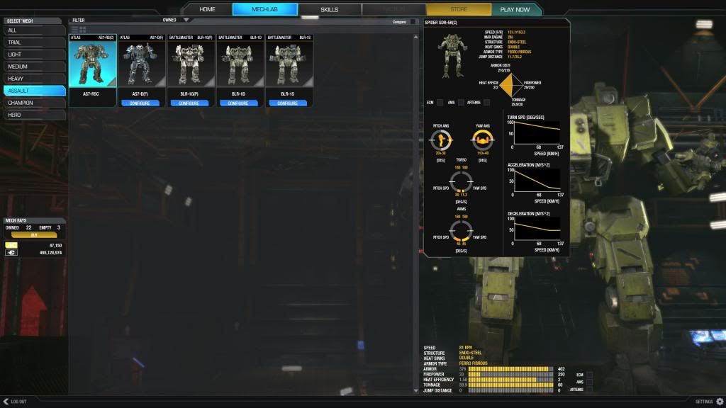
Posted Image

As you can see, a spider is a bit heavier then an Atlus.


Text Size:
1) Overall The text seems small, It feels hard to locate everything in the beginning. Where is the overall tonnage of my mech? Oh... thrown down on the bottom right like it wasn't important. Given all the "eye candy" And focus on parts. Wouldn't you make the current tonnage of your mech easier to notice?

2) Bigger Screen, Less Info. It feels like you've taken the whole screen but are conveying LESS information to the user. I now have to Hover over EVERYTHING to see the information. Or Look all the way across the UI to notice details (like tonnage) while I'm flipping through a mechs arms on the Left side of the screen. To locate the parts, which are shown on the Right side of the screen. Things are far too spread out.


Skills:
1) Skill menu can be Glitched. If you rapidly click between the Mech labs Trial mechs, and the Skill Tabs Lights bar you can eventually produce this error.
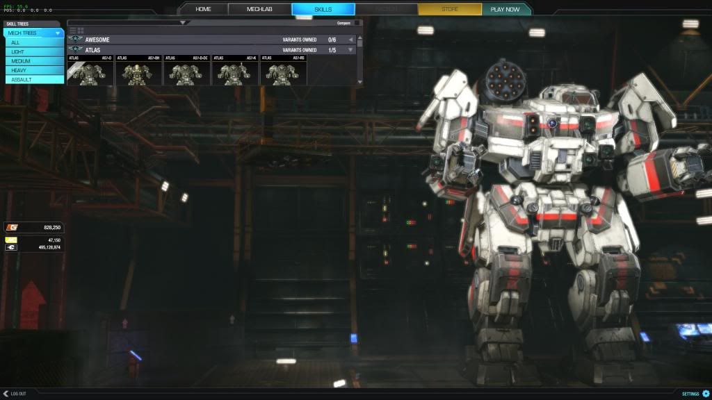
Posted Image

Where the Skill bar is far too small to be used. Scrolling with it will actually move down to the next mech. Not granting you access to any of the buttons on the Mechs themselves.

2)Clicking Mechs Name should Open the Drop down. Right now you have to click the tiny gray arrow to the right to open the drop box to access your mechs skills. It should be accessible much like it is in our current UI. just clicking the name should open it.

3) Master Level must be scrolled to view. When you've finally unlocked Master, you can't seem to find it anyone. The Menu is only half size (for some reason.) and a big gray area shows up at the bottom. Not showing the Master Skill until you scroll down. This should be fixed. I guess by the gray open area you've tried to do that, but it didn't work quite right.
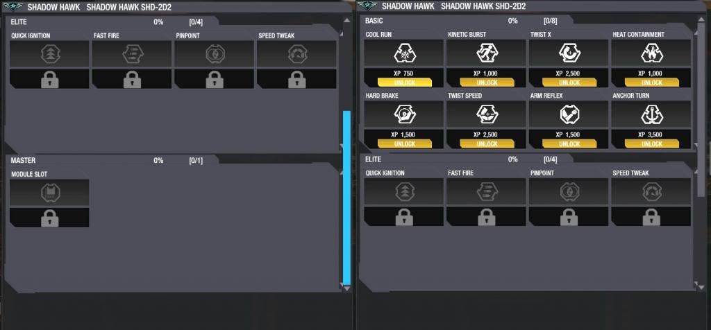
Posted Image

4) When Buying Mech Skills, why does the confirm window pop up so far away? Why can't a simple confirm window show up somewhere NEAR my mouse, so I don't have to go chasing it down? Just a gripe on my part.


Options:
1) Why is there no throttle Decay Option?


Weapon Groups:
1) Switching to "weapon Groups" requires a Mech save. This is probably a good thing. But why is it the only place that seems to cause a save. And twice for me caused a freeze. I can click on Home, or Skills without saving my loadout.

2) Blue Bars make it hard to ID a Lit Number. Change the Lit numbers to yellow, or make the blue bars Hollow. This way they are easier to see what is set up.


Home:
1) The Home Button Text Doesn't Load. When you first enter the game there is no "HOME" until you hover over it.
Posted Image

2) Select Mech Under HOME is a redundant Menu. It simply opens up the Mech bay. I hope this button has a further use in the future.


Purchasing Mechs:

1) Why was it so hard to figure out how to purchase a mech? I had to locate the Filter button and select the "Unowned" section. This isn't very intuitive and will lead new players to get quite frustrated.

2) Two Menus to buy one mech. There does not need to be a popup menu asking if I want to pay with C-bills or MC. Of course I want to pay with C-bills. Now I understand some may want to use MC. Bring back the dual buttons, there's room for a second button under there just like in our current UI. Purchase C-bill, and Purchase MC. It's not hard and it saves on a menu. Also Makes Purchases Smoother.


Gameplay:
1) Testing Grounds Doesn't take you to the correct Locations (already known)

2) Options Menu Overlay Error. If you enter the testing grounds or the Training grounds this error can occur. Hitting ESC brings up the menu. Clicking 'Options' and hitting ESC brings you back to the game with the Options menu still open:
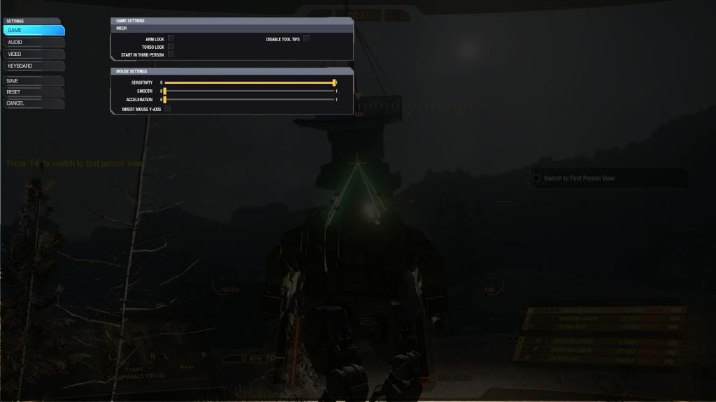
Posted Image

3) The In Game Font was changed. Was this for a specific reason? If not I'd like it returned to the old Font Myself. Otherwise Just a personal Gripe.

4) Graphical Lag on map Load. When the player goes through the startup sequence for the mech, He eventually Leans back and looks through his monitor. At that moment The HUD used to flick on instantly. Now there is often times a two or three second delay. Is this fixable?

Crashes:
1. When I went to "Weapon Groups" it required me to "Save" my configuration. After 5 minutes of waiting, I decided it was frozen, Restarted.
2. Clicking through the Mechs under Skills produced a Crash To Desktop


Good Stuff:
1) The Detail Popups of the mechs look Gorgeous.

2) You only have to click once to bypass all the opening videos.


Overall:

I'm not impressed. I feel the original UI did more with less. But maybe I'm just against change. Keep up the good work on UI 2.0 and I hope it becomes excellent.

I would like to see the Mech Lab a bit more streamlined. Able to see most of the information you need quickly and without clutter. Much like the current UI is. And if you are going to show off the mech so well, at least have the mech do something, or be intractable with. (like clicking the limbs opens up that limbs configuration)

Edited by Enzane, 29 October 2013 - 11:18 AM.


#80 wickwire

    Member

  • PipPipPipPipPipPipPip
  • 741 posts
  • LocationIgnoring The Meta Since 2012

Posted 29 October 2013 - 11:20 AM

View PostCurccu, on 29 October 2013 - 10:33 AM, said:

Up the text size of items you can put into your mech (in this pictures engine names and ratings) Posted Image


I agree. IMO this is bad design because everything seems to be the same font size. The little window showing the center torso seems like an afterthought.

View Postsabujo, on 29 October 2013 - 10:44 AM, said:

  • The table view for the loadout is, in my opinion, very inefficient when we need to browse. This kind of layout is good when the picture is the main element of differentiation and this isn’t definitely the case, especially on components such as engines where everything looks the same. I know there will be a list version, however I don’t see a point for table view in this section.

This.

Edited by wickwire, 29 October 2013 - 11:28 AM.


5 user(s) are reading this topic

0 members, 5 guests, 0 anonymous users