

I am still in complete shock at just how chi..te this new UI is.
Unbelievable how you can turn the worst part of the game into something even crapppppper.
I'll say it again - this is just embarrassing what you have done...
Firstly, you can't easily find engines anymore since I can't seem to find quickly which mech has what engine - STUPID!
Secondarly, I can't seem to work out anymore how many HS my mech has. After 30 minutes of fu...king around I still don't know where this shows us!
Thirdly, WTF to a I find out how many crit slots I have left????
If this stuff is easy to find then you haven't made it idiot proof for people like me and that my friends is a FAILED design.
Seriously hire some people from Germany or something that know how to make stuff efficient and just work.
Finally, whats with all the extra screens and confirmations you have too go through to just to set the mech up???
I have spent $800 in 3 months playing this game because I love battle tech and the game play. Everything else about this game fencing stinks especially the social function.
Sorry I take that back - there is no social function. How you guys can't even deliver a chat channel is beyond me and would add immense value to the game.
Pull your head out guys. This game will be dead in 6 months if you don't get your sh....t together fast!

Ui Feedback
Started by Elder Thorn, Feb 04 2014 12:28 PM
1175 replies to this topic
#502
Posted 05 February 2014 - 04:34 PM
1. An Owned section for Mechlab (No trial mechs) and Skills lists, and saved between logins/sessions.
2. Preferred game modes only asked once and saved between logins/sessions.
3. Allow longer names for Mechs.
4. Not messing with Mech Lab unless I really have to - just a complete mess. Looking forward to the Smurfy overhaul.
5. Kerning and narrow character width of new font in a match makes everything a little more difficult to read.
6. Need a separate button for Save and Checkout.
Edited by uckfred, 05 February 2014 - 04:36 PM.
#503
-

-

- Legendary Founder

- 120 posts
Member
- Locationwashington dc
Posted 05 February 2014 - 04:48 PM
I will not post the things I like just the things I would like fixed or added.
I would like to be able to see the EXP under or over the current selected mech. The gxp is there but no EXP. I have to drill down through a few menus/tabs to get to it. That needs fixed. Second is why not show the currently equipped gear to the left or right or how about a moveable window that shows a simple loadout. I got tjhis big mech in the middle of my window but would like to see what engine I have on it and such so that I can use my second screen to compare to online builds as I go.
another issue is the filters are not working as they really should. Owned is on all of them because the amount is next to them 0-N amount. I don't want them to show up at all if I don't own them unless I select show not owned mechs. Trials should be filtered out and this is something that bugs me a lot......I want the chasis types to be a filter. I do not want H and C mechs at the top unless I filter on that. Let all my stalkers be together and my griffins together.
Grouping is a bit silly. We got the grp three head icon at the bottom that blinks...then it opens a window on th ebottom right...and then a big windows opens top left...for grps.. you can't ready up form there...you got to leave it and then go select a mech etc....that needs redone all together. Take a look at world of tanks. You can have a bunch of people in the ready area at bottom and the group leader can pull people in to the match window based on what he needs.
Match groups...we got 4 and 12...why did 8s get removed? Hell take a 8 and a 4 and put them against a 12 .....wait times for 12s are pretty long. Iet people that are in groups of 4 or 8 opt in to go against 12s as an option. More matches in less time.
How about somethign new...? Like having two 12 man groups bid the tonnage for the matches? Like they did in lore? You say bring 700tons and I will match that...then you bring 7-12 mechs that add up to 700 tons or less. Simple to me...so it could be 12 on 12 or 8 on 7 or whatever. Something new would be good for this game....and mroe Maps......I hope you can get the factions and clans setup soon. Alteast let people join it so we can chat in game and such and have a tag in matches.
I am sure there is more....the interface seems to lag a bit when you go in to skills....why? well it has to load up all the mechs and not the one you currently have selected....that makes no sense. If I wanted to mess with skills for another mech then I would have selected it first.
I would suggest the secretary test for the UI. have the office clerk or receptionist just play the game for the first time....shouldnt need much of a tutorial if the interface is intuitive.
Hope you can get some stuff fixed soon.
I ddo like the sales on mechs but that wont keep the masses appeased forever.
Ebonkosh
#504
-

-
- Overlord
- 1,566 posts
Member
- LocationCanada
Posted 05 February 2014 - 04:56 PM
Greetings all,
Reference the MechLab within UI2.0
- Once you select an owned Mech and move through the Modules.
- Everything has a red bar through it, both the invalid as well as the equipped.
Change one of them so I can find what is actually on the Mech, may I suggest showing the equipped items as blue. Thus allowing me to see at just a glance what is mounted.
- This is on every module type.
9erRed
#505
-
-
- Overlord

- 866 posts
Member

Posted 05 February 2014 - 05:06 PM

I believe this window overlapping my upgrade options is an issue.. Possibly because of resolution change? Probably just a minor error.
Also, the buttons on that misplaced window make the mouse-over sound, but don't activate when clicked.
Edited by Gamuray, 05 February 2014 - 05:08 PM.
#506
-

- 1 posts
Rookie

Posted 05 February 2014 - 05:19 PM
I really wanted this game to be successful. I came back after this new UI release to see how things were going. While there are a few new features that are helpful this user interface is a complete train wreck.
Did anyone who studied user interface design work on this project or did you let a bunch of programmers (who always know best) design this steaming pile of junk? Talk about 2 steps back? I know this generic feedback is pretty much useless so I will give some specifics.
Mech list (mech selection)
giant list of crap. no way to see the genealogy and variants of particular classes, nor can I sort into reasonable sub groupings.
The statistics of the mech are difficult to read. it is not intuitive to see which are upgraded from standard, or how many of the hard-points are filled. Couldn't you have at least colored the text for double heat sinks so it shows up another color and standard mods are gold? That might make it easier to scan visually.
The graphs to the right are not conveying information in a useful manner. I think someone got the speed graphs backwards. Mechs don't start running at 90kmph and then slowly accelerate faster. Someone needs to check this bug out.
The graphic at the bottom is hard to see. Most of the text on the whole screen is hard to see (and I have a 32 inch screen. Pick a font with some readability.
Equipping a mech is a nightmare. I dont "OWN" all 100+ engines just because I pull an Xl325 from a mech. The items that I do OWN should be very visible. Things that dont fit the mech in question shouldn't even show up on the list of options.
If I have an active mech and I am at the front page of the interface , why cant I just dive into that mech? Why are there no active stats about the mech in the center of the screen?
The whole thing is a big cluster F. I am not commonly annoyed with an interface, good job. It's so annoying that I dont even want to play at all.
I feel sorry for that one guy at the office who was pointing out how horrible this was, yet no one listened to him. Its clear to me that there is a complete moron in charge of the interface design (or pushing the design team) creating this complete and utter garbage.
Do the gaming community a big favor and use some of the insane money you charge to hire a real UI developer with a game development pedigree. Ive seen free mobile apps with MUCH better interfaces. How could you go from good, to worse? IMO it looks like a classic case of allowing programmers to "design" things. Here is a news flash: Most of the population do NOT think like programmers groomed on Microsoft developer suites.
#507
-

-
- Liquid Metal

- 282 posts
Member
- LocationSagittarius A
Posted 05 February 2014 - 05:26 PM
Thanks dear Developers over there,
you have managed to hide every useful information as best as you could. This whole UI2.0 Situation is a mess, and nothing less. I can read nothing with those tiny texts. Everywhere grids instead of lists which all bear the same symbol, an information overflow of secondary to less important information is shown every where, but not the one your where actually looking for is easy to find. The heat-scale is one of the most important information and you show it like it where nothing which should be highlighted. Modules are gone, forever probably or is it intended to search every single one of my 20 mechs for the desired module?
The best of all is that you cannot even see what you are buying over there in that strange picture collection called "shop". You can see a stupid pic of a yen-lo-wang but have to ask your oracle first whats maybe behind the image. You hide information really well.
It's just annoying. It is the maximized opposite of a userfriendly interface in almost every single way. Blame you PGI!
#508
-

-
- The Defiant

- 43 posts
Member
- LocationMontreal
Posted 05 February 2014 - 05:28 PM
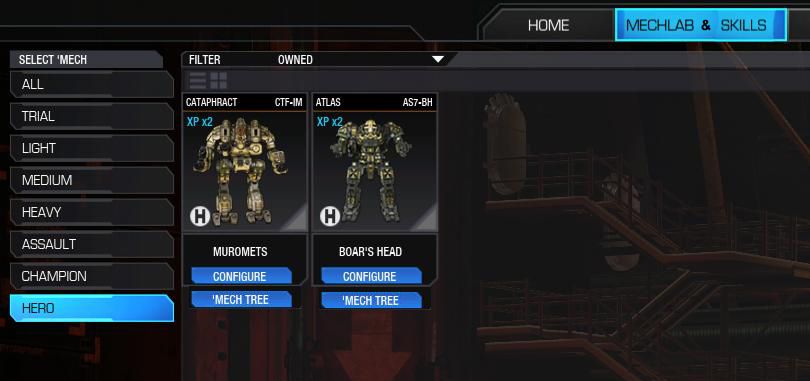
Would like it if after a match the mech selection would go back to the class I was previoulsy in(Hero for instance), instead of always going back to the ALL section.
#509
-

-
- Shredder

- 397 posts
Member
Posted 05 February 2014 - 05:33 PM
My constructive opinion is that the overal layout of the new ui requires to many mouseovers and clicks for the user to access pertinent information quickly and easily. For instance, the loadout section for center torso shows row upon row of engines to chose from. However, each box is dominated by the same overly-large drawing of an engine rather than any useful information. Having to mouse over the boxes to get basic information is less desirable than having info readily available. Also, a tonnage-remaining indicator would be nice.
#510
-
-
- Little Helper
- 17 posts
Member
Posted 05 February 2014 - 05:39 PM
Okay,
BUG REPORT
pressing escape during a match brings up the menu. If you click 'exit map' or 'quit game' an are you sure dialog pops up. If you press escape, the menu behind disappears and you can't confirm or deny your option...
FIX, press escape again and the menu pops up behind and the okay/cancel become live again.
Pet Hates.
No ability to quickly see modules on a chassis.
No 'Ready' button outside group screen.
'Checkout' button, bottom left when the other action buttons are top left.
no 'overall' armour adjustment. selecting each area is time consuming, especially when the area buttons are top left and the armour adjuster is top rightish.
Edited by Bobbit, 05 February 2014 - 05:40 PM.
#511
-
-
- Bridesmaid
- 15 posts
Member
- LocationOromocto N.B.
Posted 05 February 2014 - 05:51 PM
mech trees need to be viewable whether they are owned or not. For example, was working on my stalkers quite some time ago; got one done, partial on another (basics obviously) but don't remember which variants. I'm not going to buy 5 stalkers just to see which ones I was working on, as I sold them some time ago.
#512
-
-
- Civil Servant

- 5,154 posts
Member
Posted 05 February 2014 - 05:52 PM
Tried loading the new UI. I would like to say thanks for the new font used, it is much more visible on 1024x768 sized monitors. If only the in match font for chat could be changed to it.
When looking to Loadout Modules, the area with the slots overlays some of the list partially blocking the upper right module. Please move to where I overlaid the blue box marked Move Here shown in the screenshot.

When looking at Mechs, if I have the Filter switched to Purchasable and change it to Owned, it ALWAYS goes to Trial no matter where I am, Medium, Heavy, anywhere. See screenshot.

Cannot take Screenshots in front end UI, would be nice to do so.
While looking through the new UI, I had a Crash to Desktop. Never had it with the old one.
All of this emailed to Support.
When looking to Loadout Modules, the area with the slots overlays some of the list partially blocking the upper right module. Please move to where I overlaid the blue box marked Move Here shown in the screenshot.
When looking at Mechs, if I have the Filter switched to Purchasable and change it to Owned, it ALWAYS goes to Trial no matter where I am, Medium, Heavy, anywhere. See screenshot.
Cannot take Screenshots in front end UI, would be nice to do so.
While looking through the new UI, I had a Crash to Desktop. Never had it with the old one.
All of this emailed to Support.
#513
-
-
- Rage

- 14 posts
Member
Posted 05 February 2014 - 05:57 PM
I will go out on a limb here and say what was so bad with the old UI? My opinion as meaningless as it is, NOTHING! it just needed refinement not a whole dang redesign...
#514
-

-

- 14 posts
Member
Posted 05 February 2014 - 06:06 PM
Someone mentioned this already, and I "Liked" the post. Don't know if the DEV's looks at the number of "Likes" or not to determine is any particular issue is bigger than another. But I'll just repeat that from the Store. It would be nice to see the mechs hardpoints and current loadout. Right now, you can just click "BUY" with no idea how the mech is configured.
#515
-
-
- Legendary Founder
- 120 posts
Member
- Locationwashington dc
Posted 05 February 2014 - 06:16 PM
Did the same UI usability testers for UI 2.0 do the Obamacare website? Come on guys....The more I use it the more I want to through my own PC out the window....I will just address the home screen cause I may blow a blood vessel if I go to another screen.
Home screen should have GXP, EXP, Small chart with current weapons and locations. Ammo i.e 3 tons srm, 1 ton AMS, 4 tons, AC10. ECM/NARC etc on the mech or not?
I should be able to buy a heatsink in the shape of Truck nutts for my atlas for 100MC. When you flush your coolant it should drop out your ass of the mech and can be used to track you by light mechs with Beagle probes.
Light mechs should be brought back to some realistic balance. Give us the ability to knock them over again or something. Jesus...I am sure that if you hit a Spider with a AC20 round it would have a pretty good chance of falling over.
Again...jump jets need shake on the way up and down. If you are not on the ground then gyros are keeoing you stable but with shake.
Bring 8 mans back.
Grouping and readying up is just ********.
No group chat channels for anything....maybe add a yahoo chat plugin for the game? something atleast?
Ok time for meds.
Ebonkosh
#516
-
-
- Legendary Founder
- 1,576 posts
Member
Posted 05 February 2014 - 06:18 PM
Combine the Mechlab and Skills Tabs and you will reduce the number of clicks drastically.
Something like this...
Something like this...

Edited by FactorlanP, 05 February 2014 - 06:19 PM.
#517
-
-
- 412 posts
Member
Posted 05 February 2014 - 06:19 PM
Revert it back or copy Smurfy.
Honestly this is the worst UI I have even seen and its just the UI, now I know why the game is in the shape it is in atm.
Honestly this is the worst UI I have even seen and its just the UI, now I know why the game is in the shape it is in atm.
#518
-

-
- Stone Cold
- 34 posts
Member

Posted 05 February 2014 - 06:28 PM
1: You could have left the font in game alone it was fine. Now it just looks like you tried to do something in game to change and its just failed. not liked at all.
2: Please let me see what my mechs have in them when i am looking at them in the list.
3: You had a better mechlab in the previous UI.
4: Communications with friends and such is a pain. If you are going to make this full screen like it is. I do not want to be forced to have to stick to one window at a time for doing things. I would like i have a free floating communications tab/window that will stay with me as I move around my mechbays/mechlabs. Oh and PLEASE put a ready button that is static in the right corner. Or a drop down menu for group/communication, that would be much nicer with what we have now.
5:Make putting modules on our mechs a little simpler?
6: Seriously, let us see what equipment is on our mech without having to go into mechlab and configure it.
7: UI 1.0 was much better, can I have it back?
Edited by Rigger, 05 February 2014 - 07:02 PM.
#519
-
-
- The Angel

- 19 posts
Member
Posted 05 February 2014 - 06:58 PM
The UI 2.0 is much better equipped to handle additional content. I think with some work it could be a really great UI. There are a few things that I find cumbersome or could use improvement:
- 1) Module slots. There is no way to tell which mech has them equipped and you are unable to move them if they are equipped in another mech. There was a screenshot in a previous post (shout out, nice pic!) that allows you to "Move module here".
- 2) Add Keyboard support. Esc brings you to Home. F1 brings you to Mech Lab, F2 skills. Arrows to navigate, Enter to select item or confirm purchase.
- 3) Drop down options when hovering over Mech Lab / Skills. Allow selection of 4 mechs like previous UI (or most used) and have quick select options to configure right off of the home screen.
- 4) Text searchable weapons / mechs. Auto filter as keyboard input (so only typing 'S' gives you small laser, SRM)
- 5) Better details, views, and filtering in the store. It is very difficult to make any decisions if you are a new player.
#520
-
- Little Helper

- 6 posts
Rookie
Posted 05 February 2014 - 07:01 PM
Please give us an option to have the out of game UI in windowed mode while the game is full screen. Until you fix the entire social section (hint: in game merc outfits/whatever, so I don't have to add everyone in the outfit to my friends list one by one) adding new people from team speak is even more annoying than it was before.


1 user(s) are reading this topic
0 members, 1 guests, 0 anonymous users


