Great suggestion, but I doubt PGI/IGP is listening...
 Valcrow, on 10 February 2014 - 10:14 AM, said:
Someone Suggested I put this here...
Here's the full thread, but here's the important part in a nutshell.
_________________
Original 2.0 layout:
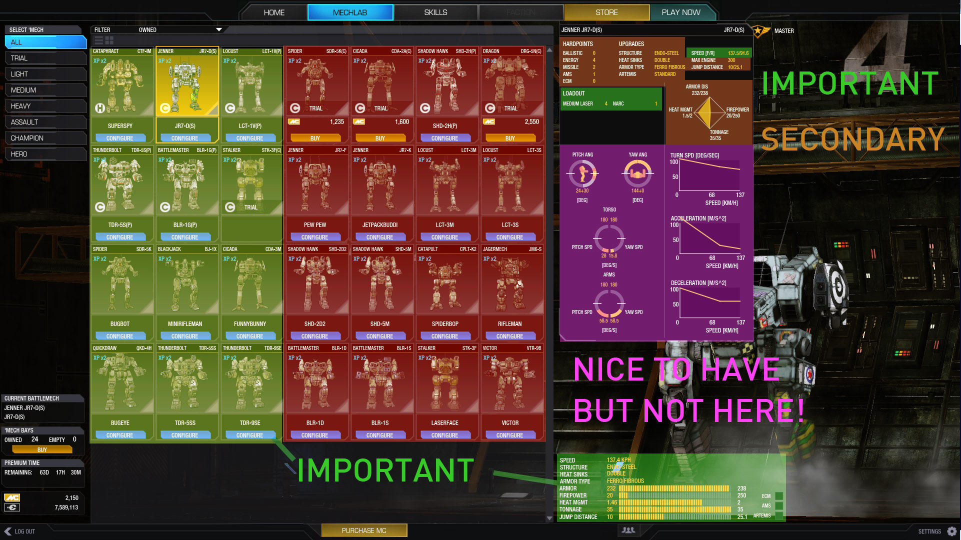
Important stuff is all to the sides & small.
Could we please have something like this:
Because then all the important stuff is laid out as follows:
In addition, we're missing awesome stuff like, ammo count, heat sinks, slots, etc.
we also need a fast way to add artillery strikes and change modules.
Lastly, that can all be glanced in the CENTER of the screen easily and completely. All we loose is 16 mech portraits.
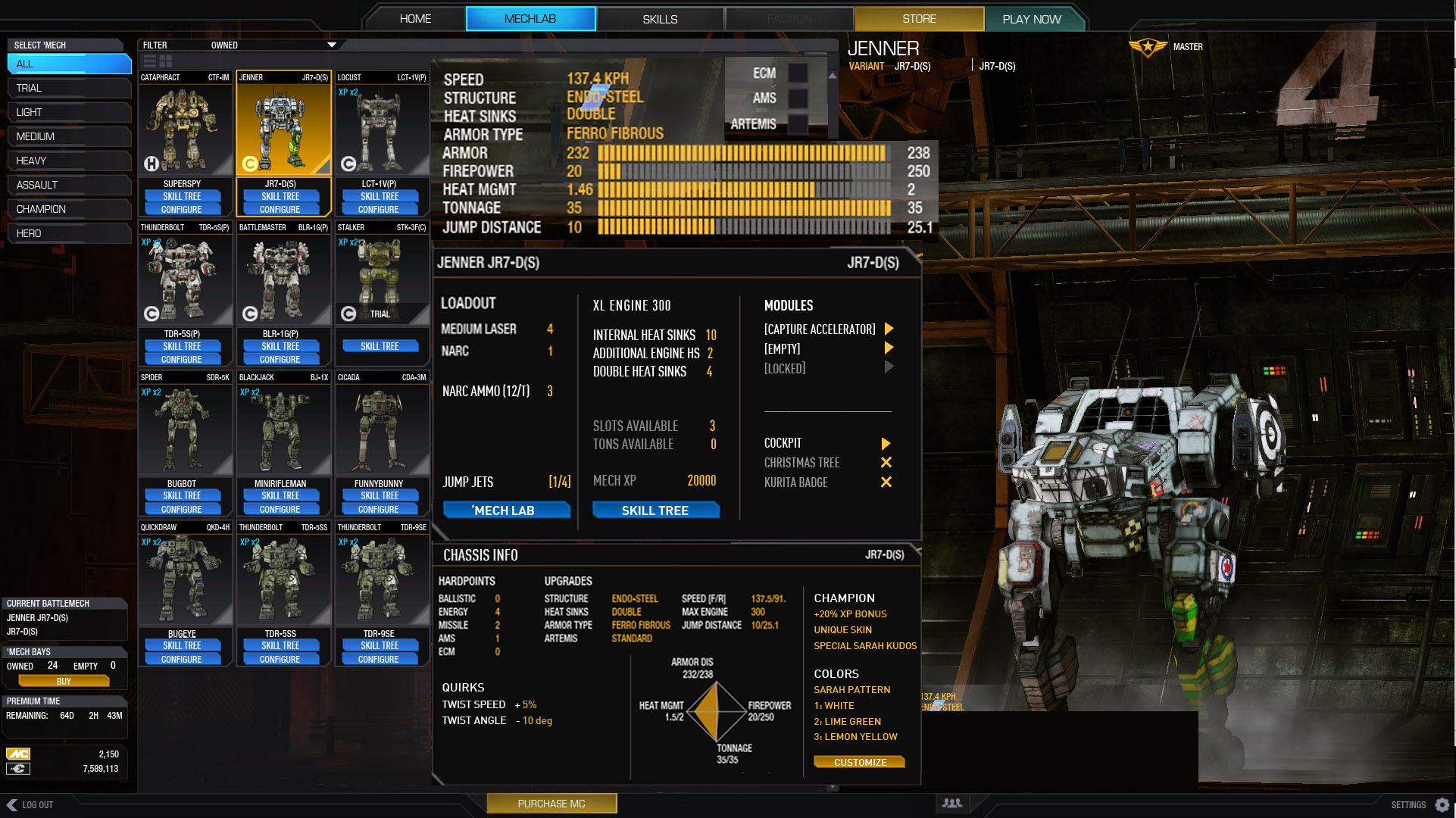
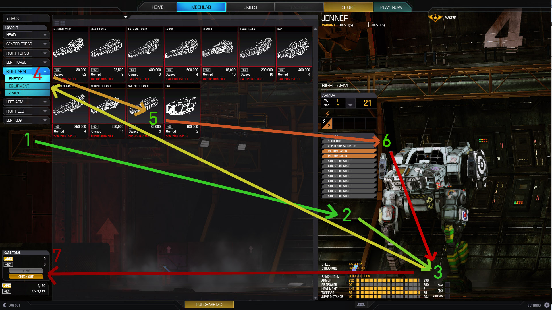
This is the current Loadout layout. Which requires both your eyes, clicks and mouse to keep going across the prime realestate (the center) without actually interacting with it at all.
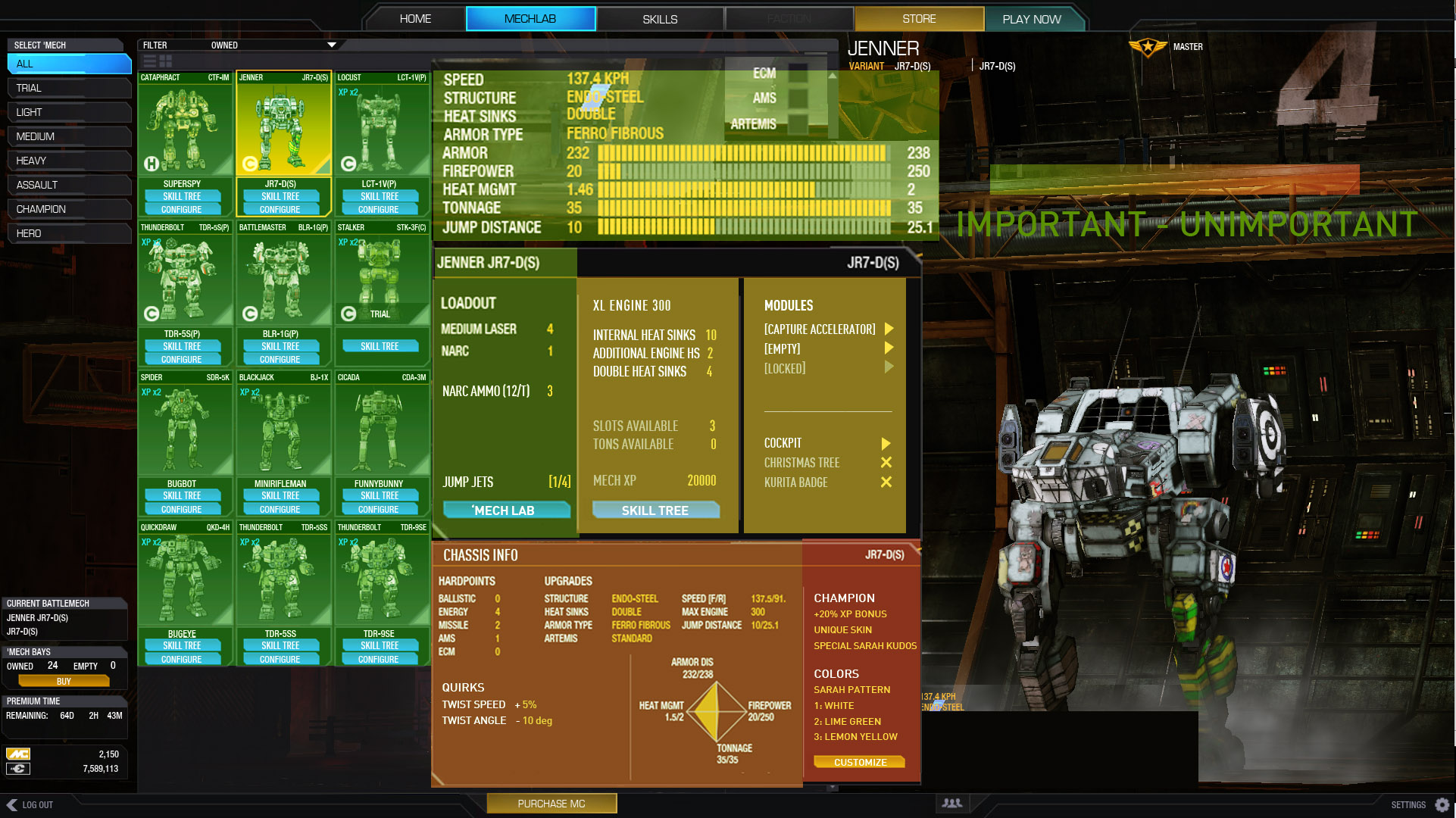
Can we have something like this?
The most important pieces of info in the middle. Tonnage, layout, slots open. all WITHOUT requiring ANY clicks.
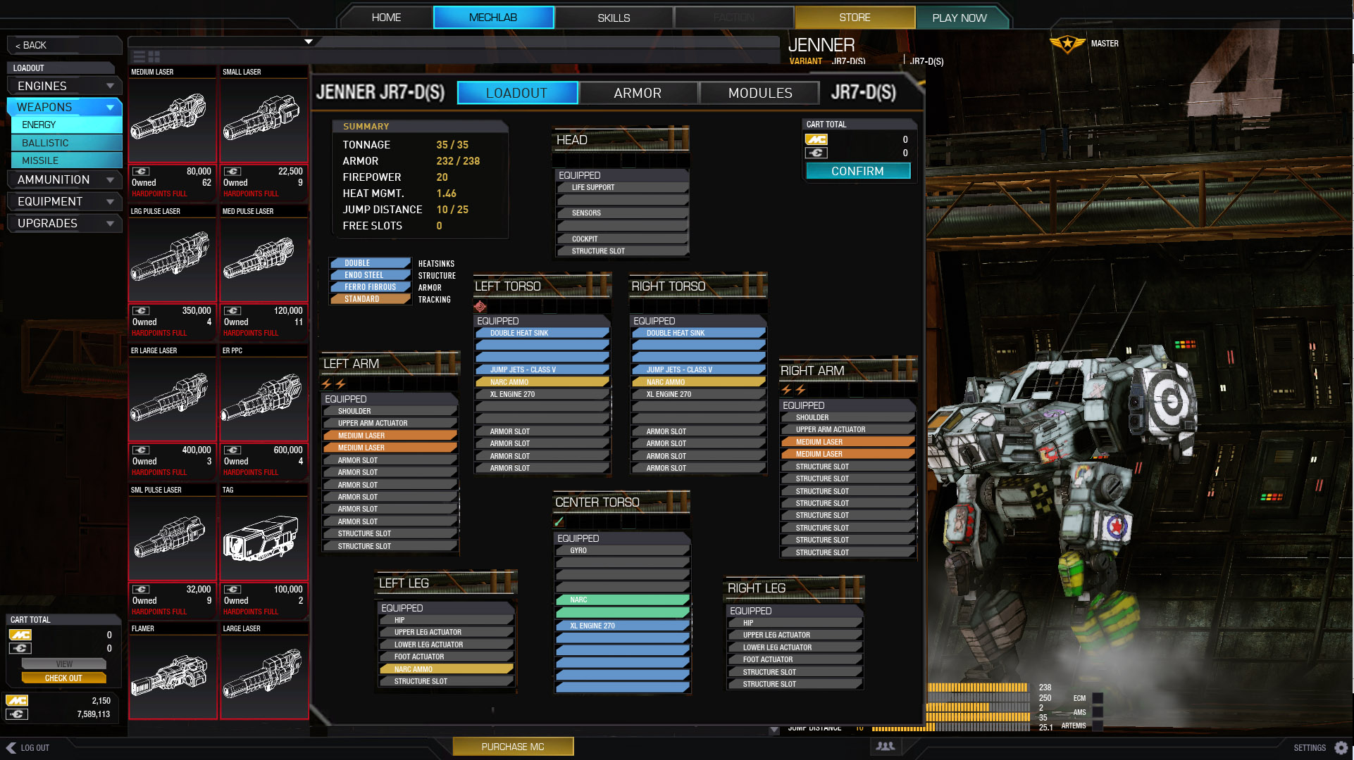
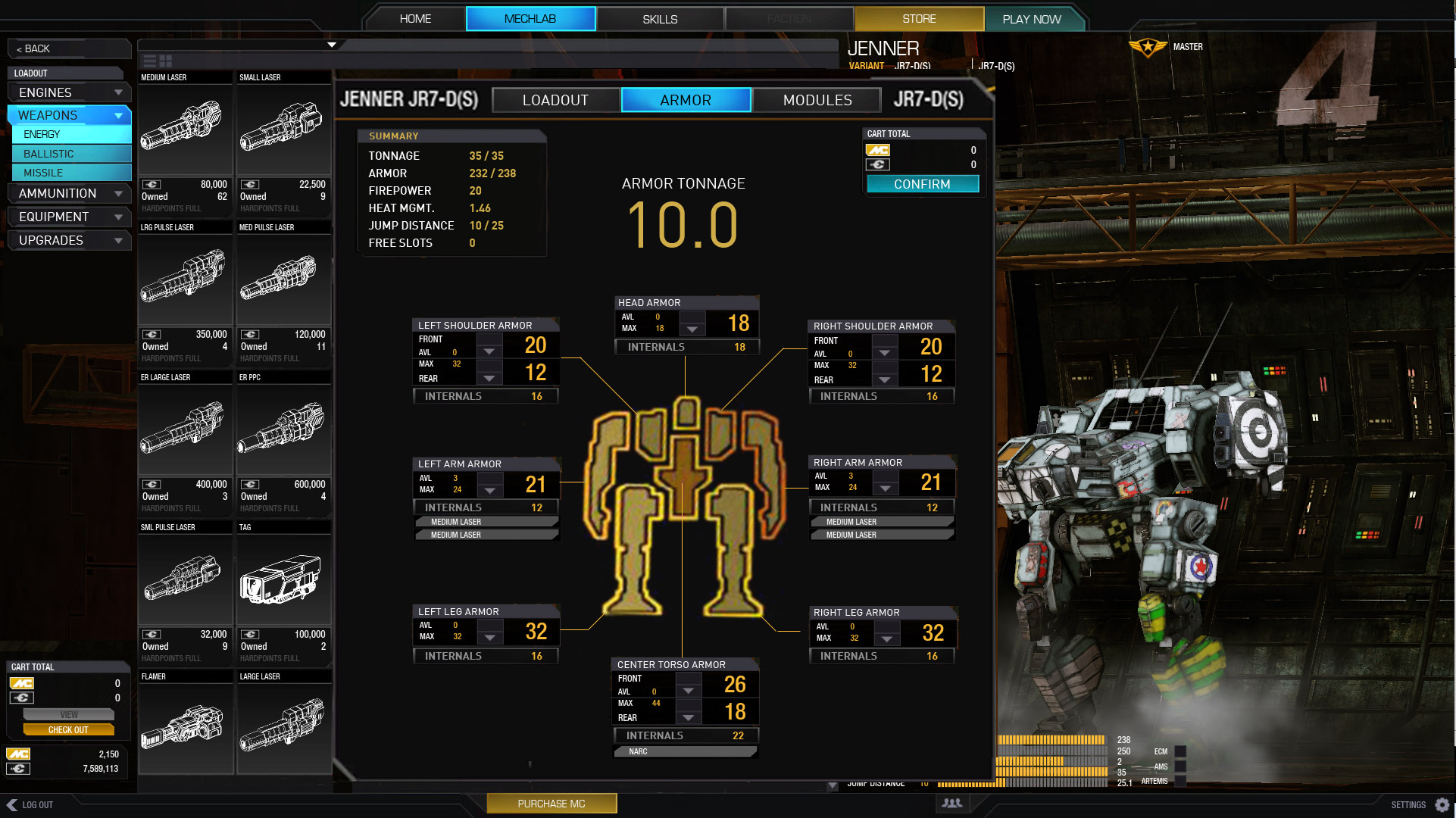
I removed the armor to fit everything. Put it in a new screen.
Shows you where your guns are, so you can make sure those spots have more armor than your disposable arms.
Internal point value showing.
And armor tonnage totals, for getting those .5t and 1.0 values.
Thanks for looking.
Like this one, except for lag issue kind of sums it up... though this POS was 2 years in the making so short-cuts shouldn't have been an issue for a normal company.
Leftwardjetlag, on 10 February 2014 - 06:21 AM, said:
Might as well chime in : UI 2.0 is an horrible useless game-killing stunt. Well it is from my short-sightted, selfish and ignorant point of view.
Maybe I am reluctant to change. Or maybe I'm just used to like well built things.
The old, crappy, buggy, unintuitive and clunky UI was actually what drove me to MWO. Been playing for about 2 months, I understand the game goes way back than that.
What the old UI did nice ?
- it wasn't buggy, clunky or anything to me.
- It would be windowed, sharp and responsive, no-bells-no-whistles, quick to play, or quick to customise
- I could see at a glance my gxp and MC.
- I would see a quick-list of favorite mechs I did want to ... 'evolve'.
It would have a mechlab (or whatever customisation environment) wich has info and functionality at my fingertip. Hell the old paper mech sheets were faster than UI 2.0 (yep, i played paper back then, i'm that old). Paper may have bad rep now, but it had to be optimized, no one would want to browse 3 manuals and a 10 page mech sheet just to play a game would they ? That's about how efficient UI 2.0 is. Despite what I saw on another thread leading to this one, customisation (some would say 'optimisation') is probably the core underlying motive to play giant robots killing each other. "Will this mod give me an advantage on the field ?". UI 2.0 kills the fun of that. Flat. Dead. Useless sounds and pictures, unnerving loading times and missing info, no way to have a general look and feel of the mech we customise.
It is sad to say, but working late and pushing deadlines *might* make for bad decisions and shortcuts. By PGI's own salespitch, UI 2.0 was rushed to the world who couldn't wait anymore for it's glory. Well, I for one could have waited. For now I wait for the mechlab to load. I have to wait for info to show. I when I'm done, even the gameplay feels slow and chunky. Don't know if it's psychologic, but the game seems to be unplayably slow, I can't drive the thing, feels like old stop-motion godzilla or something. I had to drop graphics a little in the old UI. Now no setting would do.
Might as well write about it, I can't play anymore. I'll stick around a week or two, curious to see if this whole mess gets cleaned up and rebooted.
Edited by Alik Kerensky, 10 February 2014 - 07:49 PM.