Jump to content

Visual Feedback On Ui + Revamp Mockups


60 replies to this topic

#1 Valcrow

    Member

  • PipPipPipPipPipPip
  • 228 posts
  • LocationCanada

Posted 10 February 2014 - 03:57 AM

Hi PGI,

Like many, I've had my share of frustration with the new UI. Although I appreciate the new graphics, and obviously a nicer backend to the UI, the functionality is not quite as we'd hoped. I think you've swayed a bit too much in the artistic direction and not enough on the user experience.

Instead of voicing the dissatisfaction through a wall of text. I thought it actually faster for me to just mock something up instead so maybe we can pinpoint our grips.

I've even mocked up an example of what I think would be pleasant to use, in keeping with your framework and art direction. -in hopes that it is easy to implement. Though I know, stuff's always harder than it looks.

I think the biggest problem lies in the hierarchy of information and underutilized screen realestate. And possibly a lack of consideration for function of the mech selection screen.

IMO, The FUNCTION of this page is to SELECT your mech. Get an OVERVIEW, and either launch or decide to REFIT.

For that, we need the following information in order of priority:

1. Mechs in bay
2. Loadout of selected mech
3. Information relating to decision to refit
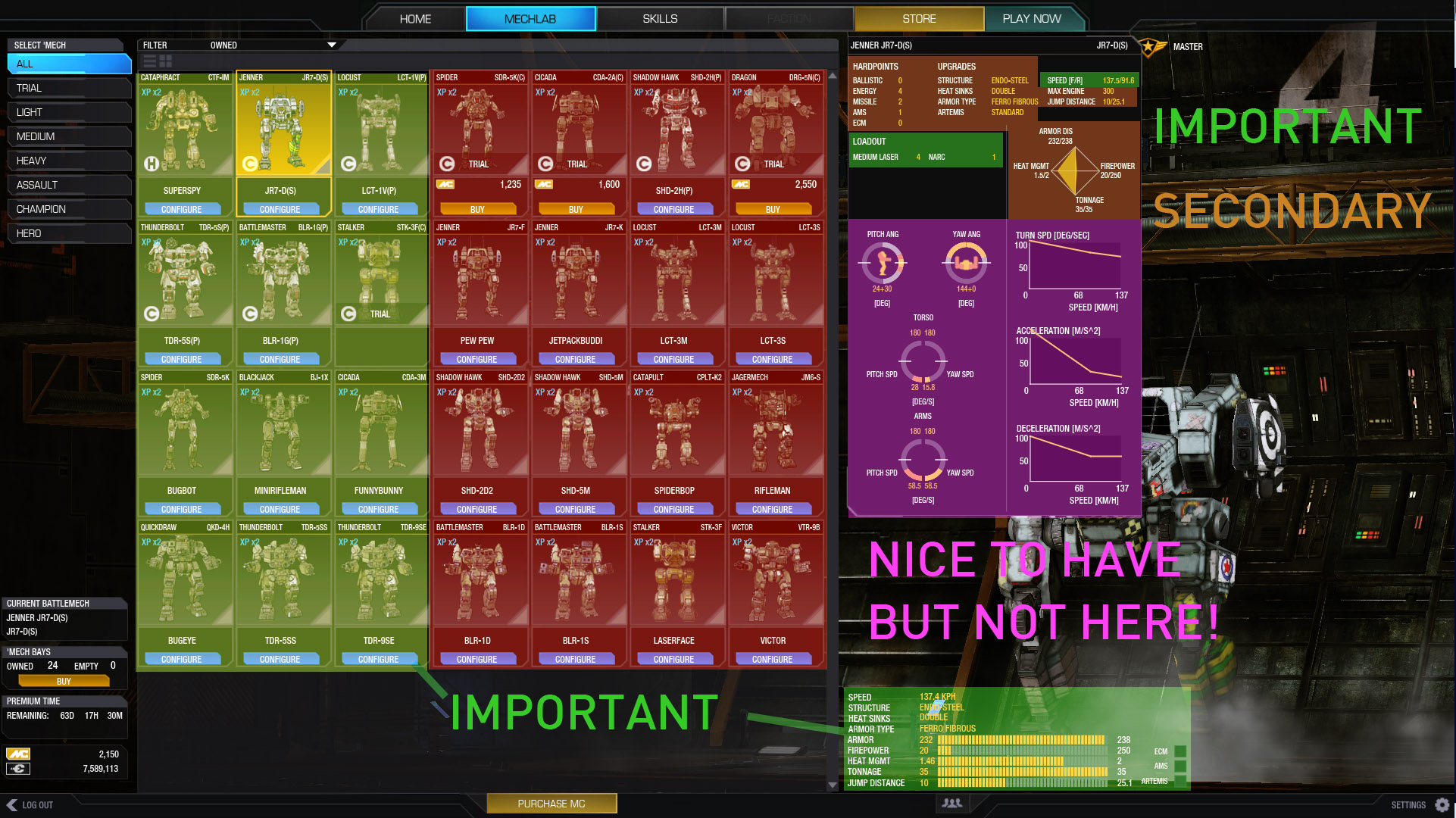
Posted Image

Currently, There are a few major problems:

The important stuff as I perceive it is in the corners and tiny. The best realestate in the center is taken up by 16 redudant mech portraits that could be solved by scrolling or filtering.

When I choose a mech, I need to see what it has immediately to decide if I want to use that one. Currently it requires a buggy 'mouse over', and information on that mech is incomplete and also tiny.

Important stuff should be in the center, and your eyes should go in a natural flow.

I propose the following:
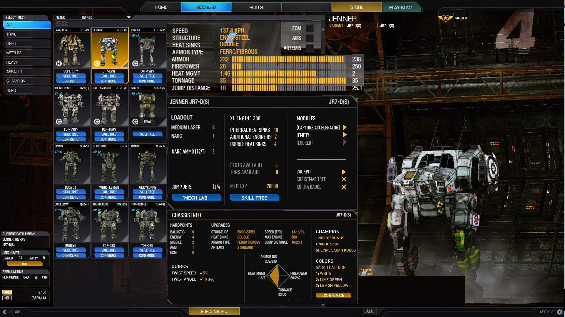
Posted Image

This layout follows my decision making process more fluidly providing much more info.

The first panel, is the overview.
The second panel, the loadout (including missing information like modules, ammo, slots, HS.)
The third, Chassis info that you 'might' need

Each panel gets more specific as it flows so you naturally get from generic to specific until you make your decision to launch or refit.

Additional stuff that I'd like on the page integrated into layout:

SKILL tree included on top of the configure button.
Easy access to modules for stuff like arty strikes.
Quirk information.
Bonus XP/Cbills info
Cockpit items - for easy removal to put in other mechs.

Removed the arm/yaw information
Although pretty, very rarely do you need that specific information...

All we loose to the currently layout is 16 mech portraits that we can scroll to get.

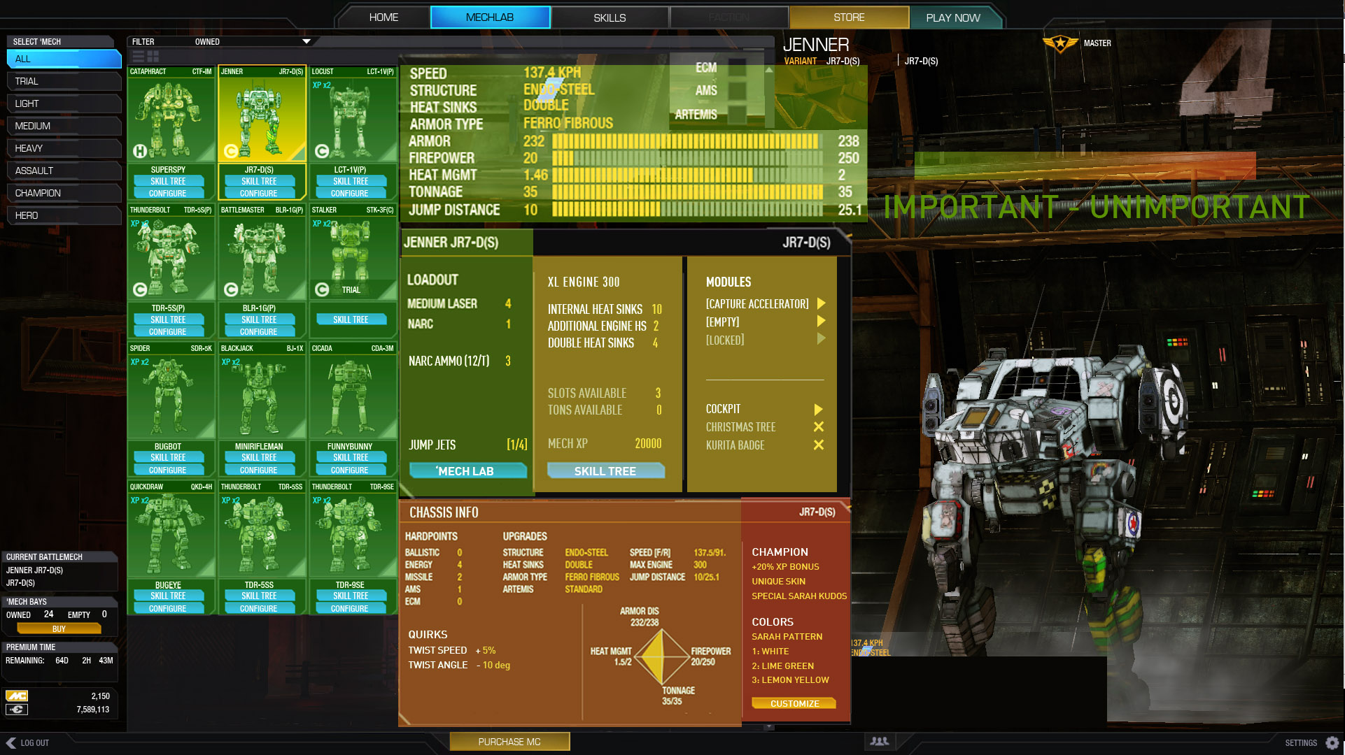
Here is the arrangement of importance on this layout:
Posted Image


LOADOUT!

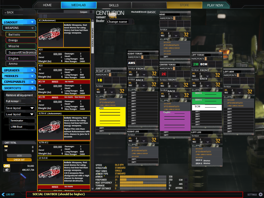
Loadout screen has more issues than the mech selection IMO. It takes ages to do anything. There is no overview perspective. I'm willing to bet the vast majority of people will find the OLD UI quicker to setup mechs than this..

I think this is due to the placement of buttons, the steps you need to take to do anything requires you to go across the screen to the left and right constantly. Whle the middle is not being used. Picture to illustrate.
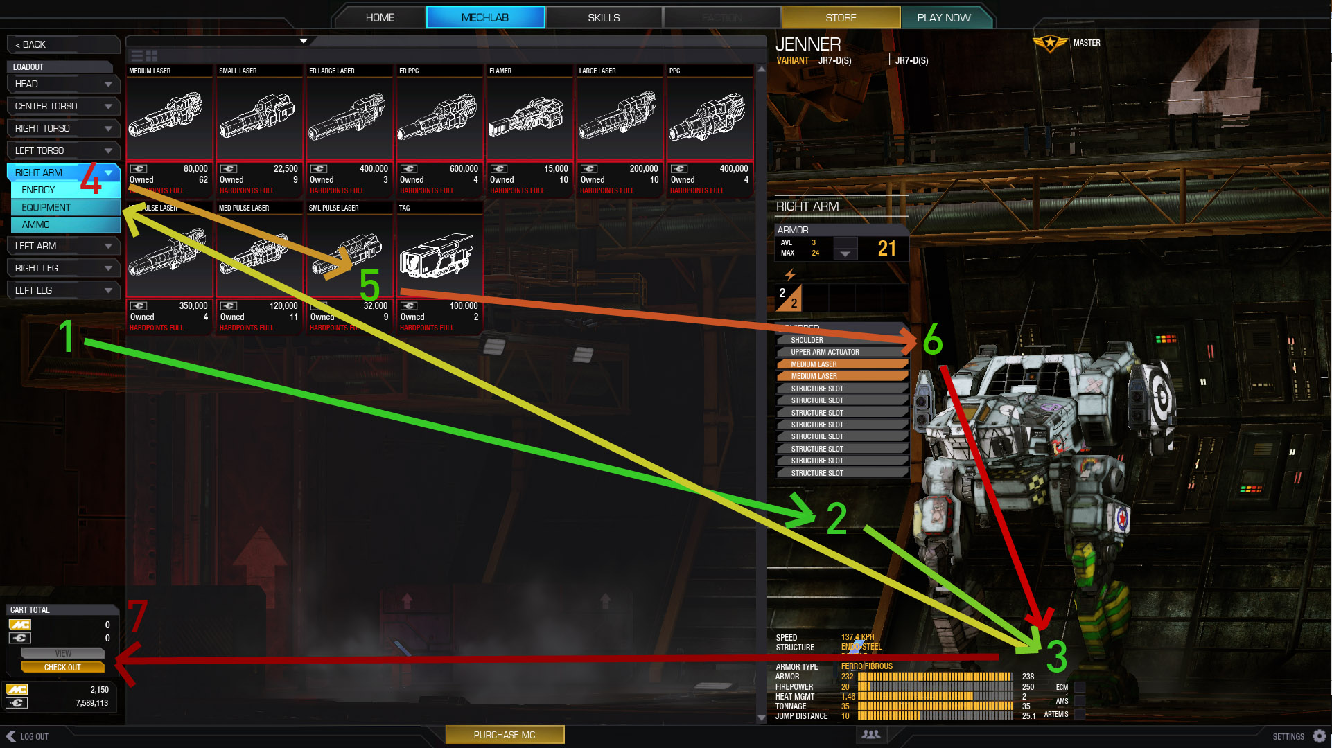
Posted Image

1, select a point to view
2. figure out which slots are free
3. check weight (its tiny and in the corner.. this is the most common thing to look at when customizing.. tonnage)
4. Select a catagory of item (ok in theory, but problems exaggerated by not being able to see more than 1 part at a time.)
5. click and drag, no double click? also, uses too much prime realestate (THE CENTER OF YOUR SCREEN)
6. drag part onto here. That works. What doesn't work is that you don't know how that relates to your other parts of the mech.
7. Check out is bottom left? Most naturally, done, ok or close buttons are on the bottom right, or sometimes top right. Never left.

You can see that your eyes and mouse are constantly going across the middle... eating up brain energy. We're also missing critical infomration for customization like free critical slots. And an overview.

Just imagine adding heat sinks to each part, and realizing you need to get .5 tons somewhere... Nightmare.

Ok, so... Here's my proposal:
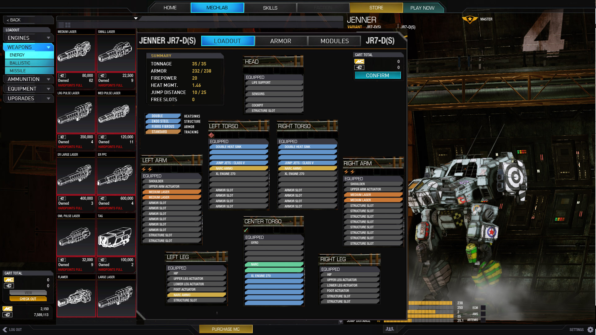
Posted Image

I don't think I need to explain this.

Note that I've removed armor into another tab.

Hardpoints don't need to be as complicated as they are. 2 lighting bolts = 2 energy hardpoints.

Tonnage, firepower etc is easily referenced in the middle of the screen.

Still have enough space to mouse over anything for expanded info.
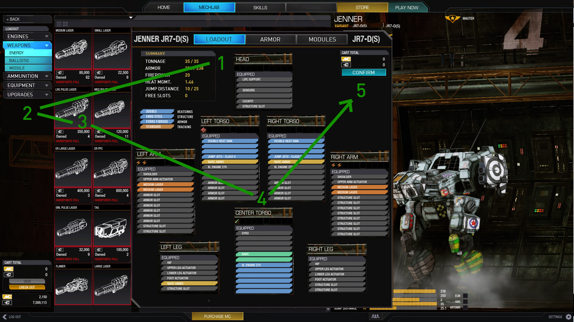
Posted Image

Here is the flow:
1. check overview/ tonnage
2. pick what you want
3. drag it over
4. make sure everything fits.
1. check tonnage (visually close)
5. repeat/confirm or go to armor.

Most of the function is in the middle of the page. and going in a natural circle. Most importantly you have at a glance all the information you need to decide what to do.

Armor...
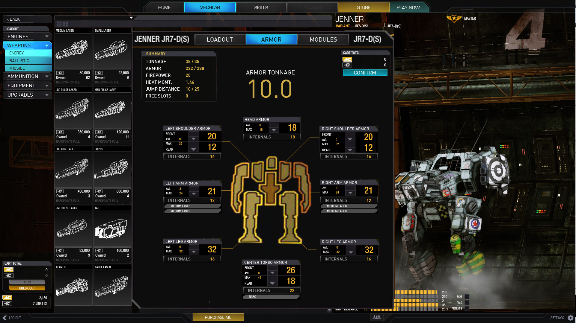
Posted Image

Again, I need not explain really.

Shows you where your guns are, so you can make sure those spots have more armor than your disposable arms.

Internal point value showing! (we need this!)

And armor tonnage totals, for getting those .5t and 1.0 values.

__________________________

I know UI 2.0 is at it's early stages, but holy cow I didn't think it would be that infuriating to use.
It does look pretty though.

I hope this helps illustrate specifically the gripes we have with 2.0.
Let me know if you all agree/disagree. Thoughts, critiques.

Thanks for looking.

Edited by Valcrow, 10 February 2014 - 04:01 AM.


#2 Aceramic

    Member

  • PipPipPipPipPip
  • The Scythe
  • The Scythe
  • 110 posts

Posted 10 February 2014 - 04:57 AM

I've quickly gotten used to UI 2.0, it's definitely an improvement over the old one. I don't really have any "major" complaints about it that haven't already been addressed (meaning, they know it's an issue and are working on a fix, they haven't necessarily fixed it yet). A couple minor complaints (like the module hunt, and not actually knowing how many heatsinks are on your 'mech), but I can work around those, or a fix is in progress. That said....


PGI, you need to hire this guy. I like this. >.>

#3 Igchy

    Member

  • PipPipPip
  • Ace Of Spades
  • Ace Of Spades
  • 94 posts
  • LocationBKK , Thailand (Not Taiwan)

Posted 10 February 2014 - 05:23 AM

Greatjob ,but i would like armor adjustment in the same section(or same tab) as weapon loadout.Its just a little bit more convenient when u reduce armor to take more weapon ,u dont have to switch between the two tabs.

Oh and dont forget ammunition counter at loadout summary screen so people dont take wrong ammo type and know exactly how many they have.

And heat sink counter to let u know that u have at least 10 HS or more (include the ones that in the engine).

Edited by Igchy, 10 February 2014 - 05:44 AM.


#4 Jacob Side

    Member

  • PipPipPipPipPipPip
  • Legendary Founder
  • Legendary Founder
  • 390 posts

Posted 10 February 2014 - 05:35 AM

I want this! Seriously!
An ammo counter would be great. I can't count the times I've had a ton of the wrong ammo squirreled away in my head

Edited by Jacob Side, 10 February 2014 - 05:37 AM.


#5 Duncan Longwood

    Member

  • PipPipPipPipPipPip
  • The Hammer
  • The Hammer
  • 253 posts

Posted 10 February 2014 - 05:39 AM

Ugh, yes, this. The amount of click-through nonsense and superfluous mouse-movement in UI 2.0 needs to be severely reduced.

Very nice write-up!

#6 Igchy

    Member

  • PipPipPip
  • Ace Of Spades
  • Ace Of Spades
  • 94 posts
  • LocationBKK , Thailand (Not Taiwan)

Posted 10 February 2014 - 05:57 AM

Posted Image

Troutmonkey made this (sorry if i'm wrong),Its in UI feedback thread,i bring it here in case PGI don't read all 16 page of feed back.

Edited by Igchy, 10 February 2014 - 05:57 AM.


#7 rolly

    Member

  • PipPipPipPipPipPipPip
  • Guardian
  • Guardian
  • 995 posts
  • LocationDown the street from the MWO server

Posted 10 February 2014 - 06:11 AM

Thank you for your post man and thanks for the reimagining. UI 2.0 is fantastic and I'm happy its here but it seriously needs an ergonomics revision. We certainly don't need an Apple version of UI 2.0 this is a great start in the right direction.

#8 Lupin

    Member

  • PipPipPipPipPipPipPip
  • Elite Founder
  • 955 posts
  • LocationKent, UK.

Posted 10 February 2014 - 06:32 AM

Thank you Valcrow for your effort.

But after 3 public tests of the UI 2.0 and feedback they missed the point and bugs.

I seem to remember PGI saying they were going to release UI 2.0 with bugs and fix on the fly.

#9 JohnAzussa

    Rookie

  • 8 posts

Posted 10 February 2014 - 06:46 AM

View PostLupin, on 10 February 2014 - 06:32 AM, said:

Thank you Valcrow for your effort.

But after 3 public tests of the UI 2.0 and feedback they missed the point and bugs.

I seem to remember PGI saying they were going to release UI 2.0 with bugs and fix on the fly.


Shall we just assume that "on the fly" means "never" ? Why would you release something knowing how broken it is? Schedules?

I read in a different thread that they were bound and determined to "make the date" for this "feature" Now if they have screwed up dates before then yes, thats bad. But working in the software industry personally let me tell you that "making the date" does not mean "release crap." I tried to customize my first purchased mech today and man was it a PITA. Now I understand fully now why there are so many complaint threads.

#10 SuperBroHeroFella

    Member

  • PipPipPipPipPip
  • The Wrench
  • 124 posts

Posted 10 February 2014 - 07:38 AM

Logged in to say thank you. There's prolly a ton of people, including me who would have done mockups like this if it weren't for the zero gratification that comes with it from PGI. So thanks again for your time, hopefully they'll think about your suggestions.

#11 Gawain14

    Rookie

  • Survivor
  • Survivor
  • 3 posts

Posted 10 February 2014 - 07:51 AM

Amazing changes Valcrow!
This would be great. Generally accessible and new user friendly.

#12 Buso Senshi Zelazny

    Member

  • PipPipPipPipPip
  • Bad Company
  • Bad Company
  • 179 posts
  • LocationUpstate New York, USA

Posted 10 February 2014 - 08:35 AM

These proposed changes would be a VAST improvement over the current interface. PGI has stated that they will be changing the Mechlab configuration screen to be "Smurfy-like", so let's hope that ends up going in this direction. The mech selection screen with info on each chassis is probably my number one issue with the current UI, and I love this proposed change.

If you haven't already, I would post this in the UI Feedback Thread as well, just to make sure somebody at PGI sees this and they can't say, "Oh, its wasn't in the Official thread, so we didn't look at it."

#13 Zyllos

    Member

  • PipPipPipPipPipPipPipPipPip
  • 2,818 posts

Posted 10 February 2014 - 08:41 AM

I could very well jump on board with this modification.

One thing to keep in mind, though, is how well the UI scales with smaller resolutions. Especially 1024x768.

#14 BP Raven

    Member

  • PipPipPipPipPipPip
  • 252 posts

Posted 10 February 2014 - 09:37 AM

Excellent job OP, that would be a massive improvement over what we have right now.

View PostZyllos, on 10 February 2014 - 08:41 AM, said:

I could very well jump on board with this modification.

One thing to keep in mind, though, is how well the UI scales with smaller resolutions. Especially 1024x768.


And larger ones too; at tripple wide resolution (~6000*1920) the mechlab stretches out across all 3 screens, with some buttons far left, some middle and some far right, literally 5 feet apart on my 23" screens...

#15 Dymlos2003

    Member

  • PipPipPipPipPipPipPipPip
  • Moderate Giver
  • Moderate Giver
  • 1,473 posts
  • LocationCalifornia

Posted 10 February 2014 - 12:06 PM

View PostBuso Senshi Zelazny, on 10 February 2014 - 08:35 AM, said:

These proposed changes would be a VAST improvement over the current interface. PGI has stated that they will be changing the Mechlab configuration screen to be "Smurfy-like", so let's hope that ends up going in this direction. The mech selection screen with info on each chassis is probably my number one issue with the current UI, and I love this proposed change.

If you haven't already, I would post this in the UI Feedback Thread as well, just to make sure somebody at PGI sees this and they can't say, "Oh, its wasn't in the Official thread, so we didn't look at it."


The Mechlab isn't changing to a smurfy like screen... there will be an OVERVIEW smurfy like screen. Big difference.

On topic:

I like these ideas. Hopefully PGI takes some of them into consideration.

Edited by Dymlos2003, 10 February 2014 - 12:07 PM.


#16 Zyllos

    Member

  • PipPipPipPipPipPipPipPipPip
  • 2,818 posts

Posted 10 February 2014 - 12:10 PM

View PostBP Raven, on 10 February 2014 - 09:37 AM, said:

Excellent job OP, that would be a massive improvement over what we have right now.


And larger ones too; at tripple wide resolution (~6000*1920) the mechlab stretches out across all 3 screens, with some buttons far left, some middle and some far right, literally 5 feet apart on my 23" screens...


Yes, I technically should state that.

The very large and small should be throughly tested.

#17 Brawler1986

    Member

  • PipPipPipPipPip
  • 147 posts

Posted 10 February 2014 - 12:14 PM

Awesome stuff Valcrow!! Lots of kudos and likes ;)

I'm a Front-end Developer myself and thought about to post a similar topic. But i don't have the time right now explain everything. Its really more initiative and i think it will remove the need for me to switch to smurf back and forth.

I really recommend PGI taking a decent usability developer/ front-end developer, because i wouldn't ever release UI 2.0 in this state.

#18 sabujo

    Member

  • PipPipPipPipPipPipPip
  • 531 posts

Posted 10 February 2014 - 02:41 PM

Excellent approach, Valcrow. You really hit the nail with it. My favorite ideas of yours are:
- The armor distribution panel (having that paper model with colored parts on an intensity scale - red to yellow, would be even nicer).
- The number of hard points stated in multiple symbols rather than numbers - YES! Hate to scan the colors and then scan for each digit. It's an avoidable mental effort with your proposal.

I would also add the feature of superimposing slots hard points (number and types) into the mech itself (and follow rotation). After that, this would be near perfect.

BTW, loved the studies on eye/mouse mileage. So true...

#19 o0cipher0o

    Member

  • PipPipPipPipPipPip
  • FP Veteran - Beta 1
  • FP Veteran - Beta 1
  • 353 posts
  • LocationItaly

Posted 10 February 2014 - 02:59 PM

Great mock-ups man, that's definitely how ui 2.0 should've been like.

I really hope PGI takes your hints in consideration.

#20 Valcrow

    Member

  • PipPipPipPipPipPip
  • 228 posts
  • LocationCanada

Posted 10 February 2014 - 09:12 PM

Thanks for comments! I've taken your advice and posted it on the official thread as well, though with a much smaller wall of text. :P


8 user(s) are reading this topic

0 members, 8 guests, 0 anonymous users