Jump to content

Updated! Timber Wolf Screen Shots Revealed


950 replies to this topic

#741 DirePhoenix

    Member

  • PipPipPipPipPipPipPipPip
  • 1,565 posts
  • Google+: Link
  • Facebook: Link
  • LocationSan Diego

Posted 13 April 2014 - 08:24 PM

View PostCimarb, on 13 April 2014 - 05:56 PM, said:

Based on the similarity to the non-prime concept art, I would assume the in game pics are not the Prime version, but instead the non-prime.

Ok, I think there are some misconceptions here. The grey/orange/green concept art is a "special" Prime variant. If the Clan Packages had a cool name like the Phoenix Packages, those would be the "Phoenix" variants. Those are exclusive to the pre-release packages. They have special geometry which includes rounded armor sections, different hands, extended armor baffles, and sometimes even roll-bars.

Then you have the standard variants. This is what the in-game screenshots are showing. Note it is still a "Prime" variant, but it's the same difference as the SHD-2H(P) and the SHD-2H, or the CPLT-C1(F) and the CPLT-C1. Same 'mech, same stats, different geometry pieces.

Consider this the Timberwolf Prime(Special Edition):
Posted Image

This would be the Timberwolf Prime (standard) - the one you'd be getting for Cbills, also the only (non-hero) version you'll be able to get after the Clan package promotion ends:
Posted Image

Same mech - these are both still Timberwolf Primes - but you can see the differences in geometry. Both of these pictures have been on the Clan package page since the beginning, and for all the other available Clan OmniMechs as well. just click the pictures of the mechs and click through the carousel to see them all.

#742 Navid A1

    Member

  • PipPipPipPipPipPipPipPipPip
  • CS 2022 Gold Champ
  • CS 2022 Gold Champ
  • 4,938 posts
  • LocationVancouver, BC

Posted 13 April 2014 - 08:39 PM

View PostFupDup, on 13 April 2014 - 08:00 PM, said:

View PostButane9000, on 13 April 2014 - 06:04 PM, said:

I don't care what anyone says. I want to see that Ryoken.

And Puma, while we're at it.


The reason i want the timber to look good is because i will never pilot one... instead i will admire it's elegance from the cockpit of a DIRE WOLF.

#743 Cimarb

    Member

  • PipPipPipPipPipPipPipPipPip
  • Caladbolg
  • Caladbolg
  • 3,912 posts
  • Twitter: Link
  • Twitch: Link
  • LocationA hop, skip and jump from Terra

Posted 13 April 2014 - 08:56 PM

View PostDirePhoenix, on 13 April 2014 - 08:24 PM, said:

Ok, I think there are some misconceptions here.
Spoiler


Same mech - these are both still Timberwolf Primes - but you can see the differences in geometry. Both of these pictures have been on the Clan package page since the beginning, and for all the other available Clan OmniMechs as well. just click the pictures of the mechs and click through the carousel to see them all.

Bah, you're right - my bad.

View PostNavid A1, on 13 April 2014 - 08:39 PM, said:


The reason i want the timber to look good is because i will never pilot one... instead i will admire it's elegance from the cockpit of a DIRE WOLF.

I will definitely be piloting the Timber Wolf, as long as it plays as much like the Cataphract as it looks, but the Dire Wolf is the one I am truly looking forward to - hopefully it will be a good mix of the Stalker and Atlas, both of which I play the most.

#744 Gasoline

    Member

  • PipPipPipPipPipPip
  • Elite Founder
  • Elite Founder
  • 338 posts

Posted 13 April 2014 - 10:45 PM

View PostKuroNyra, on 11 April 2014 - 09:11 AM, said:

Posted ImagePosted Image

Those screenshot look WAY better than the first ones. It still looks rather bulky, but since it's a 75t chassis I'm fine with it.

It's rather amusing that people really want that CT lengthened. I mean... seriously, that would be a death sentence. We already have walking center torsos... no need for another one, especially not in a 'Mech that can withstand the loss of a side torso while sporting an XL engine. Tbh. this was the thing I liked most about the redesign. The sharpened cockpit line makes it looking a bit more aggressive. The only thing, that could use a little more uniqueness for my taste are the arm pods. They're a bit too cataphract-ish.

I would really like to see a video of the movement animations. Interests me to see if they adopted this agile, expansive movement style which it had in older video games.

#745 Navid A1

    Member

  • PipPipPipPipPipPipPipPipPip
  • CS 2022 Gold Champ
  • CS 2022 Gold Champ
  • 4,938 posts
  • LocationVancouver, BC

Posted 13 April 2014 - 11:06 PM

Even in those screenshots there is room for improvement:


View PostNavid A1, on 11 April 2014 - 07:48 PM, said:

A 5 minute edit:
Posted Image

I think it looks nimble (like the concept art) without feeling it would snap on first AC2 hit .... as you can see, a small shrink in thighs goes a long way...
the joint may seems small but it was inevitable in a 5 min edit... it can stay the same size as the current model. the main focus was on the thigh itself.


#746 Cricent

    Rookie

  • Elite Founder
  • Elite Founder
  • 9 posts

Posted 13 April 2014 - 11:49 PM

looks fine, everyone needs to stop complaining, yall are acting like the goldilocks from the three little bears." oh my porridge is too cold or my porridge is to hot" you all are like the legs are too long or the legs are too thick .... give it a rest.............. porridge is porridge and timber wolf is a timber wolf.

#747 aniviron

    Member

  • PipPipPipPipPipPipPipPipPip
  • 3,752 posts

Posted 14 April 2014 - 12:12 AM

View PostCricent, on 13 April 2014 - 11:49 PM, said:

looks fine, everyone needs to stop complaining, yall are acting like the goldilocks from the three little bears." oh my porridge is too cold or my porridge is to hot" you all are like the legs are too long or the legs are too thick .... give it a rest.............. porridge is porridge and timber wolf is a timber wolf.


Sorry for having an opinion about a game I care about and have spent money on, in a franchise I've been smitten with for almost two decades. I'll go back to just not caring if things look bad then.

#748 GalaxyBluestar

    Member

  • PipPipPipPipPipPipPipPipPip
  • 3,748 posts
  • Location...

Posted 14 April 2014 - 12:12 AM

just confirming what some people are dissapointed with

Posted Image

what we got

Posted Image

Posted Image

both good and bad camera angles confirm this.

#749 LightningStorm

    Member

  • PipPipPip
  • Ace Of Spades
  • 60 posts
  • Locationİstanbul, Türkiye

Posted 14 April 2014 - 01:03 AM

I wasn't planning on having a timber wolf but I guess I've changed my mind because it looks better than what i expected, and I hope it's legs will look like the one in the first screen shot, it reminds me of "legs go all the way up griffin" :o

#750 Osric Lancaster

    Member

  • PipPipPipPipPipPip
  • 447 posts

Posted 14 April 2014 - 01:26 AM

View PostGalaxyBluestar, on 14 April 2014 - 12:12 AM, said:

just confirming what some people are dissapointed with

Posted Image


See, those legs look a LOT better. On a whole the 'Mech looks better. They're still lacking the off-set knee joint, the arms are too boxy and I'm not a fan of the fact that they're melded with the launchers but it looks more like the 'Mech it's supposed to be.

Also this picture is beautiful:

Posted Image

#751 Sable Phoenix

    Member

  • PipPipPip
  • Legendary Founder
  • Legendary Founder
  • 73 posts

Posted 14 April 2014 - 01:36 AM

The real problem is that the modeling team did NOT accurately translate the concept art into the game. The legs are bulkier of course, but the real problem is their blockiness, the lack of rounded surfaces, as well as the weird dip in the shin. The same goes with all of that crap hanging off the side torsos; in the concept art, that stuff is flush with the shoulder joint actuator and looks fine. In the 3D model, it all extends far out of the side of the mech, nearly to the elbow joint.

If they'd just put the actual concept into a model, I think far fewer people would have an issue with the design, myself included. Clan Omnimechs are supposed to be sleeker and more organic-looking than Battlemechs. The concept art was a nice compromise between that design aesthetic and a something that looks like an armored vehicle meant to fight a war. The model, though, the model is a failure.

#752 ssm

    Member

  • PipPipPipPipPipPipPip
  • 574 posts
  • LocationPoland

Posted 14 April 2014 - 02:17 AM

View PostSable Phoenix, on 14 April 2014 - 01:36 AM, said:

The real problem is that the modeling team did NOT accurately translate the concept art into the game. The legs are bulkier of course, but the real problem is their blockiness, the lack of rounded surfaces, as well as the weird dip in the shin. The same goes with all of that crap hanging off the side torsos; in the concept art, that stuff is flush with the shoulder joint actuator and looks fine. In the 3D model, it all extends far out of the side of the mech, nearly to the elbow joint.

Well, lack of rounded surfaces keeps them in line with entire mwo design line, n ot to mention that it lowers the poly count.

As for the crap hanging around side torso - I think that it's here to emulate the "square box" that was the rear of original design.

Elbow joint - any shorter than that and pods would clip the upper part of the legs during tors twisting.

View PostSable Phoenix, on 14 April 2014 - 01:36 AM, said:

If they'd just put the actual concept into a model, I think far fewer people would have an issue with the design, myself included. Clan Omnimechs are supposed to be sleeker and more organic-looking than Battlemechs. The concept art was a nice compromise between that design aesthetic and a something that looks like an armored vehicle meant to fight a war. The model, though, the model is a failure.

Posted Image

They aren't, really. Some of them are sleek, some are bulky, some are organic, some are mechanical - they do not follow any consistent design line.

I don't know where and when this "Clan Mechs are supposed to be more graceful/streamlined/sleekier/organic looking" idea started, but I know that somebody who started it never saw more than 3-4 of original Omnis, not to mention some that came after that.

Edited by ssm, 14 April 2014 - 02:24 AM.


#753 Uncle Totty

    Member

  • PipPipPipPipPipPipPipPip
  • The Hunter
  • The Hunter
  • 1,556 posts
  • Facebook: Link
  • LocationSomewhere in the ARDC (Ark-Royal Defense Cordon)

Posted 14 April 2014 - 02:34 AM

View PostGalaxyBluestar, on 14 April 2014 - 12:12 AM, said:

just confirming what some people are dissapointed with

Posted Image

what we got

Posted Image

Posted Image

both good and bad camera angles confirm this.

Hole shit! Half of the flaws you have pointed out are not even there! :) Yes the "fat goes upward", yes the "sunburst" is gone, yes there is an extra slab of armor on the torso. The rest are just total bullshit. :o

Edited by Nathan K, 14 April 2014 - 02:39 AM.


#754 Navid A1

    Member

  • PipPipPipPipPipPipPipPipPip
  • CS 2022 Gold Champ
  • CS 2022 Gold Champ
  • 4,938 posts
  • LocationVancouver, BC

Posted 14 April 2014 - 02:44 AM

View PostSable Phoenix, on 14 April 2014 - 01:36 AM, said:

The real problem is that the modeling team did NOT accurately translate the concept art into the game. The legs are bulkier of course, but the real problem is their blockiness, the lack of rounded surfaces, as well as the weird dip in the shin. The same goes with all of that crap hanging off the side torsos; in the concept art, that stuff is flush with the shoulder joint actuator and looks fine. In the 3D model, it all extends far out of the side of the mech, nearly to the elbow joint.

If they'd just put the actual concept into a model, I think far fewer people would have an issue with the design, myself included. Clan Omnimechs are supposed to be sleeker and more organic-looking than Battlemechs. The concept art was a nice compromise between that design aesthetic and a something that looks like an armored vehicle meant to fight a war. The model, though, the model is a failure.


Those stuff they've added to the side torsos looks kinda cool... i like them... they give the mech a more intimidating look.
but then there is the concept which should have been the base. The concept looks more agile and nimble. The 3d modelers missed some of the key points obviously.

Edited by Navid A1, 14 April 2014 - 02:46 AM.


#755 Osric Lancaster

    Member

  • PipPipPipPipPipPip
  • 447 posts

Posted 14 April 2014 - 02:59 AM

View Postssm, on 14 April 2014 - 02:17 AM, said:

They aren't, really. Some of them are sleek, some are bulky, some are organic, some are mechanical - they do not follow any consistent design line.

I don't know where and when this "Clan Mechs are supposed to be more graceful/streamlined/sleekier/organic looking" idea started, but I know that somebody who started it never saw more than 3-4 of original Omnis, not to mention some that came after that.


To be fair the Executioner is probably the best one you could have picked for your argument and it STILL looks a lot less angular and more beveled than say, a Banshee. As far as consistent design line, a lot of clan 'Mechs share characteristics. Especially the arms are interchangeable between a lot of Clan Omnis.

This guy does some really sweet clan 'Mechs -
http://mwomercs.com/...somethingawful/

#756 LiGhtningFF13

    Member

  • PipPipPipPipPipPipPipPip
  • The Devoted
  • The Devoted
  • 1,375 posts
  • LocationBetween the Flannagan's Nebulea and the Pleiades Cluster

Posted 14 April 2014 - 03:01 AM

Can't wait to see the other clan variants!

#757 Teela Zain Elmes

    Member

  • PipPip
  • 47 posts
  • LocationNear planet Huntress

Posted 14 April 2014 - 03:07 AM

... neither do I!

#758 ssm

    Member

  • PipPipPipPipPipPipPip
  • 574 posts
  • LocationPoland

Posted 14 April 2014 - 03:09 AM

View PostOsric Lancaster, on 14 April 2014 - 02:59 AM, said:


To be fair the Executioner is probably the best one you could have picked for your argument and it STILL looks a lot less angular and more beveled than say, a Banshee. As far as consistent design line, a lot of clan 'Mechs share characteristics. Especially the arms are interchangeable between a lot of Clan Omnis.

This guy does some really sweet clan 'Mechs -
http://mwomercs.com/...somethingawful/

Of course, but there is one more thing, as far as "Clan Mechs are more streamlined/organic/ etc" go.

Because so are, for example, those guys:

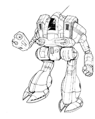
Posted Image

Posted Image

Even If we agreed that some/most of the Omnis are streamlined/organic to some degree, it applies as well (or even to a larger degree) to IS designs.

And that's my entire point - mechs in BT universe, at least in earlier eras, are not visually differentiated along major factions (IS/Clans). They are organic/mechanical/streamlined/blocky designs all across the board, regardless if the are Clan or IS.

Edited by ssm, 14 April 2014 - 03:10 AM.


#759 Cimarb

    Member

  • PipPipPipPipPipPipPipPipPip
  • Caladbolg
  • Caladbolg
  • 3,912 posts
  • Twitter: Link
  • Twitch: Link
  • LocationA hop, skip and jump from Terra

Posted 14 April 2014 - 07:34 AM

You can try to argue against someone's memories, but you will fail. People have glorified the TimberWolf (and Clans in general) to the point that they are completely delusional about them. In fact, even after seeing the Executioner and the IS examples, as well as the eight million different artistic versions of the TimberWolf, they are STILL not going to let these false memories go.

Expectations for the TimberWolf were just too high. There was no way PGI was going to make everyone happy with it, and even if they "fix" the legs, 95% of the complainers are still going to complain about something else.

#760 Ngamok

    Member

  • PipPipPipPipPipPipPipPipPipPip
  • Elite Founder
  • Elite Founder
  • 5,033 posts
  • Twitter: Link
  • Twitch: Link
  • LocationLafayette, IN

Posted 14 April 2014 - 08:51 AM

We still complaining here?


16 user(s) are reading this topic

0 members, 16 guests, 0 anonymous users